IS428 2017-18 T1 Assign Russell Yap Song Chen
Link to assignment: Assignments
Link to dropbox: Assignment Dropbox
Contents
- 1 Overview
- 2 The Task
- 3 Background Information
- 4 The Data
- 5 Question 1: Characterize the sensors’ performance and operation. Are they all working properly at all times? Can you detect any unexpected behaviors of the sensors through analyzing the readings they capture?
- 6 Question 2: Now turn your attention to the chemicals themselves. Which chemicals are being detected by the sensor group? What patterns of chemical releases do you see, as being reported in the data?
- 7 * Which factories are responsible for which chemical releases? Carefully describe how you determined this using all the data you have available. For the factories you identified, describe any observed patterns of operation revealed in the data.
Overview
Mistford is a mid-size city is located to the southwest of a large nature preserve. The city has a small industrial area with four light-manufacturing endeavors. Mitch Vogel is a post-doc student studying ornithology at Mistford College and has been discovering signs that the number of nesting pairs of the Rose-Crested Blue Pipit, a popular local bird due to its attractive plumage and pleasant songs, is decreasing! The decrease is sufficiently significant that the Pangera Ornithology Conservation Society is sponsoring Mitch to undertake additional studies to identify the possible reasons. Mitch is gaining access to several datasets that may help him in his work, and he has asked you (and your colleagues) as experts in visual analytics to help him analyze these datasets.
Mitch Vogel was immediately suspicious of the noxious gases just pouring out of the smokestacks from the four manufacturing factories south of the nature preserve. He was almost certain that all of these companies are contributing to the downfall of the poor Rose-crested Blue Pipit bird. But when he talked to company representatives and workers, they all seem to be nice people and actually pretty respectful of the environment.
In fact, Mitch was surprised to learn that the factories had recently taken steps to make their processes more environmentally friendly, even though it raised their cost of production. Mitch discovered that the state government has been monitoring the gaseous effluents from the factories through a set of sensors, distributed around the factories, and set between the smokestacks, the city of Mistford and the nature preserve. The state has given Mitch access to their air sampler data, meteorological data, and locations map. Mitch is very good in Excel, but he knows that there are better tools for data discovery, and he knows that you are very clever at visual analytics and would be able to help perform an analysis.
The Task
General Task
The four factories in the industrial area are subjected to higher-than-usual environmental assessment, due to their proximity to both the city and the preserve. Gaseous effluent data from several sampling stations has been collected over several months, along with meteorological data (wind speed and direction), that could help Mitch understand what impact these factories may be having on the Rose-Crested Blue Pipit. These factories are supposed to be quite compliant with recent years’ environmental regulations, but Mitch has his doubts that the actual data has been closely reviewed. Could visual analytics help him understand the real situation?
The primary job for Mitch is to determine which (if any) of the factories may be contributing to the problems of the Rose-crested Blue Pipit. Often, air sampling analysis deals with a single chemical being emitted by a single factory. In this case, though, there are four factories, potentially each emitting four chemicals, being monitored by nine different sensors. Further, some chemicals being emitted are more hazardous than others. Your task, as supported by visual analytics that you apply, is to detangle the data to help Mitch determine where problems may be. Use visual analytics to analyze the available data and develop responses to the questions below.
The Specific Tasks
- Characterize the sensors’ performance and operation. Are they all working properly at all times? Can you detect any unexpected behaviors of the sensors through analyzing the readings they capture?Limit your response to no more than 9 images and 1000 words.
- Now turn your attention to the chemicals themselves. Which chemicals are being detected by the sensor group? What patterns of chemical releases do you see, as being reported in the data? Limit your response to no more than 6 images and 500 words.
- Which factories are responsible for which chemical releases? Carefully describe how you determined this using all the data you have available. For the factories you identified, describe any observed patterns of operation revealed in the data. Limit your response to no more than 8 images and 1000 words.
Background Information
The four manufacturing factories south of the nature preserve which Mitch is suspicious of the chemical releases and these are their coordinates:
| Factory | X | Y |
|---|---|---|
| Roadrunner Fitness Electronics | 89 | 27 |
| Kasios Office FurnituExample | 90 | 21 |
| Radiance ColourTeExample | 109 | 26 |
| Indigo SoExample ardExample | 120 | 22 |
In addition, these are the chemicals detected by the sensors and their following descriptions are below:
- AGOC-3A – New environmental regulations, and consumer demand, have led to the development of low-VOC and zero-VOC solvents. Most manufacturers now use one or more low-VOC substances and Mistford’s plants have wholeheartedly signed on. These new solvents, including AGOC-3A, are less harmful to human and environmental health.
- Appluimonia – An airborne odor is caused by a substance in the air that you can smell. Odors, or smells, can be either pleasant or unpleasant. In general, most substances that cause odors in the outdoor air are not at levels that can cause serious injury, long-term health effects, or death to humans or animals. However, odors may affect your quality of life and sense of well-being. Several odor-producing substances, including Appluimonia, are monitored under this program.
- Chlorodinine – Corrosives are materials that can attack and chemically destroy exposed body tissues. Corrosives can also damage or even destroy metal. They begin to cause damage as soon as they touch the skin, eyes, respiratory tract, digestive tract, or the metal. They might be hazardous in other ways too, depending on the particular corrosive material. An example is the chemical Chlorodinine. It has been used as a disinfectant and sterilizing agent as well as other uses. It is harmful if inhaled or swallowed.
- Methylosmolene – This is a trade name for a family of volatile organic solvents. After the publication of several studies documenting the toxic side effects of Methylosmolene in vertebrates, the chemical was strictly regulated in the manufacturing sector. Liquid forms of Methylosmolene are required by law to be chemically neutralized before disposal.
The Data
The data available consists of sensor readings from a set of air-sampling sensors and meteorological data from a weather station in proximity to the factories and sensors. The factories and sensors locations are provided in terms of x,y coordinates on a 200x200 grid, with (0,0) at the lower left hand corner (southwest). The sensors map shows the locations of the sensors and factories by number for the sensors and by name for the factories.
- Sensor Data.xlsx
- Sensor Location.xlsx
- Meteorological Data.xlsx
- Datafix.py (Self-created cleaning script)
- Cleaned_Sensor_Data.csv (Generated from script above using Sensor Data.xlsx)
Question 1: Characterize the sensors’ performance and operation. Are they all working properly at all times? Can you detect any unexpected behaviors of the sensors through analyzing the readings they capture?
Link to Workbook
In general, the sensors seem to functioning majority of the time. However, whether these sensors are working properly is another matter altogether.
Patterns in Missing Data
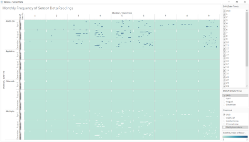
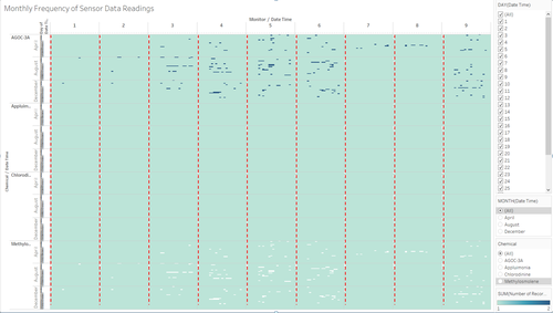
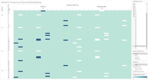
The first thing I did was to check for the number of records for each time stamp and sensor in the recordings to see if there are cases of missing data or duplicate data. After plotting it out in a calendar chart, I wasable to see something very interesting.
From Figure 1 and 2, I can see that there is a similar pattern in the missing data points with regards to all chemical reading for each sensor. These missing data points seem to happen at midnight (00:00) for all the sensors for the following dates: 2nd April, , 6th April, 2nd August, 4th August, 7th August, 2nd December AND 7th December. However, some sensors did pick up some readings for certain chemicals on these days. This regular pattern could symbolize that there is something else at work which results in the sensors collectively failing on these days at the exact same time.
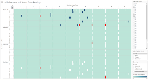
However, there is a total of 7 data points which deviate from this usual pattern. These exceptions are highlighted as a red block in figure 3.
For AGOC-3A: Monitor 3 on 2nd August, 00:00, Monitor 6,7 and 8 on 7th December, 00:00.
| AGOC 3-A | ||||||||||
| Date | Monitor 1 | Monitor 2 | Monitor 3 | Monitor 4 | Monitor 5 | Monitor 6 | Monitor 7 | Monitor 8 | Monitor 9 | |
|---|---|---|---|---|---|---|---|---|---|---|
| 2nd April, 00:00 | Y | Y | Y | Y | Y | Y | Y | Y | Y | |
| 6th April, 00:00 | Y | Y | Y | Y | Y | Y | Y | Y | Y | |
| 2nd August, 00:00 | Y | Y | Y | Y | Y | Y | Y | Y | ||
| 4th August, 00:00 | Y | Y | Y | Y | Y | Y | Y | Y | Y | |
| 7th August, 00:00 | Y | Y | Y | Y | Y | Y | Y | Y | Y | |
| 2nd December, 00:00 | Y | Y | Y | Y | Y | Y | Y | Y | Y | |
| 7th December, 00:00 | Y | Y | Y | Y | Y | Y |
For Appluimonia: Monitor 7 on 7th December, 00:00
| Appluimonia | ||||||||||
| Date | Monitor 1 | Monitor 2 | Monitor 3 | Monitor 4 | Monitor 5 | Monitor 6 | Monitor 7 | Monitor 8 | Monitor 9 | |
|---|---|---|---|---|---|---|---|---|---|---|
| 2nd April, 00:00 | Y | Y | Y | Y | Y | Y | Y | Y | Y | |
| 6th April, 00:00 | Y | Y | Y | Y | Y | Y | Y | Y | Y | |
| 2nd August, 00:00 | Y | Y | Y | Y | Y | Y | Y | Y | Y | |
| 4th August, 00:00 | Y | Y | Y | Y | Y | Y | Y | Y | Y | |
| 7th August, 00:00 | Y | Y | Y | Y | Y | Y | Y | Y | Y | |
| 2nd December, 00:00 | Y | Y | Y | Y | Y | Y | Y | Y | Y | |
| 7th December, 00:00 | Y | Y | Y | Y | Y | Y | Y | Y |
For Methylosmolene: Monitor 3 on 2nd August. 00:00 and Monitor 8 on 7th December, 00:00.
| Methylosmolene | ||||||||||
| Date | Monitor 1 | Monitor 2 | Monitor 3 | Monitor 4 | Monitor 5 | Monitor 6 | Monitor 7 | Monitor 8 | Monitor 9 | |
|---|---|---|---|---|---|---|---|---|---|---|
| 2nd April, 00:00 | Y | Y | Y | Y | Y | Y | Y | Y | Y | |
| 6th April, 00:00 | Y | Y | Y | Y | Y | Y | Y | Y | Y | |
| 2nd August, 00:00 | Y | Y | Y | Y | Y | Y | Y | Y | ||
| 4th August, 00:00 | Y | Y | Y | Y | Y | Y | Y | Y | Y | |
| 7th August, 00:00 | Y | Y | Y | Y | Y | Y | Y | Y | Y | |
| 2nd December, 00:00 | Y | Y | Y | Y | Y | Y | Y | Y | Y | |
| 7th December, 00:00 | Y | Y | Y | Y | Y | Y | Y | Y |
Relationship between missing and extra data points
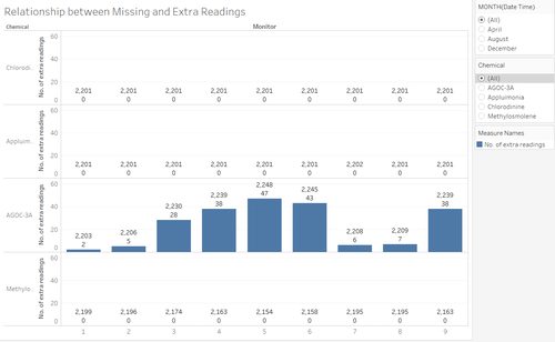
Using a table which displays the number of records for each sensor, I created a calculated field which finds the difference between the number of records recorded and the number of distinct records to find the number of duplicates in the sensor data. From Figure 4, there was a total of 214 duplicate data points in the readings for AGOC-3A.
Interestingly enough, that is the exact number of missing data points for Methylosmolene. If we were to take the current number of records of each sensor for Methylosmolene and add the number of duplicate data from AGOC-3A from the respective sensors, it will add up to 2021 for all the sensors which is the expected number of records each sensor should have. However, sensor 8 is an exception having a total of 2202 because as mentioned above, Monitor 8 has a exception in the readings which should be missing. Thus, sensor 8 will have 1 more extra reading as compared to the other sensors for Methylosmolene readings.
| Methylosmolene Adjustment | ||||||||||
| Description | Monitor 1 | Monitor 2 | Monitor 3 | Monitor 4 | Monitor 5 | Monitor 6 | Monitor 7 | Monitor 8 | Monitor 9 | |
|---|---|---|---|---|---|---|---|---|---|---|
| Original no. of Methylosmolene records | 2199 | 2196 | 2174 | 2163 | 2154 | 2158 | 2195 | 2195 | 2163 | |
| Duplicate AGOC-3A records | 2 | 5 | 28 | 38 | 47 | 43 | 6 | 7 | 38 | |
| Adjusted no. of Methylosmolene records | 2201 | 2201 | 2201 | 2201 | 2201 | 2201 | 2201 | 2202 | 2201 |
Taking reference from figure 5, after filtering the periods which only have duplicates, we can see that the duplicate data points in AGOC-3A readings perfectly fill up the gaps of the missing data points for Methylosmolene. Thus, there is a possibility that there was an error in the classification of readings leading to a double count of AGOC-3A readings. Or it could be a malicious intent to hide high emissions of Methylosmolene which is a harmful gas as AGOC-3A which is least harmful.
Summary
In Summary, there seems to be a regular pattern of malfunction in the sensors during the midnight of 2nd April, , 6th April, 2nd August, 4th August, 7th August, 2nd December AND 7th December. This could be a result of a malfunction but a more probable reason is that it is a scheduled maintenance as the pattern seems to be very regular. The 7 exceptions to these regular patterns are the sensors of concern as these sensors defied the regular pattern being displayed.
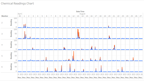
Figure 6 shows the chemical readings of some sensors for AOGC-3A. Readings which are colored orange means that the number of records at that point is 2 which means it is a result of the duplicate entry. If we look at Figure 6, we can see that almost all of the spikes happen on the periods when there is a duplicate record.
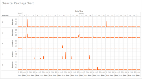
Figure 7 shows the chemical readings of some sensors for Methylosmolene. Figure 7 seems to have sporadic spikes naturally. Thus, there is a possibility that someone tampered with the sensors in such a way that it mis-categorizes high readings of Methylosmolene as AGOC-3A. This is worrisome because Methylosmolene is a highly regulated pollutant in the manufacturing sector. If someone tampered with the sensors, it would give the illusion that the culprit is performing within the limits when they could actually be not.
Question 2: Now turn your attention to the chemicals themselves. Which chemicals are being detected by the sensor group? What patterns of chemical releases do you see, as being reported in the data?
Link to Workbook
Data Cleaning Step
NOTE: For this question, I am not using the original data set, but I am using a cleaned data set which was generated with a python script. It was done by finding the mean and standard deviation of AGOC-3A emissions for each sensor. After which, z-score is calculated for the duplicate data entries and the value which shows the lower z-score is assigned to AGOC-3A while the other entry will be assigned to Methylosmolene. An example of such an entry is shown below:
| Methylosmolene Adjustment | |||
| Chemical | Date Time | Monitor | Readings |
|---|---|---|---|
| AGOC-3A | 17/4/2016 6:00:00 AM | 3 | 11.00977 |
| AGOC-3A | 17/4/2016 6:00:00 AM | 3 | 3.98816 |
After the script was ran, 11.00977 was assigned to AGOC-3A and 3.98816 was assigned to Methlosmolene for the date time, 17/4/2016 6:00:00 AM.
Sensor readings by chemical type
General Patterns
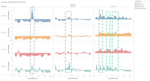
Figure 8 shows the total chemical readings for each chemical, broken down by days and month. Looking at each month, we can see that there is a huge spike of 4 standard deviations above the mean in AGOC-3A in the month of April, a minor one for Chlorodinine, and multiple spikes for Methylosmolene.
For the month of August, only the readings for Methylosmolene is a cause for concern with multiple spikes happening across the month with a bulk of the spikes happening between 10-13 August with the largest recorded spike being recorded on the 13th of August. Readings for the other 3 chemicals fluctuate healthily along the mean.
For the month of December, all of the readings are above the mean for AGOC-3A, Appluimonia, and Chlorodinine. For Methylosmolene, the readings are mostly above the mean with slight fluctuations below the mean on 3-4, 19-21 and 25 to 31st of December
Patterns in Spikes
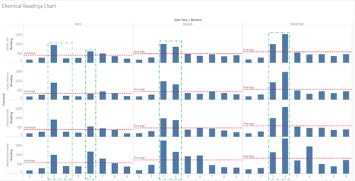
There also seems to be a similar pattern in the timing of the spikes between the chemicals as shown in the green dotted boxes in Figure 8. One on the 15th of April between AGOC-3A and Methylosmolene, one between AGOC-3A, Appluimonia and Methylosmolene on the 13th of August and 3 spikes which coincide across all 4 chemicals on 5, 11 and 18th of December.
Sensor readings by sensor
General Pattern
Figure 9 shows the total sum of the readings for each sensor for each month. The green boxes show the 2 sensors with the highest readings for the month and the red line across is the average of the From the figure above, sensor 3 and 6 shows the highest amount of emissions for the period of April with sensor 3 having the highest readings for AGOC-3A, Appluimonia, Chlorodinine while sensor 6 has the highest reading for Methylosmolene for the period.
For August and December, sensor 3 and 4 show the highest readings for all chemicals for the period, but sensor 3 had the highest reading in August while sensor 4 has the highest reading in December. For Methylosmolene, the readings hover above the mean between December 2 to December 18. From this chart, we can see that the amount of emissions generally increases over time with April having the least amount of emissions, August having average emissions and December having the most emissions.
Exceptions to the pattern
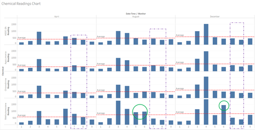
Looking at the results singled out with a purple dotted line in figure 10, Sensor 7 and 8 seems to have high amount of emissions which hover slightly above the average amount of emissions for the month of April. However, this pattern does not repeat itself for August and December.
Monitor 5 Methylosmolene readings seem to spike in August while Monitor 6 consistently shows high readings for Methylosmolene as shown in the green circles in figure 10.
Summary
Chemical readings start off low in April and steadily increase with each increase in month with December having the highest amount of emissions. Thus could be due to seasonal factors, as December is coming close to the end of the year, so productions is increased to account for the holiday season.
The regularity in the spikes and the fact that sensor 3 and 4 are consistently logging high readings of all chemicals leads me to think that there is a possibility that the companies near sensor 3 and 4 are very closely related in operations as when there is a spike, there is a spike in all the chemicals, meaning to say that there is a company which depends on other companies in order to do their manufacturing, leading to the concurrent spike in emissions for all chemicals as it is quite unlikely that one company is the sole contributor of all the chemical emissions. Sensor 3,4,5 and 6 consistently log high readings of Methylosmolene which is a harmful chemical. This pattern is particularly obvious in the month of December.
However, the spikes in Methylosmolene does not seem to follow any set pattern and its spikes are sporadic in every period, thus we can single out that even if Methylosmolene spikes, the other chemicals do not necessarily spike as well, thus the producer of Methylosmolene is mostly a company which can function without the other companies.
* Which factories are responsible for which chemical releases? Carefully describe how you determined this using all the data you have available. For the factories you identified, describe any observed patterns of operation revealed in the data.
Approach
In order to pin-point the culprit, I decided to use a wind-rose type of concept to pinpoint which companies are the producers of certain chemicals. By using the sensors as a base, we draw back a cone which aims to visually show which company is the possible culprit. By using wind-speed and the wind direction in the meteorological dataset, plot out a cone and whichever factory is covered by the cone, it is a probable producer of the chemical. To zoom in on the possible culprits, we first pick out the days in which there are spikes and proceed to look at which hours the peaks occur.
