IS428 2017-18 T1 Assign Siew Xue Qian Jazreel
Contents
- 1 Overview
- 2 The Task
- 3 Dataset Analysis & Transformation Process
- 4 Data Import/Configuration
- 5 Interactive Visualization
- 6 Interesting & Anomalous Observations
- 6.1 Characterize the sensors’ performance and operation. Are they all working properly at all times? Can you detect any unexpected behaviours of the sensors through analyzing the readings they capture?
- 6.2 Which chemicals are being detected by the sensor group? What patterns of chemical releases do you see, as being reported in the data?
- 6.3 Which factories are responsible for which chemical releases? - Factories are responsible for which chemical releases
- 7 Navigation Links
Overview
Mistford is a mid-size city is located to the southwest of a large nature preserve. The city has a small industrial area with four light-manufacturing endeavors. Mitch Vogel is a post-doc student studying ornithology at Mistford College and has been discovering signs that the number of nesting pairs of the Rose-Crested Blue Pipit, a popular local bird due to its attractive plumage and pleasant songs, is decreasing! The decrease is sufficiently significant that the Pangera Ornithology Conservation Society is sponsoring Mitch to undertake additional studies to identify the possible reasons. Mitch is gaining access to several datasets that may help him in his work, and he has asked you (and your colleagues) as experts in visual analytics to help him analyze these datasets.
Mitch Vogel was immediately suspicious of the noxious gases just pouring out of the smokestacks from the four manufacturing factories south of the nature preserve. He was almost certain that all of these companies are contributing to the downfall of the poor Rose-crested Blue Pipit bird. But when he talked to company representatives and workers, they all seem to be nice people and actually pretty respectful of the environment.
In fact, Mitch was surprised to learn that the factories had recently taken steps to make their processes more environmentally friendly, even though it raised their cost of production. Mitch discovered that the state government has been monitoring the gaseous effluents from the factories through a set of sensors, distributed around the factories, and set between the smokestacks, the city of Mistford and the nature preserve. The state has given Mitch access to their air sampler data, meteorological data, and locations map. Mitch is very good in Excel, but he knows that there are better tools for data discovery, and he knows that you are very clever at visual analytics and would be able to help perform an analysis.
The Task
General task
The four factories in the industrial area are subjected to higher-than-usual environmental assessment, due to their proximity to both the city and the preserve. Gaseous effluent data from several sampling stations has been collected over several months, along with meteorological data (wind speed and direction), that could help Mitch understand what impact these factories may be having on the Rose-Crested Blue Pipit. These factories are supposed to be quite compliant with recent years’ environmental regulations, but Mitch has his doubts that the actual data has been closely reviewed. Could visual analytics help him understand the real situation?
The primary job for Mitch is to determine which (if any) of the factories may be contributing to the problems of the Rose-crested Blue Pipit. Often, air sampling analysis deals with a single chemical being emitted by a single factory. In this case, though, there are four factories, potentially each emitting four chemicals, being monitored by nine different sensors. Further, some chemicals being emitted are more hazardous than others. Your task, as supported by visual analytics that you apply, is to detangle the data to help Mitch determine where problems may be. Use visual analytics to analyze the available data and develop responses to the questions below.
The specific tasks
- Characterize the sensors’ performance and operation. Are they all working properly at all times? Can you detect any unexpected behaviors of the sensors through analyzing the readings they capture?Limit your response to no more than 9 images and 1000 words.
- Now turn your attention to the chemicals themselves. Which chemicals are being detected by the sensor group? What patterns of chemical releases do you see, as being reported in the data? Limit your response to no more than 6 images and 500 words.
- Which factories are responsible for which chemical releases? Carefully describe how you determined this using all the data you have available. For the factories you identified, describe any observed patterns of operation revealed in the data. Limit your response to no more than 8 images and 1000 words.
Dataset Analysis & Transformation Process
The following is what I have received from the dataset:
- Backgrounder on Sensors in the Lekagul Wildlife Preserve Area.docx
- Companies v2.docx
- MapLargeLabels.jpg
- MC2 Data Descriptions.docx
- Meteorological Data.xlsx
- Sensor Data.xlsx
- Sensor Location.xlsx
The data will then be visualized using Tableau. However, data cleaning is required to ensure all is working properly.
| Problem #1 | Building Data |
|---|---|
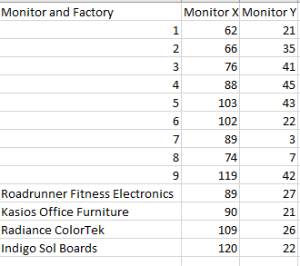
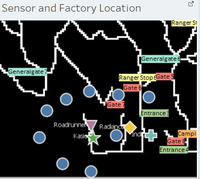
| Issue | Firstly, when we look at the MapLargeLabels.jpg we see there are factories in the map but we do not have their location data. But when we look into the MC2 Data Descriptions document, we see that there are factories location listed. Let’s combine the sensor location with the factory location.
The following are the factory locations: Roadrunner Fitness Electronics: 89,27 Kasios Office Furniture: 90,21 Radiance ColourTek: 109,26 Indigo Sol Boards: 120,22 |
| Solution | We then put these data into the excel call Sensor and Location Data like the following: |
| Problem #2 | Building Data |
|---|---|
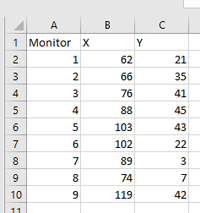
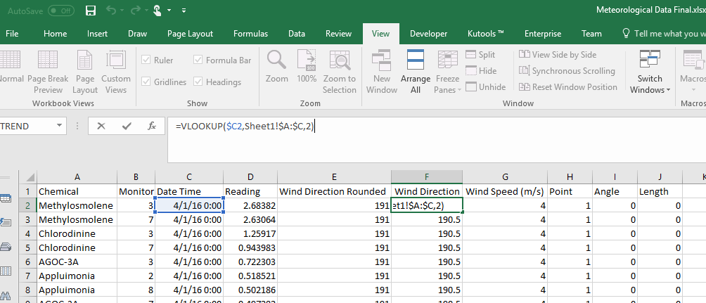
| Issue | Next, let’s look into the sensor data. We see that there is only have Chemical, Monitor, Date Time, Reading but not the monitor x and y coordinates. Since we need these to visualise on tableau, let’s match them together by having a sheet with the list of sensor location and another sheet with all the sensor data |
| Solution | Use vlookup in excel to match the monitor column in sheet 1 with sheet 2 by using the above image formula. |
| Problem #3 | Building Data |
|---|---|
| Issue | Let’s look at the Meteorological Data which is the wind data, we see that we have date, wind direction, wind speed and elevation.
There are some missing values and missing row in the data, thus we need to remove it. |
| Solution | We need to remove row 445 and row 460 from the dataset. |
| Problem #4 | Building Data |
|---|---|
| Issue | After cleaning the missing values in Meteorological Data, and since we want to do a wind rose chart we need to transform the data into the correct format. As I do not know how to do a wind rose chart , I did some research and the link to the reference is at the bottom of this wiki page. |
| Solution | Since I am not using elevation, let’s ignore the data.
|
| Problem #5 | Building Data |
|---|---|
| Issue | In order to be able to see the wind direction and the chemical difference together in the same chart we need to combine the chart into one.
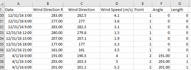
But the wind data is in every 3 hour, thus we need to transform the wind data by matching it with the sensor data since the sensor data has hourly data. |
| Solution | To achieve this, we use the same method as the previous for the wind point and we map the data of the sensors to the wind with a proximate match of vlookup. In order to have 3 different points for each data point we need to duplicate the data for each of the points by copy and pasting it. Reference to the following image for details: |
From the data given, I have consolidated all information and compile into 3 final datasets.
Sensor and Factory Location Data - All 9 sensors coordinates and Factory coordinates Sensor and Location Data - All 9 sensors reading data and its coordinates Meteorological Data - Wind data itself and a combined of wind data and sensor data
Data Import/Configuration
As we are importing multiple data source, we need to tell tableau how the files are related to one another. In this case, the data that has a common attribute which is the date/time. For example, if we want to filter the date across different data source then we need to link them up. For some data as there are common attributes, tableau will automatically link them up.
Interactive Visualization
The interactive visualization can be accessed here: https://public.tableau.com/profile/jazreel#!/vizhome/VisualDetective-Assignment/Home
For the best experience, adjust your screen resolution to 1366x768 and enable full screen on the browser. Adjust the dashboard so that all elements can be clearly visible. The following interactivity elements are added to help users navigate through the different filters and actions so that their analysis can be performed smoothly.
| Interactive Technique | Rationale | Brief Implementation Steps |
|---|---|---|
| ||
| ||
|
The following sections give some guidelines on the usage in each of the individual dashboard.
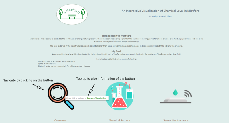
Home Dashboard
The following shows the home dashboard:
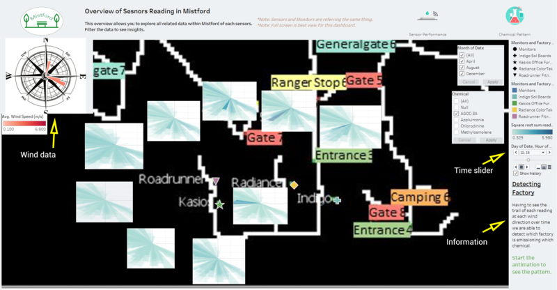
Overview Dashboard
The following shows the overview dashboard:
Sensor's Performance Dashboard
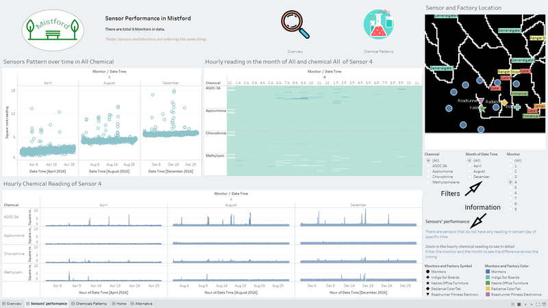
The following shows the Sensor's Performance dashboard:
Chemical Pattern Dashboard
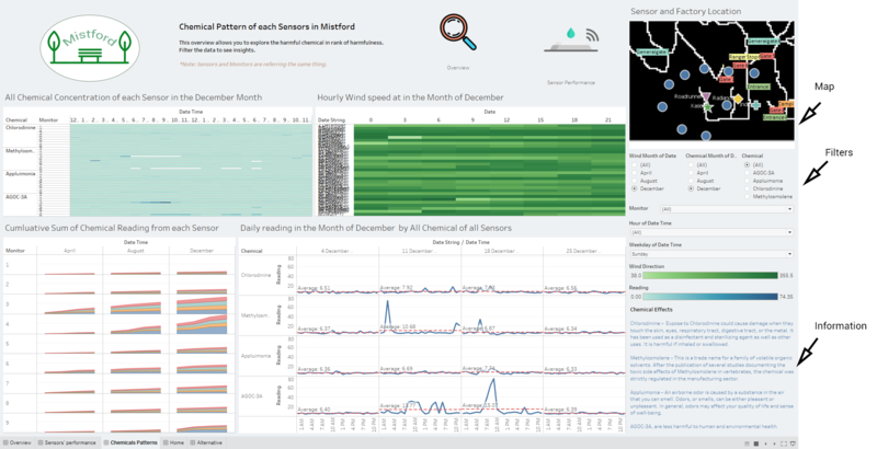
The following shows the Chemical Pattern dashboard:
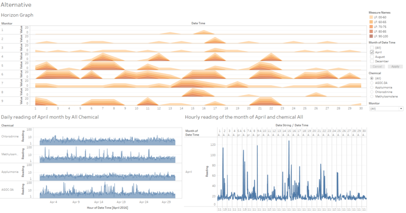
Alternative Dashboard
I added some other charts for different visualisation to cater for different users. Mainly is to just play around with the data. It is added as an additional dashboard.
Interesting & Anomalous Observations
Characterize the sensors’ performance and operation. Are they all working properly at all times? Can you detect any unexpected behaviours of the sensors through analyzing the readings they capture?
The nine sensors, each measuring four chemical concentrations, are generally functionally continuously during the three month long sample periods. Readings are logged at hourly intervals 24 hours per day. But there are missing readings for the certain day and chemical.
Sensor’s Pattern over 3 months
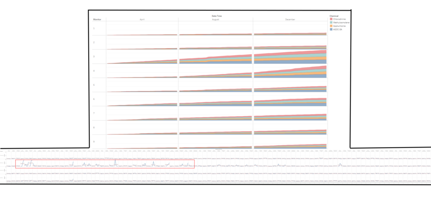
The sensors show the pattern of variations. Sensor 4 shows that there is a shifted linearly over time, as there is a running sum pattern shown over time. Sensor 5 gets more variations over time, slight increase each month. Sensor 9 shows an increase in variation from August. Sensor 3 shows more variation spread compared to the other sensors. The other sensors have generally normal variations across 3 months.
Missing Reading in Sensor
- Each Sensor of every chemical has missing reading on the 2nd and 6th of April, 12 am
- Each Sensor of every chemical has missing reading on the 2nd, 4th and 7th of August, 12 am
- Each Sensor of every chemical has missing reading on the 2nd and 7th of December, 12 am
- Numerous missing reading for chemical Methylosmolene in Sensor 3 to 9 in April
- Numerous missing reading for chemical Methylosmolene in Sensor 1 to 6 and Sensor 9 in August
- Numerous missing reading for chemical Methylosmolene in Sensor 1 to 6 and Sensor 9 in December
Suspicion
Suspect that some of the missing reading of chemical Methylosmolene is in the chemical AGOC-3A as there is a pattern of high density in the chemical AGOC-3A in the corresponding missing values.
Missing Reading in Wind Data
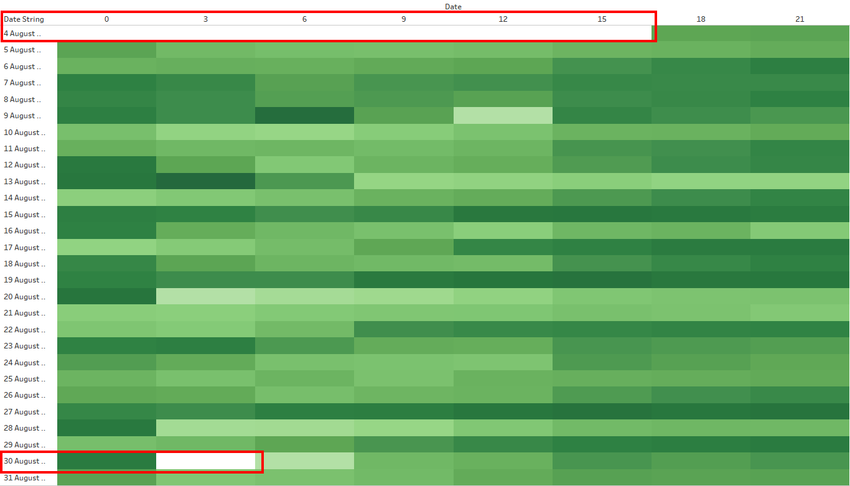
In the month of August, we can see that there is no wind data from 1st August 12 am to 4th August 6pm. Also, there is no wind data on the 30th August 3am.
Which chemicals are being detected by the sensor group? What patterns of chemical releases do you see, as being reported in the data?
Looking into the chemicals
When there is no wind data in the above mention period, we see a spike in chemical Appluimonia on 4th August 4 am from sensor 3, chemical AGOC-3A on 4th August 3pm from sensor 5 and chemical Chlorodinine on 4th August 5pm from sensor 3.
| Findngs on 4th August |
|---|
For 30th August when there is no wind data, we see chemical Appluimonia has higher than average reading coming from sensor 3 at 3am. Also, chemical AGOC-3A has slightly above average reading at 3am coming from various sensors, namely sensor 3,4,5,6,7.
| Findings on 30th August |
|---|
Cumulative Sum Chart of Sensor Reading
This chart shows the cumulative sum of reading of each sensors over the 3 months. We can see that sensor 3 have increase readings each month for each chemical. For sensor 4, there is more readings captured in the month of December. In sensor 6, we see the portion of AGOC-3A and Methylosmolene is more than the other chemicals.
When we looked into the midnight (12am to 4am) period across the months, we can see that the chemical Methylosmolene happen during these period.
Chemical Pattern
We look into each chemical over the 3 months in each sensor.
AGOC-3A & Appluimonia
There are spikes detected of chemical AGOC-3A in sensors 3,4,5,6 and one from sensor 8.
There are generally more spikes detected in sensor 3 and there is a constant pattern in sensor 4 for the chemical Appluimonia.
Chlorodinine & Methylosmolene
There are some spikes in sensor 4,5 and 6 for Chemical Chlorodinine. There is some fluctuation in sensor 3 and a little in sensor 7.
We see that some sensors did not manage to detect reading for chemical Methylosmolene and we can see that there is spike detect in sensor 6.
Which factories are responsible for which chemical releases? - Factories are responsible for which chemical releases
Factory Radiance and Kasios emits AGOC-3A
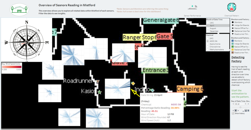
Looking at each month, on 15th April 12pm, we see that sensor 6 have high reading of 45.51ppm, clearly shows Factory Radiance emits AGOC-3A.
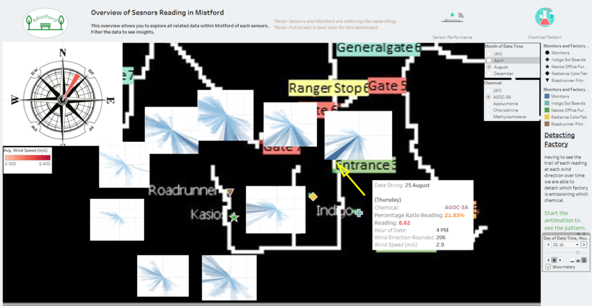
On 25th August 4pm, we see that sensor 9 have high percentage ratio reading of 21.83%, which means across all sensor it has the highest ppm on the specific period. Also, the wind direction is coming from the Northeast, that cause sensor 9 to detect reading coming from factory Radiance.
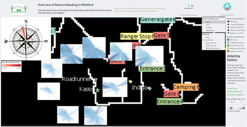
When we look over 3 months we can clearly see that factory Radiance and Kasios emits AGOC-3A.
Factory Indigo emits Appluimonia
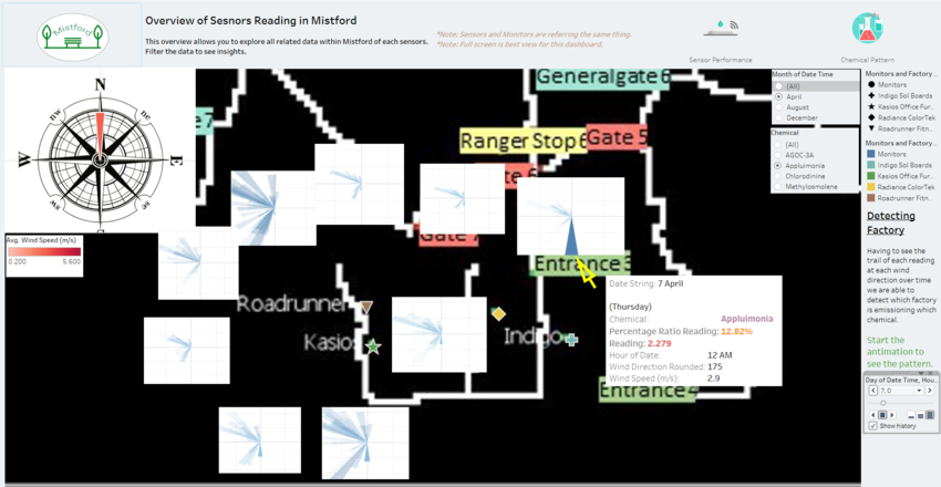
When we look at 7th April 12 am we can see that sensor 9 has high percentage portion of reading across other sensors when the wind is blowing at north. We can clearly see that factory indigo release the chemical Appluimonia.
Factory Roadrunner emits Chlorodinine
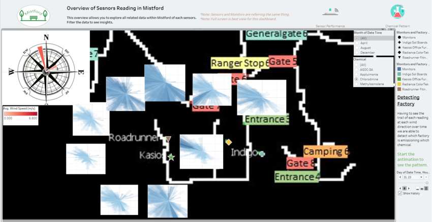
Let’s look over the 3 months, we can see that sensor 6 detects reading mostly coming from the northwest which is directing at factory roadrunner. We can also see that sensor 5 has high reading coming from the southwest which is also directing to factory roadrunner, as well as sensor. All in all, it that tells us that factory roadrunner emits the chemical chlorodinine.
Factory Kasios emits Methylosmolene
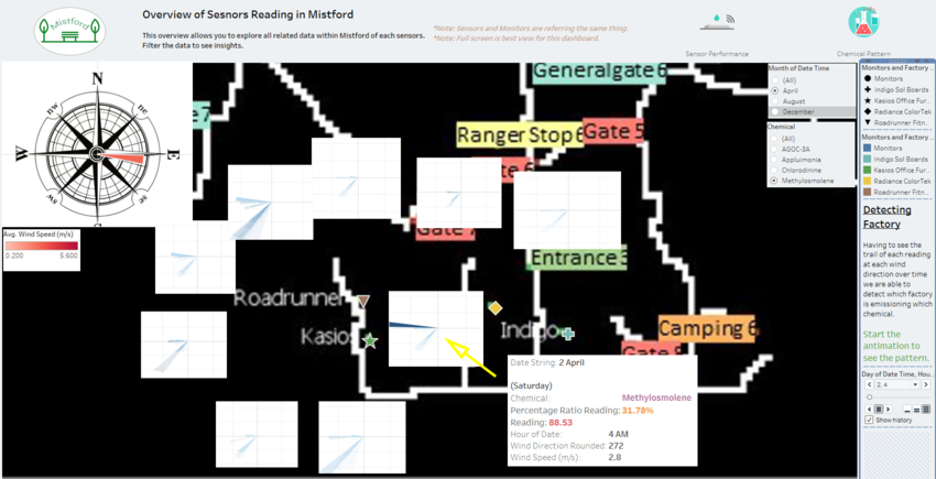
On the 2nd April 4 am, we see that the wind direction is coming from the east, and sensor 6 detect high reading of 88.53ppm from factory kasio.
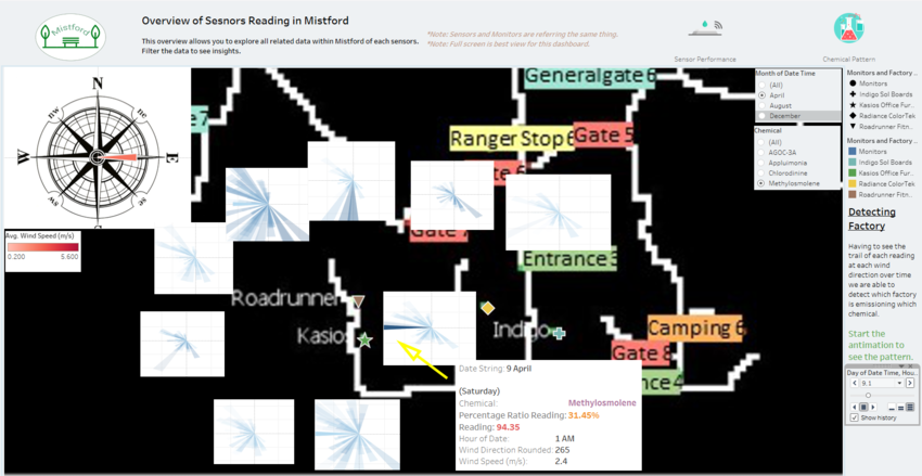
Also on the 9th of April, we see a high reading of 94.35ppm from sensor 6 directing to factory kasio. We can tell that factory kasio is emitting the chemical Methylosmolene.
- Link to Assignment_Dropbox (https://wiki.smu.edu.sg/1718t1is428g1/Assignment_Dropbox)
- Link to Assignment_Overview (https://wiki.smu.edu.sg/1718t1is428g1/Assignments)
References
In the completion of the analysis, the following references have been extremely useful:
- Tableau Blog - Top 15 LOD Expressions (https://www.tableau.com/about/blog/LOD-expressions?__src=liftigniter&__widget=blog-widget&li_source=LI&li_medium=blog-widget)
- Tableau Community - Wind speed distribution in a wind rose (https://community.tableau.com/thread/209697)
- Creating Coxcomb Charts in Tableau (https://boraberan.wordpress.com/2014/03/30/creating-coxcomb-charts-in-tableau/)
- How to create a horizon chart to display dense data (https://www.tableau.com/about/blog/2016/4/visualizing-dense-data-how-cut-and-superpose-areas-52839?height=931&width=1004&inline=true#flight)
