IS428 2017-18 T1 Assign Lu Jianan
Contents
Overview
Mistford is a mid-size city is located to the southwest of a large nature preserve. The city has a small industrial area with four light-manufacturing endeavors. Mitch Vogel is a post-doc student studying ornithology at Mistford College and has been discovering signs that the number of nesting pairs of the Rose-Crested Blue Pipit, a popular local bird due to its attractive plumage and pleasant songs, is decreasing! The decrease is sufficiently significant that the Pangera Ornithology Conservation Society is sponsoring Mitch to undertake additional studies to identify the possible reasons. Mitch gets permission for accessing to several datasets that may help him in his work, but he seeks an experts in visual analytics to help him analyze these datasets.
Mitch Vogel was immediately suspicious of the noxious gases just pouring out of the smokestacks from the four manufacturing factories south of the nature preserve. He got the conclusion that all of these companies are causing the downfall of the poor Rose-crested Blue Pipit bird. But when he talked to company representatives and workers, they all seem to be nice people and actually pretty respectful of the environment.
On the other hand, Mitch was surprised to learn that the factories had recently taken steps to make their processes more environmentally friendly, although it raised their cost of production. Mitch discovered that the state government has been monitoring the gaseous effluents from the factories through a set of sensors, distributed around the factories, and set between the smokestacks, the city of Mistford and the nature preserve. The state has allowed Mitch access to their air sampler data, meteorological data, and locations map. Mitch is very good in Excel, but he knows that there are better tools for data discovery, and he knows that expert in visual analytics could be able to help him to perform an analysis to understand the real situation better.
Task
General task
The four factories in the industrial area are subjected to higher-than-usual environmental assessment, due to their proximity to both the city and the preserve. Gaseous effluent data from several sampling stations has been collected over several months, along with meteorological data (wind speed and direction), that could help Mitch understand what impact these factories may be having on the Rose-Crested Blue Pipit. These factories are supposed to be quite compliant with recent years’ environmental regulations, but Mitch has his doubts that the actual data has been closely reviewed. Could visual analytics help him understand the real situation?
The primary job for Mitch is to determine which (if any) of the factories may be contributing to the problems of the Rose-crested Blue Pipit. Often, air sampling analysis deals with a single chemical being emitted by a single factory. In this case, though, there are four factories, potentially each emitting four chemicals, being monitored by nine different sensors. Further, some chemicals being emitted are more hazardous than others. Your task, as supported by visual analytics that you apply, is to detangle the data to help Mitch determine where problems may be. Use visual analytics to analyze the available data and develop responses to the questions below.
The specific tasks
- Characterize the sensors' performance and operation. Perform a visual analysis to find the sensors which does not work properly. Analyzing the sensor's data by comparing the date, the normal data trend of the sensors. Pointing out the unexpected behaviors done by any sensors at which specific day and time.
- visualize the sensor reading for all chemicals to find the pattern and trend and whether the chemicals are being detected by the sensor group.
- find which factories are responsible for which chemical releases. Carefully describe how to determine this by using the visual graph. For the factories identified, describe any observed pattern of operation revealed in the data.
Visualisation Software
The software used for processing the visual analysis:
| Software Name | Software Logo | Description |
|---|---|---|
| Tableau | visualize data after processing the background data from excel datasets | |
| QlikView | visualize data after the background data from excel datasets | |
| Excel | check and modify the raw datasets to remove invalid input or wrong input |
Data Building/Cleaning
| Serial | Observation | Description |
|---|---|---|
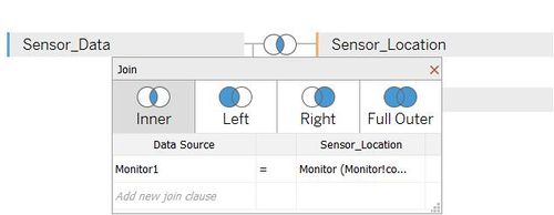
| 1 | Inner join data between Meteorological Data.xlsx and Sensor Data.xlsx by date | |
| 2 | Inner join data between Sensor Data.xlsx and Sensor Location.xlsx by monitor | |
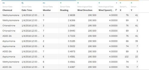
| 3 | Delete useless column and hide unused column "Elevation (m)" from Meteorological Data.xlsx, and also hide the duplication of common column monitor and date. This image shows the output table after 2 inner join 3 tables with clean data. |
Solution
Task#1
| Serial | Observation | Result |
|---|---|---|
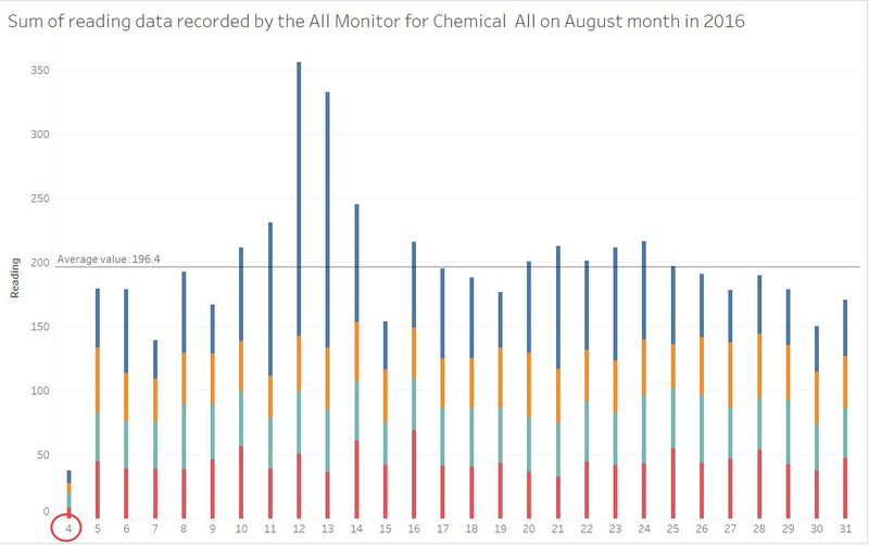
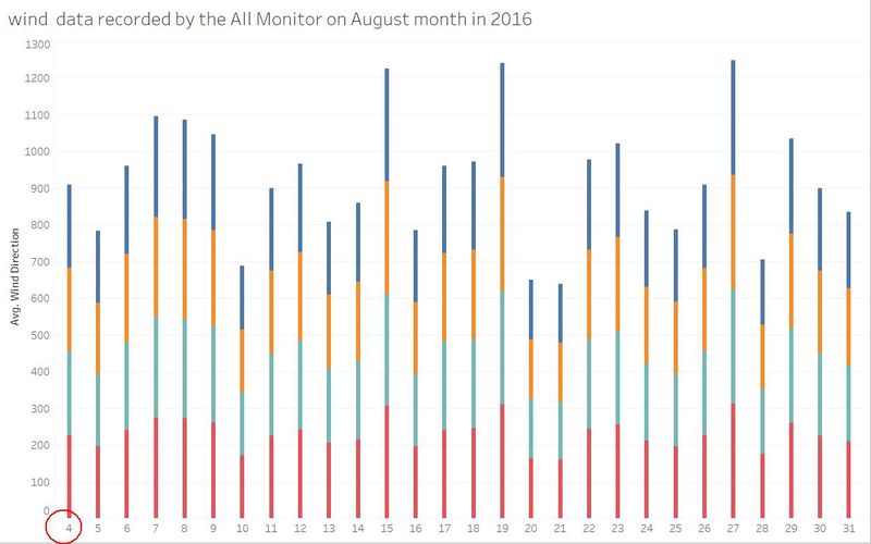
| 1 | The conclusion is made that during the period from August 1 to August 3 in 2016, all the monitors are offline. Hence, there is no data collected or due to unforeseen circumstance those days' record was missing. | |
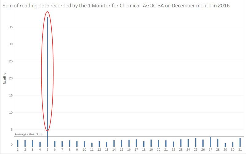
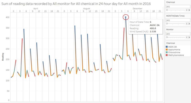
| 2 | There are a few wrong input data for reading by sensors in 2016. One of the example is this on December 5, the reading in monitor 1 for chemical "AGOC-3A" is too high which is unexpected(error) data recorded by the sensor or the staff who wrote this dataset. | |
| 3 | The conclusion is made that during the period from August 1 to August 3 in 2016, all the monitors are offline. Hence, there is no data collected or due to unforeseen circumstance those days' record was missing. | |
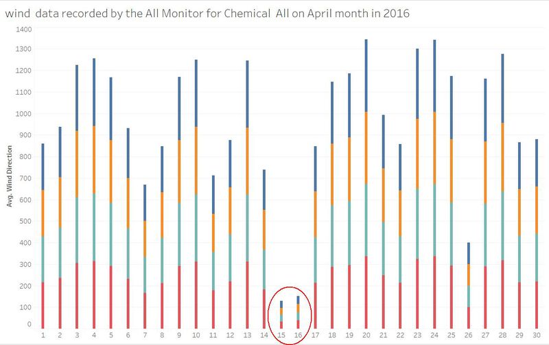
| 4 | There are some wrong input data for wind direction recorded by sensors. The wind direction is wrong in all monitors for all chemical on April 15 to April 16 in 2016. |
Task#2
| Serial | Observation | Description |
|---|---|---|
| 1 | The reading for all the monitors has the similar trend, which is the pollution for all chemicals are slightly higher in December 2016 (Winter season) and lower in April 2016 (Spring season). While the chemical "AGOC-3A" has the highest reading among all chemicals. Besides, the worst reading are always record on 6am each day. | |
| 2 | Example | |
| 3 | Example |


