IS428 2017-18 T1 Assign DLau Peng Liang Bryan
Contents
IS428 Main Page: Brings you to the IS428 main page
Assignment Overview: Overview of the Assignment & Details
Assignment Dropbox: Dropbox with links to other peer's assignments
Problem & Motivation
Mistford is a mid-size city is located to the southwest of a large nature preserve. The city has a small industrial area with four light-manufacturing endeavors. Mitch Vogel is a post-doc student studying ornithology at Mistford College and has been discovering signs that the number of nesting pairs of the Rose-Crested Blue Pipit, a popular local bird due to its attractive plumage and pleasant songs, is decreasing! The decrease is sufficiently significant that the Pangera Ornithology Conservation Society is sponsoring Mitch to undertake additional studies to identify the possible reasons.
Mitch Vogel was immediately suspicious of the noxious gases just pouring out of the smokestacks from the four manufacturing factories south of the nature preserve. He was almost certain that all of these companies are contributing to the downfall of the poor Rose-crested Blue Pipit bird. But when he talked to company representatives and workers, they all seem to be nice people and actually pretty respectful of the environment.
In fact, Mitch was surprised to learn that the factories had recently taken steps to make their processes more environmentally friendly, even though it raised their cost of production.
Mitch is gaining access to several datasets that may help him in his work, and he has asked you (and your colleagues) as experts in visual analytics to help him analyse these datasets. These datasets includes air sampler data, meteorological data, and locations maps provided by the state government, which has been monitoring the gaseous effluents from the factories through a set of sensors distributed around the factories.
Task
General Task
The four factories in the industrial area are subjected to higher-than-usual environmental assessment, due to their proximity to both the city and the preserve. Gaseous effluent data from several sampling stations has been collected over several months, along with meteorological data (wind speed and direction), that could help Mitch understand what impact these factories may be having on the Rose-Crested Blue Pipit. These factories are supposed to be quite compliant with recent years’ environmental regulations, but Mitch has his doubts that the actual data has been closely reviewed. Could visual analytics help him understand the real situation?
The primary job for Mitch is to determine which (if any) of the factories may be contributing to the problems of the Rose-crested Blue Pipit. Often, air sampling analysis deals with a single chemical being emitted by a single factory. In this case, though, there are four factories, potentially each emitting four chemicals, being monitored by nine different sensors. Further, some chemicals being emitted are more hazardous than others. Your task, as supported by visual analytics that you apply, is to detangle the data to help Mitch determine where problems may be. Use visual analytics to analyze the available data and develop responses to the questions below.
Specific Task
- Characterize the sensors’ performance and operation. Are they all working properly at all times? Can you detect any unexpected behaviors of the sensors through analyzing the readings they capture? Limit your response to no more than 9 images and 1000 words.
- Now turn your attention to the chemicals themselves. Which chemicals are being detected by the sensor group? What patterns of chemical releases do you see, as being reported in the data? Limit your response to no more than 6 images and 500 words.
- Which factories are responsible for which chemical releases? Carefully describe how you determined this using all the data you have available. For the factories you identified, describe any observed patterns of operation revealed in the data. Limit your response to no more than 8 images and 1000 words.
Dataset Analysis & Transformation Process
Datasets Provided (Sensor Data, Sensor Location, Meteorological Data)
Additional Information Provided
Interactive Visualisation
Results
Task #1
Figure 1 - Sensor Activity Rate
When first analyzing the data, I began to first plot the calendar heatmap of the sum of all readings to identify if there were any sensors that were not functioning as intended. I defined a faulty sensor as one that was either not collecting any chemical, or collecting data of chemicals erroneously (collecting data of the wrong chemicals).
According to Figure 1 which illustrates the sensors activity rate (sensors that are actively collecting data are deemed to be active), we are able to identify that NO readings was collected on the 2nd April, 6th April, 4th August, 7th August and 2nd December, at 00:00. This was highly unusual and seems to indicate that all the sensors were inactive during that period of time. However, readings began to be collected once again at 01:00, which could suggest that it was merely intermittent disruption (e.g. thunderstorms) causing blackouts, or that the sensors could have been due for a scheduled maintenance during that period of time.
As the inactivity only happens at the start of the month, it seems more likely that the sensors stopped collecting data due to scheduled maintenance to ensure that they remain operational for the next few months, before the next scheduled maintenance sessions.
Figure 2 - Duplicate & Missing Readings
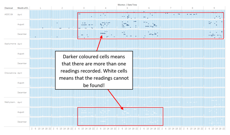
After the creation of the calendar heatmap, I thought that it would be good to gain a better understanding about the readings of each sensor, at a specific period in time. Hence, I decided to create another chart that would provide me with the detailed analysis of the readings per chemical per monitor at the exact date and time. At any given point in time (e.g. 2200 on 12/6/16), one monitor should only have ONE reading per chemical. Following that logic, I initially expected all of the points to be of a single color when I plotted the chart, and used the COUNT(Number of Records) as color identification for differentiating between two points.
However, as illustrated in Figure 2, we are able to clearly identify gaps in between, and see that there are points that are of different colors, which shows that the sensors have been reading more than one instance of the chemical at a specific point in time, which should not be the case and suggests that the sensor may potentially be faulty.
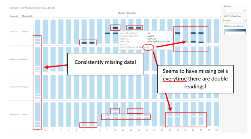
Figure 3 - Duplicate Readings == Missing Readings?
Adding in a couple of filters for a clearer visualization then allows us to see that whenever a sensor picks up two readings of the same chemical, the sensor also fails to pick up one reading of the same chemical. This further reinforces the idea that the sensors may be faulty, as they are erroneously reading Methylosmolene for AGOC-3A. As Methylosmolene is an extremely toxic chemical, the sensors' failure to correctly identify it should definitely be cause for concern, and serve as immediate notice for the technicians to re-evaluate all of the sensors' configurations. This is because AGOC-3A is considered to be the least harmful both to humans and to the environment, and if the government has any plans to use the chemical emission rates to tout that they are now a "cleaner and greener" state, they should first ensure that there aren't any harmful chemicals that are being disguised as AGOC-3A.
Task #2
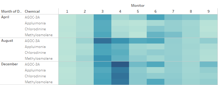
Figure 4 - Chemical Emissions Per Month
Looking across the 3 months of data provided, we were able to plot out the chemical emissions per month for each of the monitors in a heatmap, as shown in Figure 4. As apparent as it is, we can see that each and every one of the sensor group is capable of reading all 4 types of the released chemicals, although the readings differ across sensors, due to proximity to the factories and also the direction and strength of the wind, which we will try to analyze and explain further in Task #3.
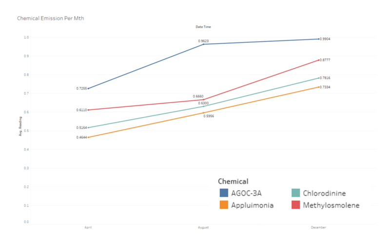
Figure 5 - Chemical Readings Trend (Across 3 Months)
Building the line chart for for the average readings per chemical across the 3-month period showed a clear trend whereby we can see that the average readings was on an upward trend from April to December.
For AGOC-3A, the emissions seemed to have slow down from August to December, whereas Methylosmolene's emissions were minimal from April to August but experienced a sharp increase from August to December, which suggests that perhaps some of the factories have decided to forego the state's initiatives to preserve air quality in a bid to obtain higher profits as the firm may have seen declines in their operating profit as they tried to adhere to regulations to reduce harmful chemical emissions, which may have increased their operating cost. Meanwhile, Appluimonia and Chlorodinine also increased exponentially from April to December.
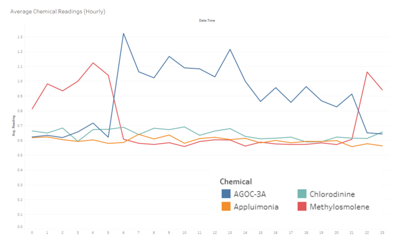
Figure 6 - Average Chemical Readings Per Hr
Using the average values of the readings across all periods as illustrated in Figure 6, I was able to observe that although most of the factories were mentioned to have reduced their emission of Methylosmolene, the emission rate for the chemical is still relatively high. In fact, it is the 2nd most emitted chemical. This observation, combined with our earlier findings that the sensors may not have accurately collected the readings of all chemicals (some harmful chemicals like Methylosmolene may currently be disguised as AGOC-3A) further exacerbates the issue whereby the citizens' health may be negatively affected without themselves being aware.
Furthermore, one interesting observation is that the emission rate of Methylosmolene spikes up during very unusual hours (2200 - 0500), and it's emission rate is exceptionally weird if we were to take into consideration that it is emitting twice that of other chemicals during a period whereby most factories should be inactive and that there should be little to no activities that would result in chemical emissions during that period of time.
Using the same illustration, we are also able to observe that it currently appears as though the state government's efforts to reduce the amount of harmful chemical emissions has been relatively effective. Based upon the average chemical release rate per hour, we are able to clearly see that AGOC-3A (the least harmful out of all the chemicals) is being released more for the most part of the day, except for the errant behavior of Methylosmolene as mentioned earlier.
Task #3
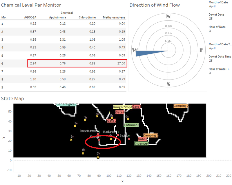
To gain further insights to discover which factories may be responsible for the release of which chemical, I created a wind flow diagram which allows me to visualize the direction whereby the emitted chemicals will be dispersed to. A text-table with a time filter was also created to allow me to draw a better conclusion, and for convenience sake, I consolidated the map, the wind flow diagram and the text-table into a dashboard as illustrated in Figure 7. To provide an example of how to utilize this dashboard, simply filter the Month, Day and Hour that you are interested in. You will have to do it twice for both the text-table and the wind flow diagram, but they should always be of the same parameters.
Figure 7 - Map Visualization Dashboard
With reference to Figure 7, we are evaluating the chemical emissions, taking into consideration the wind direction and wind strength on the 25th of April at 0300, in an attempt to find out which factory is the main contributor. We observe that Sensor 6 is picking up exceptionally high readings of Methylosmolene (27.00), and we will now try to pinpoint which factory may be emitting it.
For every sensor, there will be 1 wind flow diagram. The way in which we identify possible pollutants will be that, if the factory lies within the trajectory of a wind stream, and the resulting sensor indicates a high level of pollution, it could be a possible indicator that the factory is contributing to the pollution.
Firstly, we will evaluate if Kasios is the main contributor. According to the wind flow diagram, the sensors that are most susceptible to Kasios at the given point in time would be Sensor 6 as the factory and the windstream are in perfect position to trigger a high rating on Sensor 6. This is made exceptionally clear as Sensor 1 has a reading of 0.0 on Methylosmolene, which makes sense because the wind did not carry any Methylosmolene when it passed by Sensor 1, which further increases the likelihood that Kasios is the main contributor of Methylosmolene. Following the same logic, we can also see that Sensor 6 also picked up a relatively high amount of AGOC-3A at the same time, which seems to suggest that Kasios is responsible for the production on both Methylosmolene and AGOC-3A, which ties in with our previous observation that there may be some form of similar characteristics between the two chemicals, which led to the sensors' occasional erroneous readings of AGOC-3A, while Methylosmolene was conveniently left out of the reading.
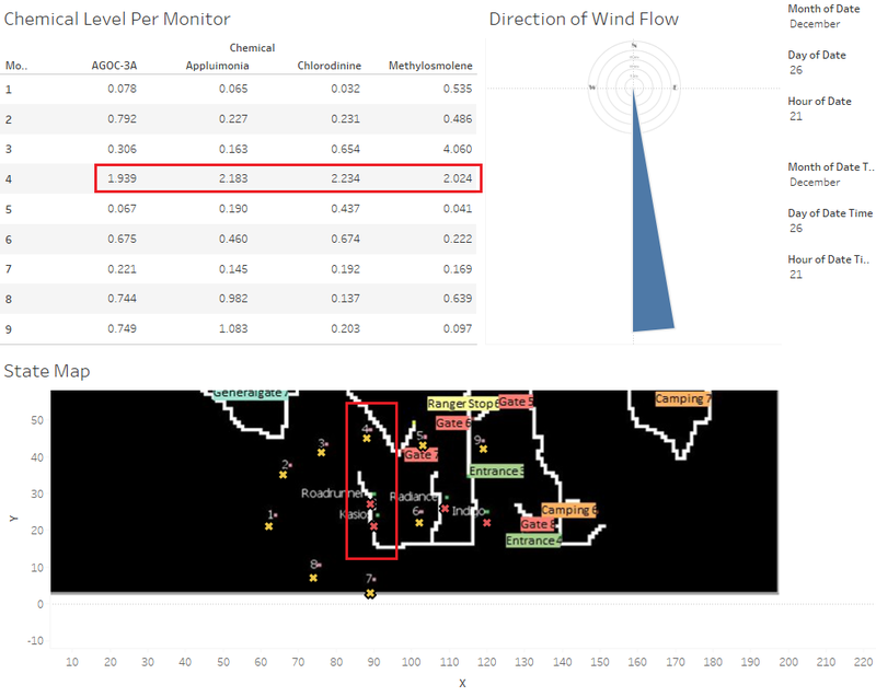
Figure 8 - Chlorodinine Analysis
Moving forward, we will look to evaluate the factories' responsibility with regards to the chemicals emission rate. When we change our settings to look at the 26th December, 2100, we are able to identify that Sensor 4 had readings that were significantly higher than the other sensors' readings. By tracing the wind flow, we are able to see that the windstream was once again directly moving towards the direction of Sensor 4, which meant that the chemicals emitted by Kasios and Roadrunner would have been recorded by Sensor 4. As we already know, Kasios produces high levels of Methylosmolene and also produces a certain level of AGOC-3A, however the anomaly over here is that the sensor also picked up high levels of Chlorodinine and Appluimonia. This suggests that Roadrunner is producing high levels of Chlorodinine and Appluimonia, but we will conduct another check to ascertain whether this is true, as illustrated in Figure 9.
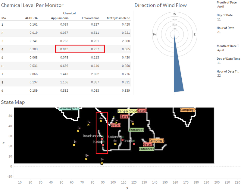
Figure 9 - Roadrunner Analysis (11th April, 2100)
This time around, we find that despite the wind direction and windstream being of the same direction, Sensor 4 did not pick up such a high level of Appluimonia, which suggests that Appluimonia did not come directly from Roadrunner, and that the wind conditions may have shifted over the last reading for the previous example, which may have resulted in the high level of Appluimonia read. In this example, we set the sensor readings to be an hour apart from the wind reading, so that we may observe the effect that the windstream potentially has on our sensor readings. Hence, we conclude that the high reading of Appluimonia in the previous example was a resultant of the directions of the winds changing, and that Roadrunner seems to be the main producer of Chlorodinine.
Figure 10 - Appluimonia Analysis
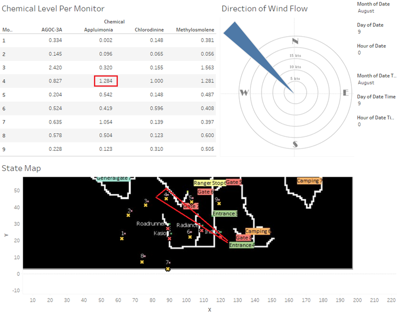
As we are on the topic, we now try to find the factory most likely to be responsible for the emission of Appluimonia.
With reference to Figure 10, we are able to see that the windstream is exceptionally strong in this example, and that it appears to be headed straight towards Sensor 4, which may help to explain the high level of Appluimonia detected by the sensor, whereas further sensors from the windstream (e.g. Sensor 1, 8, 9 - those that are not within range of the windstream) only have minimal readings of said chemical. Hence, we are able to easily conclude that Indigo Sol Board is the main polluter of Appluimonia.
Figure 11 - AGOC-3A Analysis
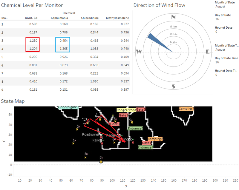
With reference to Figure 11, we are able to see that on the 16th August, 0000 hrs, Sensors 3 and 4 picked up a high reading of AGOC-3A (twice that of the other sensors). Further investigations revealed that the windstream was once again headed directly towards the two sensors, as illustrated in the diagram. However, attention may also be drawn to the fact that Sensor 3 had a reading of 0.454 for Appluimonia, whereas Sensor 4 had Appluimonia at 1.365. The explanation for that would be the strength of the wind, which does not appear to be strong enough to cover sufficient distance for the two sensors to receive similar readings, although we can be sure that the factory releasing Appluimonia and the factory releasing AGOC-3A are definitely within proximity. Hence, we can conclude that AGOC-3A is produced by Radiant ColourTek, and once again conclude that Appluimonia is produced by Indigo Sol Board (the nearest factory to Radiant ColourTek).
Conclusion
To better present my findings as to which factories are responsible for which chemicals, I decided to develop a table to illustrate my findings.
| AGOC-3A | Appluimonia | Chlorodinine | Methylosmolene | |
|---|---|---|---|---|
| Kasios Office Furniture | ✔ |
✘ |
✘ |
✔
|
| Roadrunner Fitness Electronics | ✘ |
✘ |
✔ |
✘
|
| Radiance ColourTek | ✔ |
✘ |
✘ |
✘
|
| Indigo Sol Board | ✘ |
✔ |
✘ |
✘
|

