IS428 2017-18 T1 Assign Tam Kei Wen
Contents
- 1 Assignment Details
- 2 Problem & Motivation
- 3 Task
- 4 Datasets Provided (Sensor Data, Sensor Location, Meteorological Data)
- 5 Additional Information Provided
- 6 Data Cleaning & Preprocessing
- 7 Results
- 7.1 1. Characterize the sensors’ performance and operation. Are they all working properly at all times? Can you detect any unexpected behaviors of the sensors through analyzing the readings they capture?
- 7.2 2. Now turn your attention to the chemicals themselves. Which chemicals are being detected by the sensor group? What patterns of chemical releases do you see, as being reported in the data?
- 7.3 3. Which factories are responsible for which chemical releases? Carefully describe how you determined this using all the data you have available. For the factories you identified, describe any observed patterns of operation revealed in the data.
- 8 Interactive Visualisation
- 9 References
- 10 Comments
Assignment Details
IS428 Main Page: (https://wiki.smu.edu.sg/1718t1is428g1/Main_Page)
Assignment Overview: (https://wiki.smu.edu.sg/1718t1is428g1/Assignments)
Assignment Dropbox: (https://wiki.smu.edu.sg/1718t1is428g1/Assignment_Dropbox)
Problem & Motivation
Mistford is a mid-size city is located to the southwest of a large nature preserve. The city has a small industrial area with four light-manufacturing endeavors. Mitch Vogel is a post-doc student studying ornithology at Mistford College and has been discovering signs that the number of nesting pairs of the Rose-Crested Blue Pipit, a popular local bird due to its attractive plumage and pleasant songs, is decreasing! The decrease is sufficiently significant that the Pangera Ornithology Conservation Society is sponsoring Mitch to undertake additional studies to identify the possible reasons.
Mitch Vogel was immediately suspicious of the noxious gases just pouring out of the smokestacks from the four manufacturing factories south of the nature preserve. He was almost certain that all of these companies are contributing to the downfall of the poor Rose-crested Blue Pipit bird. But when he talked to company representatives and workers, they all seem to be nice people and actually pretty respectful of the environment.
In fact, Mitch was surprised to learn that the factories had recently taken steps to make their processes more environmentally friendly, even though it raised their cost of production.
Mitch is gaining access to several datasets that may help him in his work, and he has asked you (and your colleagues) as experts in visual analytics to help him analyse these datasets. These datasets includes air sampler data, meteorological data, and locations maps provided by the state government, which has been monitoring the gaseous effluents from the factories through a set of sensors distributed around the factories.
Task
General Task
The dataset provided several months of meteorological data (wind speed and direction) and chemical data emitted by four industrial factories and captured by nine sensing stations. To explore the spatio-temporal chemical readings and wind data, specifically which factories emitted what chemicals and how the nine sensors in the area were performing, the team developed a web-based analytics tool with interactive visualizations and path line analysis to reveal sensor errors and chemical reading spikes, as well as pinpoint possible sources of chemical reading spikes. The goal was to help the local ornithologist determine whether or not the factories were compliant with environmental regulations.
Specific Task
Specifically, we are to provide visualisation to identify these issues:
• Sensors: To find out if all sensors’ performance and operations are working properly at all times, by detecting unexpected behaviours of sensors from the readings captured. [Characterize the sensors’ performance and operation. Are they all working properly at all times? Can you detect any unexpected behaviours of the sensors through analysing the readings they capture? Limit your response to no more than 9 images and 1000 words.]
• Chemicals: To find out which chemicals are being detected by the sensor group, by identifying patterns of chemical releases. [Now turn your attention to the chemicals themselves. Which chemicals are being detected by the sensor group? What patterns of chemical releases do you see, as being reported in the data? Limit your response to no more than 6 images and 500 words.]
• Factories: To find out which factories are responsible for which chemical releases, to be able to pinpoint on the factories which are responsible for the Rose-Crested Blue Pipits. [Which factories are responsible for which chemical releases? Carefully describe how you determined this using all the data you have available. For the factories you identified, describe any observed patterns of operation revealed in the data. Limit your response to no more than 8 images and 1000 words.]
Datasets Provided (Sensor Data, Sensor Location, Meteorological Data)
Additional Information Provided
Data Cleaning & Preprocessing
Problems with the Data
1. Missing Values
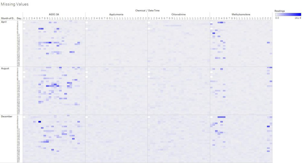
Figure 1 - Sensor Activity
Analysis of the sensor data in the form of a heat map reveals missing data as indicated by blank squares. This turned out to be rather unusual, and seems to suggest that certain sensors were faulty and therefore unable to pick up readings. In order to further study the extensiveness of the missing values, missing rows have to be inserted into the data through the use of Java code (Figure 2).
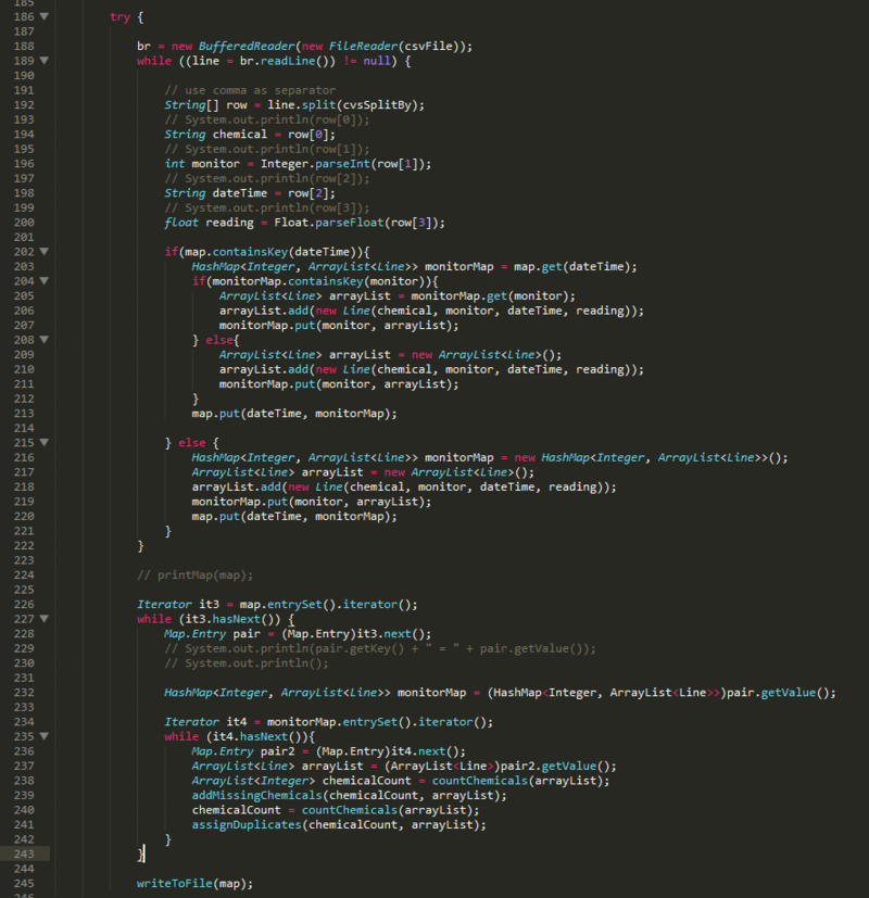
Figure 2 - Sensor Activity
The code shown in figure two inserts missing rows into the data, and also flags duplicate readings in each sensor.
2. Duplicate Values
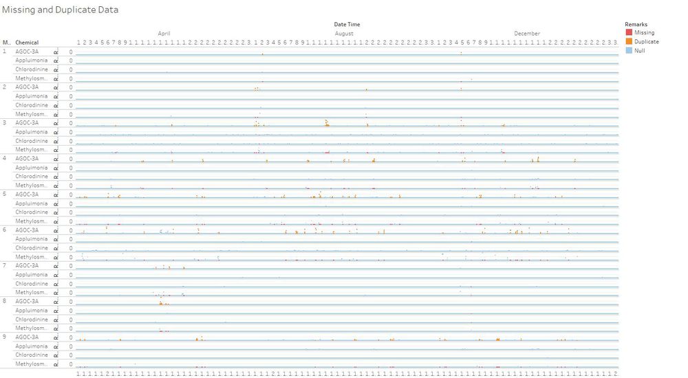
Figure 3 - Duplicate Values
Upon further study of the sensor data, more missing values were picked up. These values are highlighted in red in figure 3. Coincidentally, there were no readings collected at certain specific points in time (2nd April, 6th April, 2nd August, 4th August, 7th August, 2nd December and 7th December at midnight) for every sensor. In the following hour at 1:00, sensor readings were restored. This could be due to the possible occurrence of intermittent disruptions which could affect the proper functioning of sensors. Weather may be one of the larger suspects on the list to have caused the sensors to cease, especially during midnight when it becomes much colder.
While some sensors did not function properly, other sensors picked up multiple readings of the same chemical. These values are highlighted in orange in figure 3. Interestingly, the sensors that picked up multiple/missing readings correspond to the exact same point in time. There are a number of possible explanations for this phenomenon:
1) There is a malicious attempt to hide certain chemical readings by disguising one chemical as another.
2) The sensors misread Methylosmolene as AGOC-3A due to the presence of similar compounds in the chemicals (since Methylosmolene and AGOC-3A are close substitutes of one another).
3) Mixtures of different chemical compounds mask the presence of certain chemicals.
Based on the current data, there is insufficient evidence to prove point 1. Points 2 and 3 appear more convincing as it could be due to the faulty sensors misreading chemical concentrations in the air. However it is unsafe to assign one of the duplicate values to the missing chemical as we do not know which of these duplicate values to choose from. If the wrong values were assigned based on our evidence-less assumptions, the preceding visualizations would suffer. Thus, no reassigning of chemicals were made to Sensor Data.xlsx. However, it is still important to keep in the back of our minds that there are missing and duplicate data when creating our visualizations.
3. Redundant Elevation Data
Figure 4 - Elevation Data in Column E of Meteorological Data.xlsx
To prevent Tableau from misinterpreting data, this column has been removed.
Results
1. Characterize the sensors’ performance and operation. Are they all working properly at all times? Can you detect any unexpected behaviors of the sensors through analyzing the readings they capture?
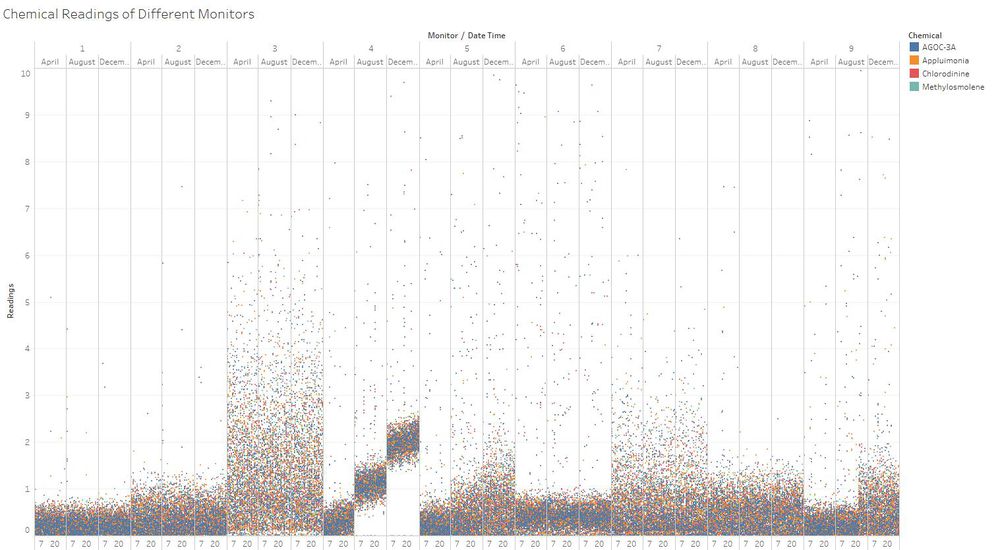
| Sensor | Remarks |
|---|---|
| Sensor 1 | Consistent, low readings across the months |
| Sensor 2 | Consistent, mid range readings across the months |
| Sensor 3 | Readings with a wide standard deviation |
| Sensor 4 | Consistent increase in chemical concentration readings over time in a step-like fashion. This could be caused by a genuine change in the concentration of chemical in the atmosphere, but is not likely because its two neighboring sensors, 3 and 5 are do not display the same trend. |
| Sensor 5 | row 5, cell 2 |
| Sensor 6 | row 6, cell 2 |
| Sensor 7 | row 7, cell 2 |
| Sensor 8 | Consistent, mid range readings across the months |
| Sensor 9 | Spike in chemical readings only in the month of December |


