IS428 2017-18 T1 Assign Lim Wang Chun Wilson
Contents
IS428 Main Page: Brings you to the IS428 main page
Assignment Overview: Overview of the Assignment & Details
Assignment Dropbox: Dropbox with links to other peer's assignments
Problem & Motivation
Mistford is a mid-size city is located to the southwest of a large nature preserve. The city has a small industrial area with four light-manufacturing endeavors. Mitch Vogel is a post-doc student studying ornithology at Mistford College and has been discovering signs that the number of nesting pairs of the Rose-Crested Blue Pipit, a popular local bird due to its attractive plumage and pleasant songs, is decreasing! The decrease is sufficiently significant that the Pangera Ornithology Conservation Society is sponsoring Mitch to undertake additional studies to identify the possible reasons.
Mitch Vogel was immediately suspicious of the noxious gases just pouring out of the smokestacks from the four manufacturing factories south of the nature preserve. He was almost certain that all of these companies are contributing to the downfall of the poor Rose-crested Blue Pipit bird. But when he talked to company representatives and workers, they all seem to be nice people and actually pretty respectful of the environment.
In fact, Mitch was surprised to learn that the factories had recently taken steps to make their processes more environmentally friendly, even though it raised their cost of production.
Mitch is gaining access to several datasets that may help him in his work, and he has asked you (and your colleagues) as experts in visual analytics to help him analyse these datasets. These datasets includes air sampler data, meteorological data, and locations maps provided by the state government, which has been monitoring the gaseous effluents from the factories through a set of sensors distributed around the factories.
Task
General Task
The four factories in the industrial area are subjected to higher-than-usual environmental assessment, due to their proximity to both the city and the preserve. Gaseous effluent data from several sampling stations has been collected over several months, along with meteorological data (wind speed and direction), that could help Mitch understand what impact these factories may be having on the Rose-Crested Blue Pipit. These factories are supposed to be quite compliant with recent years’ environmental regulations, but Mitch has his doubts that the actual data has been closely reviewed. Could visual analytics help him understand the real situation?
The primary job for Mitch is to determine which (if any) of the factories may be contributing to the problems of the Rose-crested Blue Pipit. Often, air sampling analysis deals with a single chemical being emitted by a single factory. In this case, though, there are four factories, potentially each emitting four chemicals, being monitored by nine different sensors. Further, some chemicals being emitted are more hazardous than others. Your task, as supported by visual analytics that you apply, is to detangle the data to help Mitch determine where problems may be. Use visual analytics to analyze the available data and develop responses to the questions below.
Specific Task
- 1. Characterize the sensors’ performance and operation. Are they all working properly at all times? Can you detect any unexpected behaviors of the sensors through analyzing the readings they capture?Limit your response to no more than 9 images and 1000 words.
- 2. Now turn your attention to the chemicals themselves. Which chemicals are being detected by the sensor group? What patterns of chemical releases do you see, as being reported in the data? Limit your response to no more than 6 images and 500 words.
- 3. Which factories are responsible for which chemical releases? Carefully describe how you determined this using all the data you have available. For the factories you identified, describe any observed patterns of operation revealed in the data. Limit your response to no more than 8 images and 1000 words.
Exploratory Data Analysis & Transformation Process
Exploratory Data Analysis
For this segment, I have used SAS Enterprise Guide in order to aid my understanding of the data.I have imported the sensor data in SAS in order to check the relationship of the variables, skewness and ranging of the dataset. Firstly, I ran the summary statistics in order to have an overview of the data I was dealing with. From the summary statistics table and plotting the histogram in SAS, I have observed that there is skewness in the data set which suggest that I would need to transform the data either by using the LOG function or the square root function in order to remove the skewness in the dataset.
Summary Statistics
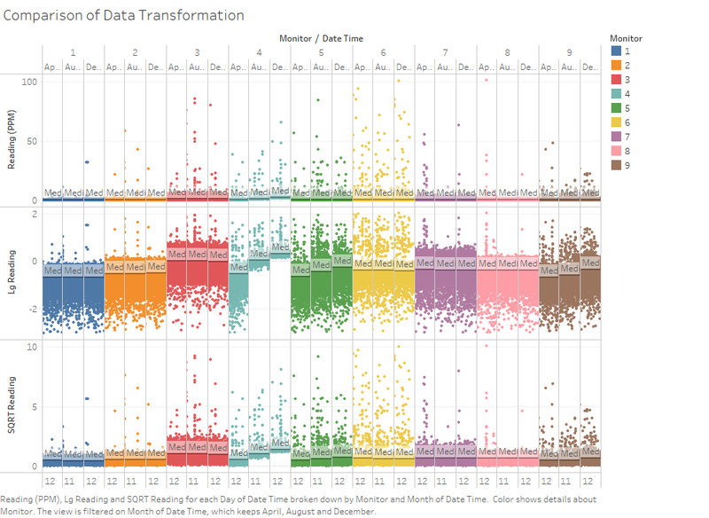
As we can see from the summary statistics, the data provided in this assignment are highly skewed. The skewness in the data set can hide trends which are otherwise obvious, hence data transformation is required in order reduce the skewness and bring out trends better.
The above is an illustration of the impact of transforming the data. The first row is the raw readings, the second is where the Log Function is used and the last row is when the square root is used. Since these data are sensor readings, taking the log would result in negative readings, hence I have decided to use the Square Root Function for this assignment to bring out the trends more clearly.
Datasets Provided (Sensor Data, Sensor Location, Meteorological Data)
| Task No. | Datasets used | Description |
|---|---|---|
| 1 | Meteorological Data.xlsx Meteorological Data.xlsx |
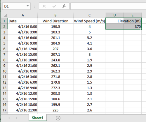
Full outer join between Date Time (Sensor Data.xlsx) and Date (Meteoroligcal Data.xlsx) |
Additional Information Provided
Interactive Visualisation
Results
Task #1
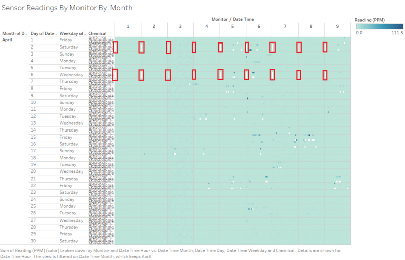
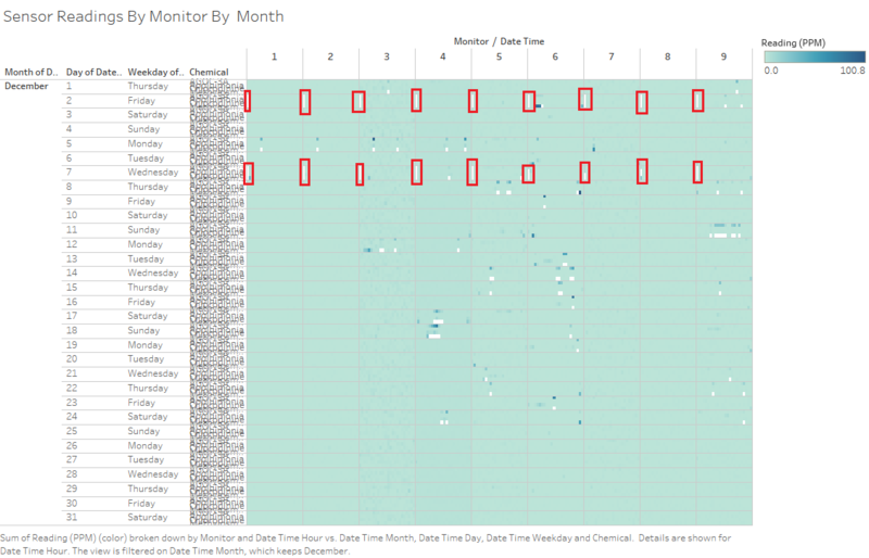
Figure 1 - Sensor Reading By Monitor By Month (April)
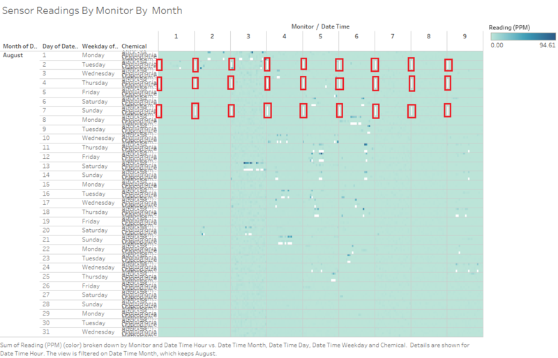
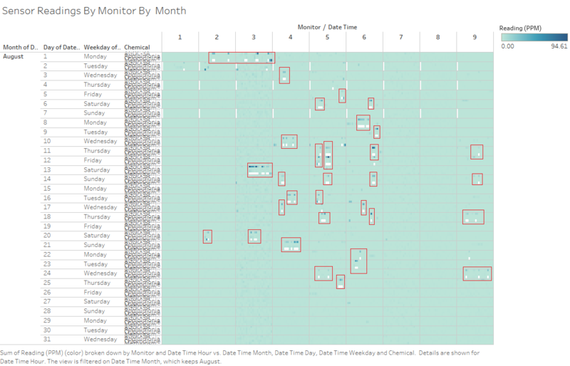
Figure 2 - Sensor Reading By Monitor By Month (August)
Figure 3 - Sensor Reading By Monitor By Month (December)
As we can see from the Figure 1,2,3 above, we can tell that there is a pattern across all 9 Monitors when it comes to missing data from the sensors. The missing data are represented as white space in the figure above. Generally, we can tell that there are a few patterns in the timestamp where there missing data points. The most obvious ones is when there is an absence of recordings. Mainly at 0000 hours of 2nd & 6th April , 2nd, 4th and 7th August , 2nd and 7th December. (Circled in red).This could suggest that there could be a periodic pattern in hardware failure across all 9 sensors when it usually breaks down at the start of the month. In addition, this could also suggest that maintenance is carried out during the start of the month which could result in the absence in readings at midnight.
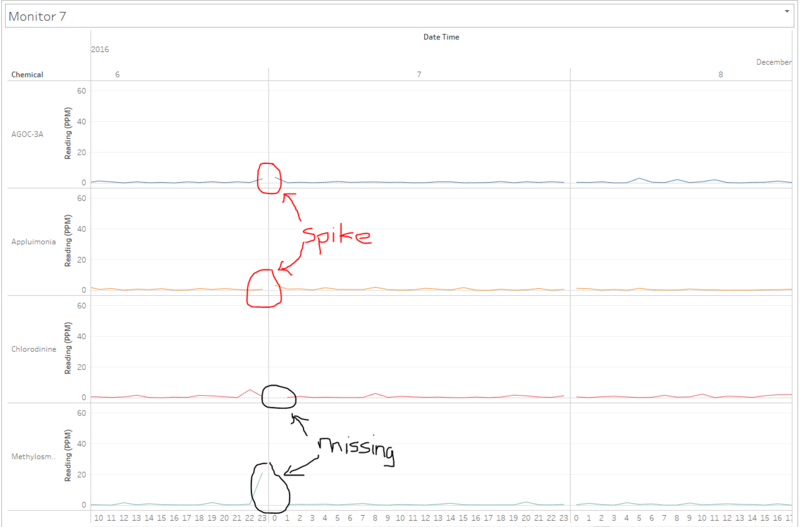
Looking at the overview for these sensor readings does not tell us much in detail. Hence we will need drill down further. Focusing on a specific day , 7th December and Sensor 7
Figure 4 - Monitor 7 Reading Time Series
We can tell that some of these missing data coincides with the spike of other chemicals. In this case, the spike in AGOC-3A and Appluimonia coincides with missing data points in Chlorodinine and Methylosmolene. When looking at the Time Series of Sensor Readings across all monitors, it is interesting to note that a second pattern can be observed regularly. For instance,
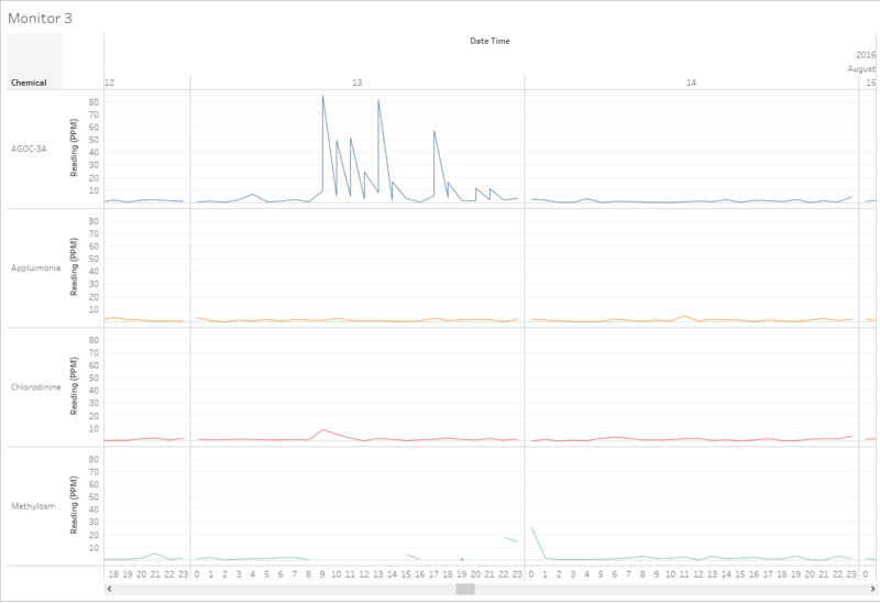
Figure 5 - Monitor 3 Reading Time Series
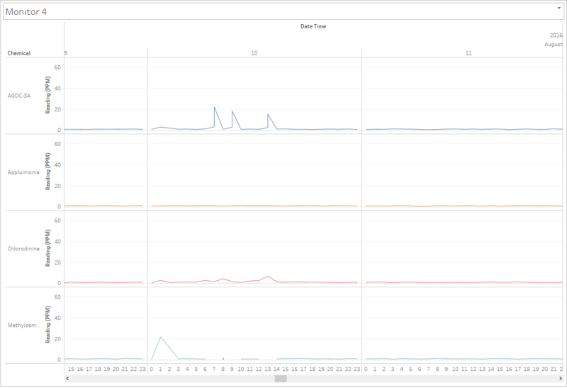
Figure 6 - Monitor 4 Reading Time Series
These are just a few examples that suggest that the missing data in the detection of Methylosmolene coincides with the peak of AGOC-3A. This suggest that it could be because of the extremely high levels of Methylosmolene in that area which causes the sensor to malfunction such that there are duplicate readings. For instance, in the figure above, there are 2 readings of AGOC-3A, this could either be due to the fact that the data sensor reading are mislabelled and 1 of the readings belong to the detection of Methylosmolene or that the high levels of AGOC-3A or Methylosmolene has caused the sensor to malfunction and register the data wrongly.
This is the second set of patterns which I have observed. At every interval of missing data in Methylosmolene, it coincides with the double readings of AGOC-3A in the same sensor. This is widely apparent in sensors 3,4,5 and 6. Figures 1- 3 shows this pattern clearly where every white space (Missing Data) in the detection of Methylosmolene in each pane, there would be a darker shade of blue in the detection of AGOC-3A. This is because the duplicate readings are aggregated and summed up.
Figure 7 - Sensor Reading By Monitor By Month (August)
I have decided to show only the month of August as an example to illustrate my point.
Task #2
Task #3
References
Comments
Feel Free to give me comments
