IS428 2017-18 T1 Assign Shi Xiaoyu
To be a Visual Detective: Mistford Sensor Data Analysis Dashboard
Contents
Problem & Objective
Mistford is a mid-size city, located to the southwest of a large nature preserve. The city has a small industrial area with four factories. Recently, there is a significant decrease on the number of nesting pairs of the Rose-Crested Blue Pipit, a popular local bird. It is speculated that the downfall of the Rose-Crested Blue Pipit may be related to noxious gases from the factories near the preserve.
With the passage of the Mistford Pact of 2010, the city and the preserve have adopted certain safeguards to help ensure the safety of the people, animals, and vegetation of the area. With the aim in mind, air sampling sensors have been placed near the town and in the preserve to monitor air quality. In total, there are nine sensors to collect information on several substances of potential concern, such as Appluimonia, Chlorodinine and etc.
By using the data given, I aim to implement data visualization techniques to better analyse data and conduct tasks below:
- Characterize sensors’ performance and detect unexpected behaviors
- Identify the chemicals detected by the sensor group and the chemical release pattern
- Determine which factories are responsible for which chemical release with explanation. Identify operation pattern of the factories
Data Preparation
There are three types of data provided, location data of the four factories and nine sensors, air sampling data from sensors and meteorological data (wind direction & wind speed) from a weather station in proximity to the factories and sensors. To prepare data before importing into Tableau, I implement the following solutions to cope with different data issues.
Problem&Solution
| Problem #1 | Building Location Data of Factories and Sensors |
|---|---|
| Issue | Location data of the four factories and nine sensors are stored in the unstandardized format (word document). Tableau fails to load the data. |
| Solution | Create a spreadsheet named Location Data. Put the factory location data and sensor location data shown as below. |
| Problem #2 | Calculating Meteorological Data For Every Hour |
|---|---|
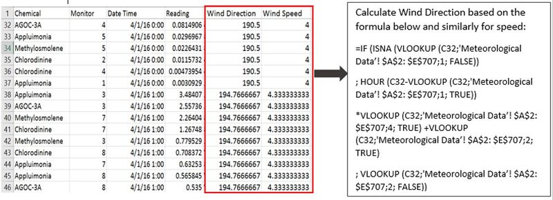
| Issue | Meteorological data is captured every 3 hours whereas sensor data is captured every hour. Hence, the meteorological information for some sensor data records are missing. In this case, wind direction and speed for certain time stamp cannot be shown in the chart. In addition, there is a blank line at row 460 in the meteorological data. |
| Solution | Remove the blank row. Add one column named DC/Hour, which represents the average direction change per hour till next timestamp. E.g. the D3 stands for the direction change per hour from 4/1/16 0:00 to 4/1/16 3:00. Similarly, add another column named SC/Hour (Average Speed Change Per Hour). Set the last record of April, August and December to 0. The new added columns will be used in the solution 3 to calculate wind direction and wind speed for every hour.Note: Here is an assumption that the the meteorological data is changed at an average speed during every three hours. |
| Problem #3 | Combine Sensor Reading and Meteorological Data in the Same File |
|---|---|
| Issue | Meteorological data and sensor data are in the separate files. It’s important to have the sensor readings with wind information at exact time stamp since we need tell which factory is responsible for the chemical release by using meteorological data of wind speed and direction. |
| Solution | Move the meteorological data and sensor data into the same file named Consolidated Data and combine the data using the formulas shown as below. |
Final Dataset
- Location Data.xlsx (Sensor Location & Factory Location)
- Consolidated Data.xlsx (Sensor Reading & Meteorological Data)
Data Import
Before importing location data and consolidated data into the Tableau, we need to tell Tableau the relationship between the two files. The common attributes in the two files are "ID" in the location data and "Monitor" in the consolidated data. Connect two data files as Excel and configure the relationship shown as below.
In addition, I created a calculated field named "Duplicate?" to indicate whether there is a duplicate on sensor reading at the specific time stamp. Its value is "True" when duplicate occurs or else "False". Given that large values may influence the analysis, i picked the min reading value by using another calculated field named "ReadingWithMin".
Visualization
Purpose
The visualization is designed based on the three objectives. Here are the breakdown of the proposed visualization:
- Introduction
- Sensor Work Performance
- Chemical Release Pattern
- Factory Operation Pattern
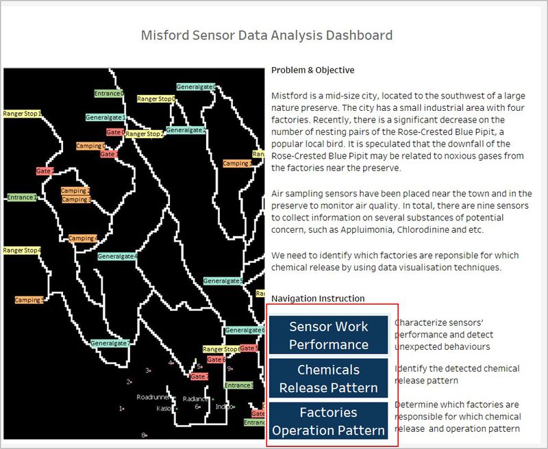
Introduction: the introduction page provides an overview of what problems we are going to cope with as well as the objectives of the visualization. It also introduces the purposes of the rest pages (Sensor Work Performance & Chemical Release Pattern & Factory Operation Pattern). From the introduction page, we can navigate to the sensor work performance page, chemical release pattern page and factory operation pattern page.
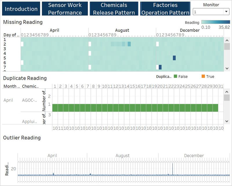
Sensor Work Performance: the sensor work performance page identifies the sensors' unexpected working behaviors. We can interact with the page by filtering the sensors. It displays what time when there are the missing reading and duplicate readings by sensor. From the page, we can also detect the outliers in the sensor reading data.
Chemical Release Pattern: the chemical release pattern page shows what chemicals are detected by the sensor group. We can select all detected chemicals or the specific chemical and view the chemical reading by day and by hour. From the page, we can find out what time and which chemical has a higher amount of emittion.
Factory Operation Pattern: the factory operation pattern page displays the locations of factories and sensors. It shows the wind direction and chemical reading of each sensor. We can play the time stamp by using the page function, from which we can see the changes of wind direction and chemical reading of each sensor by hour. With these, we can know the sensor mainly detect the chemical from which factory at certain time stamp and hence conclude which factory are responsible for which chemical release and their operation pattern.
Interactive Techniques & Type of Chart Used
| Introduction |
|---|
Interactive Technique
|
| Sensor Work Performance |
|---|
Interactive Technique
|
| Types of Charts used When exploring the data given, i found out three unexpected sensor behaviors. To better compare and visualize the problems, there are three charts used.
The image below is a representative of the type of charts used. |


