1718t1is428T8
Singapore’s location at the tip of the Malay Peninsula has long made it a vital hub for the trade of goods through the Straits of Malacca. As a city-state with scarce natural resources, international trade forms the lifeblood of this bustling country, while at the same time, forming its greatest vulnerability. This establishes the importance of understanding trade patterns, influenced by multiple macroeconomic factors, to safeguard the stability and future of the nation.
Various government bodies such as the Ministry of Trade and Industry (MTI) and Innovation and Enterprise (IE) Singapore pay close attention to these figures, continuously monitoring the trade numbers, its individual components and the countries that contribute to it. While the Straits Times regularly refers to trade figures when reporting trade-related news. As such, there is a need for a visualisation tool to quickly, clearly and concisely display this information for the relevant agencies to analyse and for the public to consume.
After reviewing the existing reports prepared by [www.mti.gov.sg%2FResearchRoom%2FSiteAssets%2FPages%2FEconomic-Survey-of-Singapore-2015%2FFullReport_AES2015.pdf&usg=AOvVaw3jR6IlTrnQsDEhWEqBvpHn MTI] and similar graphs reported by the Straits Times, we identified the following areas in which we plan our visualization to value-add to:
1) Interactivity and Customisability - By allowing the reader to interact with the graph to filter periods to view as well as the level of detail. This will facilitate user-led investigation and exploration of the data without any data processing tools.
2) Professional and ready to use format – This will save stakeholders such as MTI and SPH time in the preparation of graphs, especially when graph formatting is necessary before release to the public.
3) Clarity - By utilising the data visualisation concepts and charts we've learned, we aim to display the data in clearer, more easily consumed formats
This will provide a one stop visualization for stakeholders in the services industry in Singapore, to quickly consume the aspects of this data that is relevant to them, in an aesthetically pleasing and intuitive manner.
We are using the following two datasets from IE Singapore:
Merchandise Imports By Region/Country, Monthly
Merchandise Exports By Region/Country, Monthly
Both data sources (import and export) consists information about the monthly trade volume from January 1976 to September 2017 between Singapore and 114 other countries/areas, where the data included existing countries and also dissolved countries that do not exists today.
To meet the required objectives of customisability and interactivity, we drew our inspiration from Mike Bostock's Visualisation on Baseball Strikeouts. We would like to reproduce his method of incorporating the many components of a time series visualisation into one graph, hidden in the background of the overall trend, as well as the ability to select a component to view when needed.
Trend Over Time
Our plan is to produce a similar visualisation, with countries instead of baseball players and exports or imports of services instead of strikeouts. This will allow us to view the long-term trend of this dataset while viewing the individual country data in the background, as well as allowing selection and highlighting of individual countries upon request.
For additional customisability, we will include filters to toggle between viewing the absolute merchandise trade, the percentage change over the years and selection of imports or exports. On top of that, to facilitate country selection, we will have a bar graph on the right denoting the measure selected, such as exports, by each individual country. This bar graph will be linked to the time series chart, allowing us to quickly view and select, for example, the largest importer from Singapore and quickly highlight it on the main chart to view its trend relative to the other countries.
Components Analysis

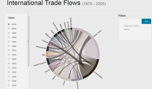
In addition to analysing the trade trends over time, another area of interest is in the amount of trade we do with each individual country. In a particular year, who was our largest trade partner as well as how much of the trade was imports versus exports. To visualise, we chose the Chord Diagram implementation of the same problem as it is an intuitive but clear way of visualising trade flow and its components.
This will allow the reader to quickly view how much trade we conduct with each country, as well as the mix between imports and exports.
The following are some of the key technical challenges that we may face throughout the course of the project:
| Key Technical Challenges | Plans to resolve these issues |
|---|---|
| |
|
The timeline for this project until its completion is as follows:
The tools and technologies we will be using for this project:
- Data Cleaning
- Excel
- JMP
- R
- Data Visualization
- D3.js
Please give us feedbacks! Thank you!


