BACKGROUND SURVEY OF RELATED WORKS
There are many charts and visualisations available which illustrates the various trends of house prices and index. We have selected a few of these to study and learn before we begin developing our own visualizations.
| Related Works
|
What We Can Learn
|
|
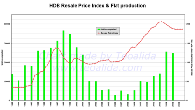
An Analysis of the trend and correlation between resale prices and flat production
Source: http://www.teoalida.com/singapore/hdbprices/
|
- The use of 2 different chart types with a secondary axis is effective in illustrating the correlation between resale prices and flat production.
- The colours used are striking and contrast well with each other.
- There are dips in both variables which are not explained in the infographic itself (E.g. 1997 Asian crisis, 2003 SARs outbreak). This events could be incorporated into the charts to make it more informative.
|
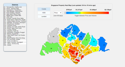
| An interactive heatmap of Singapore’s house prices in various districts
Source: https://www.srx.com.sg/heat-map
|
- This heatmap uses colours appropriately so that the house prices of each district can be identified intuitively (Red means expensive, blue means cheap, orange means mid-range)
- The use of filters allows user to find out more about the price distribution of each house type easily.
- When user mouseover a district on the heatmap, the corresponding district on the legend is highlighted. This improves usability as users do not have to match district numbers manually.
|
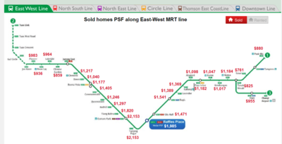
| An interactive visualization of house prices along MRT stations
Source: https://www.srx.com.sg/mrt-home-prices/property-listings-near-east-west-line
|
- This visualization makes use of unique ways to illustrate the relation between nearby facilities and house prices.
- The separating of the various MRT lines using filters at the top prevent too much information from being shown in one page
|


