1718t1is428T15
Proposed Storyboard
Upload Data
A UI will be provided for the user to upload datasets of past and/or future years. This would provide more flexibility for users to analyze a wider range of energy usage data.
Filters
…
Hexagonal Binning
There are many levels that we can consider when thinking of how to analyze the intensity of energy consumption in Singapore, such as on a national level, regional level, or subzone level. But these levels are too coarse and does not provide a comprehensive view - for instance, a large subzone would surely have a higher energy consumption level since there are more residents living in it.
Thus, to properly analyze the intensity of energy consumption in Singapore, we need to do so on a more granular level; We decide to break down Singapore into various groups of postal codes. By aggregating a few postal codes together, we have a higher chance of uncovering new findings.
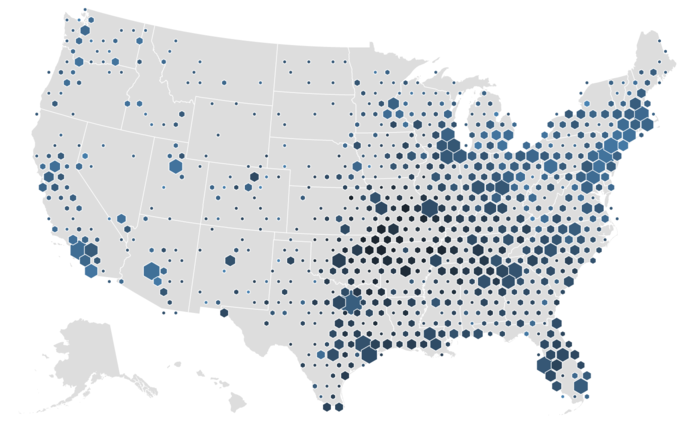
The best way to visualize this would be to plot hexagonal bins (“hexbins”) onto the Singapore map, with each hexbin representing a group of postal codes, and using a gradient colour scheme to represent each group’s energy consumption intensity.
Line Chart
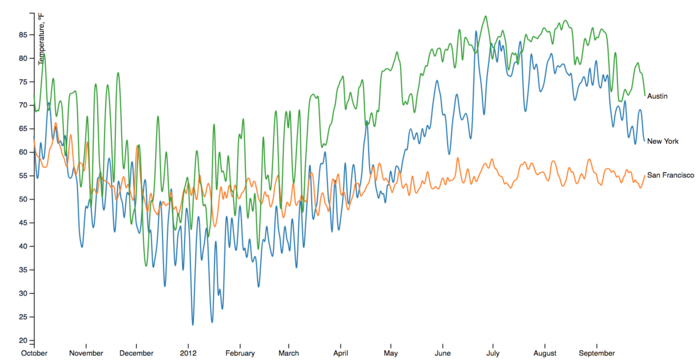
We will add in a multi-series line chart to allow users to compare the monthly energy consumption levels by: 1) entire Singapore, 2) a group of postal codes, and 3) each postal code.
The default line chart would show only the average monthly consumption of the entire nation. Upon clicking on a single hexbin, the line chart would populate another series to show the average monthly consumption by the group of postal codes within that hexbin. Finally, a third series representing a single postal code would be displayed when ...


