IS428 2017-18 T1 Assign Dong Ruiyan
Visual Analytics Assignment
Contents
Problem & Motivation
Mistford is a mid-size city is located to the southwest of a large nature preserve. The city has a small industrial area with four light-manufacturing endeavors. Mitch Vogel is a post-doc student studying ornithology at Mistford College and has been discovering signs that the number of nesting pairs of the Rose-Crested Blue Pipit, a popular local bird due to its attractive plumage and pleasant songs, is decreasing! The decrease is sufficiently significant that the Pangera Ornithology Conservation Society is sponsoring Mitch to undertake additional studies to identify the possible reasons. Mitch is gaining access to several datasets that may help him in his work, and he has asked you (and your colleagues) as experts in visual analytics to help him analyze these datasets.
Mitch Vogel was immediately suspicious of the noxious gases just pouring out of the smokestacks from the four manufacturing factories south of the nature preserve. He was almost certain that all of these companies are contributing to the downfall of the poor Rose-crested Blue Pipit bird. But when he talked to company representatives and workers, they all seem to be nice people and actually pretty respectful of the environment. In fact, Mitch was surprised to learn that the factories had recently taken steps to make their processes more environmentally friendly, even though it raised their cost of production. Mitch discovered that the state government has been monitoring the gaseous effluents from the factories through a set of sensors, distributed around the factories, and set between the smokestacks, the city of Mistford and the nature preserve. The state has given Mitch access to their air sampler data, meteorological data, and locations map. Mitch is very good in Excel, but he knows that there are better tools for data discovery, and he knows that you are very clever at visual analytics and would be able to help perform an analysis.''
Task 1
Characterise the sensors’ performance and operation. Are they all working properly at all times? Can you detect any unexpected behaviours of the sensors through analysing the readings they capture? Limit your response to no more than 9 images and 1000 words.
Characterise Monitor Performance
I characterise the monitors’ performance and operations based on the amount of noise in their readings.
Large Amount of Noise
From the graph, I find that Monitor 5, 6, and 9 have large amount of noise. Monitor 5 become more noise from August. Monitor 9 become more noise and the baseline of increases from August.
Medium Amount of Noise
Monitor 3 and 7 have medium amount of noise comparing with Monitor 5, 6 and 9.
Small Amount of Noise
Special: Monitor 4
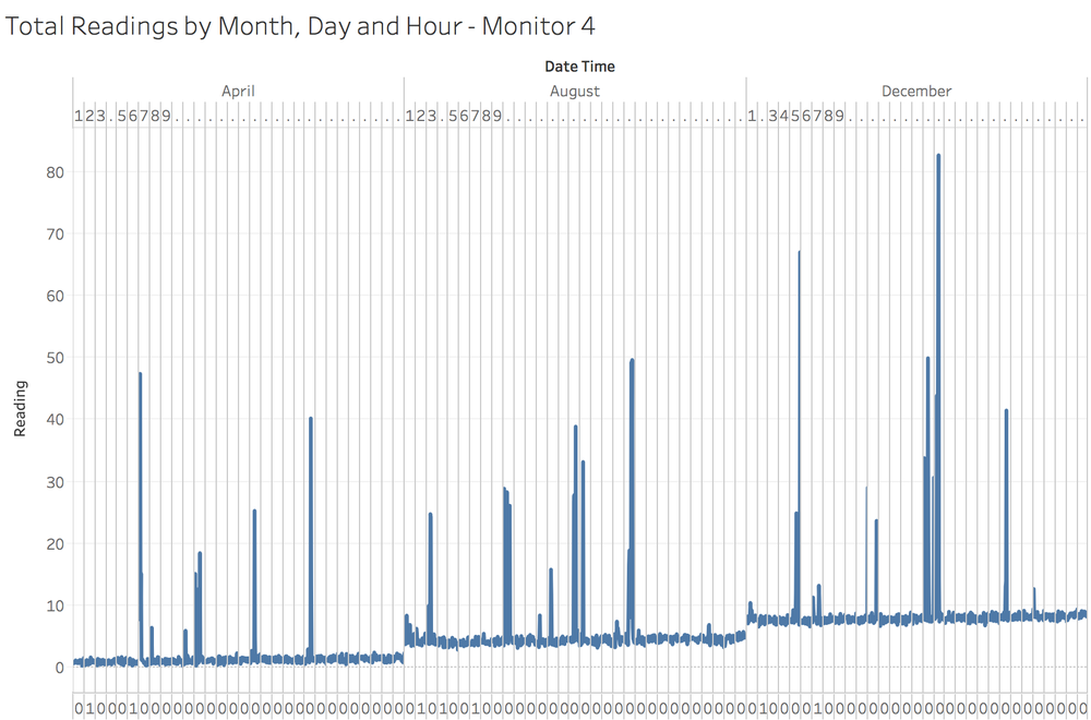
The line graph shows the total readings of Monitor 4 at each timestamp over the 3 months. It shows a clear linearly-increasing in its readings over the time. However, other monitors did not show such kind of trend, and the possibility that this trend is caused by environmental change is very small. This trend might be caused due to errors or improperly working behaviours.
Improperly Working Behaviours
Stop Working
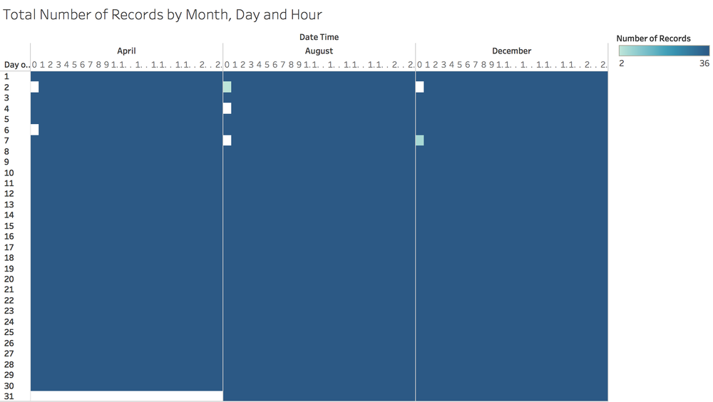
The calendar chart shows how total number of records of all 9 monitors varies with the hour of the day over the 3 months. There are 5 blank girds, which shows the total number of records of all 9 monitors at the timestamps is 0. It strongly indicates that all 9 monitors stopped working at the timestamps period, which are 00:00 AM 2nd April, 00:00 AM 6th April, 00:00 AM 4th August, 00:00 AM 7th August and 00:00 AM 2nd December. There are 2 light green grids, which shows that the total number of records of all 9 monitors at the timestamps is much fewer than that at other timestamps. By viewing the calendar chart for different monitor (filter by monitor), only Monitor 3 was working and captured 2 records at 00:00 AM 2nd August, and only Monitor 7 and Monitor 8 was working and captured total 5 records at 00:00 AM 7th December.
Redundant Records
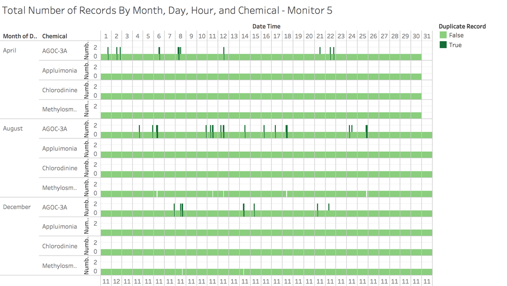
By viewing the charts of total number of records of each chemical at each timestamp for different monitor (filter by monitor), most of the monitors captured the amount of AGOC-3A released twice at multiple timestamps over the 3 months. The above chart is one example for Monitor 5. There are multiple dark green bars, which shows the total number of records of AGOC-3A at that timestamp is 2. It indicates that Monitor 5 captured the amount of AGOC-3A released at that timestamp twice. By viewing the chart for different monitor (filter by monitor), most of the monitors captured the amount of AGOC-3A released twice at multiple timestamps over the 3 months. Besides, in most cases of the duplicated records of AGOC-3A at a timestamp, the amount of AGOC-3A of one record is much higher than (around 10 times) that of the other record. (To view that, go to ..dashboard) Since the smaller readings are at the normal range while the larger readings are abnormally high, I assume that the large readings are outlier due to improper working behaviours of the monitors. The extremely high readings may dominate the following analysis. To avoid that, the records with smaller reading of AOGC-3A are kept and the records with larger reading will be ignored. To do that, I created a …
Exceptions
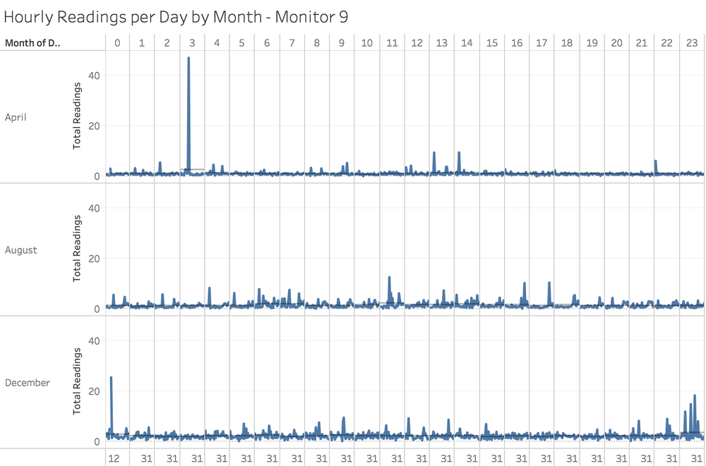
By viewing the line graphs of the hourly readings of all chemicals per day by month captured by different monitor (filter by monitor) over the 3 months, I find that all monitors captured abnormally high readings. One clear example is the line graph of Monitor 9, which shows an extremely high reading of 46.91 at 03:00 AM 11th April that is much larger than the average readings of 2.53 at 03:00 AM across April.
Task 2
Now turn your attention to the chemicals themselves. Which chemicals are being detected by the sensor group? What patterns of chemical releases do you see, as being reported in the data? Limit your response to no more than 6 images and 500 words.
Monitor Detection Pattern
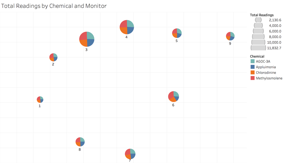
This graph shows that total readings of each chemical detected by each monitor. The pie chart of each monitor shows that all monitors detect all different amount of these 4 chemicals.
Chemical Release Pattern
Increase Pattern
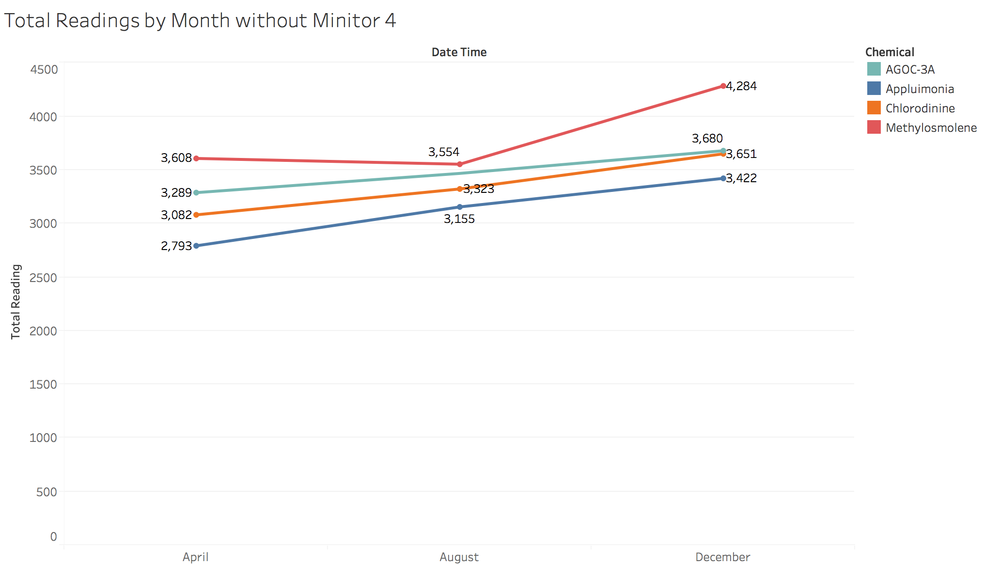
This chart displays the monthly readings of each chemicals without Monitor 4 over the 3 months. The reason of excluding Monitor 4 is that the performance of Monitor 4 analysed in previous question shows a constant increase in chemical readings over time, which may dominate in this analysis. It is obvious that the total amount of Appluimonia, Chlorodinine, and AGOC-3A released experienced an increase trend over the time. The total amount of Methylosmolene released decreased from April to August but it increased much more from August to December.
Daily Release Pattern
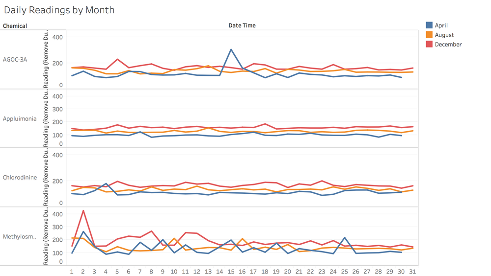
The chart displays the daily amount of each chemical released by month. It is obvious that the daily amount of Appluimonia and Chlorodinine released fluctuates less dramatically than that of Methylosmolene and AGOC-3A from the start day to the end day of each month.
Hourly Release Pattern
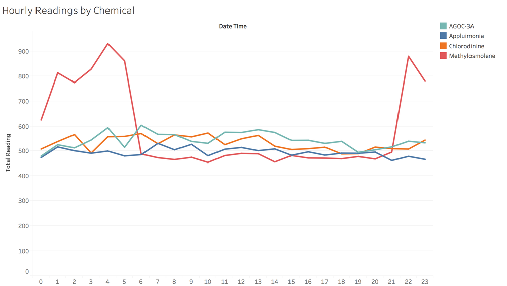
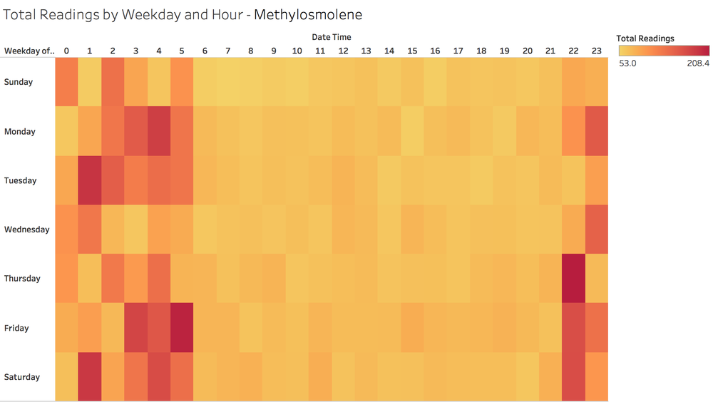
The chart shows the hourly amount of each chemical released over the 3 months. It is obvious that the hourly amount of Methylosmolene released increases extremely from 09:00 PM to 05:00 AM. While, the hourly amount of Appluimonia, Chlorodinine and AGOC-3A released fluctuates over the time.
This heat map also indicates the peak amount of Methylosmolene released during 09:00 PM to 05:00 AM.
Task 3
Which factories are responsible for which chemical releases? Carefully describe how you determined this using all the data you have available. For the factories you identified, describe any observed patterns of operation revealed in the data. Limit your response to no more than 8 images and 1000 words.


