Difference between revisions of "1718t1is428T13"
| Line 62: | Line 62: | ||
|- | |- | ||
| − | | <center> | + | | <center> GES data from 2008 - 2016 </center> <br> <center>Source: https://docs.google.com/spreadsheets/d/1tVlxRwv5mSaGIdsdxMDcxpuAHZfgyJ20mWVVVkYuPc8/pubhtml </center>|| |
| − | * Provides | + | * Provides Graduate Employment Survey of local universities in Singapore from 2008 onwards, as the data in data.gov.sg only provide 2013 onwards |
|- | |- | ||
| − | | <center> | + | | <center> MoM Data on Labour Market </center> <br> <center>Source: http://stats.mom.gov.sg/Pages/ExploreStatisticsPublications.aspx#PublicationSearch </center>|| |
| − | + | Provide Data on : | |
| − | + | * Gross Montly Income | |
| − | + | * Job Recruitment, Resignation, Vacancy Rate | |
| − | + | * Job Vacancy Reason | |
| − | |||
| − | |||
| − | |||
| − | |||
| − | |||
| − | * | ||
| − | |||
| − | |||
| − | |||
| − | * | ||
|- | |- | ||
Revision as of 17:33, 26 November 2017
Contents
Problem and Motivation
Problem:
The Graduate Employment Survey (GES) is conducted on a yearly basis to provide insights about the job prospects about a particular course. The Ministry of Education conduct these surveys yearly for Universities in Singapore. However, the results of these surveys are not interactive and do not provide any trends and insights with respect to the Labour Market demands.
Motivation:
As graduates to be who going to enter the job market soon, we felt that it would be interesting to look at the historical salary data to know the gauge of our expected salary, the demand in the job market and as well our position in term of starting salary among our fellow school peers. In addition, we also felt that it would be interesting to find out whether does the starting salary reflect the market demand. Furthermore, we hope that our visualizations would help students from Polytechnic and Junior Colleges decide their courses choices with regards to its career prospects as it would be interesting to find out what are the top paid salary programmes through the year, and the changes to the market demand.
Objectives
In this project, we are interested to create a visualisation application that helps users perform and answer the following:
1. Visualise Ranking of Highest Starting Salary throughout the years
2. To find insight and relationship difference between Starting Salary and Labour Market
3. To find out the trend of the Starting Salary and the employment rate over the years with regards to the courses
4. To find out the popularity of the courses by intake, and what new courses are been introduced or omitted over the years
Dataset Description
| DataSet | Description |
|---|---|
| |
| |
|
Provide Data on :
|
Background Research and Survey of Related Work
| Visualization | Explanation |
|---|---|
| |
| |
|
Key Technical Challenges
| Key Technical Challenges | Mitigation Plan |
|---|---|
| |
| |
|
Tools & Libraries
- Tableau
- Microsoft Excel
- Photoshop
- D3.js Library
- HTML, CSS & JavaScript
- Github
Story Board
Story board are done to show the type of chart & data to display Graduate Employement Survey Data Look into the graduate employment survey data to find out:
- Changes of Gross Monthly Salary of each degree over the year
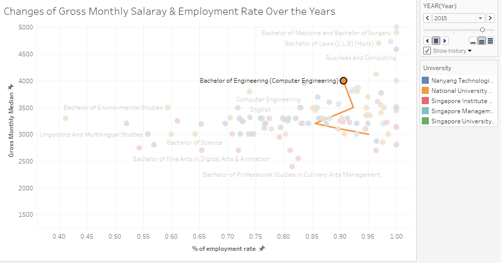
We intended to use Scatter Plot to show the different relationship between the salary, employment rate of each degree course. It show shows it's position among all the other courses from the different university school. We will be including a timeline slider, to change the data-point accrodingly to the specific year. This will help to show how it have changes over the years
- Ranking of the salary across the degree:
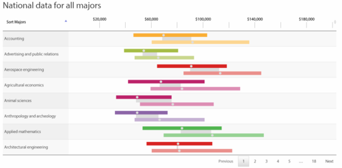
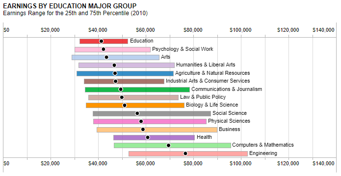
Next, we intend to perform a ranking of the degree by its salary. This help to shows the ranking of each course by the starting salary amount. Beside ranking, we will show the 25, 75 percentile as well to showcase the gaps between the salary despite being of the same university and school. This allows end-user to have a better gauge of the salary distribution.
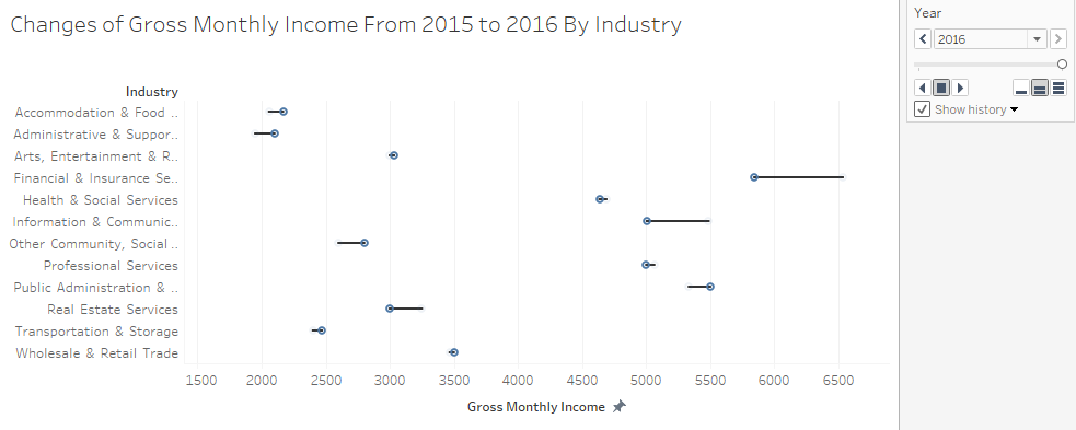
Gross Monthly Income After knowing the salary of the different degree over the year, and the ranking. We want to look into the salary of different industry and sector. Hence, We want to find out
- What’s the changes of salary of the Sector or Industry over the year
For this, we will be using a slope graph instead. As slope graph is able to show the ranking and better illustrate the change in salary between the two years.
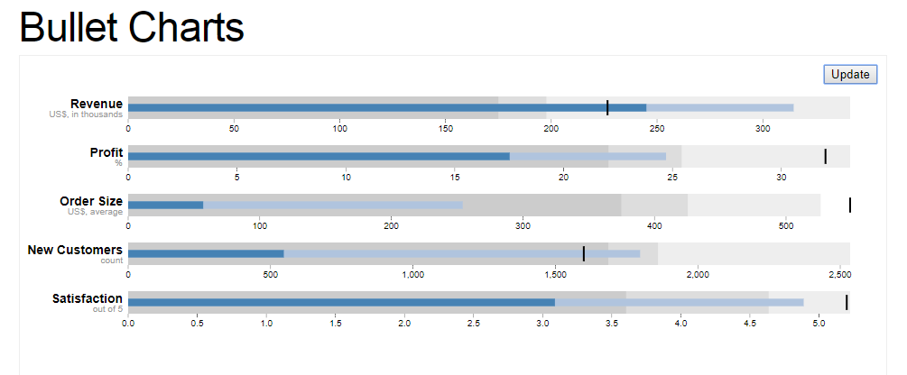
Rates (Recruitment, Resignation, Vacancy) Knowing the Employment Rate from the GES, we want to look into the Recruitment, Resignation & Vacancy Rate. To find out:
- Whether is there a relationship between the rates?
For this, we will be using a bullet chart. With the Vacancy Rate being the target, the Recruitment Rate as the actual value and Resignation as the additional information. This will illustrate whether the company is able to recruit based on the amount of vacancy it has.
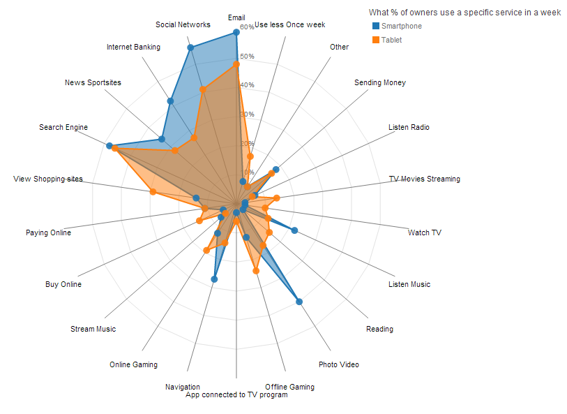
Vacancy Reason After knowing about the vacancy rate of the different occupation group and industry. We are interested to know the reason behind the vacancy rate. Hence, we want to find out:
- Which reason contributes most to the vacancy rate of the particular industry, and which reason contributes most based on Job Education Level. And how it has changed from 2015 to 2016
Using a spider chart, it helps to better illustrate the different reason contribution to the vacancy. As each reason is a category itself, spider chart fits well in such situations.
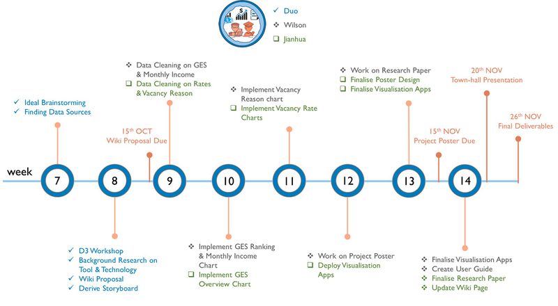
Project Timeline
References
- Data Gov : https://data.gov.sg/search?groups=education
- Salary SG : http://www.salary.sg/
- Visualisation of SG Graduate Salary : http://pay.sgcharts.com/
- Digital Senior : http://digitalsenior.sg/graduate-employment-survey-ges-nus-ntu-smu/
Comments
Feel free to give us comments!

