Difference between revisions of "IS428 2017 18T1 Group02 Proposal"

From Visual Analytics for Business Intelligence
Jump to navigation Jump to search
Line 1: Line 1:
[[File:1718T1G1 Logo.png|center|250px]]
+
[[File:1718T1G1 Logo.png|center|200px]]
  
 
{| style="background-color:white; color:white padding: 5px 0 0 0;" width="100%" height=50px cellspacing="0" cellpadding="0" valign="top" border="0" |
 
{| style="background-color:white; color:white padding: 5px 0 0 0;" width="100%" height=50px cellspacing="0" cellpadding="0" valign="top" border="0" |
Line 73: Line 73:
 
| <center>Bus Stop Names and Locations<br/>
 
| <center>Bus Stop Names and Locations<br/>
 
(https://www.mytransport.sg/content/mytransport/home/dataMall.html#)</center>
 
(https://www.mytransport.sg/content/mytransport/home/dataMall.html#)</center>
 +
[[File:Bus data.png|center|200px]]
 
||  
 
||  
 
* Bus Stop Number
 
* Bus Stop Number
Line 86: Line 87:
 
| <center>Mrt Stations Names and Locations <br/>
 
| <center>Mrt Stations Names and Locations <br/>
 
(https://www.mytransport.sg/content/mytransport/home/dataMall.html#)</center>
 
(https://www.mytransport.sg/content/mytransport/home/dataMall.html#)</center>
 +
[[File:MRT data.png|center|200px]]
 
||  
 
||  
 
* MRT Station Number
 
* MRT Station Number

Revision as of 02:30, 24 November 2017

1718T1G1 Logo.png


PROBLEM & MOTIVATION

With housing prices being a hot topic that most undergraduates are talking about as we approach that final period called graduation, don't you wish that there was a way for us to get a better picture of the housing market so that we can make our big decision on where we are going to live from now on? Thus, we sought out to look for a dataset which would be able to provide us with the required information we needed to come up with useful visualizations. Unfortunately, most datasets are incomplete or not useful in providing us with any insight unless a good amount of data cleaning and wrangling is done. For example, transaction data which only gives you the block number and road name with no postal code. How is that useful? Therefore, one of our primary goals is to come up with a visualization which would provide users with useful information about the resale market in Singapore and help people gain access to a better data set than the ones currently out there. On top of that, we want to create an easy-to-use visualization tool that can help people analyze the historical flat data so that users can see which flats in Singapore would be the most value for money so that users can actually buy a home which is worth its investment. We also felt that it would be interesting to explore the patterns in the resale flat prices and see what factors really affect the prices of HDBs and find out how much of a premium people attach to amenities such as proximity to public transport, age of the lease, schools and etc...


OBJECTIVES

In this project, we are interested to create a visualisation that helps users perform the following:

  1. View the trend in the resale prices over time with respect to major events that happened in the year (Example: 1993 Change in Pricing Model,1997 Recession
  2. Identify which areas are more expensive and possible reasons for the high value (Proximity to public transport, Schools, Shopping Malls, Park)
  3. To find out if getting a specific HDB is a good investment based on the number of year left on the lease and which locations may potentially be more profitable based on the age of the HDB.

By using our visualisation, we will be able to give users a better idea of the pricing situation of the resale HDBs so that people can make better decisions in the HDB which they want to choose to call their home. Such as when is the best time to buy as HDB; where are the most profitable / cheapest locations; whether a HDB is expensive


SELECTED DATASET

In our analysis, we will only be using data within the year of 1990 - 2017. The rationale for the range of data selected is as follows:

The dataset for analysis will be retrieved from multiple databases, as elaborated below:

Dataset/Source Data Attributes Rationale Of Usage
Resales flat prices from Mar 2012 onwards
(https://data.gov.sg/dataset/resale-flat-prices?resource_id=83b2fc37-ce8c-4df4-968b-370fd818138b )
Resales flat prices from 2002 - Feb 2012
(https://data.gov.sg/dataset/resale-flat-prices?resource_id=8c00bf08-9124-479e-aeca-7cc411d884c4 )
Resales flat prices from 1990 - 1999
(https://data.gov.sg/dataset/resale-flat-prices?resource_id=adbbddd3-30e2-445f-a123-29bee150a6fe )
  • Month
  • Town
  • Flat Type
  • Block
  • Street Name
  • Storey Range
  • Floor Area (Sqm)
  • Flat Model
  • Lease Commence Date
  • Resale Price (S$)
This dataset will be used as a main source of information in our analysis to understand the number of HDB around Singapore from 1990 to 1999, 2002 to Feb 2012 and Mar 2012 onwards respectively.
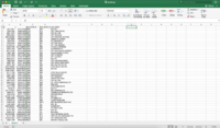
Bus Stop Names and Locations
(https://www.mytransport.sg/content/mytransport/home/dataMall.html#)
Bus data.png
  • Bus Stop Number
  • Bus Stop Roof Number
  • Bus Stop Name
  • X
  • Y
  • Latitude
  • Longitude
This dataset aims to complement the main dataset by providing detailed information about the latitude and longitude of the bus stops located around HDB. We use a javascript script to convert all the X and Y coordinates to EPSG:4326 latitude and longitude coordinates.
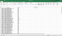
Mrt Stations Names and Locations
(https://www.mytransport.sg/content/mytransport/home/dataMall.html#)
MRT data.png
  • MRT Station Number
  • MRT Station Name
  • X
  • Y
  • Latitude
  • Longitude
This dataset aims to complement the main dataset by providing detailed information about the latitude and longitude of the MRT stations located around HDB. We use a javascript script to convert all the X and Y coordinates to EPSG:4326 latitude and longitude coordinates
Master Plan Subzone Boundary Names and GeoPolygon
(https://data.gov.sg/dataset/master-plan-2014-subzone-boundary-no-sea)
  • Polygon
  • Name
  • Subzone Number
  • Subzone Code
  • Region Name
  • Area Code
  • Area Indicator
This dataset aims to complement the main dataset by providing detailed information about all the subzone in Singapore. We use a javascript library toGeoJson.js to help us convert .KML file to .GeoJson file


BACKGROUND SURVEY OF RELATED WORKS

There are many charts and visualisations available which illustrates the various trends of house prices and index. We have selected a few of these to study and learn before we begin developing our own visualizations.

Related Works What We Can Learn

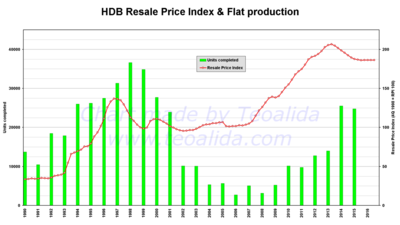
An Analysis of the trend and correlation between resale prices and flat production

1718T1G1 BackgroundSurvey1.png

Source: http://www.teoalida.com/singapore/hdbprices/

  • The use of 2 different chart types with a secondary axis is effective in illustrating the correlation between resale prices and flat production.
  • The colours used are striking and contrast well with each other.
  • There are dips in both variables which are not explained in the infographic itself (E.g. 1997 Asian crisis, 2003 SARs outbreak). This events could be incorporated into the charts to make it more informative.
  • However, major events are not shown in the chart itself. This makes it difficult for the audience to understand the various changes throughout the years. It would be much clearer if events were annotated directly on the charts.

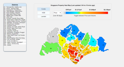
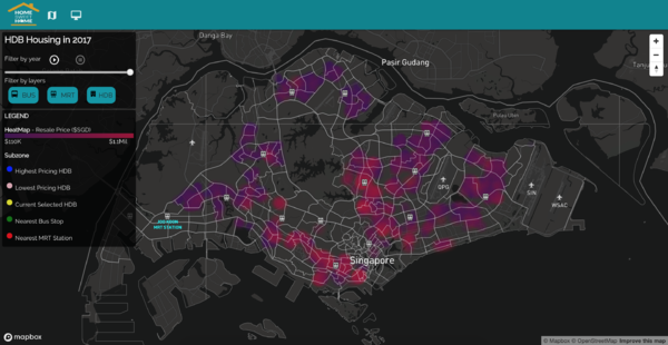
An interactive heatmap of Singapore’s house prices in various districts

1718T1G1 BackgroundSurvey2.png

Source: https://www.srx.com.sg/heat-map

  • This heatmap uses colours appropriately so that the house prices of each district can be identified intuitively (Red means expensive, blue means cheap, orange means mid-range)
  • The use of filters allows user to find out more about the price distribution of each house type easily.
  • When user mouseover a district on the heatmap, the corresponding district on the legend is highlighted. This improves usability as users do not have to match district numbers manually.
  • Even though the colours are intuitive, it could still be confusing as audience might still have to constantly refer back to the colour scale to interpret the colours. Colour intensity of a single colour could be used instead of to illustrate the difference in prices.

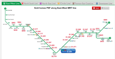
An interactive visualization of house prices along MRT stations

1718T1G1 BackgroundSurvey3.png

Source: https://www.srx.com.sg/mrt-home-prices/property-listings-near-east-west-line

  • This visualization makes use of unique ways to illustrate the relation between nearby facilities and house prices.
  • The separating of the various MRT lines using filters at the top prevent too much information from being shown in one page
  • However, this chart could be too high level and general. Illustrating this on the Singapore map would be more useful instead, where each house's proximity to the MRT station and their respective resale price is shown.


PROPOSED STORYBOARD
Proposed Layout How Analyst Can Conduct Analysis
HSH Home.png
  1. Introduce analysts to the topic of HDB Resale Price and the objectives of the visualization project
  2. Upon clicking "Find your Dream Home", analysts will then begin their process of exploration
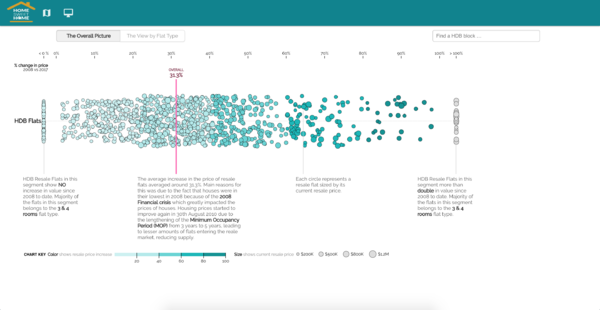
HSH Insight1.png
  1. When a user enters our app, we will show them a brief history of HDB followed by the problem that most young people are facing with regards to understanding the HDB situation.
  2. The 2 screens of different insights we are trying to show will be displayed as 2 clickable buttons so that it is easy for a user to know what exactly he wants to look for at a glance.
  3. The dual axis bar-line chart will indicate the number of units sold vs the HDB price index to show the performing over the years.
  4. The scatter plot groups attacks based on 3 main categories - Planning Area, HDB resale price, Life left on lease. Firstly, by grouping based on planning area, it shows the the different HDB of how many years they left on lease. The size of the circle indicate the resale price of the HDB
HSH Insight2.png
  1. In the next phase of the exploration, we
  2. The radar chart shows 5 different governance indicators that defines how well a HDB is price with several other indicators. The closer the area is to the center of the chart, the less well the indicators is. Upon mouse-over of each area, one can also retrieve the exact values of each governance indicator.
  3. Using the map of Singapore as a filter condition, analysts can selected their choice of HDB to see if its near any bus stop, MRT, schools.
  4. By looking at both charts, the analyst will then be able to compare and establish possible linkages between the different indicators for HDB over the years. As such, these 2 charts are placed side by side to assist the analyst in their data exploration.


ADDRESSING KEY TECHNICAL CHALLENGES

The following are some of the key technical challenges that we may face throughout the course of the project:

Key Technical Challenges How We Propose To Resolve
Unfamiliarity of Visualization Tool Usage
  • Independent Learning on Visualization Tools
  • Peer Learning
Data Cleaning & Transformation
  • Work together to clean, transform and analyze the data
Unfamiliarity in Programming using Javascript & D3 Libraries
  • Attend D3 Programming Workshop
  • Independent Learning on D3 Libraries & Technical Tools
  • Peer Learning
Unfamiliarity in Implementing Interactivity and Animation Tools / Techniques in Visualization App
  • Develop a Storyboard/Design Flow
  • Assign members to specialize on Interactivity/Animation Techniques


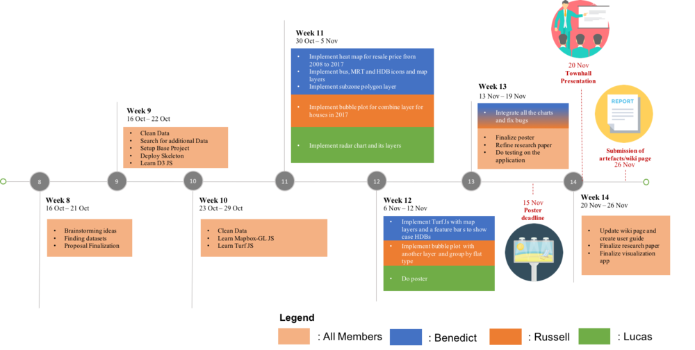
PROJECT TIMELINE

The following shows our project timeline for the completion of this project:

1718T1G1 Timeline.png


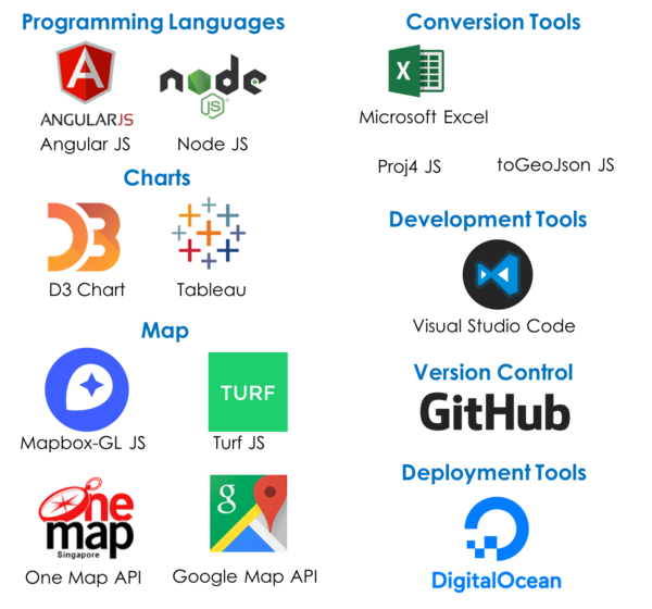
TOOLS / TECHNOLOGIES

The following are some of the tools/technologies that we will be utilizing during the project:

Hsh technologies.png


ARCHITECTURE DIAGRAM


REFERENCES


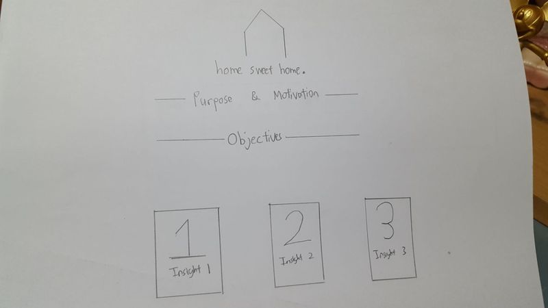
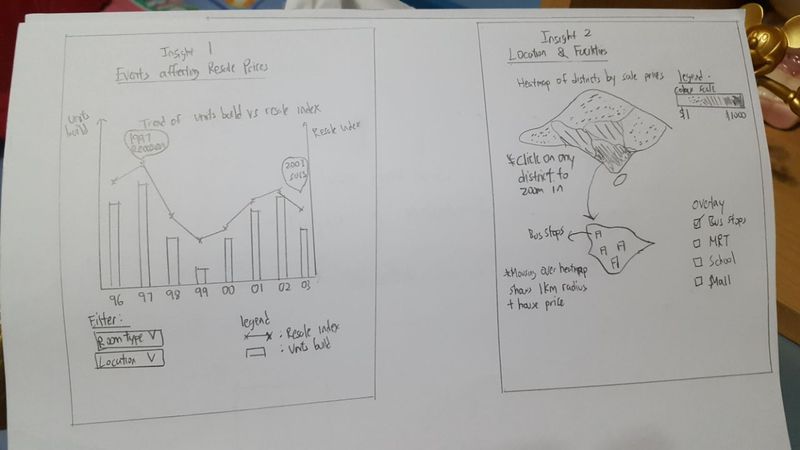
OUR BRAINSTORMING SESSIONS

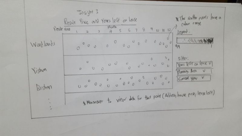
The following are some of the proposed storyboard that we designed during our brainstorming sessions:

HSH Homesketch.jpeg


HSH Insight 1 and 2.jpg


HSH insight1.jpg


Our idea was to provide charts which are able to visualise the trends of HDB over the years in Singapore. We decided to split into multiple charts to be able to showcase the information more clearly.


COMMENTS

Feel free to comments, suggestions and feedbacks to help us improve our project! (: