Difference between revisions of "1718t1is428T12"
| Line 58: | Line 58: | ||
==<div style="background: #F6B419; padding-top: 20px; padding-bottom: 20px; line-height: 0.3em; text-indent: 15px; font-size:20px; font-family:Trebuchet MS; "><font color= #5E2705>Background Survey of Related Works</font></div>== | ==<div style="background: #F6B419; padding-top: 20px; padding-bottom: 20px; line-height: 0.3em; text-indent: 15px; font-size:20px; font-family:Trebuchet MS; "><font color= #5E2705>Background Survey of Related Works</font></div>== | ||
| − | <div style=" | + | <div style="padding-top: 15px; padding-bottom: 30px; padding-left: 15px; padding-right: 15px;"> |
{| class="wikitable" style="background-color:#FFFFFF;" width="100%" | {| class="wikitable" style="background-color:#FFFFFF;" width="100%" | ||
|- | |- | ||
| − | ! style="font-weight: bold;background: #5E2705;color:#fff;width: 50%;" | | + | ! style="font-weight: bold;background: #5E2705;color:#fff;width: 50%;padding:10px;" | Visualization |
| − | ! style="font-weight: bold;background: #5E2705;color:#fff;" | Explanation | + | ! style="font-weight: bold;background: #5E2705;color:#fff;padding:10px; " | Explanation |
|- | |- | ||
| [[Image:is428_databg_ucb_viz.png|550px|center]] | | [[Image:is428_databg_ucb_viz.png|550px|center]] | ||
<br> | <br> | ||
| − | <center>Data source: http://people.ischool.berkeley.edu/~yhfan/W209-Final-Project/</center> | + | <center>'''Data source:''' http://people.ischool.berkeley.edu/~yhfan/W209-Final-Project/</center> |
| − | || | + | | style="padding:10px;" | |
| − | + | ==== Geospatial map chart ==== | |
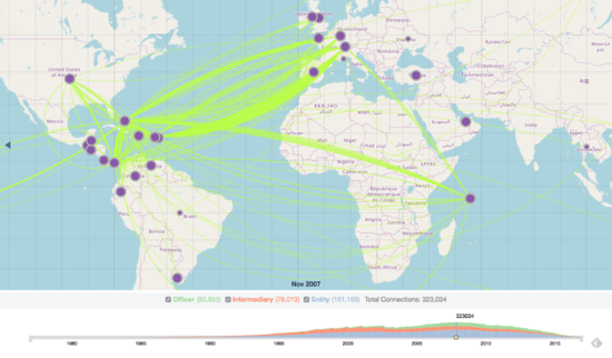
| + | This visualization shows the interconnectedness of countries connected and involved in the offshore industry over a forty-year period. The map view scalable and specific date and time is selectable on the timeline.<br> | ||
| + | <br> | ||
| + | '''Pros:'''<br> | ||
| + | * Able to see an overview of countries who are connected and involved in the offshore industry. | ||
| + | * Location circle markers are clickable with a pop-up displaying more details on the total number of officer, intermediary and entity connections in each country. | ||
| + | * Location circle marker sizes are dynamically sized according to the number of connections each country has. | ||
| + | <br> | ||
| + | '''Cons:'''<br> | ||
| + | * No country name labels on the location pins, only appears upon hover. | ||
| + | * Despite location circle marker sizes being dynamically sized according to the number of connections each country has, large pin sizes are limited to the same size after it is past the threshold. | ||
| + | * Color choice of the location pins and network lines are slightly jarring and don't go nicely with the overall muted color choice for the visualization. | ||
|- | |- | ||
| − | | [[Image:|550px|center]] | + | | [[Image:is428_databg_ucb_viz2.png|550px|center]] |
| + | <br> | ||
| + | <center>'''Data source:''' http://people.ischool.berkeley.edu/~yhfan/W209-Final-Project/</center> | ||
| + | | style="padding:10px;" | | ||
| + | ==== Network graph ==== | ||
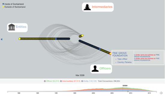
| + | This visualization is part of a drill-in in the previous visualization when you click on a particular country. It shows the interconnectedness of companies in that particular country to companies outside the country, across the world. The nodes show more details when they are hovered over.<br> | ||
| + | <br> | ||
| + | '''Pros:'''<br> | ||
| + | * Able to see an overview of entities, officers and intermediaries situated outside and inside a particular country. | ||
| + | * More details of nodes upon hover. | ||
<br> | <br> | ||
| − | + | '''Cons:'''<br> | |
| − | + | * Difficult to understand at a glance. | |
| − | + | * The labels for "Entities", "Intermediaries" and "Officers" are positioned at an imaginary 'T' shape, but the ordered nodes are positioned with a 'Y' shape, which makes it hard for reference. | |
| + | * Network lines are faint against the grey background, and color choice of the nodes are slightly jarring and don't go nicely together with the visualization. | ||
|- | |- | ||
| − | | [[Image:|550px|center]] | + | | [[Image:is428_databg_viz1.png|550px|center]] |
| + | <br> | ||
| + | <center>'''Data source:''' http://www.arcgis.com/apps/MapJournal/index.html?appid=1f611be658e74ad48f899d1d6152bdb4</center> | ||
| + | | style="padding:10px;" | | ||
| + | ==== Interactive map ==== | ||
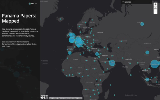
| + | Map showing companies in Mossack Fonseca database “connected” to a particular country by address. The data also shows clients, beneficiaries, and shareholders by country. The visualization uses scaled circle location markers to show the number of companies in each country mentioned in the database. Each country's circle location markers are clickable, which reveal the number of clients, beneficiaries, and shareholders mentioned in the papers from the selected country.<br> | ||
| + | <br> | ||
| + | '''Pros:'''<br> | ||
| + | * Able to see at a glance which countries have the most number of companies, clients, beneficiaries, and shareholders based on their circle location marker size. | ||
| + | * Map is scalable. User is able to zoom in to have a closer look at the smaller countries, and zoom out to have an overview of the concentration of companies. | ||
| + | * Minimal yet effective color choices that are also pleasing on the eye. | ||
<br> | <br> | ||
| − | + | '''Cons:'''<br> | |
| − | + | * Unable to see the connections of each country to other countries (i.e. which individual from a particular country has offshore companies in Switzerland). | |
| − | + | * No timeline provided — whatever shown on the map is all the data from from 1974 to 2015. Some companies might have already been dissolved. | |
|} | |} | ||
</div> | </div> | ||
Revision as of 23:43, 23 November 2017
| Version 1 | Version 2 |
Contents
Introduction & Motivation

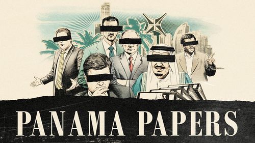
The Panama Papers (2016) are a huge leak — 11.5 million (approximately 2.6 TB) — of financial documents that reveal the financial holdings of the rich and powerful. The global investigation into the secretive industry of offshore companies expose how politicians, celebrities, sportsmen and high-net-worth individuals set up front companies in remote jurisdictions to protect their cash from higher taxes, and facilitate bribery, arms deals, financial fraud and drug trafficking. Laying within the trove of leaked files are also the names of the rich and powerful in the Asia-Pacific (APAC) region, overshadowed by the media’s interest of more prominent names of the West.
Objectives
As news coverage, even in Singapore, was focused mainly on the West, attention is diverted from what may be more important, which are details of individuals and businesses in APAC that are also found in the leaked documents. This results in a lack of information and coverage on the APAC region.
Our goal is the shed light on the individuals and business involved in the APAC region in the following ways:
- To present the complexity and structure of relationships between entities and individuals in each country in the APAC region.
- Identify key parties in the offshore investments.
Background Survey of Related Works
| Visualization | Explanation |
|---|---|
|
|
Geospatial map chartThis visualization shows the interconnectedness of countries connected and involved in the offshore industry over a forty-year period. The map view scalable and specific date and time is selectable on the timeline.
|
|
|
Network graphThis visualization is part of a drill-in in the previous visualization when you click on a particular country. It shows the interconnectedness of companies in that particular country to companies outside the country, across the world. The nodes show more details when they are hovered over.
|
|
|
Interactive mapMap showing companies in Mossack Fonseca database “connected” to a particular country by address. The data also shows clients, beneficiaries, and shareholders by country. The visualization uses scaled circle location markers to show the number of companies in each country mentioned in the database. Each country's circle location markers are clickable, which reveal the number of clients, beneficiaries, and shareholders mentioned in the papers from the selected country.
|
Data Source
| Dataset | Attributes |
|---|---|
Offshore Leaks Database by The International Consortium of Investigative JournalistsData source: https://offshoreleaks.icij.org/pages/database |
|
Paradise-Panama-Papers: Data Scientists United Against Corruption datasetData source: https://www.kaggle.com/zusmani/paradisepanamapapers/data |
Tools / Libraries
- Tableau
- Github
- Microsoft Excel
- Adobe Creative Suite
- Sketch
- Neo4j
- D3.js
- Python
Technical Challenges
| Key Technical Challenges | Detailed Description | Proposed Solution |
|---|---|---|
|
D3.js is a JavaScript library for producing dynamic, interactive data visualizations in web browsers. |
| |
|
The data set are in text format and many other different format. Integration are challenging as there are a lot of manual work to be done. |
| |
|
In order to enable users to understand the data sets, interactive elements needs to be suitable for this project |
|
Project Timeline & Task Assignments
References
- Databases: https://offshoreleaks.icij.org/pages/database
- Kaggle Dataset: https://www.kaggle.com/zusmani/paradisepanamapapers/data
- D3.js: https://d3js.org/
- Neo4j: https://neo4j.com/
Comments
Please leave comments here.


