Difference between revisions of "1718t1is428T10 Proposal"
| Line 89: | Line 89: | ||
|- | |- | ||
| − | | [[Image:teamveg_worldmap.jpg|550px|center]] | + | | [[Image:teamveg_worldmap.jpg|550px|center|link="https://datamaps.github.io/"]] |
<br> | <br> | ||
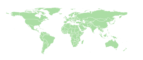
<center>World Map Visualisation</center> | <center>World Map Visualisation</center> | ||
Revision as of 01:30, 20 November 2017
Contents
Problem and Motivation
Tourism has always been a sector of large importance to Singapore's economy. Based on the 2016 Marketing Report by Singapore Tourism Board (STB), STB has plans to grow Singapore’s tourism industry. One of the key questions whilst analyzing their market portfolio was how they could determine the growth potential for our current and potential markets.
Through this visualisation, we would be looking into the market share that Singapore is able to capture in its Top 15 visitor arrival countries. Specifically, as Indonesia, China and India rank as the top three countries that are contributing to Singapore's booming tourism sector, we seek to delve deeper in order to discover the actual populations within these visitor countries, so as to determine whether there is still potential in the form of market share that STB could capture.
This project provides an interactive visualisation to better analyse STB's strategy: should resources be allocated to investments in these markets to continue to drive demand? Or should STB start looking at how it can diversify its market portfolio beyond Asia?
Objectives
This project aims to provide insights into the following:
- Countries that are sending the most tourists to Singapore
- Proportion of tourists coming to Singapore against the total outbound residents of the country
- Comparison of their expenditure and income patterns
- Breakdown of tourists’ expenditures to find out which industries they are spending most on
Background Survey of Related Works
| Visualizations | Explaination |
|---|---|
|
|
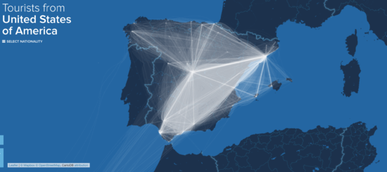
This visualisation enables the viewer to find out the countries that the tourists are coming from. This, combined with the thickness of the line to represent the relative number of tourists compared to the other countries will enable us to have a quick and clear overview. Additionally, the team will look into customising this current chart, to allow for a more detailed view of each countries' actual proportion of tourists that are coming into Singapore compared to the other countries being visited. |
|
|
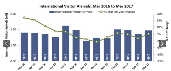
This visualisation comprises of two charts in one - a time-series line chart, and a bar chart, which compares the international visitor arrival with the year on year change. Despite the limitations with this visualisation (seemingly confusing), the team feels that it is necessary to give a broad overview of the overall trend in relation to the total number of visitors. Additionally, it would be good to subsequently break this down to enable zooming into a certain country's monthly changes. |
|
|
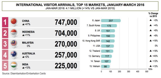
The bar chart allow user to compare data between the countries. Next to each bar, we will indicate whether the number of visitors increases or decreases from the previous year, and how much different is the percentage. This chart is to let our user get a rough gauge of the number of visitors to Singapore. |
|
|
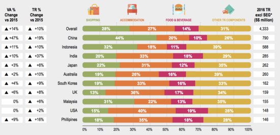
The used of stacked horizontal bar charts is an effective way of demonstrating the distribution of tourists by country. The columns allow us to show the net change in visitors to Singapore, on whether it's increased or decreased with respect to the changes in population. This chart allows users to understand the proportion of overseas visitors to Singapore in contrast to other destinations they have traveled to. |
Design Inspirations
The following interactive data visualisations were used as inspiration for our application:
| Visualization example | What was learnt | Desired objective to meet |
|---|---|---|
|
|
We learnt how to display the geographical locations through a world map, to showcase the physical distance that travelers travel to get to Singapore. This visualisation also shows the use of scale and colors, to convey the number of visitors coming to Singapore from a given country, compared to the other top 13 countries. |
#1: Countries who are sending the most tourists to Singapore
|
|
|
We learnt how to make use of the fisheye zoom to allow for better viewing of clustered data. Many of the top 13 visiting countries are in the ASEAN region, and due to their close proximity to Singapore, many arrows and labels makes it difficult for a viewer to make active selections or comparisons. The fisheye zoom allows for finer mouse control by the user, without compromising on the overall view of the world map or distorting the sense of scope and scale. |
#1: Countries who are sending the most tourists to Singapore
|
|
|
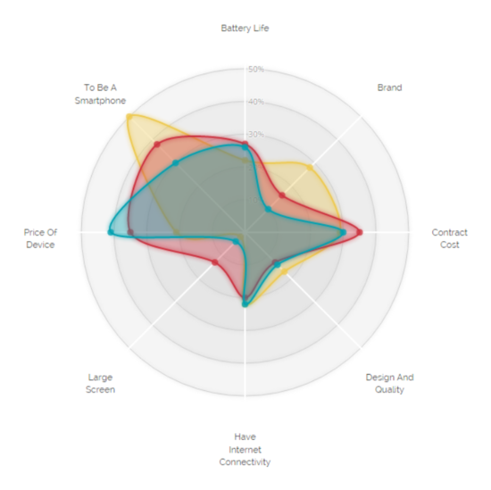
We learnt how to use a radial chart to demonstrate the breakdown of expenditure into different categories. This allowed for an insightful expenditure distribution to be displayed, along with being aesthetically pleasing. The ability to overlay multiple such breakdowns helps with comparison via area and skew easily. We also learnt that too many overlays will make the radial chart too cluttered and lose its prime value in its pure simplicity. |
#3: Comparison of their expenditure and income patterns
|
Proposed Storyboard
#1: Title Screen
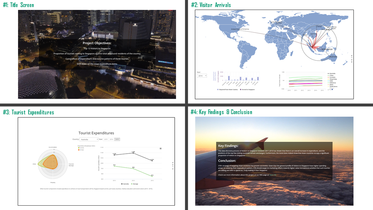
The title screen indicates the objectives that the data visualisation application seeks to accomplish on the topic of Visitors to Singapore.
The use of a video background is meant to capture the different sights and places of interest in Singapore, playing to the theme of tourism. We liken our application user to that of a Singapore tourist, with the landing page akin to landing in Singapore.
The screens are assembled as part of a single-page website design, where each screen occupies the entirety of a screen display and page navigation is accomplished via scrolling or arrow keys.
#2: Visitor Arrivals
The Visitor Arrivals visualisation consists of a geomap, line graph and bar graph in order to visualise different aspects of Visitor Arrivals, due to the multifaceted nature of the data. These visualisations are all linked by year, with the dropdown menu dictating the data that is presented on all charts to present a unified dashboard view of Visitor Arrivals.
Geomap
The geomap visualises the travel pattern of visitors from Singapore’s Top 15 visitor countries between 2010–2016. The geomap allows the viewer to see the geographical locations of visiting countries on a scaled world map, depicting, the number of visitors, the distance they travelled to Singapore, and how geographically close these countries are to each other.
The following controls have been added to enhance the analysis of the geomap:
- Dropdown menu to select year to display
- Directed weighted arrows from visiting country to Singapore, with the weight being proportional to the absolute number of visitors visiting Singapore
- Tooltip when hovering the mouse over a labelled country to provide
- Number of visitor arrivals to Singapore
- Total number of departures from selected country
- Proportion of total departures to Singapore
- Fisheye zoom on mouse cursor for better navigation and viewability
Bar Chart
The bar chart compares the number of Singapore visitors across the Top 13 visitor countries per year. These are ranked in descending order, showing the absolute number of visitors to Singapore per country. Following which, a toggle can be done to depict the absolute number of outbound visitors per country, allowing for a comparison by proportion of total outbound visitors arriving in Singapore. The following controls have been added to enhance the analysis of the bar chart:
- Bar chart
- Dropdown menu to select year to display
- Toggle to display “Arrived in Singapore” (default) or “Departed from Home Country”
- Tooltip when hovering the mouse over a bar to provide
- Number of visitor arrivals to Singapore
- Total number of departures from selected country
Line Graph
The line graph depicts a time-series of Singapore visitors from the Top 13 visitor countries between 2010-2015. This allows for a quick yet meaningful comparison of the visitor arrival trend over time, along with a detailed drilldown which allows the user to see the individual country's visitor trends over time.
The following controls have been added to enhance the analysis of the line graph:
- Toggle to display individual country or all countries (default)
- Tooltip when hovering the mouse over each point of the line to provide
- Year of visitor arrival
- Number of visitor arrivals to Singapore
#3: Visitor Expenditure
The Visitor Expenditures visualisation consists of a radial chart and line graph, to compare the yearly expenditure by country and their detailed breakdown against the average. These visualisations are all linked by country and year, with the dropdown menu dictating the country and the pill buttons dictating the year to render data that is presented on all charts to present a unified dashboard view of Visitor Expenditures.
Radial Chart
The radial chart provides the breakdown of visitor expenditure per country, with a comparison against the average tourist expenditure. This allows for easy comparisons to be made, visualising any skews in the data clearly.
The following controls have been added to enhance the analysis of the radial chart:
- Dropdown menu to select country to display
- Toggle to select year to display
- Highlighting of country or average expenditure on hovering mouse over a bounded area
Line Graph
The line graph provides the time series of visitor expenditure per country, with a comparison against the average tourist expenditure between the period of 2013-2015. This allows for easy comparisons to be made, visualising any fluctuations in the expenditure pattern clearly.
The following controls have been added to enhance the analysis of the line graph:
- Toggle to display individual country, average or both (default)
- Tooltip when hovering the mouse over each point of the line to provide
- Year of visitor arrival
- Number of visitor arrivals to Singapore
#4: Key findings and conclusion
The key findings and conclusion screen display the important insights gathered to meet the objectives of the Visitors to Singapore topic, along with a conclusion on what this dataviz application accomplishes and how might STB benefit from such findings. The use of the video background wraps up the theme of tourism, with a flying plane used to invoke a sense of completion and departure. We further the metaphor used for our application user, gaining much from the experience and leaving the application in a similar fashion as leaving Singapore: fulfilled.
Tools / Libraries
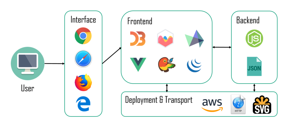
The following tools and libraries are used in the development of the web-based data visualisation application:
- Microsoft Excel
- D3.js
- Chart.js
- HighCharts.js
- JQuery
- Github
- Tableau
- Bower
Architectural Diagram
The architecture diagram depicts the design implementation of the web-based data visualisation application:
Datasets
We have chosen the following datasets to do data discovery:
| Dataset | Rationale |
|---|---|
| |
| |
|
Technical Challenges
We encountered the following technical challenges throughout the course of the project. We have indicated our proposed solutions, and the outcomes of the solutions.
| Key Technical Challenges | Proposed Solution | Outcome |
|---|---|---|
|
The use of the CEIC database was used for the most accurate information. For information that simply could not be sourced, or are from less credible sources, consultation with Professor Kam was arranged to seek his guidance on the matter. | |
|
The independent learning and team sharing greatly aided the team with our competence and confidence in using D3.js and other programmatic visualisation tools. The D3.js workshop that was organised was excellent in ensuring that the right skills were learnt. | |
|
The adopted process was having clear instructions issued to each member in the team, along with maintaining constant communication with each other. In the event that the dataset is deemed too dirty to be usable, it was dropped along with sourcing for new data that would be a suitable replacement. | |
|
The constant communication and discussion helped with deciding on which data should be integrated and displayed. Professor Kam's advice was also sought, with his guidance serving most helpful throughout the integration process. | |
|
The design inspirations phase and background research greatly aided the team in understanding the most effective ways in visualising the data. Understanding the type of data that we worked with, along with adopting the best design practices helped with creating meaningful visualisations. Professor Kam was also consulted to provide feedback on ideal visualisations for the given dataset. |
Roles & Milestones
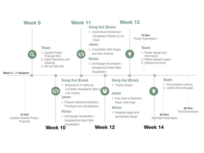
- Project Timeline
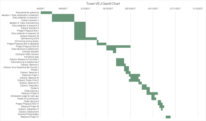
- Gantt Chart
References
- D3.js: https://d3js.org/
- Singapore Inbound Tourism Data: https://www.stb.gov.sg/statistics-and-market-insights/Pages/statistics-Visitor-Arrivals.aspx
- Singapore Tourism Board Marketing Strategy Report 2016: https://www.stb.gov.sg/news-and-publications/publications/Documents/Marketing_Strategy-Of_Stories_Fans_and_Channels.pdf
- CEIC Database: https://www.ceicdata.com/en
Comments
Feel free to leave comments / suggestions!

