Difference between revisions of "1718t1is428T6 Proposal"
Swkong.2014 (talk | contribs) |
Swkong.2014 (talk | contribs) |
||
| Line 287: | Line 287: | ||
[[File:1718t1is428t6Storyboard|framed|center|Storyboard]] | [[File:1718t1is428t6Storyboard|framed|center|Storyboard]] | ||
| − | 1. When users first load the map they will be greeted the above UI with only the hexbin map initialized while all the other visualisations will be unpopulated. All categories in the filter will be selected | + | 1. When users first load the map they will be greeted the above UI with only the hexbin map initialized while all the other visualisations will be unpopulated. All categories in the filter will be selected by default. <br> |
| − | 2. In the hexbin map, the size of the hexagon indicates the number of past transaction in the selected period, with larger size indicating more transactions, while the color intensity indicates the average price per square feet (PSF), with darker | + | 2. In the hexbin map, the size of the hexagon indicates the number of past transaction in the selected period, with larger size indicating more transactions, while the color intensity indicates the average price per square feet (PSF), with darker colour indicating a more expensive average PSF. <br> |
| − | 3. Users have the freedom to select the filters, such as the type of sales, type of property and time period to change their analysis. Upon changing the filters, the hexagon binning map will change to reflect the changes in the filter. | + | 3. Users have the freedom to select the filters, such as the type of sales, type of property and time period to change their analysis. Upon changing the filters, the hexagon binning map will change to reflect the changes in the filter. <br> |
| − | 4. For more information of each hexagon, user can hover over to reveal the tooltip that contains additional information. | + | 4. For more information of each hexagon, the user can hover over to reveal the tooltip that contains additional information. <br> |
| − | 5. Upon clicking a hexagon in the hexbin map, the map on | + | 5. Upon clicking a hexagon in the hexbin map, the map on the right will show the zoom-in view of the hexagon which contains the projects located within it. Similarly, users can hover over it to find more details of the project.<br> |
| − | 6. Users will then be able to click on the individual projects to add it into the 3 charts at the bottom of the application to explore and compare between multiple projects. After clicking on a project, the hexagon which contains the property will be highlighted to indicate that a project from the hexagon has been selected. Projects from different hexagon can be selected for comparison in the charts below. | + | 6. Users will then be able to click on the individual projects to add it into the 3 charts at the bottom of the application to explore and compare between multiple projects. After clicking on a project, the hexagon which contains the property will be highlighted to indicate that a project from the hexagon has been selected. Projects from different hexagon can be selected for comparison in the charts below.<br> |
| − | 7. The purpose of the three charts at the bottom are as follow: | + | 7. The purpose of the three charts at the bottom are as follow:<br> |
| − | Historical price line graph: facilitates the historical price comparison of the monthly average PSF for the selected projects against each other, Singapore’s average and the average of all the currently selected projects. | + | :::a) Historical price line graph: facilitates the historical price comparison of the monthly average PSF for the selected projects against each other, Singapore’s average and the average of all the currently selected projects.<br> |
| − | Historical Volume stacked bar chart: visualises the proportionality of each property’s transaction volume over each month provides additional insight into demand and supply | + | :::b) Historical Volume stacked bar chart: visualises the proportionality of each property’s transaction volume over each month provides additional insight into demand and supply<br> |
| − | Price per square feet by floor & size scatter plot: facilitates exploration of the effect the level and size of the property on the price for the various projects. Users will be able to scroll over to explore more details of the transactions. | + | :::c) Price per square feet by floor & size scatter plot: facilitates exploration of the effect the level and size of the property on the price for the various projects. Users will be able to scroll over to explore more details of the transactions.<br> |
| − | |||
| − | |||
| − | |||
| − | |||
| − | |||
| − | |||
| − | |||
| − | |||
| − | |||
| − | |||
| − | |||
| − | |||
| − | <br/><div style="background: #364558; padding: 15px; font-weight: bold; line-height: 0.3em; text-indent: 15px;letter-spacing:-0.08em;font-size:20px"><font color=#fbfcfd face="Century Gothic">ADDRESSING KEY TECHNICAL CHALLENGES</font></div> | + | <br/> |
| + | ==<div style="background: #364558; padding: 15px; font-weight: bold; line-height: 0.3em; text-indent: 15px;letter-spacing:-0.08em;font-size:20px"><font color=#fbfcfd face="Century Gothic">ADDRESSING KEY TECHNICAL CHALLENGES</font></div>== | ||
The following are some of the key technical challenges that we may face throughout the course of the project: | The following are some of the key technical challenges that we may face throughout the course of the project: | ||
{| class="wikitable" style="background-color:#FFFFFF;" width="100%" | {| class="wikitable" style="background-color:#FFFFFF;" width="100%" | ||
| Line 345: | Line 334: | ||
|} | |} | ||
| − | <br/><div style="background: #364558; padding: 15px; font-weight: bold; line-height: 0.3em; text-indent: 15px;letter-spacing:-0.08em;font-size:20px"><font color=#fbfcfd face="Century Gothic">PROJECT TIMELINE</font></div> | + | <br/> |
| + | ==<div style="background: #364558; padding: 15px; font-weight: bold; line-height: 0.3em; text-indent: 15px;letter-spacing:-0.08em;font-size:20px"><font color=#fbfcfd face="Century Gothic">PROJECT TIMELINE</font></div>== | ||
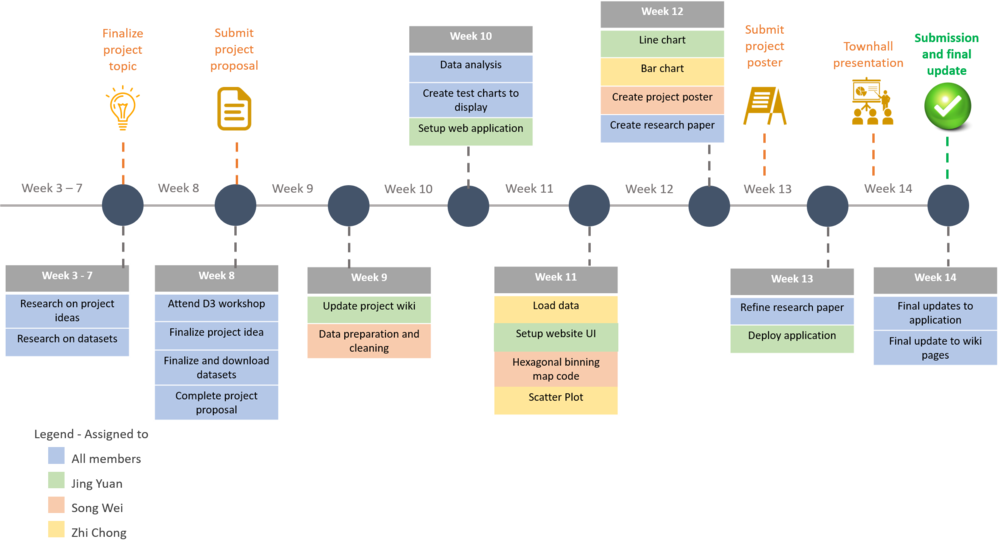
<p>The following shows our project timeline for the completion of this project:</p> | <p>The following shows our project timeline for the completion of this project:</p> | ||
[[File:JingYuan ProjectSchedule.png|1000px|center]] | [[File:JingYuan ProjectSchedule.png|1000px|center]] | ||
Revision as of 21:10, 15 October 2017
Contents
PROBLEM & MOTIVATION
Real Estate investment has always been a relatively safe choice for those seeking to gain decent returns on investment. It is the dream of many to retire early and earn a good passive rental income from their property. Although there are plenty of opportunities to make huge profits from a real estate investment, it is a lot arguably more complicated than investing in stocks and bonds due to the financial, geographical and legal issues that one has to consider. With the advancement of information technology, various analytical tools have been developed to guide buyers in making a better decision.
In Singapore, several analytical tools have been created to guide people in property purchase. The tools are mostly great but they might be lacking in certain areas which makes it less ideal for analysis.
Firstly, many analytical tools offer a highly aggregated geospatial overview of the real estate market in Singapore. Housing price reflects the various housing attributes of a property, such as the number of bedrooms, distance to MRT station, distance from expressway, amenities nearby and many other attributes. They can be summarised into two types- unit specific characteristics and location characteristics. Even within the same estate, housing price differ in the location characteristics such as distance from school, distance from MRT station. What this means is that the variation in the price of an estate is attributed to both unit specific characteristics as well as location factors, causing a high variance. As a result of the high variance within each estate, the average price per square foot of an estate is not a good indication of the price of a property in the area.
Furthermore, existing map visualisation are only able to show a single continuous variable – either price per square foot or volume of sales. Having to constantly switch between two chloropleths to understand both the volume distribution and price distribution makes analysis difficult and inefficient for the user.
Lastly, existing visualisations do not give users the freedom to aggregate values based on their preference, giving users less room for further analysis.
Therefore, we aim to develop an improved visualisation of the Singapore property market that offers a better analysis capabilities to meet the needs of analysts, investors and real estate agents.
OBJECTIVES
Our target audience are analysts, investors and real estate agents who are more interested in the patterns and trends of the property market.
With our visualisation, users are able to:
1. Analyse the geospatial patterns of the property market, such as the transaction and price distribution of different areas.
2. Analyse the time-series pattern of property prices
3. Compare the pricing trends of different projects
SELECTED DATASET
In our analysis, we will be using the following data:
| Dataset/Source | Data Attributes | Examples |
|---|---|---|
|
Project Name Address No. of Units Area (sqm) Type of Area Transacted Price ($) Nett Price($) Unit Price ($ psm) Unit Price ($ psf) Sale Date Property Type Tenure Completion Date Type of Sale Purchaser Address Indicator Postal District Postal Sector Postal Code Planning Region Planning Area |
AMBER SKYE 8 Amber Road #08-07 1 104 Strata 1869000 - 17971 1670 30-Jun-14 Apartment Freehold Uncompleted New Sale Private 15 43 439853 Central Region Marine Parade | |
|
|
Project Name Address Postal Code X Y |
Kovan Residence 3 Kovan Road #07-10 544917 29776.9544 31382.1849 |
BACKGROUND SURVEY OF RELATED WORKS
The following are some of the existing visualisation tool for the property market in Singapore:
| Related Works | Comments |
|---|---|
|
|
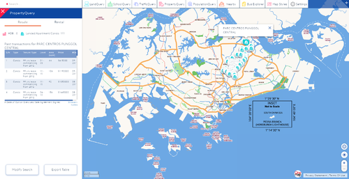
Pros: 1. Allows user to view the past transaction details of each condominium 2. Allows user to filter the housing characteristics, such as number of rooms to start their analysis Cons: 1. Detailed view shows a table with the most recent transaction details, which is useful for homebuyers but might not be useful for analysts or investors as they are more interested in the trend. 2. Good that it allows user to select the individual properties but symbols might overlap each making it difficult to click on the property of interest |
|
|
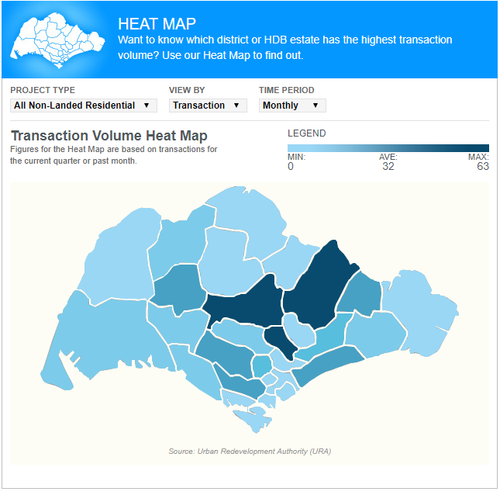
Pros: 1. Map does well in showing the popularity of each area in the non-landed residential property market, which allows user to gauge the demand of each area. Cons: 1. Map does not allow one to drill down to find out which project is the key driver in the area. 2. The map does not interact with other charts on the page. All the charts on the page are standalone charts. As a result, there is no sequential flow of analysis. |
|
|
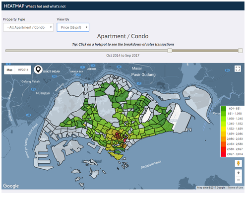
Pros: 1. Users could hover over to view the psf/ volume without having to click on it 2. Clicking on the area of interest shows the recent transaction in the area, which is a good information for homebuyers 3. Aggregating average price per square foot by sub-estate is more precise than aggregating average price per square foot by estate 4. Allows user to select the period for analysis Cons: 1. Price per square foot estimate can be more precise by using a less aggregated average price per square foot 2. It is difficult and time consuming to constantly switch between the heatmap by volume and heatmap by psf for analysis. |
In developing our visualisation, we will retain the good points from the existing visualisations and improve the points that can be done better.
DESIGN INSPIRATIONS
Other than looking at related work, we can also reference and look for inspirations from other interactive visualizations created by others.
| Reference of Other Interactive Visualization | What Can We Learn? |
|---|---|
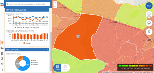
| An analysis of property pricing in Singapore Source: https://app.vizili.com/explore |
Hover over technique: |
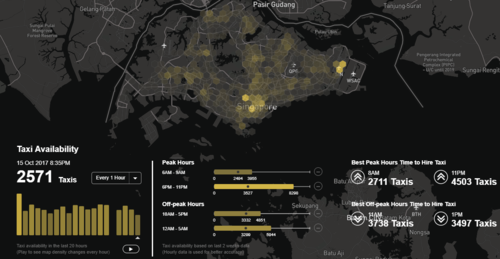
| An analysis of taxi availability in Singapore |
Hexagonal binning: |
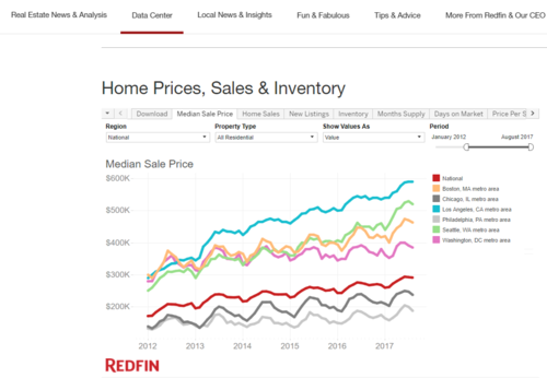
| An analysis of home prices, sales and inventory in U.S. |
Filter: |
PROPOSED STORYBOARD
1. When users first load the map they will be greeted the above UI with only the hexbin map initialized while all the other visualisations will be unpopulated. All categories in the filter will be selected by default.
2. In the hexbin map, the size of the hexagon indicates the number of past transaction in the selected period, with larger size indicating more transactions, while the color intensity indicates the average price per square feet (PSF), with darker colour indicating a more expensive average PSF.
3. Users have the freedom to select the filters, such as the type of sales, type of property and time period to change their analysis. Upon changing the filters, the hexagon binning map will change to reflect the changes in the filter.
4. For more information of each hexagon, the user can hover over to reveal the tooltip that contains additional information.
5. Upon clicking a hexagon in the hexbin map, the map on the right will show the zoom-in view of the hexagon which contains the projects located within it. Similarly, users can hover over it to find more details of the project.
6. Users will then be able to click on the individual projects to add it into the 3 charts at the bottom of the application to explore and compare between multiple projects. After clicking on a project, the hexagon which contains the property will be highlighted to indicate that a project from the hexagon has been selected. Projects from different hexagon can be selected for comparison in the charts below.
7. The purpose of the three charts at the bottom are as follow:
- a) Historical price line graph: facilitates the historical price comparison of the monthly average PSF for the selected projects against each other, Singapore’s average and the average of all the currently selected projects.
- b) Historical Volume stacked bar chart: visualises the proportionality of each property’s transaction volume over each month provides additional insight into demand and supply
- c) Price per square feet by floor & size scatter plot: facilitates exploration of the effect the level and size of the property on the price for the various projects. Users will be able to scroll over to explore more details of the transactions.
- a) Historical price line graph: facilitates the historical price comparison of the monthly average PSF for the selected projects against each other, Singapore’s average and the average of all the currently selected projects.
ADDRESSING KEY TECHNICAL CHALLENGES
The following are some of the key technical challenges that we may face throughout the course of the project:
| Key Technical Challenges | How We Propose To Resolve |
|---|---|
|
Lack of experience in using D3.js and Javascript |
|
|
Lack of experience in implementing interactivity and animated designs in viz application. |
|
|
Data cleaning and transformation |
|
|
Unfamiliar with hosting of web application on server |
|
PROJECT TIMELINE
The following shows our project timeline for the completion of this project:
The following are some of the tools/technologies that we will be utilizing during the project:
- D3.js (Creating charts)
- Leaflet.js (For map)
- Sublime Text (For coding)
- EasyPHP (hosting on localhost)
- Photoshop (Modifying images)
An analysis of property pricing in Singapore (https://app.vizili.com/explore)
An analysis of taxi availability in Singapore (https://yongquanben.github.io/sg_taxi_availability/)
An analysis of home prices, sales and inventory in U.S. (https://www.redfin.com/blog/data-center)
D3.js (https://d3js.org/)
Examples of D3 charts by Mike Bostock (https://bost.ocks.org/mike/example/)
Related Works 1 (https://www.onemap.sg/main/v2/propertyquery)
Related Works 2 (http://www.stproperty.sg/singaporepropertywatch)
Related Works 3 (https://www.edgeprop.sg/analytic/heatmap)
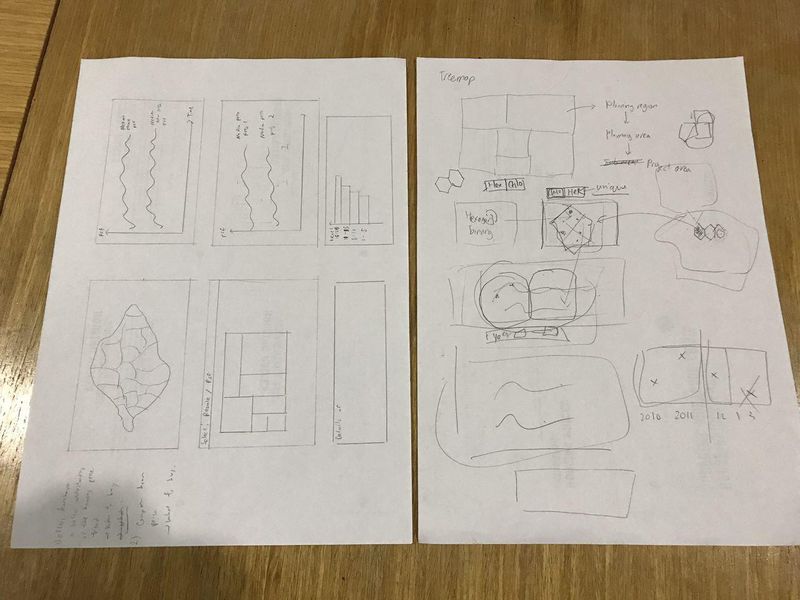
The following show the proposed storyboard that we designed during our brainstorming sessions:
These are some of the sketches we have done during our fruitful meetings. However, the final idea is still based on the proposed storyboard after few consultations with Prof. Kam.
All comments are welcomed
