Difference between revisions of "IS428 2017-18 T1 Assign Cheryl Chiam"
| Line 157: | Line 157: | ||
|- | |- | ||
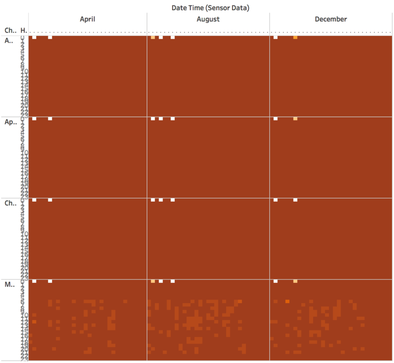
| Issue || Many sensors for Methylosmolene are consistently down compared to the rest of the chemicals. The darkest brown shows a monitor count of 9. The lighter brown shows an 8. Missing monitor occurrence is most frequent in Methylosmolene (last row). From background context, we understand that Methylosmolene is toxic. | | Issue || Many sensors for Methylosmolene are consistently down compared to the rest of the chemicals. The darkest brown shows a monitor count of 9. The lighter brown shows an 8. Missing monitor occurrence is most frequent in Methylosmolene (last row). From background context, we understand that Methylosmolene is toxic. | ||
| − | Perhaps there could be tampering with the sensors to affect the true readings. Or it could be just that the sensors for that chemical is faulty. | + | Perhaps there could be tampering with the sensors to affect the true readings. Or it could be just that the sensors for that chemical is faulty as seen by the pattern in missing sensors occurring in the same bottom left region for each pane (certain days and hours are always unaffected). |
''Question: Which sensor shows missing records? '' | ''Question: Which sensor shows missing records? '' | ||
Revision as of 16:15, 8 October 2017
To be a Visual Detective
Contents
Links
Problem & Motivation
Mistford is a mid-size city is located to the southwest of a large nature preserve. The city has a small industrial area with four light-manufacturing endeavors. Mitch Vogel is a post-doc student studying ornithology at Mistford College and has been discovering signs that the number of nesting pairs of the Rose-Crested Blue Pipit, a popular local bird due to its attractive plumage and pleasant songs, is decreasing! The decrease is sufficiently significant that the Pangera Ornithology Conservation Society is sponsoring Mitch to undertake additional studies to identify the possible reasons. Mitch is gaining access to several datasets that may help him in his work, and he has asked you (and your colleagues) as experts in visual analytics to help him analyze these datasets.
Mitch Vogel was immediately suspicious of the noxious gases just pouring out of the smokestacks from the four manufacturing factories south of the nature preserve. He was almost certain that all of these companies are contributing to the downfall of the poor Rose-crested Blue Pipit bird. But when he talked to company representatives and workers, they all seem to be nice people and actually pretty respectful of the environment.
In fact, Mitch was surprised to learn that the factories had recently taken steps to make their processes more environmentally friendly, even though it raised their cost of production. Mitch discovered that the state government has been monitoring the gaseous effluents from the factories through a set of sensors, distributed around the factories, and set between the smokestacks, the city of Mistford and the nature preserve. The state has given Mitch access to their air sampler data, meteorological data, and locations map. Mitch is very good in Excel, but he knows that there are better tools for data discovery, and he knows that you are very clever at visual analytics and would be able to help perform an analysis.
General task
The four factories in the industrial area are subjected to higher-than-usual environmental assessment, due to their proximity to both the city and the preserve. Gaseous effluent data from several sampling stations has been collected over several months, along with meteorological data (wind speed and direction), that could help Mitch understand what impact these factories may be having on the Rose-Crested Blue Pipit. These factories are supposed to be quite compliant with recent years’ environmental regulations, but Mitch has his doubts that the actual data has been closely reviewed. Could visual analytics help him understand the real situation?
The primary job for Mitch is to determine which (if any) of the factories may be contributing to the problems of the Rose-crested Blue Pipit. Often, air sampling analysis deals with a single chemical being emitted by a single factory. In this case, though, there are four factories, potentially each emitting four chemicals, being monitored by nine different sensors. Further, some chemicals being emitted are more hazardous than others. Your task, as supported by visual analytics that you apply, is to detangle the data to help Mitch determine where problems may be. Use visual analytics to analyze the available data and develop responses to the questions below.
Dataset Analysis & Transformation Process
| Activity #1 | Clean and Prepare Meteorological Data for Interpolation |
|---|---|
| Steps |
(We will be using MD.csv for interpolation.) Created files:
|
| Results |
| Activity #2 | Interpolate Meteorological Data |
|---|---|
| Steps |
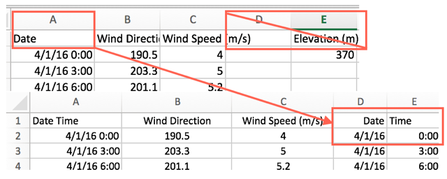
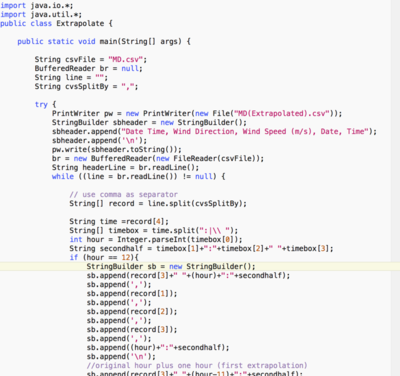
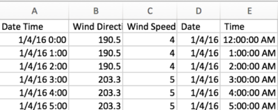
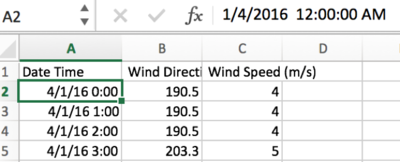
As the records are in three hour intervals, the hours in between are not present. To aid the investigation, I hold the assumption that the next 2 hours after each wind reading follows the same readings taken at the original hour. Eg. 00:00’s wind speed and wind direction will be the same for 01:00 and 02:00. I carried out this interpolation by writing an Interpolation java program from scratch after editing the fields in MD.csv to a suitable Date/Time format and removing header. Basically, it reads through each line in the csv and then separates each field by looking at the delimiter. It will focus on the Time field, carrying out an additional separation of hours and minutes. If the hours are any of the 3 hour intervals, it will add a that timing’s record into the newly created csv called MeteorologicalData(Interpolate).csv along with two more records for the next two hours with the copied data. After csv is generated, I changed the Date Time format to follow Sensor Data’s format and removed columns Date and Time since it’s not needed anymore. Created files:
|
| Results |
Direct Results of the program shown in MeteorologicalData(Interpolate).csv: After editing the csv generated to follow Sensor Data’s format: |
| Activity #3 | Create Locations.xlsx |
|---|---|
| Steps |
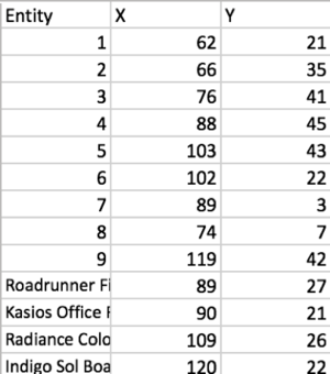
From the description document, we can record the factorys’ X,Y coordinates and combined with the sensors’ coordinates. Created files:
|
| Results |
| Activity #4 | Inverse Map Colour |
|---|---|
| Steps |
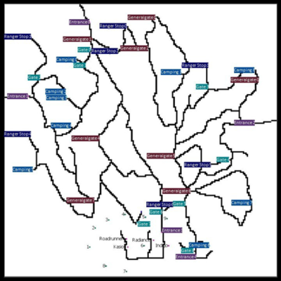
Used external tool to inverse map colour for clearer and more focused display if showing diagrams on it. Created files:
|
| Results |
Files that we would be using for our visualization:
- MeteorologicalData(Interpolate) (created)
- Sensor Data.xlsx (original)
- Locations.xlsx (created)
- InverseMap.png (created)
Dataset import structure/ Process
| Import #1 | Data |
|---|---|
| Explanation |
|
| Solution |
| Import #1 | Map |
|---|---|
| Explanation |
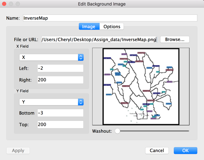
Map follows the following configurations shown in image. |
| Solution |
The Specific tasks
Task 1 Findings
Characterize the sensors’ performance and operation. Are they all working properly at all times? Can you detect any unexpected behaviors of the sensors through analyzing the readings they capture? Limit your response to no more than 9 images and 1000 words.
| Problem #1 | Not all Sensors are recording 4 chemical readings | ||||||
|---|---|---|---|---|---|---|---|
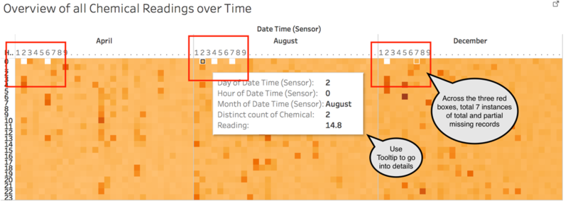
| Issue | Seven abnormal missing chemical reading counts all occurring at 0000h.
Using tooltips interactive tool, we can delve in deeper.
Questions: Were the missing chemical readings for one chemical or a few? Next visualization examines the Monitor count per chemical. | ||||||
| Solution |
Heatmap: Darker colour represents higher chemical reading. Size of square indicates number of readings. Zero readings = empty, 4 readings = filled. |
| Problem #2 | Sensors for Methylosmolene are faulty |
|---|---|
| Issue | Many sensors for Methylosmolene are consistently down compared to the rest of the chemicals. The darkest brown shows a monitor count of 9. The lighter brown shows an 8. Missing monitor occurrence is most frequent in Methylosmolene (last row). From background context, we understand that Methylosmolene is toxic.
Perhaps there could be tampering with the sensors to affect the true readings. Or it could be just that the sensors for that chemical is faulty as seen by the pattern in missing sensors occurring in the same bottom left region for each pane (certain days and hours are always unaffected). Question: Which sensor shows missing records? The next visualization would help us see which monitor is down as we focus on those dates with at least one missing monitor count (aka not 9/light brown). |
| Solution |
Y axis: Hours X axis: Days |
| Problem #3 | Sensors duplicating data/misassignment of data |
|---|---|
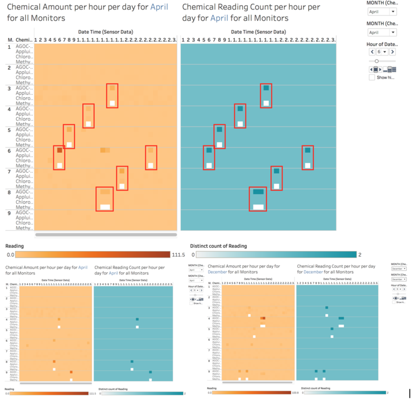
| Issue | Orange Visualization: Chemical Reading Amounts. Blue Visualization: Chemical Reading Count.
Using the previous visualization as a basis, we pick a period to focus on. Using the filters in this visualization, we zoom in to the relevant Month. All monitors are displayed for each day (x-axis), due to pages filter, the visualization changes per hour. Looking at the Orange visualization, we can observe that When there are missing Methylosmolene recordings, there are higher AGOC-3A recordings, across different timings and over the months. But what is the cause of this? The Blue visualization gives us some clues. When Methylosmolene has missing records, AGOC-3A gains an extra record and the readings for AGOC-3A are high not because of the readings alone being high but because there are actually TWO readings for the same day + date +hour, essentially there are duplicated readings. The images shows three excerpts of the hour(pages) display. First two shows that this abnormal behaviour is across the day at different timings. Last picture shows that this pattern is observed in other months too. Hence a possible explanation to explain the consistent pattern of missing Methylosmolene is possibly wrong assignment of records, as if Methylosmolene recordings went to AGOC-3A. It is unlikely Methylosmolene was genuinely 0 as the other hours and days do not display it throughout. Whether this is due to tampering of the sensors is unknown, but this is seen generally across the sensors. There is a very strong positive correlation. Question: Any other trend in sensors? The next visualization help us see the overall picture for sensor performance. |
| Solution |
| Problem #4 | Sensor 4 likely to be faulty |
|---|---|
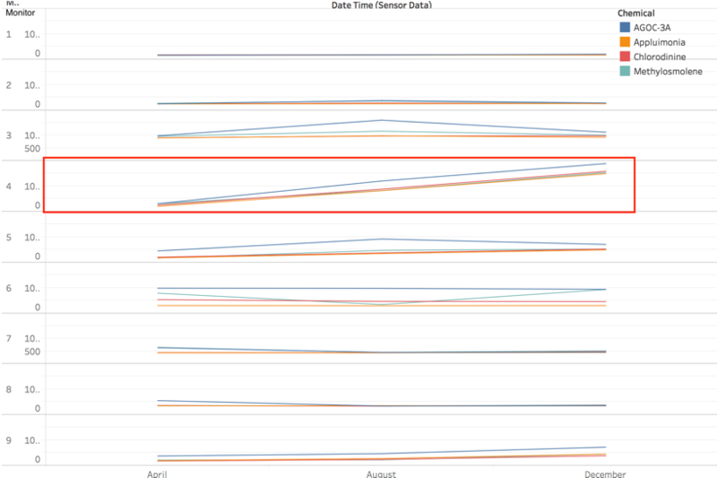
| Issue | Plotting time over months, it seems like only Sensor 4 shows a constant increase in recordings. The rest are all rather consistent. |
| Solution |
Task 2 Findings
Now turn your attention to the chemicals themselves. Which chemicals are being detected by the sensor group? What patterns of chemical releases do you see, as being reported in the data? Limit your response to no more than 6 images and 500 words.
Task 3 Findings
Which factories are responsible for which chemical releases? Carefully describe how you determined this using all the data you have available. For the factories you identified, describe any observed patterns of operation revealed in the data. Limit your response to no more than 8 images and 1000 words.
