Difference between revisions of "IS428 2017 18T1 Group02 Proposal"
| Line 32: | Line 32: | ||
<div style="background: #347473; padding: 15px; font-weight: bold; line-height: 0.3em; text-indent: 15px;letter-spacing:-0.08em;font-size:20px"><font color=#fbfcfd face="Century Gothic">PROBLEM & MOTIVATION</font></div> | <div style="background: #347473; padding: 15px; font-weight: bold; line-height: 0.3em; text-indent: 15px;letter-spacing:-0.08em;font-size:20px"><font color=#fbfcfd face="Century Gothic">PROBLEM & MOTIVATION</font></div> | ||
The main motivation for this project was the fact that current applications which attempt to help users make a better decision about their future home are very superficial. It looks cool and interactive but it does not really help a person make a better choice on which house is a good investment. | The main motivation for this project was the fact that current applications which attempt to help users make a better decision about their future home are very superficial. It looks cool and interactive but it does not really help a person make a better choice on which house is a good investment. | ||
| − | The reason why we say this is because we have always heard the old saying, you should buy a house at a good location, but what exactly is a good location? An article taken from HOME&DÉCOR | + | The reason why we say this is because we have always heard the old saying, you should buy a house at a good location, but what exactly is a good location? An article taken from [http://www.homeanddecor.com.sg/blogs/property-you-buy-your-dream-resale-hdb-flat HOME&DÉCOR], a website which specialized in information related to homes gave a very detailed list of steps on the information a person should look for before making a purchase of a new home? Everyone talks about it, but no one has actually properly visualized it and attempted to make it easier for people to understand this pricing factor known as its location. Thus, we sought to find a dataset which can help us create visualization which would help us achieve the goal of helping users make a better decision on which house they should get. Unfortunately, most datasets are not useful in providing us with any insights unless a good amount of data cleaning and wrangling is done. For example, transaction data taken from data.gov.sg only gives you the block number and road name with no postal code. How is that useful? Therefore, one of our primary goals is to come up with a visualization which would provide users with a good visual representation about the resale market in Singapore and give people access to a better data set than the ones currently out there. On top of that, we want to create an easy-to-use visualization tool that can help people analyze the historical flat data so that users can see which flats in Singapore would be the most value for money so that users can actually buy a home which is worth its investment. We also felt that it would be interesting to explore the patterns in the resale flat prices and see what factors really affect the prices of HDBs and find out how much of a premium people attach to amenities such as proximity to public transport, age of the lease, schools and etc... |
Revision as of 22:55, 24 November 2017
The main motivation for this project was the fact that current applications which attempt to help users make a better decision about their future home are very superficial. It looks cool and interactive but it does not really help a person make a better choice on which house is a good investment. The reason why we say this is because we have always heard the old saying, you should buy a house at a good location, but what exactly is a good location? An article taken from HOME&DÉCOR, a website which specialized in information related to homes gave a very detailed list of steps on the information a person should look for before making a purchase of a new home? Everyone talks about it, but no one has actually properly visualized it and attempted to make it easier for people to understand this pricing factor known as its location. Thus, we sought to find a dataset which can help us create visualization which would help us achieve the goal of helping users make a better decision on which house they should get. Unfortunately, most datasets are not useful in providing us with any insights unless a good amount of data cleaning and wrangling is done. For example, transaction data taken from data.gov.sg only gives you the block number and road name with no postal code. How is that useful? Therefore, one of our primary goals is to come up with a visualization which would provide users with a good visual representation about the resale market in Singapore and give people access to a better data set than the ones currently out there. On top of that, we want to create an easy-to-use visualization tool that can help people analyze the historical flat data so that users can see which flats in Singapore would be the most value for money so that users can actually buy a home which is worth its investment. We also felt that it would be interesting to explore the patterns in the resale flat prices and see what factors really affect the prices of HDBs and find out how much of a premium people attach to amenities such as proximity to public transport, age of the lease, schools and etc...
In this project, we are interested to create a visualisation that helps users gain the following insights:
- Which areas are under-valued and worth investing in.
- How much have housing prices grown since the last recession in 2008 till now.
- Which flat types are the most active in the resale market and which types are a better for investment purposes.
By using our visualisation, we will be able to give users a better idea of the pricing situation of the resale HDBs so that people can make better decisions in the HDB which they want to choose to call their home.
In our analysis, we will only be using data within the year of 1990 - 2017. The rationale for the range of data selected is as follows:
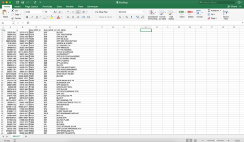
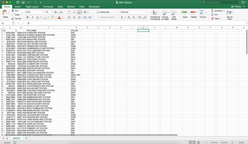
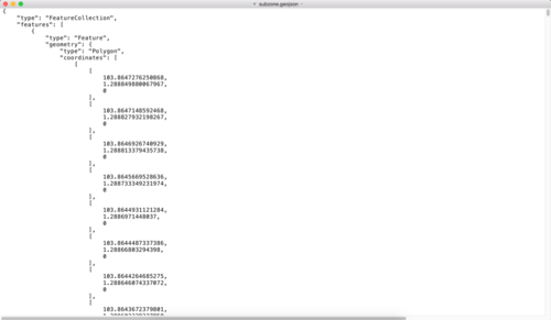
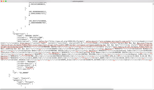
The dataset for analysis will be retrieved from multiple databases, as elaborated below:
| Dataset/Source | Data Attributes | Rationale Of Usage |
|---|---|---|
(https://data.gov.sg/dataset/resale-flat-prices?resource_id=83b2fc37-ce8c-4df4-968b-370fd818138b ) (https://data.gov.sg/dataset/resale-flat-prices?resource_id=8c00bf08-9124-479e-aeca-7cc411d884c4 ) (https://data.gov.sg/dataset/resale-flat-prices?resource_id=adbbddd3-30e2-445f-a123-29bee150a6fe ) |
|
|
(https://www.mytransport.sg/content/mytransport/home/dataMall.html#) |
|
|
(https://www.mytransport.sg/content/mytransport/home/dataMall.html#) |
|
|
(https://data.gov.sg/dataset/master-plan-2014-subzone-boundary-no-sea) |
|
|
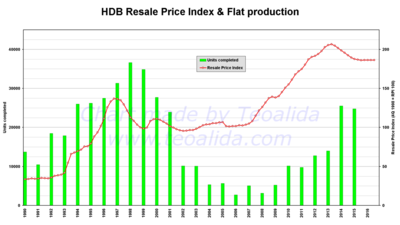
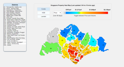
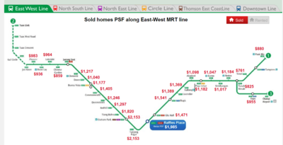
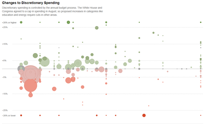
There are many charts and visualisations available which illustrates the various trends of house prices and index. We have selected a few of these to study and learn before we begin developing our own visualizations.
| Related Works | What We Can Learn |
|---|---|
|
|
|
| |
| |
|
| Proposed Layout | How Analyst Can Conduct Analysis |
|---|---|
| |
| |
|
|
The following are some of the key technical challenges that we may face throughout the course of the project:
| Key Technical Challenges | How We Propose To Resolve |
|---|---|
| |
| |
| |
|
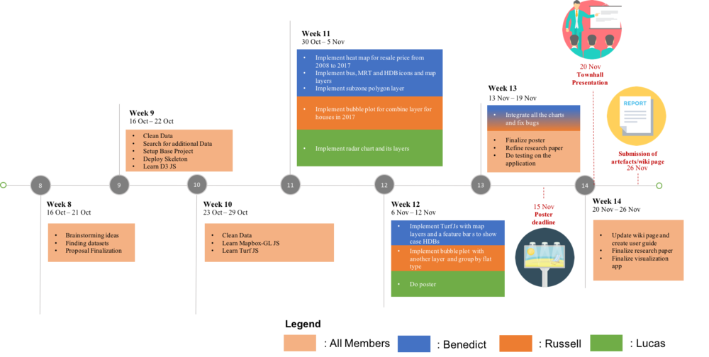
The following shows our project timeline for the completion of this project:
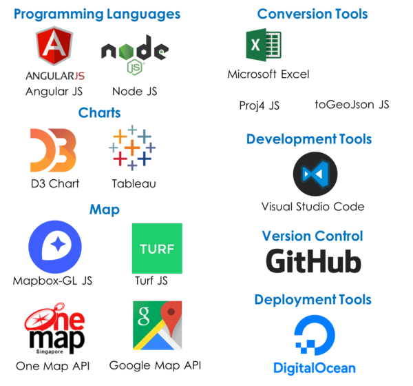
The following are some of the tools/technologies that we will be utilizing during the project:
- DrWealth’s infographic (https://www.drwealth.com/singapore-property-prices-along-mrt-lines/)
- Data Gov Database (https://data.gov.sg)
- D3.js (https://d3js.org/)
- Examples By Mike Bostock (https://bost.ocks.org/mike/example/)
- Housing Development Board (http://www.hdb.gov.sg/cs/infoweb/residential/buying-a-flat/resale/resale-statistics)
- [1]PROPERTY: Before you buy your dream resale HDB flat. Retrieved November 23, 2017, from http://www.homeanddecor.com.sg/blogs/property-you-buy-your-dream-resale-hdb-flat
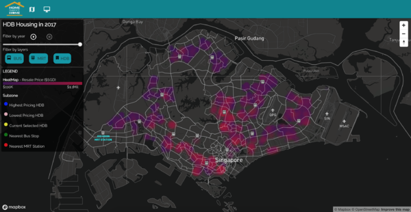
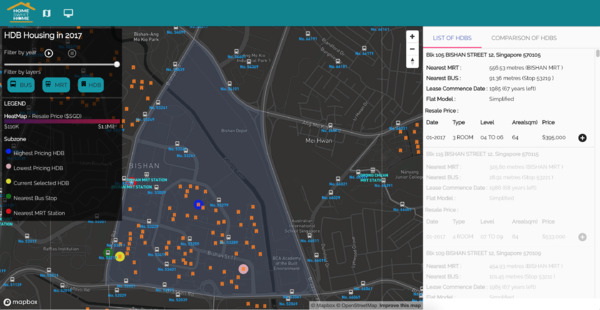
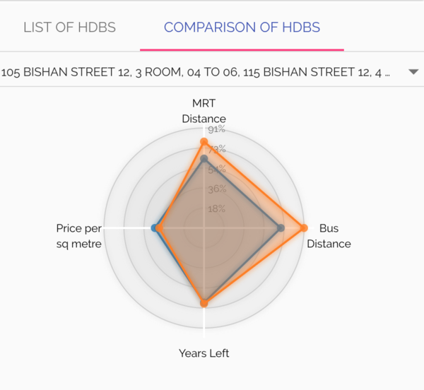
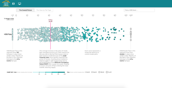
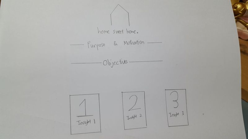
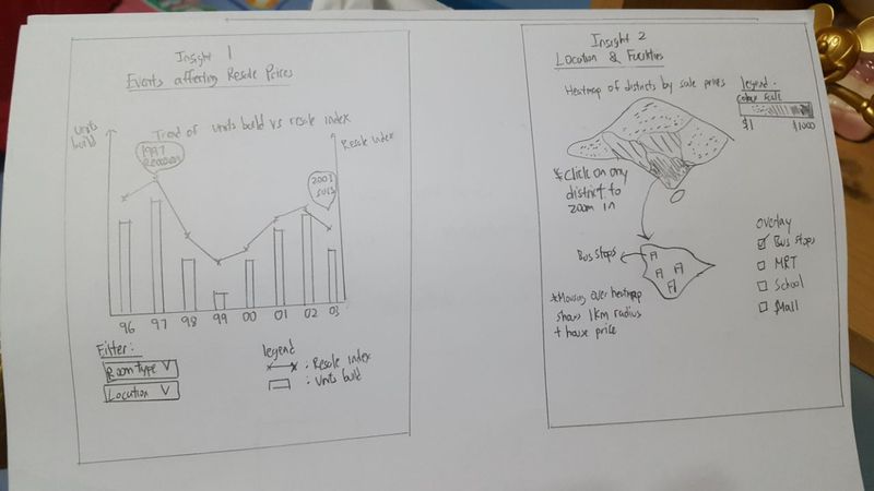
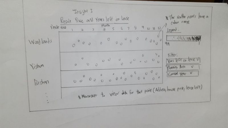
The following are some of the proposed storyboard that we designed during our brainstorming sessions:
Our idea was to provide charts which are able to visualise the trends of HDB over the years in Singapore. We decided to split into multiple charts to be able to showcase the information more clearly.
Feel free to comments, suggestions and feedbacks to help us improve our project! (:

