Difference between revisions of "1718t1is428T13"
| Line 90: | Line 90: | ||
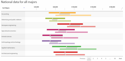
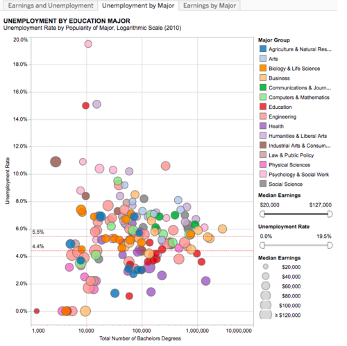
| <center> [[File:DUOteamV1.jpg|500px|frameless|center]] </center> <br> <center>Source: http://ideasillustrated.com/blog/2011/11/28/earnings-and-unemployment-by-college-major/</center>|| | | <center> [[File:DUOteamV1.jpg|500px|frameless|center]] </center> <br> <center>Source: http://ideasillustrated.com/blog/2011/11/28/earnings-and-unemployment-by-college-major/</center>|| | ||
| − | A divergent bar chart provides useful insights with regards to a specific course and is useful in telling the distribution of pay. | + | *A divergent bar chart provides useful insights with regards to a specific course and is useful in telling the distribution of pay. |
|- | |- | ||
Revision as of 21:50, 16 October 2017
Visual Analytics Project
Contents
Problem and Motivation
Problem:
The Graduate Employment Survey (GES) is conducted on a yearly basis to provide insights about the job prospects about a particular course. The Ministry of Education conduct these surveys yearly for both University and Polytechnics in Singapore. However, the results of these surveys are not interactive and does not provide any trends and insights.
Motivation:
As graduates to be who going to enter the job market soon, we felt that it would be interesting to look at the historical salary data to know the gauge of our expected salary, the demand in the job market and as well our position in term of starting salary among our fellow school peers. In addition, we also felt that it would be interesting to find out whether does the starting salary affects the intake for the course in that year. Furthermore, we hope that our visualizations would help students from Secondary Schools and Junior Colleges decide their courses choices with regards to its career prospects as it would be interesting to find out what are the top paid salary programmes through the year, and the changes to the market demands.
Objectives
In this project, we are interested to create a visualisation application that helps users perform and answer the following:
1. Visualise Ranking of Highest Starting Salary throughout the years
2. To find out intake trends for tertiary courses in Singapore
3. To find out the trend of the Starting Salary and the employment rate over the years with regards to the courses
4. To find out the popularity of the courses by intake, and what new courses are been introduced or omitted over the years
Dataset Description
| DataSet | Description |
|---|---|
| |
| |
| |
| |
| |
|
Background Research and Survey of Related Work
| Visualization | Explanation |
|---|---|
| |
| |
|
Key Technical Challenges
| Key Technical Challenges | Mitigation Plan |
|---|---|
| |
| |
|
Proposed Visualization
Tools & Libraries
- Tableau
- Microsoft Excel
- Photoshop
- D3.js Library
- HTML, CSS & JavaScript
- Github
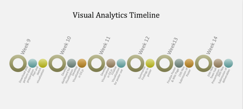
Project Timeline
References
- Data Gov : https://data.gov.sg/search?groups=education
- Salary SG : http://www.salary.sg/
- Visualisation of SG Graduate Salary : http://pay.sgcharts.com/
- Digital Senior : http://digitalsenior.sg/graduate-employment-survey-ges-nus-ntu-smu/
Comments
Feel free to give us comments!


