Difference between revisions of "1718t1is428T7"
| Line 62: | Line 62: | ||
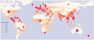
Interactive Filled World Map<br> [[File:G1t7_proposal_map.png|300px]]<br />Source: [http://www.unodc.org/wdr2016/interactive-map.html link] </strong> | Interactive Filled World Map<br> [[File:G1t7_proposal_map.png|300px]]<br />Source: [http://www.unodc.org/wdr2016/interactive-map.html link] </strong> | ||
| style="font-family:Open Sans, Arial, sans-serif; text-align: left; padding:3px 10px; border-bottom:solid 1px #d8d8d8" | | | style="font-family:Open Sans, Arial, sans-serif; text-align: left; padding:3px 10px; border-bottom:solid 1px #d8d8d8" | | ||
| − | + | Example shows the different intensity of percentage of the population affected by drug abuse and the total number of drug abusers as shape circle.<br> | |
<b>Pros:</b> | <b>Pros:</b> | ||
*Able to see an general picture of the drug landscape. | *Able to see an general picture of the drug landscape. | ||
| Line 117: | Line 117: | ||
<div style="margin:0px; padding: 10px; background: #f2f4f4; font-family: Open Sans, Arial, sans-serif; border-radius: 7px; text-align:left"> | <div style="margin:0px; padding: 10px; background: #f2f4f4; font-family: Open Sans, Arial, sans-serif; border-radius: 7px; text-align:left"> | ||
[[File:G1t7_proposal_storyboard.PNG|600px|center]] | [[File:G1t7_proposal_storyboard.PNG|600px|center]] | ||
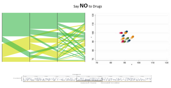
| − | + | Main dashboard should show the overview information of the drugs e.g. the screenshot above.<br> | |
| − | + | <br> | |
| − | + | First chart on the top left will be a parallel set, showing the relationship between countries and the different drug use. Sets should be customisable to enable different views.<br> | |
| − | + | <br> | |
| − | + | The next chart on the right will be a scatter plot. It will show the various statistics of a drug and be able to provide insights of the relationship between different groups of drugs. Chart will also show the trace line of each bubble. By selecting the individual bubble, the user can see another dashboard will more drill down information of that specific drug.<br> | |
| + | <br> | ||
| + | The bottom chart will double as a adjustable timeline as well as a line graph showing the ups and downs over the years. Special milestone that affects the line will also be labelled. Adjusting this graph will filter the data that will be shown on the two charts above. | ||
</div> | </div> | ||
Revision as of 12:18, 13 October 2017
Contents
Problem and Motivation
TEXT
TEXT
TEXT
Objectives
TEXT
TEXT
Data Source
Datasets are retrieved from https://data.unodc.org/ and http://www.emcdda.europa.eu/data/stats2017_en.
These two sites provides comprehensive and diverse data regarding drugs.
Data Snippet

References to Related Work
| Screenshots | What we can learn |
|
Interactive Filled World Map |
Example shows the different intensity of percentage of the population affected by drug abuse and the total number of drug abusers as shape circle.
Cons:
|
|
Stacked Distribution Pipeline |
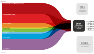
Example showcase a beautifully designed stacked bar, showing the ratio of revenue brought in by each type of drug that fuels the different types of activities at the right end of the chart.
Cons:
|
|
Price OHLC |
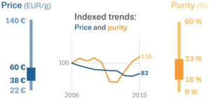
Example shows the price level, high and low for a type of drug along the years.
Cons:
|
|
Drug Prevalence Boxplot |
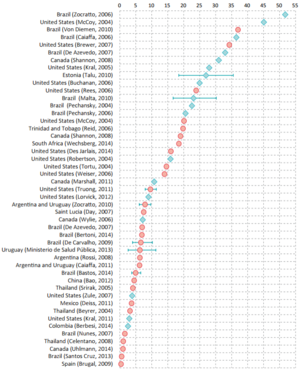
Example shows the prevalence of a drug abuse in each country
Cons:
|
Storyboard
Main dashboard should show the overview information of the drugs e.g. the screenshot above.
First chart on the top left will be a parallel set, showing the relationship between countries and the different drug use. Sets should be customisable to enable different views.
The next chart on the right will be a scatter plot. It will show the various statistics of a drug and be able to provide insights of the relationship between different groups of drugs. Chart will also show the trace line of each bubble. By selecting the individual bubble, the user can see another dashboard will more drill down information of that specific drug.
The bottom chart will double as a adjustable timeline as well as a line graph showing the ups and downs over the years. Special milestone that affects the line will also be labelled. Adjusting this graph will filter the data that will be shown on the two charts above.
Key Technical Challenges
Inexperienced with data visualisation tools
New to D3.js and Javascript
Data cleaning and transformation
Project Schedule
Tools/Technologies
These are the tools and technologies that we will be learning and implementing for this project:
- Tableau
- Microsoft Excel
- D3.js
- Chart.js
- AngularJS
- Adobe Illustrator
References
Our Team
Group 7
Fan Kaiyang
Mark Ng Wei Jie
Gary Quek Jian Zhang

