Difference between revisions of "1718t1is428T13"
| (63 intermediate revisions by 2 users not shown) | |||
| Line 3: | Line 3: | ||
<!--Header--> | <!--Header--> | ||
| − | + | ||
<!--/Header--> | <!--/Header--> | ||
| − | {|style="background-color:# | + | {|style="background-color:#131E40; color:#4d79ff; padding: 10 0 10 0;" width="100%" cellspacing="0" cellpadding="0" valign="top" border="0" | |
| − | | style="padding:0.2em; font-size:100%; background-color:# | + | | style="padding:0.2em; font-size:100%; background-color:#4286f4; text-align:center; color:#F5F5F5" width="10%" | |
| − | [[ | + | [[1718t1is428T13 |<font color="#F5F5F5" size=2 face="sans-serif"><b>PROPOSAL</b></font>]] |
| + | |||
| + | | style="background:none;" width="1%" | | ||
| + | | style="padding:0.2em; font-size:100%; background-color:#131E40; border-bottom:0px solid #4286f4; text-align:center; color:#F5F5F5" width="10%" | | ||
| + | [[1718t1is428T13_Poster|<font color="#F5F5F5" size=2 face="sans-serif"><b>POSTER</b></font>]] | ||
| style="background:none;" width="1%" | | | style="background:none;" width="1%" | | ||
| − | | style="padding:0.2em; font-size:100%; background-color:# | + | | style="padding:0.2em; font-size:100%; background-color:#131E40; border-bottom:0px solid #3D9DD7; text-align:center; color:#F5F5F5" width="10%" | |
| − | [[ | + | [[1718t1is428T13_Application|<font color="#F5F5F5" size=2 face="sans-serif"><b>APPLICATION</b></font>]] |
| style="background:none;" width="1%" | | | style="background:none;" width="1%" | | ||
| − | | style="padding:0.2em; font-size:100%; background-color:# | + | | style="padding:0.2em; font-size:100%; background-color:#131E40; border-bottom:0px solid #3D9DD7; text-align:center; color:#F5F5F5" width="10%" | |
| − | [[ | + | [[1718t1is428T13_Research Paper|<font color="#F5F5F5" size=2 face="sans-serif"><b>RESEARCH PAPER</b></font>]] |
| style="background:none;" width="1%" | | | style="background:none;" width="1%" | | ||
| − | | style="padding:0.2em; font-size:100%; background-color:# | + | | style="padding:0.2em; font-size:100%; background-color:#131E40; border-bottom:0px solid #3D9DD7; text-align:center; color:#F5F5F5" width="10%" | |
| − | [[ | + | [[Project_Groups|<font color="#F5F5F5" size=2 face="sans-serif"><b>Back to Other Groups</b></font>]] |
|} | |} | ||
<!--Content--> | <!--Content--> | ||
<br/> | <br/> | ||
| − | ==<div style="background: # | + | ==<div style="background: #4286f4; padding: 15px; line-height: 0.3em; text-indent: 15px; font-size:18px; font-family:sans-serif"><font color= #FFFFFF>Introduction</font></div>== |
| − | <div style="font- | + | <div style="font-sans-serif;font-size:15px"> |
| − | + | <p> | |
| − | + | Singapore has developed rapidly over the past few decades | |
| + | and part of this development is attributed to the Education | ||
| + | System. Singapore Education System is known to be | ||
| + | stressful and concerns have been raised about the need to | ||
| + | change. Is the goal at the end of this rat race worth the stress? | ||
| + | </p> | ||
| + | <p> | ||
| + | The Graduate Employment Survey (GES) is conducted on a | ||
| + | yearly basis to provide insights on the salary prospects of a | ||
| + | course. The Ministry of Education (MoE) conduct these | ||
| + | surveys yearly for Local Universities in Singapore. | ||
| + | However, the results of these surveys are not interactive and | ||
| + | do not provide any trends and insights with respect to the | ||
| + | Labour Market demands. | ||
| + | </p> | ||
| + | <p>Labour Market data such as Job Vacancy are collect by | ||
| + | Ministry of Manpower (MoM) to provide insight and | ||
| + | information of the labour market to the public. Data for Job | ||
| + | Vacancy are pertaining to private sector establishment each | ||
| + | with at least 25 employees and the public sector. However, | ||
| + | those data are usually in tabular form and provide minimum | ||
| + | insight to the public for analysis of the labour market. | ||
| + | </p> | ||
| + | <p> | ||
| + | This project aims to offer insights about the fresh graduate | ||
| + | salary with respect to the Labour Market in Singapore and its | ||
| + | changes over the years. We will be focusing on the vacancy | ||
| + | rate of the labour market and the reason contribute to the | ||
| + | vacancy, as it affects the fresh graduate employment | ||
| + | indirectly. | ||
| + | </p> | ||
| + | |||
| + | ==<div style="background: #4286f4; padding: 15px; line-height: 0.3em; text-indent: 15px; font-size:18px; font-family:sans-serif"><font color= #FFFFFF>Motivation</font></div>== | ||
| + | <div style="font-sans-serif;font-size:15px"> | ||
| + | <p> | ||
| + | Our research and development efforts were motivated by the | ||
| + | lack of easy to use web-based visualizations about the fresh | ||
| + | graduate salary and labour market as these data are mainly | ||
| + | published in table form which are hard to illustrate trends | ||
| + | moreover gain insights. | ||
| + | </p> | ||
| + | <p> | ||
| + | In addition, as graduates who will be entering the job market | ||
| + | soon, we want to better understand the industry outlook in | ||
| + | the labour market. Ultimately, we hope that these | ||
| + | visualizations would help other students from Junior | ||
| + | Colleges and Polytechnics decide their career paths. | ||
| + | </p> | ||
| + | |||
| + | ==<div style="background: #4286f4; padding: 15px; line-height: 0.3em; text-indent: 15px; font-size:18px; font-family:sans-serif"><font color= #FFFFFF>Objectives</font></div>== | ||
| + | <div style="font-family:sans-serif;font-size:15px"> | ||
| + | In this research, we aim to accomplish the following objectives: | ||
| + | |||
| + | 1. Visualise the fresh graduate salary with against employment rate overtime with respect to each course.<br> | ||
| + | 2. Visualise the ranking of each specific course throughout the years.<br> | ||
| + | 3. Visualise the changes in salary with respect to the labour market by industry over the years. <br> | ||
| + | 4. Visualise the overall Recruitment, Resignation and Vacancy Rate by Occupation Group<br> | ||
| + | 5. Visualise the possible reasons for Vacancy by Sector and Education <br> | ||
| + | </div> | ||
| + | |||
| + | ==<div style="background: #4286f4; padding: 15px; line-height: 0.3em; text-indent: 15px; font-size:18px; font-family:sans-serif"><font color= #FFFFFF>Dataset Description</font></div>== | ||
| + | <div style="font-family:sans-serif;font-size:16px"></div> | ||
| + | {| class="wikitable" | ||
| + | |- | ||
| + | ! style="font-weight: bold;background: #0BD98D;color:#000;width: 50%;" | DataSet | ||
| + | ! style="font-weight: bold;background: #0BD98D;color:#000;" | Description | ||
| + | |- | ||
| + | |||
| + | | <center> Ministry of Education (MoE) Graduate Employment Survey - NTU, NUS, SIT, SMU & SUTD </center> <br> <center>Source: https://data.gov.sg/dataset/graduate-employment-survey-ntu-nus-sit-smu-sutd</center>|| | ||
| + | * Graduate Employment Survey of local universities in Singapore for the year 2013 - 2015 | ||
| + | |- | ||
| + | |||
| + | | <center> GES data from 2008 - 2016 </center> <br> <center>Source: https://docs.google.com/spreadsheets/d/1tVlxRwv5mSaGIdsdxMDcxpuAHZfgyJ20mWVVVkYuPc8/pubhtml </center>|| | ||
| + | * Provides Graduate Employment Survey of local universities in Singapore from 2008 onwards, as the data in data.gov.sg only provide 2013 onwards | ||
| + | |- | ||
| + | |||
| + | | <center> MoM Data on Labour Market </center> <br> <center>Source: http://stats.mom.gov.sg/Pages/ExploreStatisticsPublications.aspx#PublicationSearch </center>|| | ||
| + | Provide Data on : | ||
| + | * Gross Montly Income | ||
| + | * Job Recruitment, Resignation, Vacancy Rate | ||
| + | * Job Vacancy Reason | ||
| + | |- | ||
| + | |||
| + | |} | ||
| + | |||
| + | ==<div style="background: #4286f4; padding: 15px; line-height: 0.3em; text-indent: 15px; font-size:18px; font-family:sans-serif"><font color= #FFFFFF>Background Research and Survey of Related Work</font></div>== | ||
| + | <div style="font-family:sans-serif;font-size:16px"></div> | ||
| + | {| class="wikitable" | ||
| + | |- | ||
| + | ! style="font-weight: bold;background: #0BD98D;color:#000;width: 50%;" | Visualization | ||
| + | ! style="font-weight: bold;background: #0BD98D;color:#000;" | Explanation | ||
| + | |- | ||
| + | |||
| + | | <center> [[File:DUOteamV1.jpg|500px|frameless|center]] </center> <br> <center>Source: https://cew.georgetown.edu/cew-reports/valueofcollegemajors/#explore-data|| | ||
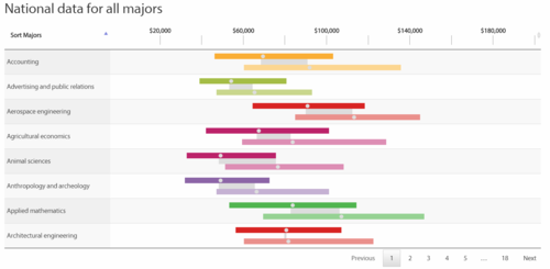
| + | *A divergent bar chart providese does provide useful insights with regards to a specific major by telling us the distribution of annual salary and its relation to other majors. However, this does not offer a clear comparison of majors over time about a specific course itself. Even though there is an option to search, there is no tooltip available to tell use the exact median, upper 25 and 75 percentiles. Colour coding allows a reader to see the difference clearly which is good. Overall, it offers a good comparison overview between majors. | ||
| + | |- | ||
| + | |||
| + | | <center> [[File:DUOteamV2.jpg|500px|frameless|center]] </center> <br> <center>Source: http://ideasillustrated.com/blog/2011/11/28/earnings-and-unemployment-by-college-major/</center>|| | ||
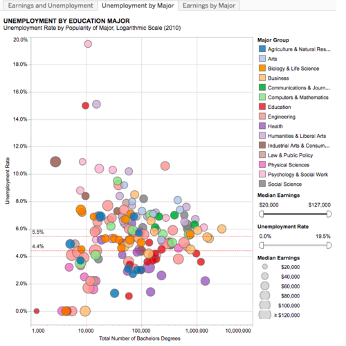
| + | * The Scatter plot above provides an extremely clear overview of how Unemployment rate is related to the number of degrees. It has made good use of the size of the circle to illustrate the median annual earnings. However, it does not provide the trend over the years how each major has progress over the years. | ||
| + | |- | ||
| + | |||
| + | | <center> [[File:DUOteamV3.jpg|500px|frameless|center]] </center> <br> <center>Source: http://pay.sgcharts.com/index.html</center>|| | ||
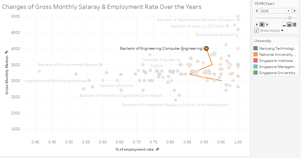
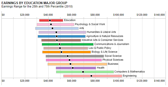
| + | * This time series bar chart is useful in showing the starting salary of various majors as well the a line graph as the employment rate by major. It provides a good comparison of the 25th, 50th and 75th percentile of each course with its employment rate. However, it does not provide a comparison across the years. Essentially this visualization provides a good summary and comparison of the various degrees and majors with a good use of colours. | ||
| + | |- | ||
| + | |||
| + | |||
| + | |||
| + | |} | ||
| + | |||
| + | ==<div style="background: #4286f4; padding: 15px; line-height: 0.3em; text-indent: 15px; font-size:18px; font-family:sans-serif"><font color= #FFFFFF>Key Technical Challenges</font></div>== | ||
| + | <div style="font-family:sans-serif;font-size:16px"> | ||
| + | {| class="wikitable" | ||
| + | |- | ||
| + | ! style="font-weight: bold;background: #0BD98D;color:#000;width: 50%;" | Key Technical Challenges | ||
| + | ! style="font-weight: bold;background: #0BD98D;color:#000;" | Mitigation Plan | ||
| + | |- | ||
| + | | <center> D3.js Programming & implementation </center> || | ||
| + | * Attend Workshop in Week8 | ||
| + | * Self-learn through online platform for more in-depth content | ||
| + | |- | ||
| + | | <center> Data Collections and Clean up </center> || | ||
| + | * Decide as a team on what data to use and what to do with missing data(if any) | ||
| + | |- | ||
| + | | <center> Visualization Tool Usage </center> || | ||
| + | * Peer Learning | ||
| + | * Self-learning through online platform | ||
| + | |} | ||
| + | </div> | ||
| + | |||
| + | <!-- | ||
| + | ==<div style="background: #4286f4; padding: 15px; line-height: 0.3em; text-indent: 15px; font-size:18px; font-family:sans-serif"><font color= #FFFFFF>Proposed Visualization</font></div>== | ||
| + | <div style="font-family:sans-serif;font-size:16px"></div> | ||
| + | --> | ||
| + | |||
| + | ==<div style="background: #4286f4; padding: 15px; line-height: 0.3em; text-indent: 15px; font-size:18px; font-family:sans-serif"><font color= #FFFFFF>Tools & Libraries</font></div>== | ||
| + | <div style="font-family:sans-serif;font-size:16px"></div> | ||
| + | *Tableau | ||
| + | *Microsoft Excel | ||
| + | *Photoshop | ||
| + | *D3.js & its related Library (amChart, highchart, plotly) | ||
| + | *HTML, CSS & JavaScript | ||
| + | *Github | ||
| + | |||
| + | ==<div style="background: #4286f4; padding: 15px; line-height: 0.3em; text-indent: 15px; font-size:18px; font-family:sans-serif"><font color= #FFFFFF>Story Board</font></div>== | ||
| + | <div style="font-family:sans-serif;font-size:16px"></div> | ||
| + | <i> Story board are done to show the type of chart & data to display </i> | ||
| + | <b> Graduate Employement Survey Data </b> | ||
| + | Look into the graduate employment survey data to find out: | ||
| + | * Changes of Gross Monthly Salary of each degree over the year | ||
| + | [[File:DUO ges Overview.png|center]] | ||
| + | We intended to use Scatter Plot to show the different relationship between the salary, employment rate of each degree course. It show shows it's position among all the other courses from the different university school. We will be including a timeline slider, to change the data-point accrodingly to the specific year. This will help to show how it have changes over the years | ||
| + | |||
| + | * Ranking of the salary across the degree: | ||
| + | [[File:DUO GES Rank.png|center]] | ||
| + | Next, we intend to perform a ranking of the degree by its salary. This help to shows the ranking of each course by the starting salary amount. Beside ranking, we will show the 25, 75 percentile as well to showcase the gaps between the salary despite being of the same university and school. This allows end-user to have a better gauge of the salary distribution. | ||
| + | |||
| + | <b> Gross Monthly Income </b> | ||
| + | After knowing the salary of the different degree over the year, and the ranking. We want to look into the salary of different industry and sector. Hence, We want to find out | ||
| + | |||
| + | * What’s the changes of salary of the Sector or Industry over the year | ||
| + | [[File:DUO Income.png|center]] | ||
| + | For this, we will be using a slope graph instead. As slope graph is able to show the ranking and better illustrate the change in salary between the two years. | ||
| + | |||
| + | <b> Rates (Recruitment, Resignation, Vacancy) </b> | ||
| + | Knowing the Employment Rate from the GES, we want to look into the Recruitment, Resignation & Vacancy Rate. To find out: | ||
| + | |||
| + | * Whether is there a relationship between the rates? | ||
| + | [[File:DUO Bullet.png|center]] | ||
| + | For this, we will be using a bullet chart. With the Vacancy Rate being the target, the Recruitment Rate as the actual value and Resignation as the additional information. This will illustrate whether the company is able to recruit based on the amount of vacancy it has. | ||
| + | |||
| + | <b> Vacancy Reason </b> | ||
| + | After knowing about the vacancy rate of the different occupation group and industry. We are interested to know the reason behind the vacancy rate. Hence, we want to find out: | ||
| + | |||
| + | * Which reason contributes most to the vacancy rate of the particular industry, and which reason contributes most based on Job Education Level. And how it has changed from 2015 to 2016 | ||
| + | [[File:DUO Reason.png|center]] | ||
| + | Using a spider chart, it helps to better illustrate the different reason contribution to the vacancy. As each reason is a category itself, spider chart fits well in such situations. | ||
| + | |||
| + | ==<div style="background: #4286f4; padding: 15px; line-height: 0.3em; text-indent: 15px; font-size:18px; font-family:sans-serif"><font color= #FFFFFF>Project Timeline</font></div>== | ||
| + | <div style="font-family:sans-serif;font-size:16px"></div> | ||
| + | [[File:Duo Timeline.jpg|800px|frameless|center]] | ||
| + | |||
| + | ==<div style="background: #4286f4; padding: 15px; line-height: 0.3em; text-indent: 15px; font-size:18px; font-family:sans-serif"><font color= #FFFFFF>References</font></div>== | ||
| + | <div style="font-family:sans-serif;font-size:16px"></div> | ||
| + | *Data Gov : https://data.gov.sg/search?groups=education | ||
| + | *Salary SG : http://www.salary.sg/ | ||
| + | *Visualisation of SG Graduate Salary : http://pay.sgcharts.com/ | ||
| + | *Digital Senior : http://digitalsenior.sg/graduate-employment-survey-ges-nus-ntu-smu/ | ||
| + | ==<div style="background: #4286f4; padding: 15px; line-height: 0.3em; text-indent: 15px; font-size:18px; font-family:sans-serif"><font color= #FFFFFF>Comments</font></div>== | ||
| + | <div style="font-family:sans-serif;font-size:16px"></div> | ||
| − | + | <b>Feel free to give us comments!</b> | |
| − | |||
| − | |||
| − | |||
| − | |||
| − | |||
Latest revision as of 18:09, 26 November 2017
Contents
Introduction
Singapore has developed rapidly over the past few decades and part of this development is attributed to the Education System. Singapore Education System is known to be stressful and concerns have been raised about the need to change. Is the goal at the end of this rat race worth the stress?
The Graduate Employment Survey (GES) is conducted on a yearly basis to provide insights on the salary prospects of a course. The Ministry of Education (MoE) conduct these surveys yearly for Local Universities in Singapore. However, the results of these surveys are not interactive and do not provide any trends and insights with respect to the Labour Market demands.
Labour Market data such as Job Vacancy are collect by Ministry of Manpower (MoM) to provide insight and information of the labour market to the public. Data for Job Vacancy are pertaining to private sector establishment each with at least 25 employees and the public sector. However, those data are usually in tabular form and provide minimum insight to the public for analysis of the labour market.
This project aims to offer insights about the fresh graduate salary with respect to the Labour Market in Singapore and its changes over the years. We will be focusing on the vacancy rate of the labour market and the reason contribute to the vacancy, as it affects the fresh graduate employment indirectly.
Motivation
Our research and development efforts were motivated by the lack of easy to use web-based visualizations about the fresh graduate salary and labour market as these data are mainly published in table form which are hard to illustrate trends moreover gain insights.
In addition, as graduates who will be entering the job market soon, we want to better understand the industry outlook in the labour market. Ultimately, we hope that these visualizations would help other students from Junior Colleges and Polytechnics decide their career paths.
Objectives
In this research, we aim to accomplish the following objectives:
1. Visualise the fresh graduate salary with against employment rate overtime with respect to each course.
2. Visualise the ranking of each specific course throughout the years.
3. Visualise the changes in salary with respect to the labour market by industry over the years.
4. Visualise the overall Recruitment, Resignation and Vacancy Rate by Occupation Group
5. Visualise the possible reasons for Vacancy by Sector and Education
Dataset Description
| DataSet | Description |
|---|---|
| |
| |
|
Provide Data on :
|
Background Research and Survey of Related Work
| Visualization | Explanation |
|---|---|
| |
| |
|
Key Technical Challenges
| Key Technical Challenges | Mitigation Plan |
|---|---|
| |
| |
|
Tools & Libraries
- Tableau
- Microsoft Excel
- Photoshop
- D3.js & its related Library (amChart, highchart, plotly)
- HTML, CSS & JavaScript
- Github
Story Board
Story board are done to show the type of chart & data to display Graduate Employement Survey Data Look into the graduate employment survey data to find out:
- Changes of Gross Monthly Salary of each degree over the year
We intended to use Scatter Plot to show the different relationship between the salary, employment rate of each degree course. It show shows it's position among all the other courses from the different university school. We will be including a timeline slider, to change the data-point accrodingly to the specific year. This will help to show how it have changes over the years
- Ranking of the salary across the degree:
Next, we intend to perform a ranking of the degree by its salary. This help to shows the ranking of each course by the starting salary amount. Beside ranking, we will show the 25, 75 percentile as well to showcase the gaps between the salary despite being of the same university and school. This allows end-user to have a better gauge of the salary distribution.
Gross Monthly Income After knowing the salary of the different degree over the year, and the ranking. We want to look into the salary of different industry and sector. Hence, We want to find out
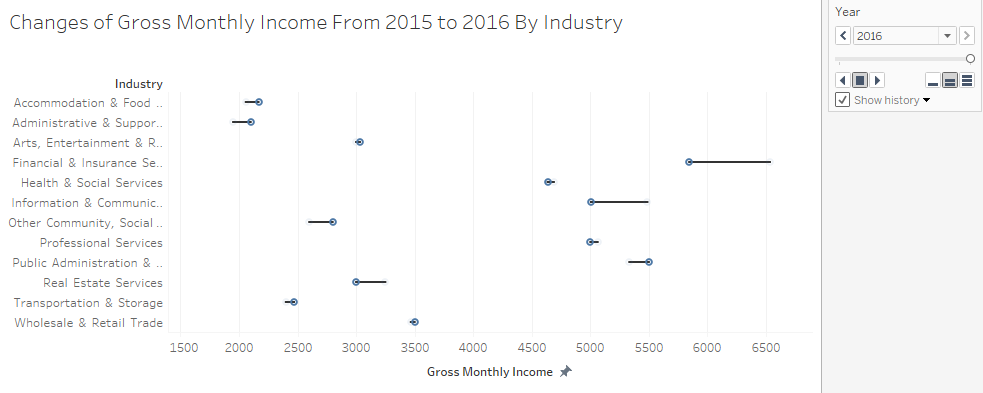
- What’s the changes of salary of the Sector or Industry over the year
For this, we will be using a slope graph instead. As slope graph is able to show the ranking and better illustrate the change in salary between the two years.
Rates (Recruitment, Resignation, Vacancy) Knowing the Employment Rate from the GES, we want to look into the Recruitment, Resignation & Vacancy Rate. To find out:
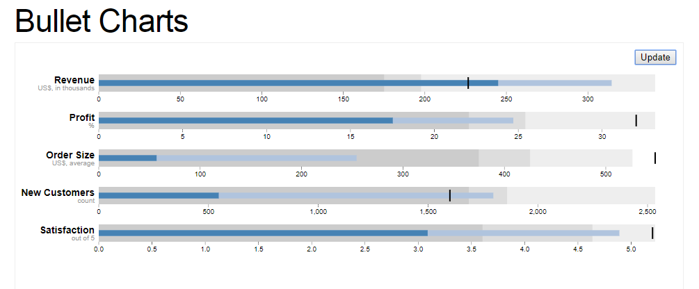
- Whether is there a relationship between the rates?
For this, we will be using a bullet chart. With the Vacancy Rate being the target, the Recruitment Rate as the actual value and Resignation as the additional information. This will illustrate whether the company is able to recruit based on the amount of vacancy it has.
Vacancy Reason After knowing about the vacancy rate of the different occupation group and industry. We are interested to know the reason behind the vacancy rate. Hence, we want to find out:
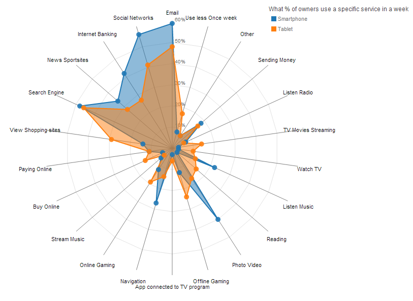
- Which reason contributes most to the vacancy rate of the particular industry, and which reason contributes most based on Job Education Level. And how it has changed from 2015 to 2016
Using a spider chart, it helps to better illustrate the different reason contribution to the vacancy. As each reason is a category itself, spider chart fits well in such situations.
Project Timeline
References
- Data Gov : https://data.gov.sg/search?groups=education
- Salary SG : http://www.salary.sg/
- Visualisation of SG Graduate Salary : http://pay.sgcharts.com/
- Digital Senior : http://digitalsenior.sg/graduate-employment-survey-ges-nus-ntu-smu/
Comments
Feel free to give us comments!

