Difference between revisions of "1718t1is428T4"
| (23 intermediate revisions by 3 users not shown) | |||
| Line 1: | Line 1: | ||
| + | [[File:Drizzle_header.png|1260px|center]] | ||
| + | <br/> | ||
| + | <!--Header--> | ||
| + | {|style="background-color:#F5F5F5; color:#4d79ff; padding: 10 0 10 0;" width="100%" cellspacing="0" cellpadding="0" valign="top" border="0" | | ||
| − | == | + | | style="background:#fff;" width="1%" | |
| − | + | | style="padding:0.2em; font-size:100%; background-color:#1E90FF; text-align:center; color:#1D1D1D; letter-spacing: 1px;" width="3%" | | |
| + | [[Image:Drizzle_home.png|center|20px|link=Project_Groups]] | ||
| − | + | | style="background:#fff;" width="1%" | | |
| + | | style="padding:0.2em; font-size:100%; background-color:#4682B4; text-align:center; color:#1D1D1D; letter-spacing: 1px;" width="10%" | | ||
| + | [[1718t1is428T4 |<font color="#fff" size=2 face="Trebuchet MS"><b>Proposal</b></font>]] | ||
| − | + | | style="background:#fff;" width="1%" | | |
| + | | style="padding:0.2em; font-size:100%; background-color:#1E90FF; text-align:center; color:#1D1D1D; letter-spacing: 1px;" width="10%" | | ||
| + | [[1718t1is428T4_Poster|<font color="#fff" size=2 face="Trebuchet MS"><b>Poster</b></font>]] | ||
| + | | style="background:#fff;" width="1%" | | ||
| + | | style="padding:0.2em; font-size:100%; background-color:#1E90FF; text-align:center; color:#1D1D1D; letter-spacing: 1px;" width="10%" | | ||
| + | [[1718t1is428T4_Application|<font color="#fff" size=2 face="Trebuchet MS"><b>Application</b></font>]] | ||
| − | ===<div style="background-color: | + | | style="background:#fff;" width="1%" | |
| + | | style="padding:0.2em; font-size:100%; background-color:#1E90FF; text-align:center; color:#1D1D1D; letter-spacing: 1px;" width="10%" | | ||
| + | [[1718t1is428T4_Research Paper|<font color="#fff" size=2 face="Trebuchet MS"><b>Research Paper</b></font>]] | ||
| + | |} | ||
| + | <!--/Header--> | ||
| + | |||
| + | <!--Content--> | ||
| + | |||
| + | ===<div style="background: #1E90FF; padding-top: 20px; padding-bottom: 20px; line-height: 0.3em; text-indent: 15px; font-size:18px; font-family:Trebuchet MS; letter-spacing: 1px;"><font color= #fff>Problem, Motivation and Objective</font></div>=== | ||
| + | Meteorological Service Singapore (MSS) collects abundant data on the weather in Singapore. There are 63 Automated Weather Stations (AWS) in Singapore, that collect daily rainfall, temperature and wind speed. This data is readily available, yearly since 1980. However, this useful data is not being properly presented, in a way that is the weather trends and patterns can be easily inferred. | ||
| + | |||
| + | |||
| + | Organisations in Singapore utilise past data from MSS to devise plans for future projects. Although the information is readily available from MSS, there is a strain on resources to extract, clean and analyse the data for specific organisations. Some organisations may be equipped with enough resources to carry out data analysis efficiently and effectively; while some may settle for the simplest analysis. With this application, we will provide a common data visualisation for the various organisations to utilize. As such, they will be able to infer relevant information from our application, without having to employ extra resources to do the same. | ||
| + | |||
| + | |||
| + | We want to build an application that visualizes the rainfall, temperature and wind speed patterns in Singapore. The visualisation should display the data over time (daily, monthly, yearly), and over location (based on the location of the AWS). By doing so, we believe that various organisations will benefit, based on the patterns observed. | ||
| + | |||
| + | ===<div style="background: #1E90FF; padding-top: 20px; padding-bottom: 20px; line-height: 0.3em; text-indent: 15px; font-size:18px; font-family:Trebuchet MS; letter-spacing: 1px;"><font color= #fff>Data Collection and Preparation</font></div>=== | ||
| + | |||
| + | |||
| + | ====1) Historical daily records of rainfall, temperature and wind speed from the 63 AWSs, from Jan 1980 to Sept 2017.==== | ||
| + | |||
| + | :Data source: http://www.weather.gov.sg/climate-historical-daily | ||
| + | |||
| + | |||
| + | :Description: Daily rainfall total, highest 30-min rainfall, highest 60-min rainfall, highest 120-min rainfall, mean temperature, maximum temperature, mean wind speed and maximum wind speed by date for each AWS over the time period of January 1980 to September 2017. | ||
| + | |||
| + | |||
| + | :Data Preparation: | ||
| + | :Option 1: Use an original code developed by our team, to crawl the data from the MSS website, and clean it into individual CSV files for each year. | ||
| + | :Option 2: Download the individual CSV, by location, month and year for the relevant locations (19 AWS), months and years (September 2007 to September 2017). Combine these :data into a individual CSV files for each year. | ||
| + | |||
| + | |||
| + | ====2) Location of the 63 AWSs (Automatic Weather Stations)==== | ||
| + | |||
| + | |||
| + | :Data Source: http://www.weather.gov.sg/wp-content/uploads/2017/02/Annual-Climatological-Report-2016.pdf | ||
| + | :Page 4 & 5, Table 4, Locations of AWSs | ||
| + | |||
| + | |||
| + | :Description: Data table including AWS ID, AWS Name, Latitude, Longitude and Elevation above mean sea-level. | ||
| + | |||
| + | |||
| + | :Data Preparation: Extract the data relevant to the 63 specified AWSs, and save it as a CSV file. | ||
| + | |||
| + | ===<div style="background: #1E90FF; padding-top: 20px; padding-bottom: 20px; line-height: 0.3em; text-indent: 15px; font-size:18px; font-family:Trebuchet MS; letter-spacing: 1px;"><font color= #fff>Background Survey and Related Works</font></div>=== | ||
{| class="wikitable" | {| class="wikitable" | ||
| '''Survey''' | | '''Survey''' | ||
| '''Explanation''' | | '''Explanation''' | ||
|- | |- | ||
| − | | [[File: | + | | [[File:Findings1.png|center|600x500px|upright=3.0]] |
<br><br> | <br><br> | ||
| − | <div align="center"><font size="1">Source : https://www. | + | <div align="center"><font size="1">Source : https://www.climate.gov/maps-data/data-snapshots/totalprecip-monthly-cmb-2017-09-00?theme=Precipitation</font></div> |
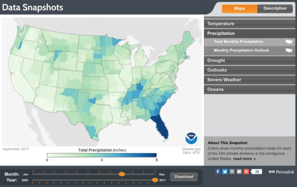
| − | | This | + | | This visualisation shows the distribution of precipitation (i.e. rainfall) across the United States. The intensity of color on the map indicates the severity of rainfall at that location, with a darker color reflecting higher rainfall. |
| + | |||
|- | |- | ||
| − | | [[File: | + | | [[File:Findings2.png|center|600x500px]] |
<br><br> | <br><br> | ||
| − | <div align="center"><font size="1">Source: https:// | + | <div align="center"><font size="1">Source: https://climate-explorer.nemac.org/?tp=g_a¢er=-9413982.7,3893395.7&zoom=4&p=G&scales=time:20161031000000.0:20171031000000.0,ytd-prcp:0.0:60.0,temp:0.0:100.0&graphs=USC00166686:PRCP_YTD,USC00233838:PRCP_YTD |
| − | | This | + | </font></div> |
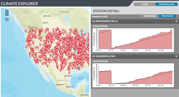
| + | | This visualisation allows the user to choose 2 or more locations from the map, upon which the rainfall at these locations over the years is displayed as separate graphs for each location. As these graphs are placed side by side and follow similar axes, it is easy to compare the trends in rainfall between the locations selected. This is an easy and interactive way to allow the users to compare the data trends for the specific locations that are of interest to them. | ||
| + | |||
|- | |- | ||
| − | | [[File: | + | | [[File:Findings3.png|center|600x500px]] |
<br><br> | <br><br> | ||
| − | <div align="center"><font size="1">Source: https:// | + | <div align="center"><font size="1">Source: https://weatherspark.com/y/114655/Average-Weather-in-Singapore-Year-Round</font></div> |
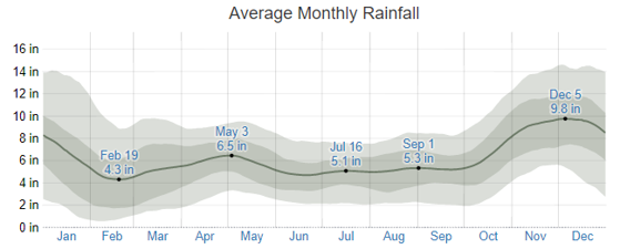
| − | | | + | | The visualisation allows the user to see how the rainfall varies between the 25th to 75th and 10th to 90th percentile bands, over the period of one year, showing variation within the months and not just the aggregate of the month's’ readings. By doing so, the viewers are able to differentiate the likelihood of a rainfall and its measurement throughout the year. |
| + | |||
|} | |} | ||
| − | ===<div style="background- | + | ===<div style="background: #1E90FF; padding-top: 20px; padding-bottom: 20px; line-height: 0.3em; text-indent: 15px; font-size:18px; font-family:Trebuchet MS; letter-spacing: 1px;"><font color= #fff>Technical Challenges</font></div>=== |
{| class="wikitable" | {| class="wikitable" | ||
|- | |- | ||
| Line 47: | Line 108: | ||
|} | |} | ||
| + | ===<div style="background: #1E90FF; padding-top: 20px; padding-bottom: 20px; line-height: 0.3em; text-indent: 15px; font-size:18px; font-family:Trebuchet MS; letter-spacing: 1px;"><font color= #fff>Project Timeline</font></div>=== | ||
| + | |||
| + | [[File:Drizzle_schedule.png|center|1000x900px]] | ||
| + | |||
| + | |||
| + | ===<div style="background: #1E90FF; padding-top: 20px; padding-bottom: 20px; line-height: 0.3em; text-indent: 15px; font-size:18px; font-family:Trebuchet MS; letter-spacing: 1px;"><font color= #fff>Sketch</font></div>=== | ||
| + | |||
| + | {| class="wikitable" | ||
| + | |||
| + | |- | ||
| + | | [[File:Homepage.jpg|center|600px]] | ||
| + | | [[File:Droplet1.jpg|center|600px]] | ||
| + | |- | ||
| + | |||
| + | | [[File:Droplet2.jpg|center|600px]] | ||
| + | | [[File:Droplet3.jpg|center|600px]] | ||
| + | |- | ||
| + | |||
| + | |} | ||
| + | |||
| + | ===<div style="background: #1E90FF; padding-top: 20px; padding-bottom: 20px; line-height: 0.3em; text-indent: 15px; font-size:18px; font-family:Trebuchet MS; letter-spacing: 1px;"><font color= #fff> Technologies & Tools</font></div>=== | ||
| + | |||
| + | |||
| + | <ul> | ||
| + | <li>Excel</li> | ||
| + | <li>Python</li> | ||
| + | <li>Tableau</li> | ||
| + | <li>Javascript</li> | ||
| + | <li>HTML5</li> | ||
| + | <li>CSS</li> | ||
| + | <li>jQuery</li> | ||
| + | </ul> | ||
| + | |||
| + | |||
| + | ===<div style="background: #1E90FF; padding-top: 20px; padding-bottom: 20px; line-height: 0.3em; text-indent: 15px; font-size:18px; font-family:Trebuchet MS; letter-spacing: 1px;"><font color= #fff> References </font></div>=== | ||
| + | <ol> | ||
| + | <li>http://www.weather.gov.sg/about-our-organisation/#vision</li> | ||
| + | <li>http://www.weather.gov.sg/climate-historical-daily/</li> | ||
| + | <li>http://www.weather.gov.sg/wp-content/uploads/2017/02/Annual-Climatological-Report-2016.pdf</li> | ||
| + | </ol> | ||
| − | |||
| − | + | ===<div style="background: #1E90FF; padding-top: 20px; padding-bottom: 20px; line-height: 0.3em; text-indent: 15px; font-size:18px; font-family:Trebuchet MS; letter-spacing: 1px;"><font color= #fff> Comments </font></div>=== | |
Latest revision as of 03:13, 23 November 2017
Contents
Problem, Motivation and Objective
Meteorological Service Singapore (MSS) collects abundant data on the weather in Singapore. There are 63 Automated Weather Stations (AWS) in Singapore, that collect daily rainfall, temperature and wind speed. This data is readily available, yearly since 1980. However, this useful data is not being properly presented, in a way that is the weather trends and patterns can be easily inferred.
Organisations in Singapore utilise past data from MSS to devise plans for future projects. Although the information is readily available from MSS, there is a strain on resources to extract, clean and analyse the data for specific organisations. Some organisations may be equipped with enough resources to carry out data analysis efficiently and effectively; while some may settle for the simplest analysis. With this application, we will provide a common data visualisation for the various organisations to utilize. As such, they will be able to infer relevant information from our application, without having to employ extra resources to do the same.
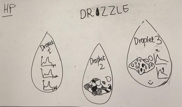
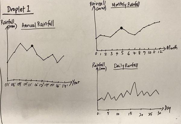
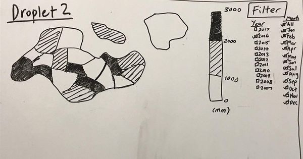
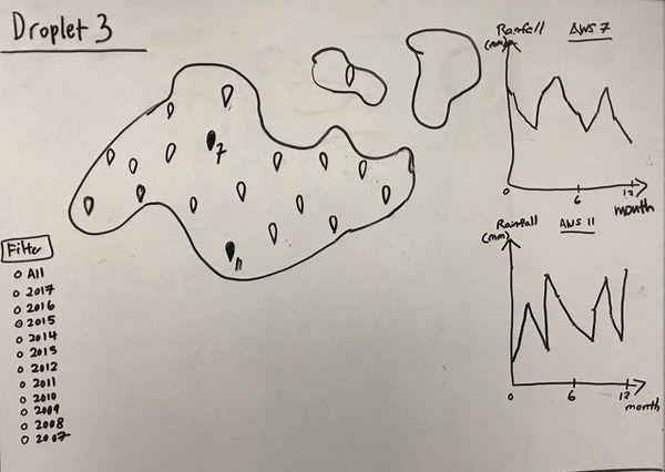
We want to build an application that visualizes the rainfall, temperature and wind speed patterns in Singapore. The visualisation should display the data over time (daily, monthly, yearly), and over location (based on the location of the AWS). By doing so, we believe that various organisations will benefit, based on the patterns observed.
Data Collection and Preparation
1) Historical daily records of rainfall, temperature and wind speed from the 63 AWSs, from Jan 1980 to Sept 2017.
- Data source: http://www.weather.gov.sg/climate-historical-daily
- Description: Daily rainfall total, highest 30-min rainfall, highest 60-min rainfall, highest 120-min rainfall, mean temperature, maximum temperature, mean wind speed and maximum wind speed by date for each AWS over the time period of January 1980 to September 2017.
- Data Preparation:
- Option 1: Use an original code developed by our team, to crawl the data from the MSS website, and clean it into individual CSV files for each year.
- Option 2: Download the individual CSV, by location, month and year for the relevant locations (19 AWS), months and years (September 2007 to September 2017). Combine these :data into a individual CSV files for each year.
2) Location of the 63 AWSs (Automatic Weather Stations)
- Data Source: http://www.weather.gov.sg/wp-content/uploads/2017/02/Annual-Climatological-Report-2016.pdf
- Page 4 & 5, Table 4, Locations of AWSs
- Description: Data table including AWS ID, AWS Name, Latitude, Longitude and Elevation above mean sea-level.
- Data Preparation: Extract the data relevant to the 63 specified AWSs, and save it as a CSV file.
Background Survey and Related Works
| Survey | Explanation |
|
|
This visualisation shows the distribution of precipitation (i.e. rainfall) across the United States. The intensity of color on the map indicates the severity of rainfall at that location, with a darker color reflecting higher rainfall. |
|
|
This visualisation allows the user to choose 2 or more locations from the map, upon which the rainfall at these locations over the years is displayed as separate graphs for each location. As these graphs are placed side by side and follow similar axes, it is easy to compare the trends in rainfall between the locations selected. This is an easy and interactive way to allow the users to compare the data trends for the specific locations that are of interest to them. |
|
|
The visualisation allows the user to see how the rainfall varies between the 25th to 75th and 10th to 90th percentile bands, over the period of one year, showing variation within the months and not just the aggregate of the month's’ readings. By doing so, the viewers are able to differentiate the likelihood of a rainfall and its measurement throughout the year. |
Technical Challenges
| Key Technical Challenges | Solutions |
| Least familiarity with D3.js, javascript and jQuery | Attend workshop conducted during recess week Self-learning through online platform (e.g. codeAcademy) |
| Data Preparation | Decide as a team on what data to keep and eliminate |
| Availability of data sets | Research data through other platforms such as SMU Libraries and companies’ official webpage |
Project Timeline
Sketch
Technologies & Tools
- Excel
- Python
- Tableau
- Javascript
- HTML5
- CSS
- jQuery
References
- http://www.weather.gov.sg/about-our-organisation/#vision
- http://www.weather.gov.sg/climate-historical-daily/
- http://www.weather.gov.sg/wp-content/uploads/2017/02/Annual-Climatological-Report-2016.pdf

