Difference between revisions of "1718t1is428T9"
Mq.wang.2014 (talk | contribs) |
|||
| (38 intermediate revisions by 3 users not shown) | |||
| Line 16: | Line 16: | ||
| style="background:#565555;" width="1%" | | | style="background:#565555;" width="1%" | | ||
| style="font-family:tahoma; padding:0.3em; font-size:100%; background-color:#565555; border-bottom:0px solid #3D9DD7; text-align:center; color:#F5F5F5" width="10%" | | | style="font-family:tahoma; padding:0.3em; font-size:100%; background-color:#565555; border-bottom:0px solid #3D9DD7; text-align:center; color:#F5F5F5" width="10%" | | ||
| − | [[ | + | [[1718t1is428T9_Poster: Poster | |
<font color="#F5F5F5" size=2><b>POSTER</b></font>]] | <font color="#F5F5F5" size=2><b>POSTER</b></font>]] | ||
| style="background:#565555;" width="1%" | | | style="background:#565555;" width="1%" | | ||
| style="font-family:tahoma; padding:0.3em; font-size:100%; background-color:#565555; border-bottom:0px solid #3D9DD7; text-align:center; color:#F5F5F5" width="10%" | | | style="font-family:tahoma; padding:0.3em; font-size:100%; background-color:#565555; border-bottom:0px solid #3D9DD7; text-align:center; color:#F5F5F5" width="10%" | | ||
| − | [[ | + | [[1718t1is428T9_Application: Application | |
<font color="#F5F5F5" size=2><b>APPLICATION</b></font>]] | <font color="#F5F5F5" size=2><b>APPLICATION</b></font>]] | ||
| style="background:#565555;" width="1%" | | | style="background:#565555;" width="1%" | | ||
| style="font-family:tahoma; padding:0.3em; font-size:100%; background-color:#565555; border-bottom:0px solid #3D9DD7; text-align:center; color:#F5F5F5" width="10%" | | | style="font-family:tahoma; padding:0.3em; font-size:100%; background-color:#565555; border-bottom:0px solid #3D9DD7; text-align:center; color:#F5F5F5" width="10%" | | ||
| − | [[ | + | [[1718t1is428T9_Research_Paper: Research Paper | |
<font color="#F5F5F5" size=2><b>RESEARCH PAPER</b></font>]] | <font color="#F5F5F5" size=2><b>RESEARCH PAPER</b></font>]] | ||
|} | |} | ||
| + | <br> | ||
<!--/Header--> | <!--/Header--> | ||
| − | == | + | ==<div style="background: #061935; padding: 15px; font-weight: bold; line-height: 0.3em; text-indent: 15px; font-size:18px; font-family:helvetica"><font color= #ffffff>Problem & Motivation</font></div>== |
| − | |||
| − | == | + | Flight delays has been a very common problem for travelers, the delay can be attributable to various problems, such as, aircraft issues, weather issues at origin airport or/and destination airport. The delay has no doubts will disappoint air travelers and affect their flight experience greatly. Thus, in this project, our team aims to investigate the performance of different airlines and flight delays in detail. |
| − | + | ||
| + | In addition, airport network is a very critical and complex transportation infrastructure for a nation, it is increasingly important for public policy considerations. The disruptions of the airport network, caused by terrorist attack, disease transmission or other reasons, can lead to huge economic loss. Thus, the study on the airport network can assist us better understand the relationship between different airports, for example, identify most critical airport, and take proactive measures to prevent occurrence of disruptions. | ||
| + | |||
| + | ==<div style="background: #061935; padding: 15px; font-weight: bold; line-height: 0.3em; text-indent: 15px; font-size:18px; font-family:helvetica"><font color= #ffffff>Objectives</font></div>== | ||
| + | |||
| + | In this project, we will adopt visualization techniques to: | ||
<ul> | <ul> | ||
| − | <li>Demographics of student alcohol | + | <li>Demographics of student alcohol consumptionAnalyse airport network connectivity</li> |
| − | <li> | + | <li>Analyse flight delays for different airlines</li> |
| − | <li> | + | <li>Evaluate on-time performance for airlines and aircrafts</li> |
</ul> | </ul> | ||
| + | With the visualization, airline companies will become aware of its on-time performance among all airlines and meanwhile have a better idea on areas where greater attention should be placed on routine operation, such as service or aircraft maintenance. | ||
| + | Our visualization will also provide a detailed insight on airport network, it will speed up the decision making process when faced with infectious diseases and terrorist attacks. | ||
| + | |||
| + | ==<div style="background: #061935; padding: 15px; font-weight: bold; line-height: 0.3em; text-indent: 15px; font-size:18px; font-family:helvetica"><font color= #ffffff>Selected Dataset</font></div>== | ||
| + | |||
| + | We have obtained the dataset from Kaggle, which can be download from https://www.kaggle.com/usdot/flight-delays/data | ||
| + | {| class="wikitable" style="background-color:#FFFFFF;" width="100%" | ||
| + | |- | ||
| + | ! style="font-weight: bold;background: #061935;color:#fbfcfd;width: 30%;" | Dataset/Source | ||
| + | ! style="font-weight: bold;background: #061935;color:#fbfcfd;width: 30%" | Data Attributes | ||
| + | ! style="font-weight: bold;background: #061935;color:#fbfcfd;" | Rationale Of Usage | ||
| + | |- | ||
| + | | <center>airline.csv<br/> | ||
| + | || | ||
| + | * IATA_Code, String, Airline identifier | ||
| + | * Airline, String, Airport Name | ||
| + | || | ||
| + | <center>This data is used to identify and provide detailed information about the different airlines. </center> | ||
| + | |- | ||
| + | | <center>airport.csv<br/></center> | ||
| + | || | ||
| + | * IATA_Code, String, Location identifier | ||
| + | * Airport, String, Airport Name | ||
| + | * City, String, City of Airport | ||
| + | * State, String, State of Airport | ||
| + | * Country, String, State of Airport | ||
| + | * Latitude, Numeric, Latitude of the Airport | ||
| + | * Longitude, Numeric, Longitude of the Airport | ||
| + | || | ||
| + | <center>This data is used to identify and provide detailed information about different airport. It complements the main dataset by providing detailed location information about latitude and longitude, city, state and country of the airport.</center> | ||
| + | |- | ||
| + | | <center>flights.csv</center> | ||
| + | || | ||
| + | * Year, Numeric, Year of the flight | ||
| + | * Month, Numeric, Month of the flight | ||
| + | * Day, Numeric, Day of the flight | ||
| + | * Day_of_Week, Numeric, Day of week of the flight | ||
| + | * Airline, String, Airline identifier | ||
| + | * Tail_Number, String, Aircraft identifier | ||
| + | * Origin_Airport, String, Departing airport | ||
| + | * Destination_Airport, String, Destination airport | ||
| + | * Departure_Delary, Numeric, Total delay on Departure, negative value indicates the flight departs before scheduled time | ||
| + | * Arrival_Delay, Numeric, Total delay on arrival, it is derived from the difference of arrival_time and scheduled_arrival, negative value | ||
| + | * indicates the flight arrived before scheduled time. | ||
| + | * Diverted,Numeric (binary data), Aircraft landed on airport that out of schedule | ||
| + | * Cancelled, Numeric (binary data), 1 means cancelled | ||
| + | * Cancellation_Reason, String, Reason for Cancellation of flight: A - Airline/Carrier; B - Weather; C - National Air System; D - | ||
| + | Security | ||
| + | * Air_System_Delay, String, Delay caused by air system | ||
| + | * Security_Delay, String, Delay caused by security | ||
| + | * Airline_Delay, String, Delay caused by airline | ||
| + | * Late_Aircraft_Delay, String, Delay caused by aircraft | ||
| + | * Weather_Delay, String, Delay caused by weather | ||
| + | || | ||
| + | <center>This data is used as the major source of information in our project. We mainly use this data to analyse flight delays and reasons of delay. In addition, the data will be used investigate airport network and analyse airport network relationship by different centrality measures, such as betweenness centrality, degree centrality. </center> | ||
| + | |} | ||
| + | |||
| + | ==<div style="background: #061935; padding: 15px; font-weight: bold; line-height: 0.3em; text-indent: 15px; font-size:18px; font-family:helvetica"><font color= #ffffff>Background Survey of Related Work</font></div>== | ||
| + | |||
| + | {| class="wikitable" style="background-color:#FFFFFF;" width="100%" | ||
| + | |- | ||
| + | ! style="font-weight: bold;background: #061935;color:#fbfcfd;width: 50%;" | Related Works | ||
| + | ! style="font-weight: bold;background: #061935;color:#fbfcfd;" | What We Can Learn | ||
| + | |- | ||
| + | | | ||
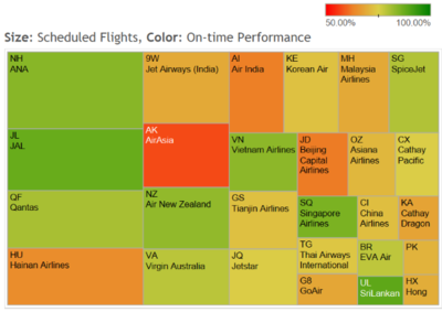
| + | <p><center>'''Monthly Performance of Airline in Asia Pacific''' </center></p> | ||
| + | [[File:1718T1G9 BackgroundSurvey1.png|400px|center]] | ||
| + | <p><center>'''Source''': https://www.flightstats.com/company/monthly-performance-reports/airlines/</center></p> | ||
| + | || | ||
| + | * The heatmap provides a clear annotation from which viewers know the size stands for the scheduled flights whereas color for on-time performance. | ||
| + | * The colors are well contrast with each other | ||
| + | |- | ||
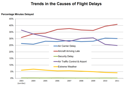
| + | | <p><center> '''Trends in the Causes of Flight Delay in US''' </center></p> | ||
| + | [[File:1718T1G9 BackgroundSurvey2.png|400px|center]] | ||
| + | <p><center> '''Source''': https://www.rita.dot.gov/bts/sites/rita.dot.gov.bts/files/2012_04_13.pdf </center> </p> | ||
| + | || | ||
| + | * The use of line chart is effective in comparing the various delay causes | ||
| + | * The chart title is clear enough to demonstrate the chart purpose | ||
| + | |- | ||
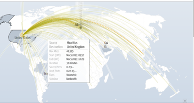
| + | | <p><center> '''Global Digital Attack Network''' </center></p> | ||
| + | [[File:1718T1G9 BackgroundSurvey3.png|400px|center]] | ||
| + | <p><center> '''Source''': http://www.digitalattackmap.com/#anim=1&color=0&country=US&list=0&time=17475&view=map </center></p> | ||
| + | || | ||
| + | * The graph vividly displays the path with its origin and destination | ||
| + | * When mouse hovers on the path, the label shows up with its detailed information | ||
| + | |} | ||
| + | |||
| + | ==<div style="background: #061935; padding: 15px; font-weight: bold; line-height: 0.3em; text-indent: 15px; font-size:18px; font-family:helvetica"><font color= #ffffff>Proposed Dashboard</font></div>== | ||
| + | |||
| + | {| class="wikitable" style="background-color:#FFFFFF;" width="100%" | ||
| + | |- | ||
| + | ! style="font-weight: bold;background: #061935;color:#fbfcfd;width: 50%;" | Proposed Layout | ||
| + | ! style="font-weight: bold;background: #061935;color:#fbfcfd;" | How Analyst Conduct Analysis | ||
| + | |- | ||
| + | | | ||
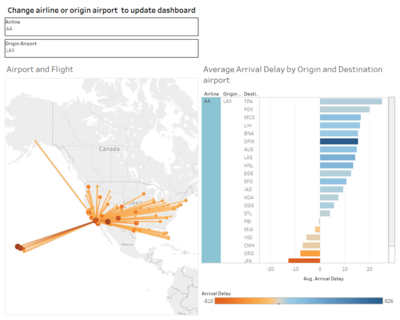
| + | <p><center>'''Dashboard of Flight Route and Arrival Delay By Airline''' </center></p> | ||
| + | [[File:1718T1G9 ProposedDashboard1.png|400px|center]] | ||
| + | || | ||
| + | The 2-columns dashboard will provide reader a brief layout of flight route map for the selected city. The chart on the right-hand side will give reader an overview of the average arrival delay of specific airline that depart from selected origin point. | ||
| + | |||
| + | In this dashboard, filter will also be provided to update the dashboard, so that readers can see and compare route maps or average arrival delay between different city. | ||
| + | |||
| + | |- | ||
| + | | <p><center> '''Dashboard of Last Aircraft Delay by Airline and Aircraft''' </center></p> | ||
| + | [[File:1718T1G9 ProposedDashboard2.png|400px|center]] | ||
| + | || | ||
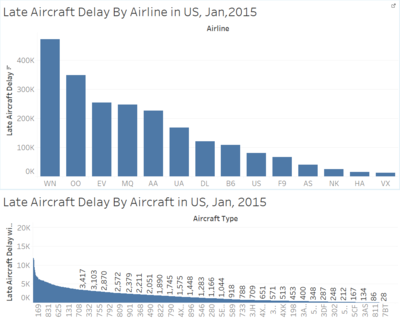
| + | There are two bar charts in the dashboard. The bar chart at the top displays the sum of delay (in minute) caused by aircraft by airline in US, Jan, 2015 in descending order. The bar chart at the bottom shows the sum of delay (in minute) caused by aircraft by aircraft in US, Jan, 2015 in descending order. | ||
| + | |||
| + | In the dashboard, when user can hover over the bars in the bar chart at the top, the corresponding tip will show up and the bar chart at the bottom will also be filtered. With this, user will know which airline has the worst on-time performance due to aircraft and which aircraft contributes most to the airline’s delay. | ||
| + | |} | ||
| + | |||
| + | ==<div style="background: #061935; padding: 15px; font-weight: bold; line-height: 0.3em; text-indent: 15px; font-size:18px; font-family:helvetica"><font color= #ffffff>Technical Complexity</font></div>== | ||
| + | |||
| + | Below are the list of technical challenges that team may be faced with when developing the visualization application. | ||
| + | {| class="wikitable" style="background-color:#ffffff;" width="100%" | ||
| + | |- | ||
| + | ! style="font-weight: bold;background: #061935;color:#fbfcfd;width: 50%;" | Technical Challenges | ||
| + | ! style="font-weight: bold;background: #061935;color:#fbfcfd;" | How To Resolve | ||
| + | |- | ||
| + | | <center> Unfamiliar with D3.js libraries and building D3 application </center> || | ||
| + | * Attend D3.js workshop | ||
| + | * Individual learning on how to build D3 application | ||
| + | * Peer Learning | ||
| + | |- | ||
| + | | <center> Lack of knowledge on how to integrate tableau work with D3 application </center> || | ||
| + | * Research on how to integrate tableau work with D3 application | ||
| + | * Conduct early integration so that team have enough time to tackle some potential errors. | ||
| + | |- | ||
| + | | <center> Insufficient metadata for the source data</center> || | ||
| + | * Research in the official website of US Department of Transportation | ||
| + | * Arrange team discussion to facilitate the understanding for the source data | ||
| + | |} | ||
| − | == | + | ==<div style="background: #061935; padding: 15px; font-weight: bold; line-height: 0.3em; text-indent: 15px; font-size:18px; font-family:helvetica"><font color= #ffffff>Tools/Technology</font></div>== |
| + | Below are the tools/technologies we will use when developing the visualization | ||
| + | * Excel | ||
| + | * Tableau | ||
| + | * D3.js | ||
| + | * Gephi<br /> | ||
| − | + | ==<div style="background: #061935; padding: 15px; font-weight: bold; line-height: 0.3em; text-indent: 15px; font-size:18px; font-family:helvetica"><font color= #ffffff>Project Milestones</font></div>== | |
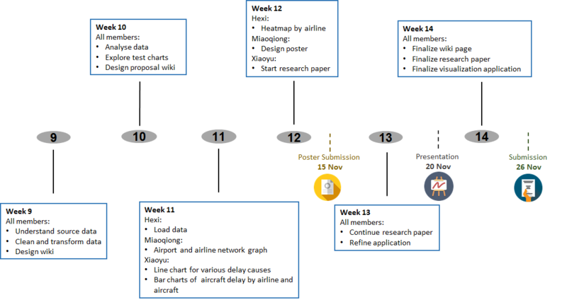
| + | [[File:1718g1t9_milestones.png|800px|center]] | ||
| − | + | ==<div style="background: #061935; padding: 15px; font-weight: bold; line-height: 0.3em; text-indent: 15px; font-size:18px; font-family:helvetica"><font color= #ffffff>References</font></div>== | |
| − | + | * https://public.tableau.com/en-us/s/blog/2015/07/taking-path-function | |
| − | + | * https://www.youtube.com/watch?v=96Pa1kSJDHM | |
| − | |||
| − | |||
| − | |||
| − | |||
| − | |||
| − | |||
| − | |||
| − | |||
| − | |||
| − | |||
| − | |||
| − | |||
| − | |||
| − | |||
| − | |||
| − | |||
| − | |||
| − | |||
| − | |||
| − | |||
| − | |||
| − | |||
| − | |||
| − | |||
| − | |||
| − | |||
| − | |||
| − | |||
| − | == | + | ==<div style="background: #061935; padding: 15px; font-weight: bold; line-height: 0.3em; text-indent: 15px; font-size:18px; font-family:helvetica"><font color= #ffffff>Comments</font></div>== |
| − | |||
| − | == Comments == | ||
Latest revision as of 09:00, 15 November 2017
Contents
Problem & Motivation
Flight delays has been a very common problem for travelers, the delay can be attributable to various problems, such as, aircraft issues, weather issues at origin airport or/and destination airport. The delay has no doubts will disappoint air travelers and affect their flight experience greatly. Thus, in this project, our team aims to investigate the performance of different airlines and flight delays in detail.
In addition, airport network is a very critical and complex transportation infrastructure for a nation, it is increasingly important for public policy considerations. The disruptions of the airport network, caused by terrorist attack, disease transmission or other reasons, can lead to huge economic loss. Thus, the study on the airport network can assist us better understand the relationship between different airports, for example, identify most critical airport, and take proactive measures to prevent occurrence of disruptions.
Objectives
In this project, we will adopt visualization techniques to:
- Demographics of student alcohol consumptionAnalyse airport network connectivity
- Analyse flight delays for different airlines
- Evaluate on-time performance for airlines and aircrafts
With the visualization, airline companies will become aware of its on-time performance among all airlines and meanwhile have a better idea on areas where greater attention should be placed on routine operation, such as service or aircraft maintenance. Our visualization will also provide a detailed insight on airport network, it will speed up the decision making process when faced with infectious diseases and terrorist attacks.
Selected Dataset
We have obtained the dataset from Kaggle, which can be download from https://www.kaggle.com/usdot/flight-delays/data
| Dataset/Source | Data Attributes | Rationale Of Usage |
|---|---|---|
|
| |
|
| |
Security
|
|
Background Survey of Related Work
| Related Works | What We Can Learn |
|---|---|
|
|
|
| |
|
Proposed Dashboard
| Proposed Layout | How Analyst Conduct Analysis |
|---|---|
|
|
The 2-columns dashboard will provide reader a brief layout of flight route map for the selected city. The chart on the right-hand side will give reader an overview of the average arrival delay of specific airline that depart from selected origin point. In this dashboard, filter will also be provided to update the dashboard, so that readers can see and compare route maps or average arrival delay between different city. |
|
There are two bar charts in the dashboard. The bar chart at the top displays the sum of delay (in minute) caused by aircraft by airline in US, Jan, 2015 in descending order. The bar chart at the bottom shows the sum of delay (in minute) caused by aircraft by aircraft in US, Jan, 2015 in descending order. In the dashboard, when user can hover over the bars in the bar chart at the top, the corresponding tip will show up and the bar chart at the bottom will also be filtered. With this, user will know which airline has the worst on-time performance due to aircraft and which aircraft contributes most to the airline’s delay. |
Technical Complexity
Below are the list of technical challenges that team may be faced with when developing the visualization application.
| Technical Challenges | How To Resolve |
|---|---|
| |
| |
|
Tools/Technology
Below are the tools/technologies we will use when developing the visualization
- Excel
- Tableau
- D3.js
- Gephi
Project Milestones
References
- https://public.tableau.com/en-us/s/blog/2015/07/taking-path-function
- https://www.youtube.com/watch?v=96Pa1kSJDHM

