Difference between revisions of "1718t1is428T15"
(Created page with "300px|center<br /> <!-- Start Nav Bar --> {| style="background-color:#fff; color:#000000 padding: 5px 0 0 0;" width="100%" cellspacing="0" cellpad...") |
|||
| (79 intermediate revisions by 3 users not shown) | |||
| Line 3: | Line 3: | ||
<!-- Start Nav Bar --> | <!-- Start Nav Bar --> | ||
{| style="background-color:#fff; color:#000000 padding: 5px 0 0 0;" width="100%" cellspacing="0" cellpadding="0" valign="top" border="0" | | {| style="background-color:#fff; color:#000000 padding: 5px 0 0 0;" width="100%" cellspacing="0" cellpadding="0" valign="top" border="0" | | ||
| − | | style="font-family:Century Gothic; font-size:100%; background:# | + | | style="font-family:Century Gothic; font-size:100%; background:#05050f; text-align:center; border-left: 0px;" width="25%";| |
<font color="#FFFFFF" size="2"><strong>PROJECT PROPOSAL</strong></font> | <font color="#FFFFFF" size="2"><strong>PROJECT PROPOSAL</strong></font> | ||
| − | | style="font-family:Century Gothic; font-size:100%; background:# | + | | style="font-family:Century Gothic; font-size:100%; background:#132039; text-align:center; border-left: 0px" width="25%" | |
| − | [[ | + | [[1718t1is428T15 Poster|<font color="#FFFFFF" size="2"><strong>PROJECT POSTER</strong></font>]] |
| − | | style="font-family:Century Gothic; font-size:100%; background:# | + | | style="font-family:Century Gothic; font-size:100%; background:#132039; text-align:center;border-left: 0px" width="25%" | |
| − | [[ | + | [[1718t1is428T15 Application|<font color="#FFFFFF" size="2"><strong>PROJECT APPLICATION</strong></font>]] |
| − | | style="font-family:Century Gothic; font-size:100%; background:# | + | | style="font-family:Century Gothic; font-size:100%; background:#132039; text-align:center; border-left: 0px" width="25%" | |
| − | [[ | + | [[1718t1is428T15 Research Paper|<font color="#FFFFFF" size="2"><strong>RESEARCH PAPER</strong></font>]] |
|} | |} | ||
<br /> | <br /> | ||
<!-- End Nav Bar --> | <!-- End Nav Bar --> | ||
| − | <!-- START PROJECT MOTIVATION --> | + | <!-- START PROJECT MOTIVATION & OBJECTIVE --> |
| − | ==<div style="margin-top: 10px;font-family: Helvetica; text-align: left;font-size:20px; border: 5px solid #00000000; border-radius:5px; text-align:center; background-color: # | + | ==<div style="margin-top: 10px;font-family: Helvetica; text-align: left;font-size:20px; border: 5px solid #00000000; border-radius:5px; text-align:center; background-color: #132039; color: white; padding: 2px"><span style="font-size:24px;">P</span>roject <span style="font-size:24px">M</span>otivation & <span style="font-size:24px">O</span>bjective</div>== |
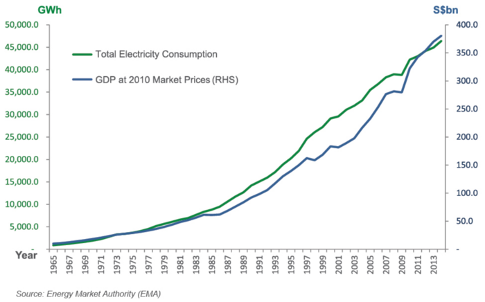
| − | Experts have warned that power demand is set to double by 2030 globally despite authoritative control. High power consumption can already be observed locally. According Energy Market Authority (EMA), Singapore has faced increasing power consumption from 1965 to 2013 <ref>https://www.ema.gov.sg/Publications_Annual_Reports.aspx</ref>. | + | Experts have warned that power demand is set to double by 2030 globally despite authoritative control. High power consumption can already be observed locally. According to the Energy Market Authority (EMA), Singapore has faced increasing power consumption from 1965 to 2013 <ref>https://www.ema.gov.sg/Publications_Annual_Reports.aspx</ref>. |
| − | [[File: | + | [[File:1718t1is428T15-Motivation.png|700px|center]] |
| − | As Singapore is land-scarce and does not have significant renewable energy options such as hydro-power, wave, or sufficient land for mass solar energy production, energy has been a top concern in the urban nation<ref>http://www.eco-business.com/news/tackling-energy-challenges-the-singapore-way/</ref>. It is thus important to promote energy saving concepts to the public as well as deploying energy saving solution island wide. However, the usual analysis tools are not enough to provide a different perspective to facilitate the deployment of the solution. Information about the energy consumption levels of residents in Singapore are often not conveyed adequately enough in | + | As Singapore is land-scarce and does not have significant renewable energy options such as hydro-power, wave, or sufficient land for mass solar energy production, energy has been a top concern in the urban nation<ref>http://www.eco-business.com/news/tackling-energy-challenges-the-singapore-way/</ref>. It is thus important to promote energy saving concepts to the public as well as deploying energy saving solution island wide. However, the usual analysis tools are not enough to provide a different perspective to facilitate the deployment of the solution. Information about the energy consumption levels of residents in Singapore are often not conveyed adequately enough in data visualisation. While EMA and Singstat provide annual data and reports on energy usage in Singapore, a powerful visualisation technique should be used to gain insights effectively. Our team aims to create a visualisation that leverages on energy datasets provided by EMA to perform spatial analysis to identify energy usage clusters with hexagonal binning. |
| − | |||
| − | <!-- | + | <!-- END PROJECT MOTIVATION & OBJECTIVE --> |
| − | + | <!-- START DATASET--> | |
| − | |||
| − | + | ==<div style="margin-top: 10px;font-family: Helvetica; text-align: left;font-size:20px; border: 5px solid #00000000; border-radius:5px; text-align:center; background-color: #132039; color: white; padding: 2px"><span style="font-size:24px;">D</span>atasets</div>== | |
| − | * | + | === Data Source === |
| + | Our analysis will be based on EMA's collection of data on Singapore's residential electricity consumption<ref>https://www.ema.gov.sg/Statistics.aspx</ref>: | ||
| + | * Public housing's monthly average household electricity consumption (kwh) (2013 - 2015) | ||
| + | * Private apartment's monthly average household electricity consumption (kwh) (2013 - 2015) | ||
| − | + | === Data Attributes === | |
| − | |||
| − | + | ==== Public Housing ==== | |
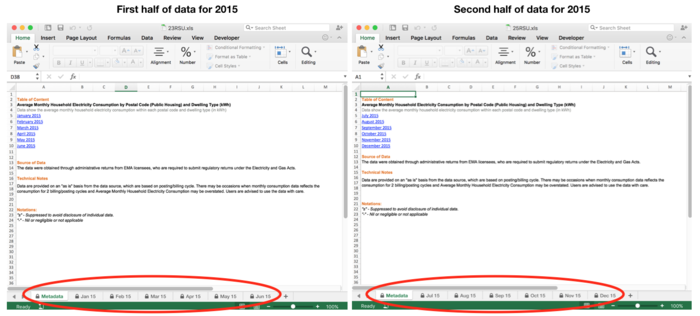
| − | + | The dataset for each year is split into two excel workbooks, each containing six sheets representing each month's data as shown below: | |
| − | + | [[File:1718t1is428T15-DataSourcePublic.png|700px|center]] | |
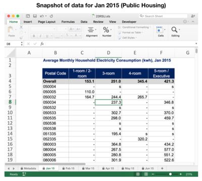
| − | + | The following is a snapshot of Jan 2015's electricity consumption data, and a description of the data attributes collected for each month: | |
| − | |||
| − | |||
| − | + | [[File:1718t1is428T15-DataSourcePublicJan.png|400px|center]] | |
| − | + | <center> | |
| − | + | {| class="wikitable" | |
| − | + | |- | |
| − | + | ! Attribute | |
| − | + | ! Description | |
| − | + | |- | |
| − | + | | Postal Code | |
| − | + | | Postal code of a public residential building | |
| − | + | |- | |
| − | + | | 1-room / 2-room | |
| − | + | | Average electricity consumed by 1-room/2-room flats in the building | |
| − | + | |- | |
| − | + | | 3-room | |
| − | + | | Average electricity consumed by 3-room flats in the building | |
| − | + | |- | |
| − | + | | 4-room | |
| − | + | | Average electricity consumed by 4-room flats in the building | |
| − | + | |- | |
| − | + | | 5-room / Executive | |
| − | + | | Average electricity consumed by 5-room/executive flats in the building | |
| − | + | |} | |
| − | + | </center> | |
| − | |||
| − | |||
| − | |||
| − | |||
| − | |||
| − | < | ||
| − | + | ==== Private Housing ==== | |
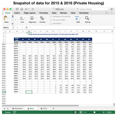
| − | + | The datasets for multiple years are split into one excel workbook, each sheet representing each year's data as shown below: | |
| − | + | [[File:1718t1is428T15-DataSourcePrivate.png|400px|center]] | |
| − | + | Each year's data contains the following attributes: | |
| − | + | <center> | |
| + | {| class="wikitable" | ||
| + | |- | ||
| + | ! Attribute | ||
| + | ! Description | ||
| + | |- | ||
| + | | Postal Code | ||
| + | | Postal code of a private residential building | ||
| + | |- | ||
| + | | Jan | ||
| + | | Average electricity consumed by all apartments in the building in Jan | ||
| + | |- | ||
| + | | Feb | ||
| + | | Average electricity consumed by all apartments in the building in Feb | ||
| + | |- | ||
| + | | Mar | ||
| + | | Average electricity consumed by all apartments in the building in Mar | ||
| + | |- | ||
| + | | Apr | ||
| + | | Average electricity consumed by all apartments in the building in Apr | ||
| + | |- | ||
| + | | May | ||
| + | | Average electricity consumed by all apartments in the building in May | ||
| + | |- | ||
| + | | Jun | ||
| + | | Average electricity consumed by all apartments in the building in Jun | ||
| + | |- | ||
| + | | Jul | ||
| + | | Average electricity consumed by all apartments in the building in Jul | ||
| + | |- | ||
| + | | Aug | ||
| + | | Average electricity consumed by all apartments in the building in Aug | ||
| + | |- | ||
| + | | Sep | ||
| + | | Average electricity consumed by all apartments in the building in Sep | ||
| + | |- | ||
| + | | Oct | ||
| + | | Average electricity consumed by all apartments in the building in Oct | ||
| + | |- | ||
| + | | Nov | ||
| + | | Average electricity consumed by all apartments in the building in Nov | ||
| + | |- | ||
| + | | Dec | ||
| + | | Average electricity consumed by all apartments in the building in Dec | ||
| + | |} | ||
| + | </center> | ||
| − | < | + | <!-- END DATASET--> |
| − | < | + | <!-- START RELATED WORKS--> |
| − | |||
| − | |||
| − | |||
| − | |||
| − | |||
| − | |||
| − | + | ==<div style="margin-top: 10px;font-family: Helvetica; text-align: left;font-size:20px; border: 5px solid #00000000; border-radius:5px; text-align:center; background-color: #132039; color: white; padding: 2px"><span style="font-size:24px;">R</span>elated <span style="font-size:24px">W</span>orks</div>== | |
| − | + | Much of the relevant prior work on residential energy consumption levels in Singapore revolve around the motivations and barriers towards energy efficiency. | |
| − | + | In 2013, the Ministry of the Environment and Water Resources (MEWR) interviewed 2,500 residents on their extent of energy efficiency practice at home, level of awareness of energy efficiency, and barriers towards being energy efficient. It found that 41.3% of the respondents are more encouraged to conserve electricity if the government were to provide monetary incentives or voucher rewards/rebates, and 36.5% are motivated by advertisements on various media platforms. The findings also concluded that residents generally perceived the high cost of energy-efficient appliances and inconvenience of energy-saving practices as barriers to energy efficiency in households.<ref>https://www.mewr.gov.sg/docs/default-source/default-document-library/grab-our-research/mewr_ee_report.pdf</ref> | |
| − | + | Another research by Energy Efficient Singapore (E2 Singapore) indicated that when residents in other countries are allowed to compare their utility bills against that of their neighbours, they can potentially achieve 4 to 12% energy savings. This is because it leverages on the power of social norms to provide direct feedback to the residents – residents are likely to bring their behavior closer to the norm when they are informed of what the norm is.<ref>http://www.e2singapore.gov.sg/DATA/0/docs/NewsFiles/Find%20out%20how%20much%20your%20neighbours%20spend%20on%20energy_v2.pdf</ref> | |
| − | + | A third by Xu and Ang from NUS analyzes the root cause of high energy consumption using the index decomposition analysis (IDA). The IDA model studies changes in energy consumption over time and is often used in major energy consuming sectors such as the transport industry. To fit the model for use on the residential sector, Xu and Ang applied a hybrid IDA model that divides the residential sector into various subsectors, each with a different key factor driving energy consumption. For instance, energy consumption in a subsector may be driven by floor area (for air cooling and heating). The paper found that environment control and household appliances are the main factors for energy consumption by households, and each of these is greatly affected by population growth and decreases in residents per household.<ref>http://www.e2singapore.gov.sg/DATA/0/docs/1-s2.0-S0306261913006193-main.pdf</ref> | |
| − | + | By using our proposed work jointly with the first two papers, users can visually identify clusters with high energy usage where efficient energy consumption measures can be implemented. With the last paper, we can trace the root cause for high energy usage. | |
| − | + | <!-- END RELATED WORKS --> | |
| − | + | <!-- START INSPIRATIONS--> | |
| − | + | ==<div style="margin-top: 10px;font-family: Helvetica; text-align: left;font-size:20px; border: 5px solid #00000000; border-radius:5px; text-align:center; background-color: #132039; color: white; padding: 2px"><span style="font-size:24px;">I</span>nspirations</div>== | |
| + | [[File:Otf choro.PNG |700px|center]]<br /> | ||
| + | The number of public and private address points in Singapore is exceptionally large at about twenty thousands records. While this may pale in comparison to data sets that amount to tens of millions of records in size, the real challenge lies in plotting these points over a geographical region as small as Singapore. The limitation in land space coupled with the immense number of data points would result in many overlapping and cluttering of address points, making data aggregation and visualizing energy consumption extremely difficult and ineffective. | ||
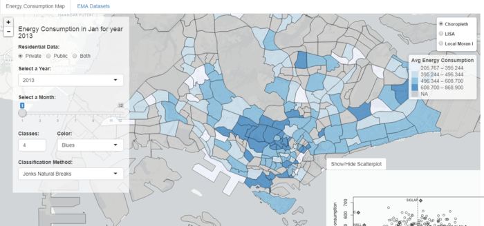
| − | + | Our team has already experimented aggregating energy consumption levels onto a choropleth map segmented by planning areas. This approach is effective in providing an overview of energy consumption levels across planning areas in Singapore, further assisting analysis in local indications of spatial correlation in terms of energy usage clustering. However, this approach is inept at investigating clustering at finer levels of spatial granularity, focusing on smaller areas is impossible as data is aggregated at the level of planning areas. | |
| + | [[File:Hexbin inspiration.PNG ||center]]<br /> | ||
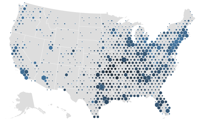
| + | With this in mind, On The Fly is experimenting with an alternative technique of hexagonal binning for visualizing energy usage density of public and private housings. By aggregating the number of address points into hexagons and computing the average energy consumption of address points in these hexagons, we aim to visualize energy consumption levels of address points aggregated across smaller areas in hex bins to generate a more detailed view of energy usages across geographical land space. | ||
| + | |||
| + | <!-- END INSPIRATIONS--> | ||
| − | + | <!-- START PROPOSED STORYBOARD--> | |
| − | < | + | ==<div style="margin-top: 10px;font-family: Helvetica; text-align: left;font-size:20px; border: 5px solid #00000000; border-radius:5px; text-align:center; background-color: #132039; color: white; padding: 2px"><span style="font-size:24px;">P</span>roposed <span style="font-size:24px">S</span>toryboard</div>== |
| − | + | [[File:1718t1is428T15-Storyboard.png|700px|center]] | |
| − | + | === Upload Data === | |
| − | + | An interface will be provided for the user to upload datasets of past and/or future years. This would provide more flexibility for users to analyze a wider range of energy usage data. | |
| − | + | === Hexagon Binning === | |
| − | [[File: | + | [[File:1718t1is428T15-StoryboardHexBin.png|700px|center]] |
| + | <center><small><i>Example of hexbin by [https://bl.ocks.org/mbostock/4330486 Mike Bostock]</i></small></center> | ||
| − | + | There are many levels that we can consider when thinking of how to analyze the intensity of energy consumption in Singapore, such as on a national level, regional level, or subzone level. But these levels are too coarse and does not provide a comprehensive view - for instance, a large subzone would surely have a higher energy consumption level since there are more residents living in it. | |
| − | + | Thus, to properly analyze the intensity of energy consumption in Singapore, we need to do so on a more granular level; We decide to break down Singapore into various groups of postal codes. By aggregating a few postal codes together, we have a higher chance of uncovering new findings. | |
| − | + | The best way to visualize this would be to plot hexagon bins (“hexbins”) onto the Singapore map, with each hexbin representing a group of postal codes, and using a gradient colour scheme to represent each group’s energy consumption intensity. | |
| − | + | === Line Chart === | |
| − | [[File: | + | [[File:1718t1is428T15-StoryboardLineChart.png|700px|center]] |
| + | <center><small><i>Example of multi-series line chart by [https://bl.ocks.org/mbostock/3884955 Mike Bostock]</i></small></center> | ||
| − | + | We will add in a multi-series line chart to allow users to compare the monthly energy consumption levels by: 1) entire Singapore, 2) a group of postal codes, and 3) each postal code. | |
| − | + | The default line chart would show only the average monthly consumption of the entire nation. Upon clicking on a single hexbin, the line chart would populate another series to show the average monthly consumption by the group of postal codes within that hexbin. The clicking would also trigger the pop-out of a second map which features a zoomed in view of the hexbin, displaying the separate postal codes within the hexbin. Clicking on any points on the pop-out map would result in a third series, representing a single postal code, to be displayed on the line chart. | |
| − | + | <!-- END PROPOSED STORYBOARD--> | |
| − | |||
| − | < | + | <!-- START DATA PREPARATION--> |
| − | + | ==<div style="margin-top: 10px;font-family: Helvetica; text-align: left;font-size:20px; border: 5px solid #00000000; border-radius:5px; text-align:center; background-color: #132039; color: white; padding: 2px"><span style="font-size:24px;">D</span>ata Preparation</div>== | |
| − | + | === File Upload Format for Application === | |
| − | + | We transformed the raw public and private housing datasets into two excel workbooks, which our app is able to read, with the following columns: | |
| − | |||
| − | + | <center> | |
| + | <i><b>Public Housing</b></i> | ||
| − | - | + | [[File:1718t1is428T15-PublicCompiled.png|400px|center]] |
| − | </ | + | <small><i>Snapshot of public housing dataset</i></small> |
| − | + | {| class="wikitable" | |
| + | |- | ||
| + | ! Attribute | ||
| + | ! Description | ||
| + | |- | ||
| + | | Postal Code | ||
| + | | Postal code of a public residential building | ||
| + | |- | ||
| + | | oneroom | ||
| + | | Average electricity consumed by 1-room flats in the building | ||
| + | |- | ||
| + | | threeroom | ||
| + | | Average electricity consumed by 3-room flats in the building | ||
| + | |- | ||
| + | | fourroom | ||
| + | | Average electricity consumed by 4-room flats in the building | ||
| + | |- | ||
| + | | fiveroom | ||
| + | | Average electricity consumed by 5-room/executive flats in the building | ||
| + | |- | ||
| + | | average | ||
| + | | Average electricity consumed by all flats in the building | ||
| + | |- | ||
| + | | year | ||
| + | | Year in which the amount of electricity was consumed and measured | ||
| + | |- | ||
| + | | month | ||
| + | | Month in which the amount of electricity was consumed and measured | ||
| + | |- | ||
| + | | lat | ||
| + | | Latitude of the building | ||
| + | |- | ||
| + | | long | ||
| + | | Longitude of the building | ||
| + | |- | ||
| + | | address | ||
| + | | Address of the building | ||
| + | |} | ||
| + | </center> | ||
| − | + | <center> | |
| − | + | <i><b>Private Housing</b></i> | |
| − | |||
| − | |||
| − | |||
| − | |||
| − | |||
| − | < | + | [[File:1718t1is428T15-PrivateCompiled.png|400px|center]] |
| + | <small><i>Snapshot of private housing dataset</i></small> | ||
| − | + | {| class="wikitable" | |
| + | |- | ||
| + | ! Attribute | ||
| + | ! Description | ||
| + | |- | ||
| + | | Postal Code | ||
| + | | Postal code of a private residential building | ||
| + | |- | ||
| + | | average | ||
| + | | Average electricity consumed by all flats in the building | ||
| + | |- | ||
| + | | year | ||
| + | | Year in which the amount of electricity was consumed and measured | ||
| + | |- | ||
| + | | month | ||
| + | | Month in which the amount of electricity was consumed and measured | ||
| + | |- | ||
| + | | lat | ||
| + | | Latitude of the building | ||
| + | |- | ||
| + | | long | ||
| + | | Longitude of the building | ||
| + | |- | ||
| + | | address | ||
| + | | Address of the building | ||
| + | |} | ||
| + | </center> | ||
| − | === | + | === Measuring Average of Each Public Postal Code === |
| − | |||
| − | + | In our proposed storyboard, the color intensity of each hexbin represents the amount of energy consumed by the postal codes within the hexbin. As we moved further into the project, however, we faced a limitation from EMA's datasets. | |
| − | + | For public housing, the data provided by EMA only tells us the average electricity consumption by all apartments that falls under the same dwelling type. For instance, the dataset for July 2015 would tell us that 3-room flats in postal code 824601 used an average of 339 kwh of electricity. The crucial information that we were unable to obtain is how many 3-room flats are in postal code 824601, or what is the total electricity consumed by all the 3-room flats. This makes it impossible for us to accurately compute each postal code's weighted-average electricity consumption. | |
| − | + | The only measure we can use to determine the public housings' hexbin color intensity is thus the average of averages. That is, for each postal code, we take the average energy consumption of 1-room/2-room, 3-room, 4-room and 5-room/executive apartments and treat that as the postal code average. However, we are aware that this is a very inaccurate representation of the actual postal code average, unless the postal code has an equally distribute number of dwelling types<ref>https://math.stackexchange.com/questions/95909/why-is-an-average-of-an-average-usually-incorrect</ref>. | |
| − | |||
| − | |||
| − | + | === Suppressed Data === | |
| − | |||
| + | Datasets for both public and private housing contains many 's' values, which represent readings that are suppressed to avoid disclosure of individual data. Such values, whether left in the datasets or removed, will affect the accuracy of our analysis. If left in the datasets, then our computation of a postal code's average would treat the 's' values as 0 (since there is no reliable way to estimate the 's' values), and bring down the overall average. On the other hand, if postal codes containing 's' values are removed from our datasets, months' or years' worth of data would be missing. At the end, we decided to remove such postal codes as it is better to treat them as missing values rather than 0. | ||
| − | + | [[File:1718t1is428T15-Suppressed1.png|400px|center]] | |
| + | [[File:1718t1is428T15-Suppressed2.png|400px|center]] | ||
| + | <center><small><i>Snapshot of suppressed values in dataset</i></small></center> | ||
| − | === | + | === Geocoding Postal Codes === |
| − | |||
| − | |||
| − | [ | + | To be able to plot the postal codes on a map, we first need to convert the postal codes to longitude and latitude. We did this by creating a geocoder app ([https://github.com/tankunsheng/SgPostalToLatLng LeGeocoder]) that calls upon OneMap's <code>search</code> API. The geocoder is able to read an excel workbook containing the postal codes, and returns an updated excel workbook containing the longitude and latitude for each postal code. |
| − | + | To make the search more efficient, we first created a separate spreadsheet that compiles all the unique public and private postal codes across 2013-2015. Then with the results from the geocoder, we performed <code>vlookup</code> with excel to obtain the lat long for the file to be uploaded onto our app. | |
| − | + | We found that for certain postal codes, OneMap's API would return us the values for bus stops, rather than residential buildings. | |
| − | + | [[File:1718t1is428T15-OneMapBusStops.png|400px|center]] | |
| + | <center><small><i>Snapshot of OneMap API returning bus stops instead of residential buildings</i></small></center> | ||
| − | + | And for some postal codes, although a residential building can be found through a Google search, the API was unable to return any results. | |
| − | |||
| − | |||
| − | < | + | [[File:1718t1is428T15-OneMapCantFind.png|400px|center]] |
| + | <center><small><i>Snapshot of OneMap API being unable to find valid postal codes</i></small></center> | ||
| − | + | <!-- END DATA PREPARATION--> | |
| − | |||
| − | |||
| − | |||
| − | |||
| − | |||
| − | |||
| − | |||
| − | <!-- | + | <!-- START ARCHITECTURE DIAGRAM--> |
| − | < | + | ==<div style="margin-top: 10px;font-family: Helvetica; text-align: left;font-size:20px; border: 5px solid #00000000; border-radius:5px; text-align:center; background-color: #132039; color: white; padding: 2px"><span style="font-size:24px;">A</span>rchitecture <span style="font-size:24px">D</span>iagram</div>== |
| − | + | [[File:1718t1is428T15-MainArchitecture.png|400px|center]] | |
| − | + | <center><small><i>Architecture diagram of Visual Enerlyst application</i></small></center> | |
| − | |||
| − | |||
| − | |||
| − | |||
| − | |||
| − | |||
| − | |||
| − | |||
| − | |||
| − | |||
| − | |||
| − | |||
| − | |||
| − | + | [[File:1718t1is428T15-GeocoderArchitecture.png|400px|center]] | |
| − | + | <center><small><i>Architecture diagram of LeGeocoder application</i></small></center> | |
| − | [[File: | ||
| − | < | ||
| − | |||
| − | + | <!-- END ARCHITECTURE DIAGRAM--> | |
| − | + | <!-- START TECHNICAL CHALLENGES--> | |
| − | |||
| − | |||
| − | |||
| − | |||
| − | |||
| − | |||
| − | |||
| − | |||
| − | + | ==<div style="margin-top: 10px;font-family: Helvetica; text-align: left;font-size:20px; border: 5px solid #00000000; border-radius:5px; text-align:center; background-color: #132039; color: white; padding: 2px"><span style="font-size:24px;">T</span>echnical <span style="font-size:24px">C</span>hallenges</div>== | |
| − | |||
| − | |||
| − | |||
| − | |||
| − | |||
| − | |||
| − | + | {| class="wikitable" style="background-color:#FFFFFF;" width="100%" | |
| − | |||
| − | |||
| − | |||
| − | |||
| − | = | ||
| − | |||
| − | |||
|- | |- | ||
| − | ! | + | ! style="font-weight: bold;background: #181c48;color:#fbfcfd;width: 50%;" | Key Technical Challenges |
| + | ! style="font-weight: bold;background: #181c48;color:#fbfcfd;" | How We Propose To Resolve | ||
|- | |- | ||
| − | | | + | | <center> Unfamiliarity with d3.js libraries </center> || |
| + | * Independent Learning | ||
| + | * Consult Instructor Prakash | ||
| + | * Peer Learning | ||
|- | |- | ||
| − | | | + | | <center> Data Cleaning & Transformation </center> || |
| + | * Work together to clean, transform and analyze the data | ||
|- | |- | ||
| − | | | + | | <center> Unfamiliarity in Implementing Interactivity and Animation Tools/Techniques in Visualization App </center> || |
| − | + | * Develop a Storyboard/Design Flow | |
| − | + | * Assign members to specialize on Interactivity/Animation Techniques | |
| − | |||
| − | |||
| − | |||
| − | |||
| − | |||
| − | |||
| − | |||
| − | |||
| − | |||
| − | |||
| − | |||
| − | |||
| − | |||
| − | |||
| − | |||
| − | |||
|} | |} | ||
| − | |||
| − | |||
| − | <!-- START | + | <!-- END TECHNICAL CHALLENGES--> |
| + | |||
| + | <!-- START TIMELINE --> | ||
| + | |||
| + | ==<div style="margin-top: 10px;font-family: Helvetica; text-align: left;font-size:20px; border: 5px solid #00000000; border-radius:5px; text-align:center; background-color: #132039; color: white; padding: 2px"><span style="font-size:24px;">T</span>imeline</div>== | ||
| − | + | [[File:1718t1is428T15-Timeline.png|700px|center]] | |
| − | * | + | <!-- END TIMELINE--> |
| − | * | + | |
| − | * | + | <!-- START TECHNICAL TECHNOLOGIES--> |
| − | <!-- END | + | |
| + | ==<div style="margin-top: 10px;font-family: Helvetica; text-align: left;font-size:20px; border: 5px solid #00000000; border-radius:5px; text-align:center; background-color: #132039; color: white; padding: 2px"><span style="font-size:24px;">T</span>echnologies/<span style="font-size:24px">T</span>ools</div>== | ||
| + | |||
| + | The following are technologies and tools which we used: | ||
| + | * Microsoft Excel (data cleaning) | ||
| + | * d3.js (visualisation) | ||
| + | * Leaflet.js (overlaying of map) | ||
| + | * d3-hexbin.js (overlaying of hexagonal bins, wrapper library of d3 and leaflet) | ||
| + | * Github (version control) | ||
| + | |||
| + | <!-- END TECHNOLOGIES--> | ||
<!-- START REFERENCE --> | <!-- START REFERENCE --> | ||
| − | ==<div style="margin-top: 10px;font-family: Helvetica; text-align: left;font-size:20px; border: 5px solid #00000000; border-radius:5px; text-align:center; background-color: # | + | ==<div style="margin-top: 10px;font-family: Helvetica; text-align: left;font-size:20px; border: 5px solid #00000000; border-radius:5px; text-align:center; background-color: #132039; color: white; padding: 2px"><span style="font-size:24px;">R</span>eference</div>== |
<references /> | <references /> | ||
<!-- END REFERENCE --> | <!-- END REFERENCE --> | ||
| + | |||
| + | <!-- START COMMENTS --> | ||
| + | |||
| + | ==<div style="margin-top: 10px;font-family: Helvetica; text-align: left;font-size:20px; border: 5px solid #00000000; border-radius:5px; text-align:center; background-color: #132039; color: white; padding: 2px"><span style="font-size:24px;">C</span>omments</div>== | ||
| + | <references /> | ||
| + | <!-- END COMMENTS --> | ||
Latest revision as of 11:29, 26 November 2017
|
PROJECT PROPOSAL |
Contents
Project Motivation & Objective
Experts have warned that power demand is set to double by 2030 globally despite authoritative control. High power consumption can already be observed locally. According to the Energy Market Authority (EMA), Singapore has faced increasing power consumption from 1965 to 2013 [1].
As Singapore is land-scarce and does not have significant renewable energy options such as hydro-power, wave, or sufficient land for mass solar energy production, energy has been a top concern in the urban nation[2]. It is thus important to promote energy saving concepts to the public as well as deploying energy saving solution island wide. However, the usual analysis tools are not enough to provide a different perspective to facilitate the deployment of the solution. Information about the energy consumption levels of residents in Singapore are often not conveyed adequately enough in data visualisation. While EMA and Singstat provide annual data and reports on energy usage in Singapore, a powerful visualisation technique should be used to gain insights effectively. Our team aims to create a visualisation that leverages on energy datasets provided by EMA to perform spatial analysis to identify energy usage clusters with hexagonal binning.
Datasets
Data Source
Our analysis will be based on EMA's collection of data on Singapore's residential electricity consumption[3]:
- Public housing's monthly average household electricity consumption (kwh) (2013 - 2015)
- Private apartment's monthly average household electricity consumption (kwh) (2013 - 2015)
Data Attributes
Public Housing
The dataset for each year is split into two excel workbooks, each containing six sheets representing each month's data as shown below:
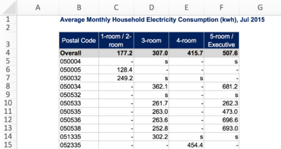
The following is a snapshot of Jan 2015's electricity consumption data, and a description of the data attributes collected for each month:
| Attribute | Description |
|---|---|
| Postal Code | Postal code of a public residential building |
| 1-room / 2-room | Average electricity consumed by 1-room/2-room flats in the building |
| 3-room | Average electricity consumed by 3-room flats in the building |
| 4-room | Average electricity consumed by 4-room flats in the building |
| 5-room / Executive | Average electricity consumed by 5-room/executive flats in the building |
Private Housing
The datasets for multiple years are split into one excel workbook, each sheet representing each year's data as shown below:
Each year's data contains the following attributes:
| Attribute | Description |
|---|---|
| Postal Code | Postal code of a private residential building |
| Jan | Average electricity consumed by all apartments in the building in Jan |
| Feb | Average electricity consumed by all apartments in the building in Feb |
| Mar | Average electricity consumed by all apartments in the building in Mar |
| Apr | Average electricity consumed by all apartments in the building in Apr |
| May | Average electricity consumed by all apartments in the building in May |
| Jun | Average electricity consumed by all apartments in the building in Jun |
| Jul | Average electricity consumed by all apartments in the building in Jul |
| Aug | Average electricity consumed by all apartments in the building in Aug |
| Sep | Average electricity consumed by all apartments in the building in Sep |
| Oct | Average electricity consumed by all apartments in the building in Oct |
| Nov | Average electricity consumed by all apartments in the building in Nov |
| Dec | Average electricity consumed by all apartments in the building in Dec |
Related Works
Much of the relevant prior work on residential energy consumption levels in Singapore revolve around the motivations and barriers towards energy efficiency.
In 2013, the Ministry of the Environment and Water Resources (MEWR) interviewed 2,500 residents on their extent of energy efficiency practice at home, level of awareness of energy efficiency, and barriers towards being energy efficient. It found that 41.3% of the respondents are more encouraged to conserve electricity if the government were to provide monetary incentives or voucher rewards/rebates, and 36.5% are motivated by advertisements on various media platforms. The findings also concluded that residents generally perceived the high cost of energy-efficient appliances and inconvenience of energy-saving practices as barriers to energy efficiency in households.[4]
Another research by Energy Efficient Singapore (E2 Singapore) indicated that when residents in other countries are allowed to compare their utility bills against that of their neighbours, they can potentially achieve 4 to 12% energy savings. This is because it leverages on the power of social norms to provide direct feedback to the residents – residents are likely to bring their behavior closer to the norm when they are informed of what the norm is.[5]
A third by Xu and Ang from NUS analyzes the root cause of high energy consumption using the index decomposition analysis (IDA). The IDA model studies changes in energy consumption over time and is often used in major energy consuming sectors such as the transport industry. To fit the model for use on the residential sector, Xu and Ang applied a hybrid IDA model that divides the residential sector into various subsectors, each with a different key factor driving energy consumption. For instance, energy consumption in a subsector may be driven by floor area (for air cooling and heating). The paper found that environment control and household appliances are the main factors for energy consumption by households, and each of these is greatly affected by population growth and decreases in residents per household.[6]
By using our proposed work jointly with the first two papers, users can visually identify clusters with high energy usage where efficient energy consumption measures can be implemented. With the last paper, we can trace the root cause for high energy usage.
Inspirations
The number of public and private address points in Singapore is exceptionally large at about twenty thousands records. While this may pale in comparison to data sets that amount to tens of millions of records in size, the real challenge lies in plotting these points over a geographical region as small as Singapore. The limitation in land space coupled with the immense number of data points would result in many overlapping and cluttering of address points, making data aggregation and visualizing energy consumption extremely difficult and ineffective.
Our team has already experimented aggregating energy consumption levels onto a choropleth map segmented by planning areas. This approach is effective in providing an overview of energy consumption levels across planning areas in Singapore, further assisting analysis in local indications of spatial correlation in terms of energy usage clustering. However, this approach is inept at investigating clustering at finer levels of spatial granularity, focusing on smaller areas is impossible as data is aggregated at the level of planning areas.
With this in mind, On The Fly is experimenting with an alternative technique of hexagonal binning for visualizing energy usage density of public and private housings. By aggregating the number of address points into hexagons and computing the average energy consumption of address points in these hexagons, we aim to visualize energy consumption levels of address points aggregated across smaller areas in hex bins to generate a more detailed view of energy usages across geographical land space.
Proposed Storyboard
Upload Data
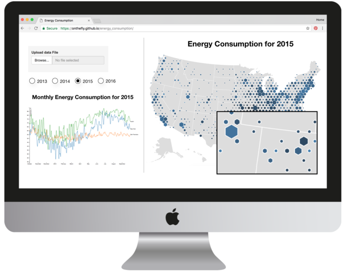
An interface will be provided for the user to upload datasets of past and/or future years. This would provide more flexibility for users to analyze a wider range of energy usage data.
Hexagon Binning
There are many levels that we can consider when thinking of how to analyze the intensity of energy consumption in Singapore, such as on a national level, regional level, or subzone level. But these levels are too coarse and does not provide a comprehensive view - for instance, a large subzone would surely have a higher energy consumption level since there are more residents living in it.
Thus, to properly analyze the intensity of energy consumption in Singapore, we need to do so on a more granular level; We decide to break down Singapore into various groups of postal codes. By aggregating a few postal codes together, we have a higher chance of uncovering new findings.
The best way to visualize this would be to plot hexagon bins (“hexbins”) onto the Singapore map, with each hexbin representing a group of postal codes, and using a gradient colour scheme to represent each group’s energy consumption intensity.
Line Chart
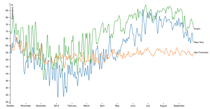
We will add in a multi-series line chart to allow users to compare the monthly energy consumption levels by: 1) entire Singapore, 2) a group of postal codes, and 3) each postal code.
The default line chart would show only the average monthly consumption of the entire nation. Upon clicking on a single hexbin, the line chart would populate another series to show the average monthly consumption by the group of postal codes within that hexbin. The clicking would also trigger the pop-out of a second map which features a zoomed in view of the hexbin, displaying the separate postal codes within the hexbin. Clicking on any points on the pop-out map would result in a third series, representing a single postal code, to be displayed on the line chart.
Data Preparation
File Upload Format for Application
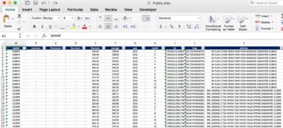
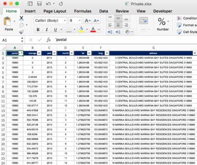
We transformed the raw public and private housing datasets into two excel workbooks, which our app is able to read, with the following columns:
Public Housing
Snapshot of public housing dataset
| Attribute | Description |
|---|---|
| Postal Code | Postal code of a public residential building |
| oneroom | Average electricity consumed by 1-room flats in the building |
| threeroom | Average electricity consumed by 3-room flats in the building |
| fourroom | Average electricity consumed by 4-room flats in the building |
| fiveroom | Average electricity consumed by 5-room/executive flats in the building |
| average | Average electricity consumed by all flats in the building |
| year | Year in which the amount of electricity was consumed and measured |
| month | Month in which the amount of electricity was consumed and measured |
| lat | Latitude of the building |
| long | Longitude of the building |
| address | Address of the building |
Private Housing
Snapshot of private housing dataset
| Attribute | Description |
|---|---|
| Postal Code | Postal code of a private residential building |
| average | Average electricity consumed by all flats in the building |
| year | Year in which the amount of electricity was consumed and measured |
| month | Month in which the amount of electricity was consumed and measured |
| lat | Latitude of the building |
| long | Longitude of the building |
| address | Address of the building |
Measuring Average of Each Public Postal Code
In our proposed storyboard, the color intensity of each hexbin represents the amount of energy consumed by the postal codes within the hexbin. As we moved further into the project, however, we faced a limitation from EMA's datasets.
For public housing, the data provided by EMA only tells us the average electricity consumption by all apartments that falls under the same dwelling type. For instance, the dataset for July 2015 would tell us that 3-room flats in postal code 824601 used an average of 339 kwh of electricity. The crucial information that we were unable to obtain is how many 3-room flats are in postal code 824601, or what is the total electricity consumed by all the 3-room flats. This makes it impossible for us to accurately compute each postal code's weighted-average electricity consumption.
The only measure we can use to determine the public housings' hexbin color intensity is thus the average of averages. That is, for each postal code, we take the average energy consumption of 1-room/2-room, 3-room, 4-room and 5-room/executive apartments and treat that as the postal code average. However, we are aware that this is a very inaccurate representation of the actual postal code average, unless the postal code has an equally distribute number of dwelling types[7].
Suppressed Data
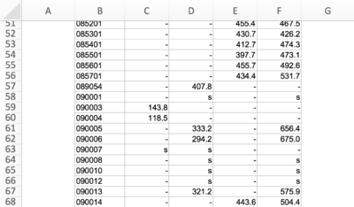
Datasets for both public and private housing contains many 's' values, which represent readings that are suppressed to avoid disclosure of individual data. Such values, whether left in the datasets or removed, will affect the accuracy of our analysis. If left in the datasets, then our computation of a postal code's average would treat the 's' values as 0 (since there is no reliable way to estimate the 's' values), and bring down the overall average. On the other hand, if postal codes containing 's' values are removed from our datasets, months' or years' worth of data would be missing. At the end, we decided to remove such postal codes as it is better to treat them as missing values rather than 0.
Geocoding Postal Codes
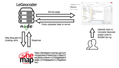
To be able to plot the postal codes on a map, we first need to convert the postal codes to longitude and latitude. We did this by creating a geocoder app (LeGeocoder) that calls upon OneMap's search API. The geocoder is able to read an excel workbook containing the postal codes, and returns an updated excel workbook containing the longitude and latitude for each postal code.
To make the search more efficient, we first created a separate spreadsheet that compiles all the unique public and private postal codes across 2013-2015. Then with the results from the geocoder, we performed vlookup with excel to obtain the lat long for the file to be uploaded onto our app.
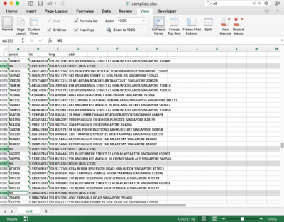
We found that for certain postal codes, OneMap's API would return us the values for bus stops, rather than residential buildings.
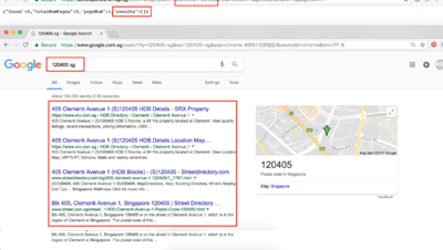
And for some postal codes, although a residential building can be found through a Google search, the API was unable to return any results.
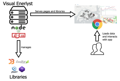
Architecture Diagram
Technical Challenges
| Key Technical Challenges | How We Propose To Resolve |
|---|---|
| |
| |
|
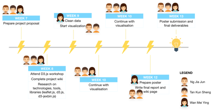
Timeline
Technologies/Tools
The following are technologies and tools which we used:
- Microsoft Excel (data cleaning)
- d3.js (visualisation)
- Leaflet.js (overlaying of map)
- d3-hexbin.js (overlaying of hexagonal bins, wrapper library of d3 and leaflet)
- Github (version control)
Reference
- ↑ https://www.ema.gov.sg/Publications_Annual_Reports.aspx
- ↑ http://www.eco-business.com/news/tackling-energy-challenges-the-singapore-way/
- ↑ https://www.ema.gov.sg/Statistics.aspx
- ↑ https://www.mewr.gov.sg/docs/default-source/default-document-library/grab-our-research/mewr_ee_report.pdf
- ↑ http://www.e2singapore.gov.sg/DATA/0/docs/NewsFiles/Find%20out%20how%20much%20your%20neighbours%20spend%20on%20energy_v2.pdf
- ↑ http://www.e2singapore.gov.sg/DATA/0/docs/1-s2.0-S0306261913006193-main.pdf
- ↑ https://math.stackexchange.com/questions/95909/why-is-an-average-of-an-average-usually-incorrect
Comments

