Difference between revisions of "1718t1is428T4"
| Line 22: | Line 22: | ||
<!--Content--> | <!--Content--> | ||
<br/> | <br/> | ||
| − | |||
| − | |||
| Line 34: | Line 32: | ||
Studies are showing that Singapore will reach a concerning 15% for obesity rate in seven years. Obesity has significant implications such as high blood pressure, type 2 diabetes, heart diseases, strokes, etc. Coming from a generation which focuses on convenience and quickness, we were curious to find out the factors that drive the rate of obesity so that we can propose a solution to combat obesity on a national level. | Studies are showing that Singapore will reach a concerning 15% for obesity rate in seven years. Obesity has significant implications such as high blood pressure, type 2 diabetes, heart diseases, strokes, etc. Coming from a generation which focuses on convenience and quickness, we were curious to find out the factors that drive the rate of obesity so that we can propose a solution to combat obesity on a national level. | ||
| + | |||
| + | |||
| + | |||
| Line 41: | Line 42: | ||
| '''Explanation''' | | '''Explanation''' | ||
|- | |- | ||
| − | | [[File: | + | | [[File:Findings1.png|center|600x500px|upright=3.0]] |
<br><br> | <br><br> | ||
| − | <div align="center"><font size="1">Source : https://www. | + | <div align="center"><font size="1">Source : https://www.climate.gov/maps-data/data-snapshots/totalprecip-monthly-cmb-2017-09-00?theme=Precipitation</font></div> |
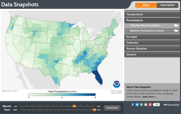
| − | | This | + | | This visualisation shows the distribution of precipitation (i.e. rainfall) across the United States. The intensity of color on the map indicates the severity of rainfall at that location, with a darker color reflecting higher rainfall. |
| + | |||
|- | |- | ||
| − | | [[File: | + | | [[File:Findings2.png|center|600x500px]] |
<br><br> | <br><br> | ||
| − | <div align="center"><font size="1">Source: https:// | + | <div align="center"><font size="1">Source: https://climate-explorer.nemac.org/?tp=g_a¢er=-9413982.7,3893395.7&zoom=4&p=G&scales=time:20161031000000.0:20171031000000.0,ytd-prcp:0.0:60.0,temp:0.0:100.0&graphs=USC00166686:PRCP_YTD,USC00233838:PRCP_YTD |
| − | | This | + | </font></div> |
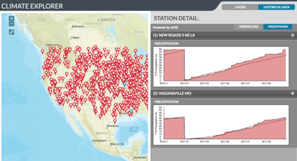
| + | | This visualisation allows the user to choose 2 or more locations from the map, upon which the rainfall at these locations over the years is displayed as separate graphs for each location. As these graphs are placed side by side and follow similar axes, it is easy to compare the trends in rainfall between the locations selected. This is an easy and interactive way to allow the users to compare the data trends for the specific locations that are of interest to them. | ||
| + | |||
|- | |- | ||
| − | | [[File: | + | | [[File:Findings3.png|center|600x500px]] |
<br><br> | <br><br> | ||
| − | <div align="center"><font size="1">Source: https:// | + | <div align="center"><font size="1">Source: https://weatherspark.com/y/114655/Average-Weather-in-Singapore-Year-Round</font></div> |
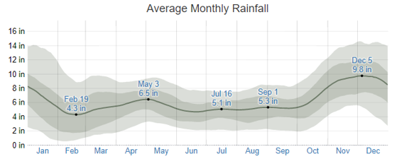
| − | | | + | | The visualisation allows the user to see how the rainfall varies between the 25th to 75th and 10th to 90th percentile bands, over the period of one year, showing variation within the months and not just the aggregate of the month's’ readings. By doing so, the viewers are able to differentiate the likelihood of a rainfall and its measurement throughout the year. |
| + | |||
|} | |} | ||
| Line 74: | Line 79: | ||
|Research data through other platforms such as SMU Libraries and companies’ official webpage | |Research data through other platforms such as SMU Libraries and companies’ official webpage | ||
|} | |} | ||
| + | |||
| + | |||
| + | |||
===<div style="background-color:maroon"><font color="white">Project Timeline</font></div>=== | ===<div style="background-color:maroon"><font color="white">Project Timeline</font></div>=== | ||
| + | [[File:timeline2.jpg|center|1000x900px]] | ||
| + | |||
| + | |||
| + | |||
| + | |||
| + | |||
| + | ===<div style="background-color:maroon"><font color="white"> Sketch </font></div>=== | ||
| + | {| class="wikitable" | ||
| + | |||
| + | |- | ||
| + | | [[File:Homepage.jpg|center|600px]] | ||
| + | | [[File:Droplet1.jpg|center|600px]] | ||
| + | |- | ||
| + | |||
| + | | [[File:Droplet2.jpg|center|600px]] | ||
| + | | [[File:Droplet3.jpg|center|600px]] | ||
| + | |- | ||
| + | |||
| + | |} | ||
| + | |||
| + | |||
| − | |||
Revision as of 18:41, 11 November 2017
Contents
Problem and Motivation
The increasing number of food delivery companies, such as FoodPanda, Deliveroo and UberEATS, has provided residents in Singapore with an easy alternative to have their food delivered to their doorstep. The convenience reaped from this service has also gained popularity among the working population and students due to the reduction in time in getting the meal. This is a worrying trend just like the increasing preference for fast food.
As how consuming more fast food reduced the time taken to wait for the food, the benefit of food delivery has adversely promoted laziness in the users, whereby the ease of getting food has eliminated the travelling time and effort for the users. This means that one can spend more time enjoying his/her meal and also get more whenever and wherever they want.
Studies are showing that Singapore will reach a concerning 15% for obesity rate in seven years. Obesity has significant implications such as high blood pressure, type 2 diabetes, heart diseases, strokes, etc. Coming from a generation which focuses on convenience and quickness, we were curious to find out the factors that drive the rate of obesity so that we can propose a solution to combat obesity on a national level.
Background Survey and Related Works
| Survey | Explanation |
|
|
This visualisation shows the distribution of precipitation (i.e. rainfall) across the United States. The intensity of color on the map indicates the severity of rainfall at that location, with a darker color reflecting higher rainfall. |
|
|
This visualisation allows the user to choose 2 or more locations from the map, upon which the rainfall at these locations over the years is displayed as separate graphs for each location. As these graphs are placed side by side and follow similar axes, it is easy to compare the trends in rainfall between the locations selected. This is an easy and interactive way to allow the users to compare the data trends for the specific locations that are of interest to them. |
|
|
The visualisation allows the user to see how the rainfall varies between the 25th to 75th and 10th to 90th percentile bands, over the period of one year, showing variation within the months and not just the aggregate of the month's’ readings. By doing so, the viewers are able to differentiate the likelihood of a rainfall and its measurement throughout the year. |
Technical Challenges
| Key Technical Challenges | Solutions |
| Least familiarity with D3.js, javascript and jQuery | Attend workshop conducted during recess week Self-learning through online platform (e.g. codeAcademy) |
| Data Preparation | Decide as a team on what data to keep and eliminate |
| Availability of data sets | Research data through other platforms such as SMU Libraries and companies’ official webpage |
Project Timeline
Sketch
Technologies & Tools
- Excel
- D3.js
- Tableau
- Javascript
- jQuery
References
