Difference between revisions of "1718t1is428T14/Proposal"
| Line 62: | Line 62: | ||
== Storyboard == | == Storyboard == | ||
| + | {| class="wikitable" | ||
| + | |- | ||
| + | ! style="font-weight: bold;width: 50%;" | Visualization | ||
| + | ! style="font-weight: bold;;" | Description | ||
| + | |- | ||
| + | | | ||
| + | <p><center>'''Sankey Diagram''' </center></p> | ||
| + | [[File:f1-sankey.png|center|250px]] | ||
| + | || | ||
| + | This type of visualisation shows hierarchy through a series of rings, that are sliced for each category node. Each ring corresponds to a level in the hierarchy, with the central circle representing the root node and the hierarchy moving outwards from it. Colour can be used to highlight hierarchal groupings or specific categories. We believe that a sunburst diagram would be effective as we would be able to visualise the number of cars breaking down from region to country to car brand. We would be using chart since it is easy to implement and interactive. These are some variations of the sunburst that we are considering too. | ||
| + | |- | ||
| + | | | ||
| + | <p><center>'''Treemap with Geographic Heatmap''' </center></p> | ||
| + | [[File:Treemap2.jpg|center|300px]] | ||
| + | [[File:Treemap1.jpg|center|300px]] | ||
| + | || | ||
| + | Treemaps are used to display hierarchical data. Treemaps are economical in that they can be used within a limited space and yet display a large number of items simultaneously. We chose to use a tree map, because it would give an overview of the amount spent on different car brands, car brands of similar regions would be grouped with same colour. The cars would be grouped by continent. | ||
| + | When the cursor hovers over the continent, the geographic heatmap will be displayed to show the country distribution for that continent. | ||
| + | |- | ||
| + | | | ||
| + | <p><center>'''Radial Stacked Barchart''' </center></p> | ||
| + | [[File:Stacked.jpg|center|250px]] | ||
| + | || | ||
| + | We may want to effectively compare the COE prices. As there would be many years and months of COE, a radial stackbar chart will allow the prices to be presented in a single view and not across the screen. This is a non traditional take of the bar chart. | ||
| + | |} | ||
Revision as of 15:50, 11 November 2017
Contents
Problem and Motivation
Formula One, better known as F1, is the highest class of racing for open-wheel automobiles that is sanctioned by the Fédération Internationale de l'Automobile (FIA),the governing body of motor sports. Open-wheel cars are cars with wheels outside of the main body, of which F1 cars are the most well-known. With their powerful engines and lightweight, aerodynamic bodies, F1 cars are capable of speeds of up to 375 km/h and are one of the fastest in the world in terms of acceleration, cornering, and overall lap times around a road circuit.
Held annually since 1950, the FIA Formula One World Championship is a race series that garners a massive base of fans and spectators, and has become one of the most coveted automotive events and spectator sports of all time. Each F1 championship, known as a "season", consist of approximately 20 races, each known as a "Grand Prix", held in circuits in different countries all over the world. The results of each race are tabulated in a points-based system to determine two annual Championship winners, one among drivers and one among constructors(teams).
Victory in F1 races is worth addressing as the F1 industry has grown to become a multi-billion-dollar industry, with a huge viewership and fan-following worldwide. It is also the hallmark of innovation in automotive technology and engineering - for example, the Kinetic Energy Recovery System which harnesses wasted energy for a power boost - and its continued success and expansion paves the way for technological development, even beyond the automotive industry.
Objectives
Our project aims to provide insights to F1 drivers and constructors (teams) by generating comprehensive visual data representations, segmented by the various factors that affect victory in an F1 Grand Prix (based on historical data) to help teams generate more effective strategies to increase their likelihood of victory.
Selected Datasets
Our project will be using datasets from online sources which track and list fundamental information such as lap times and pit stop times, available on websites such as statsf1.com. We will also transcribe the data to our own Excel spreadsheets and process them to sieve out important information.
Our project will analyze the following attributes from the datasets:
- Drivers
- Grand Prix Locations each Season
- Lap times
- Pit stop times
- Pit stop strategies
- Tyre strategies
- Budgets
- Constructors
- Weather
- Final results
- Vehicle Breakdowns
- Crashes
Approach
Our approach to this problem is to first define a professional F1 driver's journey through an F1 season, which lasts for about 20 Grand Prix races. We will then create easily-understood visual data representations to link the above attributes to the victory rates of drivers and constructors, with the aim of allowing the audience to easily deduce the best strategies and other factors that is most likely to help them achieve victory in a race or in an entire season. This may be separated not only into specific sets of races (e.g. best strategy to win 1 race vs. best strategy to win an entire season), but also into specific locations (best strategy on Monaco Grand Prix circuit), budget availability, or specific weather conditions, among others. In addition, it may even include a combination of factors (best strategy to win a race in Monaco Grand Prix in wet weather, given a budget of approximately $100 million). The user of the final resulting program will be able to select the factors according to his current situation and/or the driver or constructor whose performance he is interested in assessing.
In addition, research will be done to supplement the best strategies and find out why they have historically led to the greatest number of victories. This will help the user to understand what leads to such victories, hence extending the purpose of our visualizations beyond mere data - they will also help the user to tailor the strategies to their own needs to reflect other factors which may not be included in our project, or discover new strategies based on the data that we have analyzed.
Potential Challenges
| Potential Challenge | Proposed Solution |
|---|---|
| Finding and processing all the data | If some data are unfeasible, make them optional and narrow down the scope |
| Unfamiliarity with Technicalities of F1 | Peer learning from the member most knowledgeable about F1 |
| Website creation and animations | Reference to other websites and learning of D3.js specifically by one member |
Storyboard
| Visualization | Description |
|---|---|
|
|
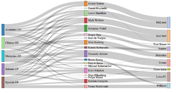
This type of visualisation shows hierarchy through a series of rings, that are sliced for each category node. Each ring corresponds to a level in the hierarchy, with the central circle representing the root node and the hierarchy moving outwards from it. Colour can be used to highlight hierarchal groupings or specific categories. We believe that a sunburst diagram would be effective as we would be able to visualise the number of cars breaking down from region to country to car brand. We would be using chart since it is easy to implement and interactive. These are some variations of the sunburst that we are considering too. |
|
|
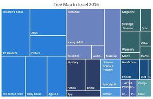
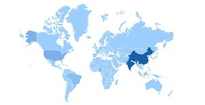
Treemaps are used to display hierarchical data. Treemaps are economical in that they can be used within a limited space and yet display a large number of items simultaneously. We chose to use a tree map, because it would give an overview of the amount spent on different car brands, car brands of similar regions would be grouped with same colour. The cars would be grouped by continent. When the cursor hovers over the continent, the geographic heatmap will be displayed to show the country distribution for that continent. |
|
|
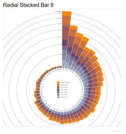
We may want to effectively compare the COE prices. As there would be many years and months of COE, a radial stackbar chart will allow the prices to be presented in a single view and not across the screen. This is a non traditional take of the bar chart. |
Timeline


