Difference between revisions of "IS428 2017 18T1 Group05"
| Line 61: | Line 61: | ||
| <div align="center">Stamp Duties</div> || Revenue from tax levied on documents || Based on types of duties (e.g. Sale & Purchase Agreement, Lease Agreement, Mortgage Agreement) | | <div align="center">Stamp Duties</div> || Revenue from tax levied on documents || Based on types of duties (e.g. Sale & Purchase Agreement, Lease Agreement, Mortgage Agreement) | ||
|- | |- | ||
| − | | <div align="center">Others</div> || Revenue mainly comprising Foreign Worker Levy and Airport Passenger Service charge || | + | | <div align="center">Others</div> || Revenue mainly comprising Foreign Worker Levy and Airport Passenger Service charge || No breakdown of data available hence visualization will depict 'others' tax as a whole |
|} | |} | ||
| Line 84: | Line 84: | ||
| ''' Interactive Graph on Texas Tax Revenue ''' | | ''' Interactive Graph on Texas Tax Revenue ''' | ||
| − | [[File:Tax revenue of Texas.png| | + | [[File:Tax revenue of Texas.png|500px|frameless|center]] |
Link: https://bivisual.cpa.texas.gov/QvAJAXZfc/OpenDocNoToolbar.htm?document=Documents%2FTR_Master_UI.qvw&host=QVS%40daupswap80&anonymous=true&select=LB00,09&sheet=SH27 | Link: https://bivisual.cpa.texas.gov/QvAJAXZfc/OpenDocNoToolbar.htm?document=Documents%2FTR_Master_UI.qvw&host=QVS%40daupswap80&anonymous=true&select=LB00,09&sheet=SH27 | ||
| Line 93: | Line 93: | ||
| '''Interactive visualization of Tax Breaks in the US''' | | '''Interactive visualization of Tax Breaks in the US''' | ||
| − | [[File:Tax break.JPG| | + | [[File:Tax break.JPG|500px|frameless|center]] |
Link: https://www.nationalpriorities.org/interactive-data/taxbreaks/2014/visualization/ | Link: https://www.nationalpriorities.org/interactive-data/taxbreaks/2014/visualization/ | ||
| Line 104: | Line 104: | ||
{| class="wikitable" | {| class="wikitable" | ||
|- | |- | ||
| − | ! | + | ! <div align="center">Type of Visualization</div> !! <div align="center">Detailed Description</div> |
|- | |- | ||
| Treemaps | | Treemaps | ||
[[File:Many eyes treemap.png|300px|frameless|left]] | [[File:Many eyes treemap.png|300px|frameless|left]] | ||
| − | [[File:Gradient grouped treemap.jpg|300px|frameless| | + | [[File:Gradient grouped treemap.jpg|300px|frameless|left]] |
| + | |||
Sample link: http://bl.ocks.org/Rnhatch/1820583 | Sample link: http://bl.ocks.org/Rnhatch/1820583 | ||
| Line 119: | Line 120: | ||
[[File:Sunburst diagram.png|300px|frameless|center]] | [[File:Sunburst diagram.png|300px|frameless|center]] | ||
| + | |||
Sample link: https://bl.ocks.org/kerryrodden/7090426 | Sample link: https://bl.ocks.org/kerryrodden/7090426 | ||
| Line 126: | Line 128: | ||
''* After much contemplation, our group has decided to utilize a tree map instead of the sunburst diagram as there is no sequence to the tax data set hence the value of the sunburst diagram features will be unnecessary.'' | ''* After much contemplation, our group has decided to utilize a tree map instead of the sunburst diagram as there is no sequence to the tax data set hence the value of the sunburst diagram features will be unnecessary.'' | ||
|- | |- | ||
| − | | | + | | Multi-Line chart |
| − | | | + | |
| − | + | [[File:PxR2k.png|300px|frameless|left]] | |
| + | |||
| + | |||
| + | Sample Link: http://bl.ocks.org/benjchristensen/2657838 | ||
| + | |||
| + | || Line charts are especially useful in visualizing time-series data and allows user to identify patterns and changes over time. | ||
| + | |||
| + | |- | ||
| + | | Stacked Area Chart | ||
| + | |||
| + | [[File:Area chart.png|300px|frameless|left|Stacked Area Chart]] | ||
| + | [[File:Area chart 2.png|300px|frameless|left|100% Stacked Area Chart]] | ||
| + | |||
| + | |||
| + | |||
| + | Sample Link: internet-banking.dbs.com.sg/IB/Welcome | ||
| + | |||
| + | || Stacked Area charts are effective ways to depict part-to-whole relationships of categories. 100% stacked area charts can be used when cumulative values are not important while stacked area charts can be used when it is important to show difference in cumulative values. | ||
| + | |||
| + | |- | ||
| + | | Bar Chart | ||
| − | + | [[File:Bar tax.png|300px|frameless|left]] | |
| − | |||
| − | + | Sample Link: http://bl.ocks.org/jonahwilliams/2f16643b999ada7b1909 | |
| − | + | || Bar charts offers user an easy way of comparing data between categories of data. In the context of tax, bar charts can enable us to visualize the change in absolute dollar amount in tax revenue in different categories and sub-categories. | |
| + | |} | ||
<div style="background: #333; padding: 15px; font-weight: bold; line-height: 0.3em; text-indent: 15px;letter-spacing:-0.08em;font-size:20px; text-transform:uppercase; border-left:10px solid #db0b2d"><font color=#fbfcfd face="Century Gothic">Technical Challenges</font></div> | <div style="background: #333; padding: 15px; font-weight: bold; line-height: 0.3em; text-indent: 15px;letter-spacing:-0.08em;font-size:20px; text-transform:uppercase; border-left:10px solid #db0b2d"><font color=#fbfcfd face="Century Gothic">Technical Challenges</font></div> | ||
| Line 166: | Line 188: | ||
| <div align="center">Identifying Optimal Interactive Elements</div> | | <div align="center">Identifying Optimal Interactive Elements</div> | ||
|| | || | ||
| + | * Interactive and animation elements needs to be properly timed and effective in helping users to understand the data better and explore trends and changes easily which may require trial and error | ||
|| | || | ||
* Research on how people normally build their interactive graphs/charts | * Research on how people normally build their interactive graphs/charts | ||
| Line 176: | Line 199: | ||
| − | <div align="center">[[Image:TaxEdTimeline.png|| | + | <div align="center">[[Image:TaxEdTimeline.png||1000px]]</div> |
Revision as of 22:10, 15 October 2017
In 2017, The Inland Revenue Authority of Singapore (IRAS) collected tax revenue amounting to S$47 billion, a 5% increase from the amount collected in the fiscal year 2016 [1].
Taxes are compulsory contributions made to the government by citizens and firms residing in the nation to fund government operations on certain categories of products and services. According to a report by the Organization for Economic Co-operation and Development (OECD), Singapore was ranked as one of the lowest-taxed economies in South-East Asia and amongst other economically developed countries[2]. Tax revenue in Singapore serves to fund government operations and promote social and economic goals. In doing so, the government aims to ensure competitive tax rates to both corporations and individuals to ensure a healthy economy.
In essence, governments are able to sustain themselves via tax revenue, and we believe that there is an underlying reason why certain taxes continue to make up a huge portion of Singapore's portfolio over the years despite the shift in tax compositions that has been trending globally[3]. Hence, we hope to allow users to explore trends and patterns in the composition of Singapore’s tax revenue over the years through this project. Furthermore, we hope that the interactive visualization will aid the public in understanding the key components of Singapore’s tax revenue and the share of their contribution to tax revenue.
In this project, we are interested to create a visualization that helps analyst perform the following:
- Understanding the trend and patterns in the composition of Singapore's tax revenue over the years.
- Analyzing the effect of taxes on certain products and services within the specific tax segment.
- Understanding of their contributions to Singapore's tax revenue
- Evaluating their investment/purchase decisions on big ticket items that are taxable (e.g. cars)
By conducting the analysis, it allows the government or policy makers to better identify potential linkages between tax collection and the potential impact if they were to raise/lower tax rates. If a link between tax collection and the effect on products and services within that segment can be identified, the government and policy makers can be made aware of how they could potentially increase their tax revenue and/or influence the market's movements. On the other hand, individuals and businesses may also better understand the impact of tax within a specific industry. Furthermore, individuals may also evaluate certain trends in the market to get a feel for how the market may move in a few years, as influenced by the government's taxation decisions.
In this project, we will be examining the key components that make up government tax revenue. Data used in this project will be obtained from open data published by the Inland Revenue Authority of Singapore [4] and Data.gov.sg [5]. We will be looking at the following areas of tax revenue in Singapore.
| Type of Tax Revenue | Description | Breakdown |
|---|---|---|
Individual Income Tax |
Revenue from the progressive tax rate imposed on individuals based on their chargeable income status | Based on individual income groups from S$20,000 to S$1,000,000 with a bin of S$5,000 |
Corporate Tax |
Revenue from the direct tax imposed on the income of business entities | Based on corporate income groups from S$10,000 to S$5,000,000 with a bin of S$10,000 |
Property Tax |
Revenue from the progressive tax rate is applied on owner-occupied and non-owner occupied residential properties. All other properties in Singapore are taxed at a fixed rate of the Annual Value | Based on Property type (e.g. Land, HDB) |
Estate Duty |
Revenue from tax imposed on wealth left by those who have died while residing in Singapore. It should be noted that estate duty is no longer imposed on deaths on and after 15th February 2008 upon the abolishment of this duty | No breakdown of data available hence visualization will depict estate duty as a whole |
Motor Vehicle Tax |
Revenue from the taxes imposed on motor vehicles (e.g. registration fees, road tax) curb car ownership and road congestion. It should be noted that Motor Vehicle Tax exclde excise duties on motor vehicle which are classified under Customs and Excise Duties | No breakdown of data available, hence visualization will depict motor vehicle tax as a whole |
Customs and Excise Duties |
Revenue from duties imposed on motor vehicles, tobacco, liquor and petroleum products | Based on product type |
Goods and Services Tax |
Revenue from the value added tax imposed on most good and services for domestic consumption | Based on economic sector & based on entity type |
Betting Tax |
Revenue from the fixed tax rate imposed on a person or organization receiving bets based on type of betting schemes available in Singapore (e.g. 4D, Toto, Big Sweep, Sports Betting). It should be noted that Betting Tax includes Casino Tax with effect from March 2010, under Section 146 of the Casino Control Act | No breakdown of data available hence visualization will depict betting tax as a whole |
Stamp Duties |
Revenue from tax levied on documents | Based on types of duties (e.g. Sale & Purchase Agreement, Lease Agreement, Mortgage Agreement) |
Others |
Revenue mainly comprising Foreign Worker Levy and Airport Passenger Service charge | No breakdown of data available hence visualization will depict 'others' tax as a whole |
Beyond this, our group has decided to consolidate all the data sources into a single workbook, organized by tax categories. The consolidated data will be uploaded here in future.
Our group has done prior research on related work on tax composition and pattern visualizations. While there has not been an interactive visualization to depict Singapore's tax revenue composition and patterns over the years, the following work are current visualizations related to Singapore Tax composition and of other countries' tax revenue.
| Related Works | Comments |
|---|---|
| Data Visualization by Inland Revenue Authority of Singapore for the Public
Link: https://www.iras.gov.sg/IRASHome/Publications/Statistics-and-Papers/Tax-Statistics/ |
Simple and intuitive design that reveals key insights on each component of tax revenue. However, the visualization is not interactive and does not allow users to see the overall composition of tax revenue and observe patterns or changes in tax revenue components. |
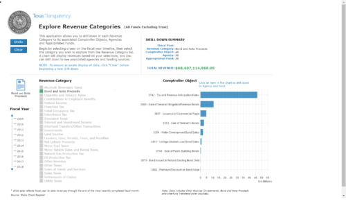
| Interactive Graph on Texas Tax Revenue | Interactive visualization allows users to filter and select according to the components needed. Upon selecting the components and year, users are able to see the relevant tax figures and the updated total revenue with a detailed breakdown of the components. |
| Interactive visualization of Tax Breaks in the US
Link: https://www.nationalpriorities.org/interactive-data/taxbreaks/2014/visualization/ |
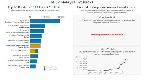
Users are able to analyze the total cost of each tax reduction scheme (also known as tax break) in the US over time and the number of people in each income group who benefit from it. |
Our project has considered the following types of visualizations and prior work that we believe will add value in building the new visualization.
Type of Visualization |
Detailed Description
|
|---|---|
| Treemaps
|
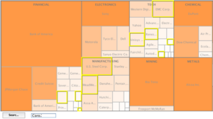
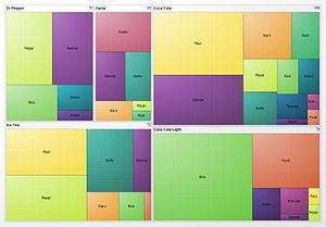
Tree map is an effective tool giving an summary of huge data sets by in breaking down information in multiple dimensions, by size & colour. As such, users can easily interpret the data set without much analytical perspective. Furthermore, with good transitions such as the one provided in the sample link, users can able to see the changes in size when the data is categorized based on different factors. |
| Sunburst Diagram
|
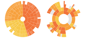
Sunburst diagrams are also known as "Radial Treemaps". Users are able to tell the hierarchy of the data from the rings in sunburst diagram. Each ring is sliced according to its respective categories. Similar to a tree map, a sunburst can organize large data sets. In addition, sunburst diagrams are able to portray the sequence of events as the user analyzes from one ring to another.
* After much contemplation, our group has decided to utilize a tree map instead of the sunburst diagram as there is no sequence to the tax data set hence the value of the sunburst diagram features will be unnecessary. |
| Multi-Line chart
|
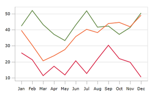
Line charts are especially useful in visualizing time-series data and allows user to identify patterns and changes over time. |
| Stacked Area Chart
Sample Link: internet-banking.dbs.com.sg/IB/Welcome |
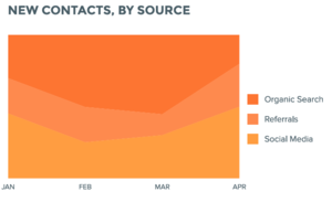
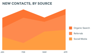
Stacked Area charts are effective ways to depict part-to-whole relationships of categories. 100% stacked area charts can be used when cumulative values are not important while stacked area charts can be used when it is important to show difference in cumulative values. |
| Bar Chart
|
Bar charts offers user an easy way of comparing data between categories of data. In the context of tax, bar charts can enable us to visualize the change in absolute dollar amount in tax revenue in different categories and sub-categories. |
Key Technical Challenges |
Detailed Description |
Proposed Solution
|
|---|---|---|
Unfamiliar with Javascript and D3 Libraries
|
|
|
Data Cleaning & Data Transformation
|
|
|
Data Storage & Rendering
|
|
|
Identifying Optimal Interactive Elements
|
|
|
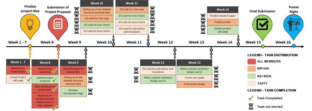
The following shows our project timeline for the completion of this project:
The following are some of the tools/technologies that we will be utilizing during the project:
- D3.js
- Chart.js
- Microsoft Excel
- Adobe Photoshop
- Notepad++
Taffy Joan
Bryan Lau
Kei Wen
Prof Kam
When to Use an Area Chart - https://visage.co/data-visualization-101-area-charts/
Sunburst Diagram - https://datavizcatalogue.com/methods/sunburst_diagram.html
IRAS collected S$47b in tax revenue in FY2017; up nearly 5% from a year ago - http://www.businesstimes.com.sg/government-economy/iras-collected-s47b-in-tax-revenue-in-fy2017-up-nearly-5-from-a-year-ago
Singapore has one of the lowest tax-GDP ratio among Asian economies: OECD - http://www.asiaone.com/singapore/singapore-has-one-lowest-tax-gdp-ratio-among-asian-economies-oecd
Recent trends in the taxation of consumption - https://ourworldindata.org/taxation/#recent-trends-in-the-taxation-of-consumption
Tax Statistics - https://www.iras.gov.sg/IRASHome/Publications/Statistics-and-Papers/Tax-Statistics/#tax_collection
D3.js - https://d3js.org/
The Advanced Web Developer Bootcamp - https://www.udemy.com/the-advanced-web-developer-bootcamp/learn/v4/content
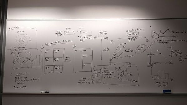
The following image shows the proposed storyboard that was designed during our brainstorming session:
As illustrated in this image, we decided to display our visualizations entirely on a single page. The page will be dynamic and allow for interactivity. Upon startup, we will present a high level view of all the tax that has been collected by Singapore's government, for all the years that we have data for. Analysts may then choose to select the starting and ending point for the number of years they would like to observe the trend for, and both our tree-maps and bar charts/area graphs/line charts will be updated dynamically. Analysts may also choose to dive deeper into a tax segment to better understand the components that make up of that segment.
Please feel free to provide us with your comments!


