Report Group7
ISSS608: Visual Analytics and Applications
- Anuthama Murugesan
- Krutika Balveer Choudhary
- Sumalika Kodumuru
|
|
|
|
|
|
Geo-spatial analysis of vehicle movement data to uncover patterns and detect anomalies
Objective:
We have developed interactive dashboards to accommodate the analysis of other sources of 'movement related data' to retain reusability of dashboards and extend its usage for other purposes where deemed suitable. Below we have explained the data processing, methodology and the usage of the final dashboard.
Data Pre-Processing:
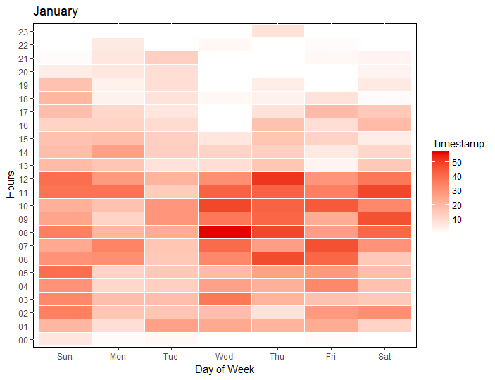
Calendar Plot
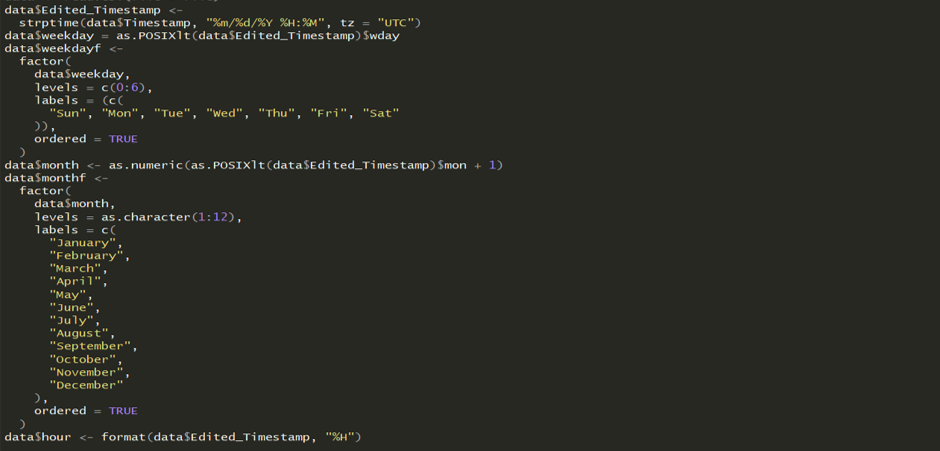
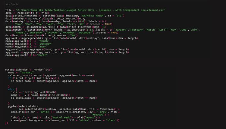
Calendar heat maps can be used to understand the peak and non-peak cycles across months, day of the weeks and hour of the day. It gives us an overview of the dataset. We need the time-stamp to be separated in months, day of the week and hour of the day. The following code was used to extract hour, day of the week and month from the timestamp to make the calendar plot
We then aggregated the data by month and day of the week.
This gave us the final table required for calendar.
Sunburst Plot
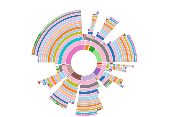
The route taken by the vehicles was explored using Sunburst diagrams. This has been used to view a summary of the paths taken and understand the more popular paths. Common destinations and starting points can be easily identified and compared.A sunburst plot is useful to visualize the sequence in navigation. We can also see the proportion of vehicles that took a certain path.
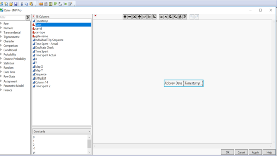
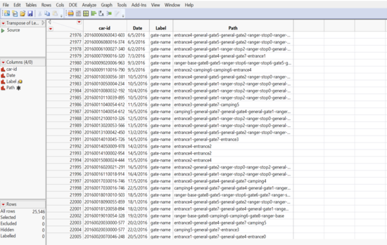
Jmp was used for cleaning this data. We needed date field to enable filters. So we extracted the date from the timestamp:
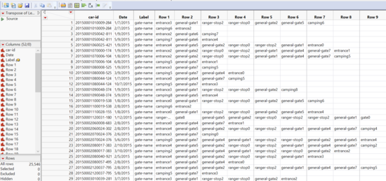
Next, we created a transpose of the gate name by car id and date. This gives us the following
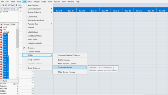
We combined the columns with “-‘” as the delimiter giving us the path taken. Now there is a column “path” created that can be used for sunburst.
The columns “Row 1” – “Row 281” were deleted. This gives us a table needed for sunburst.
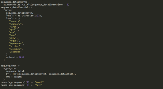
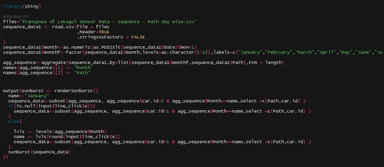
In R, Month was extracted from the date to enable filtering by month. And data was aggregated for months.
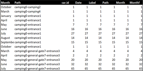
Final output sample:
Network Plot
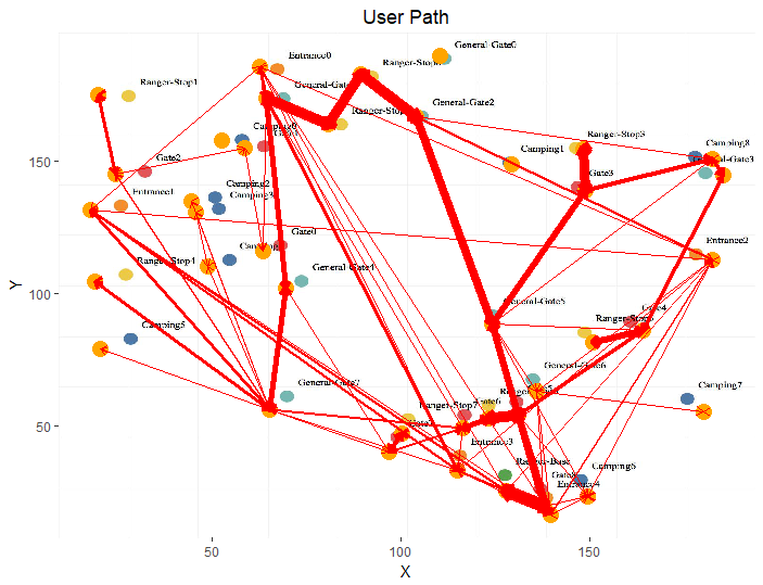
Network plot is constructed to examine the structure of relationship between gates in terms of how frequently people/users have taken the path. From this it is easy to identify which road is more popular. In order to construct this network plot, source and target gates need to be identified and the data should be prepared to plot path from source to target gate. However since the popularity of the path is an important insight that can be drawn from the network plot, frequency of the source and target needs to be extracted from the data.
The prepared data consists of two tables:
1. Node Table: Consists of all the available gates in the preserve mapped to a unique identifier and with their respective location details. X and Y co-ordinates represent the location of the gate in the preserve. A snippet of the actual data table is shown as follows:
2. Edge Table: Consists of Source and Target variables denoting Gate names but mapped to the node table with a common ID. Frequency and the time at which it occurred is noted for analysis. Here X1,X2, Y1 and Y2 represent the X-coordinate and Y-coordinate of Source and Target variable respectively. A snippet of the actual data table is shown as follows:
Methodology:
Packages used:
Calender plot:
Packages Used:
1. Utils
2.ggplot
Functions:
1. strptime , as.POSIXlt, factor, as.numeric, format, aggregate and subset are the base packages used that are available in the R studio environment.
2. ggplot is used to plot weekday on X axis and hour of the day on Y axis by filling the time stamp. Customization for better aesthetics appeal are performed using scale_fill_gradient, theme and labs functionality.
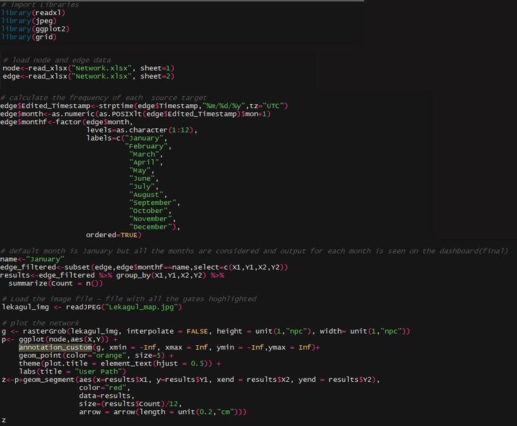
The output shown above is achived using these functions and it is achieved by coding as follows:
The above code consists of two parts. The first half represents the data preparation and the functions used to prepare the data. The second part is the render function used to connect ( in Rshiny) with calendar on the server side.
Sunburst Plot
Sunburst plot is used to show navigation of a user (vehicle) by identifying the sequence of gates traveled based on the time stamp captured by sensors.The code for the sunburst consists of two parts- One data preparation and the other part is the operational aspect which is written on the server side of rshiny.
Network plot:
Packages Used:
1. readxl
2. jpeg
3. ggplot2
4. grid
Functions:
1. read_xlsx function is used to load excel format data from the local system into R. This function is available in “readxl” package and it takes the path as an argument to read the excel file. It consists of “sheet “attribute providing flexibility on selecting the sheet number from the excel sheet.
2. readJPEG function is used to load the image file in JPEG format from the local directory.
3. strptime is a base package available as a part of the inbuilt packages of R studio. It consists of functions that help convert between character representations and objects of classes " POSIXLT " and " POSIXCT " calendar date and time.
4. as.numeric function is used to convert into a numeric format. Other base functions that were used apart from strptime are as.numeric and factor, subset to perform basic operations on the data to modify it the way it is needed for analysis.
5. rasterGrob function is used to render an image in a specific size and location required as per the requirement. This is later used in ggplot for annotation_custom.
6. ggplot is used to plot X and Y coordinates of gates along with geom_point for plotting the points on the axis by customizing the size and shape based on aesthetic requirements.
7. geom_segment function is used with ggplot to draw the path from source to target( i.e between gates) . It draws a straight line between two points and has the ability to draw arrows pointing which direction they have moved to. The X , Y, Xend and Yend arguments denote the X and Y cco-ordinates of source and target fields respectively.
Application:
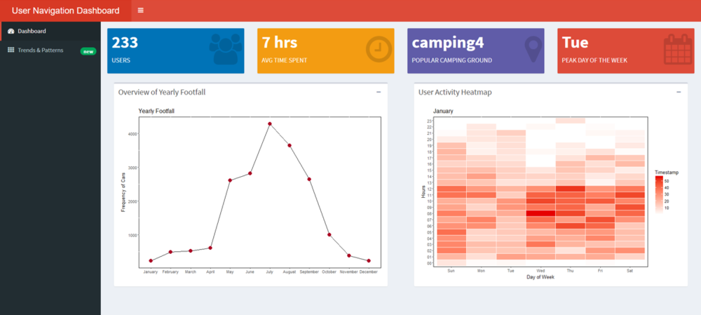
In our first dashboard we wanted to provide an overview of the data set.
- The line graph gives the peak month of the year and we can see that July is the busiest month for the Natural Preserve.
- The dots on the line graph which denote each month are filters for this dashboard which will filter the calendar heatmap on the right.
- The default filter has been set to January.
- The Value boxes on the page guide in calling out key findings for the dataset. We notice that in January there were 233 visitor and the most visitors came on Tuesday. We can also see that camping ground 4 was most popular.
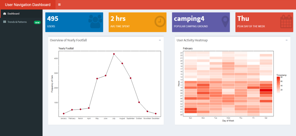
- On click on Feb the plot changes as follows
- Feb was clearly a busier period for the Preserve than Jan with more than double the visitors.
- We notice that post 8 PM there is barely much movement
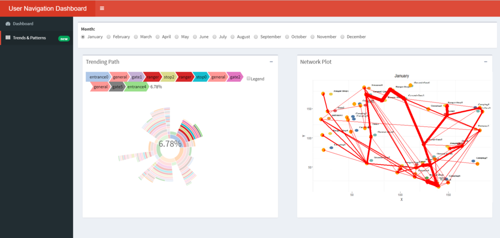
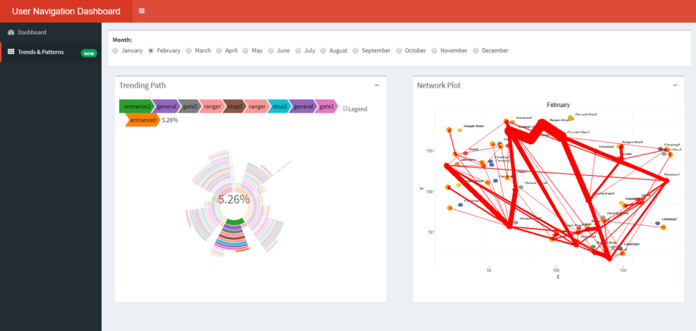
In the second dashboard, we try to visualise the sequence related findings.
- From the plot when we hover over the sunburst plot we can see the path taken and the percentage of vehicles that took a certain path.
- The path entrance 0--> general-gate1-->rangerstop 2-->rangerstop0-->general-gate2-->general-gate5-->entrance 4 was the most frequently taken path for January and 6.78% of the vehicles took the exact same path.
- The network plot shows the popularity in terms of the most frequently used road. We notice that the road connecting general-gate2-->rangerstop 0-->rangerstop2-->general-gate1 is widely used.
- For new businesses identifying such high footfall roads can aid in setting up outlets.
- We can use the radio buttons on top to look at the paths for each month. We can see how the path has changed for Feb. The lines of the network plot are much thicker indicating more vehicles have passed
