ISSS608 2016-17 T3 Group8 Arules Final Projrct
|
|
|
|
|
Contents
Project Motivation
Association Rule Mining is Powerful
Although association rule mining is usually applied in market basket analysis to mine the relationship between different products, it is actually a very powerful algorithm that can be applied for any dataset to discover the association, correlation and causation between variables. With an interesting target variable, we actually can find out the relevant association rules within the dataset, even if it is not a transaction data. Click here to read more on association rules discussed in our proposal
However, not all datasets are ready to do this kind of data mining in R, for example continuous variables are not easy to handle, which is a barrier for users to step into the world of data analytics. We intend to develop an association rule mining application for non-statistician users to understand easily, to play with and get insights, and to bring them into data analytics using the fundamental yet powerful concept - probabilities.
Room for Improvement of Current Packages
Current R packages available for association rule mining are helpful for data analysts, but their limitations also brings difficulty to interpret the analysis results:
1) Static Visualizations
Visualizations provided in current ARM packages are mostly static, which are difficult for users to do see difference between different settings on the rules without editing a line of code. For example, it is hard to see how many rules were kicked-out if support threshold was increased by 0.005.
2) Lack Interactivity
There is little interactivity in the current ARM packages. Users are unable to select or zoom in on the visualizations.
3) Manual Calibration
Users are only able to manually calibrate the generated rules by changing thresholds for support, confidence, lift, antecedent or consequent.
R Packages Used
- For interactive application: R Shiny and Shiny Dashboard
Shiny is an R Studio package for developing interactive charts, data visualizations and applications to be hosted on the web using the R programming language. It enables developer to make an interactive application which allow user to understand a certain model or do some data explorations. In this case, we could visualize the underlying rules beyond given datasets which show a clear picture of how those items correlate with each other. Package ‘shiny’Package ‘shinydashboard’
- For mining association rules: arules family of packages
“Arules” is the very foundation on which we built this application. “Arules” enables users to apply association rule mining algorithms on transaction data or any other data that meets certain requirement. It is quite powerful at manipulating and transforming data, pruning redundant rules, as well as filtering association rules generated. Users can filter the rules by customizing thresholds for support, confidence, and lift, as well as the antecedent and consequent, and sort the rules by support, lift and confident. Package ‘arules’Package ‘arulesViz’
- For interactive scatterplot: ggplot2 and plotly Package ‘plotly’ Package ‘ggplot2’
- For network visualization: visNetwork and igraph Package ‘visNetwork’Package ‘igraph’
- For data preparation: sqldf(for SQL operations in R),dplyr,stringr Package ‘sqldf’ Package ‘dplyr’ Package ‘stringr’
Choice of Visualizations and Critics
This section discusses the choices of visualizations used in our application with respect to their usefulness. Critics on the default visualizations provided in the arulesviz packages will be discussed as well to the areas for improvement for our visualization designs.
| Discussion | Visualization |
|---|---|
Benefits of scatterplots
|
|
Benefits of network diagrams
|
Application Design in Details
Click here to view our application dashboards designs at a glance
1. Load data
| 1)Choose File to Upload |
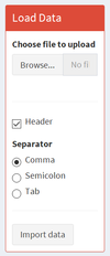
Users can upload any dataset they want as long as they are in the following format:
1.Market Basket Analysis
2.Targeted ARM Any dataset that contains a target variable that the user is interested in. The users are able to choose if the dataset contains a header and the separator for the file. |
| 2.Import Data | Once the data file is uploaded and the users are ready to do the association rule mining on this dataset, they can click the “Import data” button and then the data would be imported into our server and saved as a data frame, which would be used for all the following data transformation, analyses and visualizations.
This is done by using “eventReactive” function in R shiny. To save a data frame dependent on user’s uploaded file, we make a reactive data frame that would be stored only when some event happens, which, in this case, is clicking on the “Import data” button. |
3.Variable Transformation
numeric_check=sapply(df1,is.numeric)
|
a) Transforming binary column Columns containing numbers of only 1 or 0 are considered as binary columns. (NA is allowed). Binary variables are recoded to “True” or “False” b) From the remaining columns, transform numeric columns to 3 bins “low, mid, high” based on quantiles.
c) Categorical columns: unchanged Users were educated in the user guide to not using numeric numbers to represent categorical information, otherwise they will be transformed in step 2. d) Combing the transformed columns and the original categorical columns back to form the new dataframe for association rule minng. |
2. Scatterplots Visualizations:
| Design Concepts | Visualization |
|---|---|
| 2.1Overview Scatterplot with Box Selection
Once rules are generated, they will be saved as data frame in the server. Each row represents one rule, which consists of the following variables: ruleID, Antecedent, Consequent, support, confidence, lift.
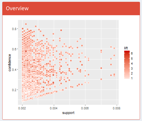
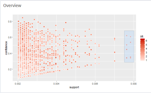
The first visualization that users would see is an overview scatterplot.
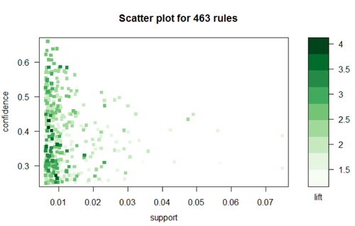
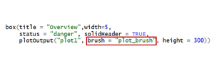
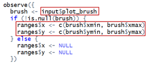
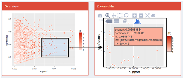
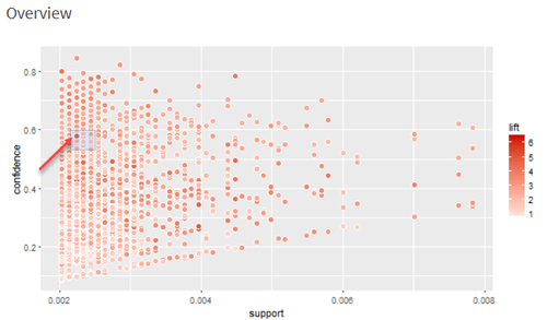
We plot all generated rules on a scatter plot where X axis is support and Y axis is confidence, colored by lift. Optimally, we would focus on those points at up-right corner of the plot and in darker red color, which is interpreted as high support, high confidence and high lift. This is a static scatterplot but we enable users to do box selection on it and they would see: 1) a zoomed-in interactive scatterplot on the right hand for them to further investigate those rules that they are more interested in; 2) a table of rule details for them to browse details of all selected rules; 3) a rule network to visualize all rules selected and the relationship between all related items. To achieve this function, we add in one parameter in this plotOutput called “function”: This “brush” function would read where the users click, drag, and release on the plot, show it on the plot as a box selection and store the box’s value range on X and Y axis.
|
|
| 2.2 Zoomed-in Scatterplot
Our zoomed-in scatterplot is an interactive one, built using “ggplot2” wrapped in “plotly”.
|
|
| 2.3 Rule Details
We also provide a data table below the zoomed-in scatterplot, which gives rule details for users to have a full-screen view of selected rules. This is done by using “brushedPoints” function which subset data based on brushed points. |
3.Network Visualizations
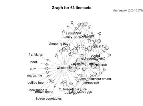
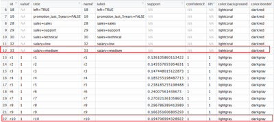
The network visualizations were built using package “vizNetwork” and “igraph”. The trick to create a network visualization from the association rules is to first visualize the rules using the default network visualization provided by the “arulesviz” package (graph method = “graph”). The arulesviz uses “igraph” package to visualize the rules into network diagram. Next, using the “get.data.frame” function from igraph package will automatically create two data frames, one for the nodes and one for the edges. VizNetwork packages could then be used to create the network visualizations. Viznetwork provides additional customization functionalities to the netowork diagrams like highlight the nearest nodes or allow the users to select certain nodes to zoom in.
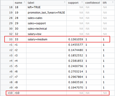
It shall be highlighted that the vertices dataframe created by the “get.data.frame” function has a little bug. The quality measures are not correctly matched to the rules, with the last rule always showing having blank quality measures. This affects the visualization if we wish to reflect the interestingness of the rules in the network diagram, eg size the rules nodes by “lift”. The bug was corrected by adjusting the dataframes back so that the quality measures are in line with the individual rules. We also created additional columns to colour the rules and the items respectively to better differentiate them in the network diagrams.
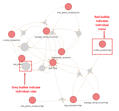
The table below explains how to interpret the network visualizations.
| Descriptions | Visualization |
|---|---|
|
|
| 2.2 Zoomed-in Scatterplot
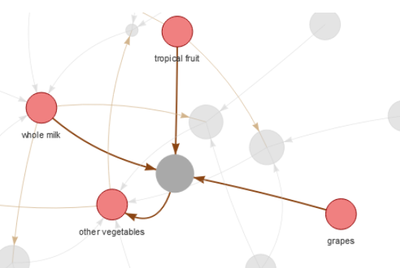
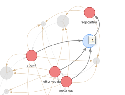
Clicking on any rule, the items linking to that rule will be highlighted and the rest will be faded.
|
4.User interactivity of the application
|
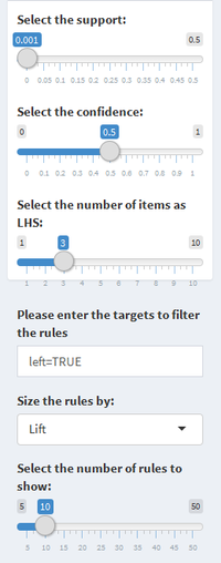
1.Model calibration (available for both generic MBA dashboard and targeted ARM dashboard)
Below calibrations are only available on the targeted ARM dashboard.
|
Use Cases
1.Market Basket Analysis
Threshold: support>0.002, confidence>0.05, length of rule: 3, size of rule nodes by: lift
|
1.Select the rules with highest confidence & lowest support
|
The rule with highest lift is: {tropical fruits,whole milk,grapes} =>{other vegetables} |
|
2.Select the rules with highest support at varying confidence
|
The rule with highest lift is: {yoghurt,other vegetables,whole milk} =>{tropical fruit} |
|
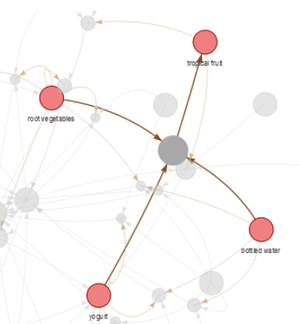
3.Select the rules with highest lift
|
The rule with highest lift is: {yoghurt,root vegetables,bottled water} =>{tropical fruit} |
2.Targeted ARM Using HR Data – Why Did the Employees Leave?
Threshold: support>0.001, confidence>0.5, length of rule: 3, RHS: left=”TRUE” (only showing who has left)
|
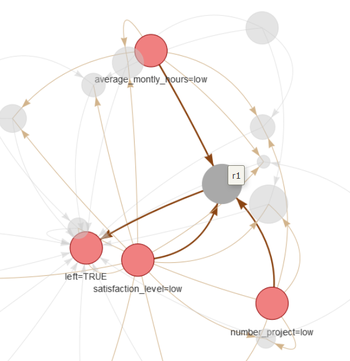
1.The rules with highest lift Which factors combining together will lead to employee leaving? {average monthly hours=low, satisfaction level =low, number of projects =low} |
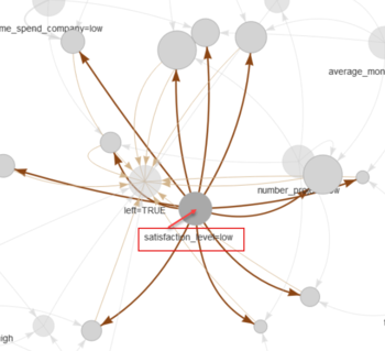
2.The most popular reason why people left The item with linked to most rules -> {satisfaction level=low} |
|
References
- visNetwork, an R package for interactive network visualization
- Association Rules and the Apriori Algorithm: A Tutorial,Annalyn Ng, Ministry of Defence of Singapore
- Association Rule Mining with R,Yanchang Zhao
- Market basket analysis,S. Bushmanov
- Market Basket Analysis Using R and Shiny, Maureen O'Donnell
- Shiny Application layout guide,JJ Allaire
- Zoomable plots in Shiny, RStudio, Inc.
- Introduction to visNetwork,B. Thieurmel - DataStorm
- Interactive arules with arulesViz and visNetwork,timelyportfolio
- Network visualization with R Workshop,Katya Ognyanova
- Selecting rows of data R Shiny
- Write Transactions or Associations to a File
- Event handler R Shiny
- Using Action Buttons R Shiny
- Create an object for storing reactive values R Shiny
Acknowledgements
Thanks Prof Kam for the guidance on our project! Special thanks to the kind souls on Stackoverflow for clearing the pieces of obstacles blocking our way.
- How to quickly form groups (quartiles, deciles, etc) by ordering column(s) in a data frame
- Exclude Blank and NA in R [duplicate]
- How to bin ordered data by percentile for each id in R dataframe [r]
- Check if variable has the value
- alternative to “!is.null()” in R
- How to update the file related to a `fileInput` variable in R Shiny without user interaction?
- How to detect binary & categorical columns coded as discrete numeric in r
- Using CUT and Quartile to generate breaks in R function
- Interactive selection in ggplotly with geom_hex() scatterplot
- Convert arules Transaction Data to an item matrix in R programming
- Using the lapply and sapply functions in R instead of a nested loop
- How to bin ordered data by percentile for each id in R dataframe [r]
- Subsetting a data frame based on contents of another data frame
- R subset a column in data frame based on another data frame/list
- How to drop columns by name in a data frame
- Obtain observations in geom_hex in a single plot (Shiny)
- Plotting a hex bin in R and ggplot2 using a continuous Z fill variable
- Setting hex bins in ggplot2 to same size
