 WeatherWISE
Application
The RainyApp can be accessed through:
insert link here.
Methodology
Data Preparation
The data has been downloaded from NEA, which is provided for 58 active weather stations across spread across Singapore. The data is provided for each month and is updated on 10th of every month. This data has been used by us to
Geospatial Interpolation
|
|
Description
|
R Script
|
Output
|
| Load the Shapefile and use it to create the map with a grid
|
|
|
| Load the coordinates of each weather station and project it to the map
|
|
|
| Filter the rainfall data based on the filter timeframe
|
|
|
| Run the fit model for the variogram
|
|
|
| Perform the Kriging based on the best fit variogram
|
|
|
| Plot the interpolated values to the SG map
|
|
|
Shiny Application
| Description
|
R Script
|
Output
|
| row 1, cell 1
|
row 1, cell 2
|
row 1, cell 3
|
| row 2, cell 1
|
row 2, cell 2
|
row 2, cell 3
|
Design Framework
| Design Framework
|
Results
|
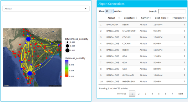
Airline Traffic
|
- The dash board design allows the user to select different airline from the drop-down menu.
- It shows the network graph of the airlines connecting different parts of India with the size as the betweeness centrality and the colour as the closeness centrality.
- The lines on the map are directed from the origin to the destination airport with the arrow head.
- The data table on the right-hand side gives user on overall view of the arrival and departure airport of the airline as well as the departure time with frequency representing the no of days it fly’s.
|
|
|
Facet
|
- This design allows the user to easily have an overall view of all the airline carriers in india and lets the user see the big picture of the airline operating in different parts of india.
- It also allows the user to see the network analysis with an overall view.
|
|
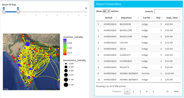
Airline by Time
|
- The design allows the user to navigate the different hours using the slider.
- It allows the user to find out which are the time where traffic network is very high and which are the airlines travelling during that period of time.
|
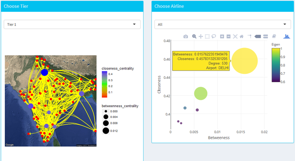
Airline by Tier
|
- This design allows the user to explore the network centrality using both the map as well as the bubble plot to locate the cities of interest on the basis of 3 tier (derived from population).
|
|
 WeatherWISE


