ISSS608 2016-17 T3 Group8 Arules Final Projrct
|
|
|
|
|
Contents
Background on Association Rules
What is association rule mining?
- An association rule is a pattern that when an event occurs, another event occurs with a certain probability.
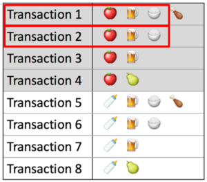
- Association rules are if/then statement that help undercover relationships between unrelated items. i.e. to find the relationships between the objects which are frequently bought together
- Association Rules find all sets of items (items set) that have support greater than the minimum support. Then using the large items to generate the desired rules that have confidence greater than the minimum confidence
- A typical and widely used example of association rules application is market basket analysis.It has an LHS and an RHS part and can be represented as itemset X => itemset Y. This means that the item/s on the right were frequently purchased along with items on the left.
Key indicators of Association Rules:
| Description | Illustration |
|---|---|
Support
|
|
Confidence
|
|
Lift
|
Generic VS Targeted Association Rule Mining
Although association rule mining is more commonly used for the market basket analysis, it can be used for other contexts as well. So instead of generically study the rules, we can also define a target of study, and use ARM to find out what combination of factors are more likely to lead to the occurrence of our target variable.In this case, the target of interest is always kept at RHS, as the consequent. A good example of the targeted ARM is demonstrated with the titanic data where people used association rule mining to see which group of passengers are likely to survive from titanic – the combination of passenger attributes shows that women and children are the ones survived.
[File:VRshiny_report_grp8_files_image007.png|500px|center]
Choice of Visualizations and Critics
This section discusses the choices of visualizations used in our application with respect to their usefulness. Critics on the default visualizations provided in the arulesviz packages will be discussed as well to the areas for improvement for our visualization designs.
| Discussion | Visualization |
|---|---|
Benefits of scatterplots
|
|
Benefits of network diagrams
|
Application Design at a Glance
| Design Concepts | Dashboard |
|---|---|
| 1.Load data dashboard
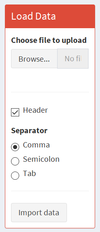
This dashboard allows the user to load their data for using our app
|
|
| 2.Dashboard for generic market basket analysis
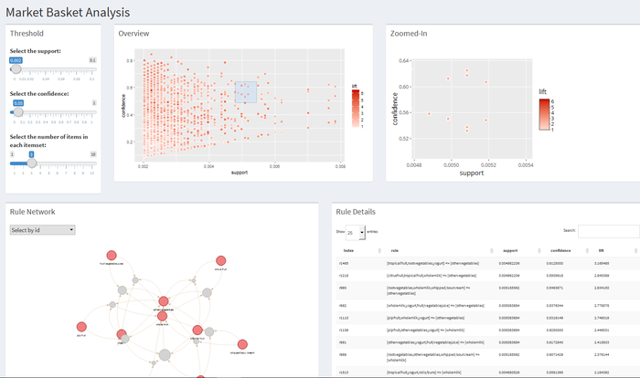
This dashboard is designed for the generic MBA analysis, where we allow the users to have an overview of the individual rules before they choose one particular area to investigate.
|
|
| 3.Dashboard for Targeted ARM
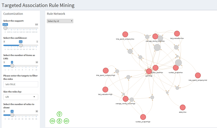
This dashboard is designed for the targeted ARM analysis. Since the targeted ARM already has an targeted item of interest, we skipped the stats explorer part but added in more interactive features for the users to calibrate the model and investigate the items of their interest.
For example, the user can choose to view only the association network of the rules leading to a specific target variable.
|
Application Design in Details
1. Load data
| 1)Choose File to Upload |
Users can upload any dataset they want as long as they are in the following format:
1.Market Basket Analysis
2.Targeted ARM Any dataset that contains a target variable that the user is interested in. The users are able to choose if the dataset contains a header and the separator for the file. |
| 2.Import Data | Once the data file is uploaded and the users are ready to do the association rule mining on this dataset, they can click the “Import data” button and then the data would be imported into our server and saved as a data frame, which would be used for all the following data transformation, analyses and visualizations.
This is done by using “eventReactive” function in R shiny. To save a data frame dependent on user’s uploaded file, we make a reactive data frame that would be stored only when some event happens, which, in this case, is clicking on the “Import data” button. |
3.Variable Transformation
numeric_check=sapply(df1,is.numeric)
|
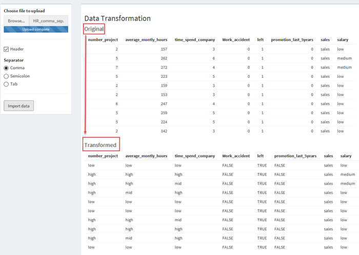
a) Transforming binary column Columns containing numbers of only 1 or 0 are considered as binary columns. (NA is allowed). Binary variables are recoded to “True” or “False” b) From the remaining columns, transform numeric columns to 3 bins “low, mid, high” based on quantiles.
c) Categorical columns: unchanged Users were educated in the user guide to not using numeric numbers to represent categorical information, otherwise they will be transformed in step 2. d) Combing the transformed columns and the original categorical columns back to form the new dataframe for association rule minng. |
2. Scatterplots Visualizations:
| Design Concepts | Visualization |
|---|---|
| 2.1Overview Scatterplot with Box Selection
Once rules are generated, they will be saved as data frame in the server. Each row represents one rule, which consists of the following variables: ruleID, Antecedent, Consequent, support, confidence, lift.
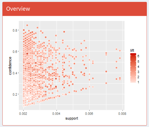
The first visualization that users would see is an overview scatterplot.
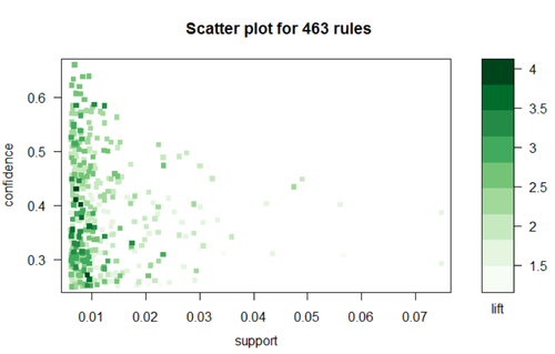
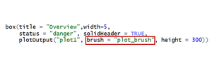
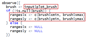
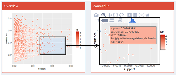
We plot all generated rules on a scatter plot where X axis is support and Y axis is confidence, colored by lift. Optimally, we would focus on those points at up-right corner of the plot and in darker red color, which is interpreted as high support, high confidence and high lift. This is a static scatterplot but we enable users to do box selection on it and they would see: 1) a zoomed-in interactive scatterplot on the right hand for them to further investigate those rules that they are more interested in; 2) a table of rule details for them to browse details of all selected rules; 3) a rule network to visualize all rules selected and the relationship between all related items. To achieve this function, we add in one parameter in this plotOutput called “function”: This “brush” function would read where the users click, drag, and release on the plot, show it on the plot as a box selection and store the box’s value range on X and Y axis.
|
|
| 2.2 Zoomed-in Scatterplot
Our zoomed-in scatterplot is an interactive one, built using “ggplot2” wrapped in “plotly”.
|
|
| 2.3 Rule Details
We also provide a data table below the zoomed-in scatterplot, which gives rule details for users to have a full-screen view of selected rules. This is done by using “brushedPoints” function which subset data based on brushed points. |
3.Network Visualizations
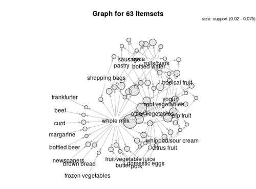
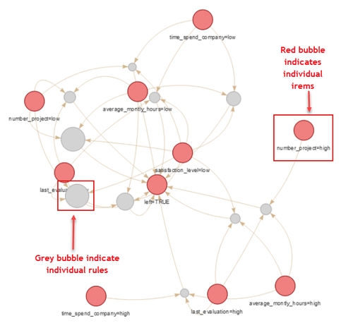
The network visualizations were built using package “vizNetwork” and “igraph”. The trick to create a network visualization from the association rules is to first visualize the rules using the default network visualization provided by the “arulesviz” package (graph method = “graph”). The arulesviz uses “igraph” package to visualize the rules into network diagram. Next, using the “get.data.frame” function from igraph package will automatically create two data frames, one for the nodes and one for the edges. VizNetwork packages could then be used to create the network visualizations. Viznetwork provides additional customization functionalities to the netowork diagrams like highlight the nearest nodes or allow the users to select certain nodes to zoom in.
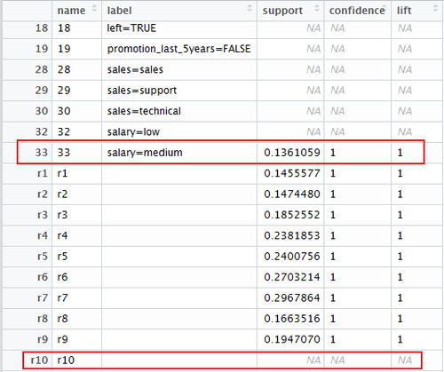
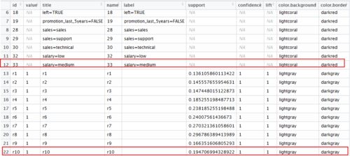
It shall be highlighted that the vertices dataframe created by the “get.data.frame” function has a little bug. The quality measures are not correctly matched to the rules, with the last rule always showing having blank quality measures. This affects the visualization if we wish to reflect the interestingness of the rules in the network diagram, eg size the rules nodes by “lift”. The bug was corrected by adjusting the dataframes back so that the quality measures are in line with the individual rules. We also created additional columns to colour the rules and the items respectively to better differentiate them in the network diagrams.
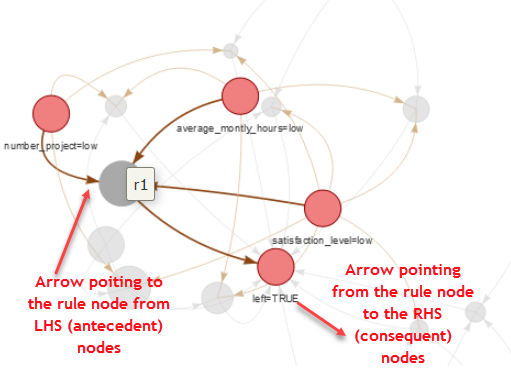
The table below explains how to interpret the network visualizations.
| Descriptions | Visualization |
|---|---|
|
|
| 2.2 Zoomed-in Scatterplot
Clicking on any rule, the items linking to that rule will be highlighted and the rest will be faded.
|
