ISSS608 2016-17 T3 Anuthama Feedback
|
|
|
|
|
|
|
Rogers.2016 (talk) : Hi Anuthama!! Interesting visuals.
Positives about your visualization:
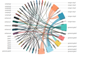
1. The chord plot helped me to understand the traffic movements like how many traffic moved from location point A to B. This can help to uncover interesting patterns.
2. The calendar heat clearly tells us the peak days and peak time which I actually missed out in my task. Really good to know the peak days before analyzing the patterns.
3. The patterns on location count over time shows us the peak hours where we observe most of the traffic counts.
Improvements
1. The disadvantage of chord plots is that it tells you only the similar patterns between 2 locations and not more than that. Say if want to know similar patterns for more 3 locations, which in this case happens a lot, it would be hard to determine using chord plot. A geo-visualization would be more preferred to show patterns that spans more than 2 location points.
2. Chord plot would be even more interesting if you add a time filter on top to show how did the movements vary over the hours.
Priyadarshi.2016 (talk) Hi Anu, quite interesting visualisations I must say. I really like how you have tied "time" to all your investigations. It's something that I could have done better. In mine time was much higher level. You used a form of calendar plot to visualise the paths when u investigate patterns. I am not to sure if they are the best way to represent them. I like your method of showing patterns in the pic below. Could u perhaps do the same for investigations? Like drill down by the hour. You may have some time limitations. Rest is so awesome! Additionally I agree with the "tresspassing". I like that you have termed them as "tresspasses" I didn't know what to call them. Also, 4 axel trucks are fishy. I assume they were park trucks for goods and bla.
Sandeepc.2016 (talk)
Hi Anu,
I really liked the way you made use of animated gifs to show the visualisations. It's something I have thought of but was not able to do. one more thing I liked about your answer was the way you used calendar plot, it's a really nice way to visualise data over a period of time with varying colour density. You can also make use of the same visualisation to show data for 24 hours.
The visualisations in Q3 - Pattern 3 the hypothesis is really interesting, but the visualization looks clumpsy. The same goes for the next pattern as well. Please take a look at what Zac has created, I feel its really a nice way to present the information whatever you are trying to present. Hope my comment helps.

