 VAST MINI CHALLENGE 1- Superwoman's Diary
Data & Dashboard
This section of the wiki tells Mitch how the data was cleaned and the dashboard tools he could use to further improve the analysis if need be.
Data transformation steps
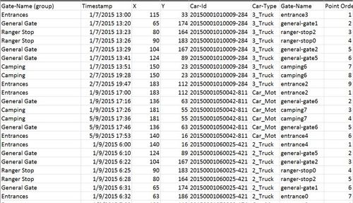
Before explaining the steps in detail let us speak about the "was" dataset and the transformed dataset. Here are the respective snapshots

The intial file contained just a few columns with coded data. It mainly had the timestamp, the car-id, car-type, gate-name. This was transformed to the following file

Description of the AS-IS data file and how it came to be
| Data Variable
|
Description
|
How was it done?
|
| Gate-Name (group)
|
So this was an aggregation of Gate-Names. All entrances were placed under the "entrance" category. This was done in order to ease analysis and to facilitate a drill down approach.
|
The grouping function in Tableau was used for this. This is a calculated field from the "Gate-Name" column of the raw file
|
| Timestamp
|
This wasn't modified
|
NA
|
| X
|
This the X coordinate of the Gate-Names on the map. The purpose is to plot it on a map.
|
This was done by importing the image with annotated gate-names into Tableau. It was placed as the background of a 200x200 grid. The annotate tool of Tableau helped find the X and the Y coordinates. These coordinates were then manually typed into an excel sheet. This excel sheet was then later joined with the raw file
|
| Y
|
This the X coordinate of the Gate-Names on the map. The purpose is to plot it on a map.
|
The method is the same as above
|
| Car-Id
|
These acted as "PathIDs" for the map. No modifications were done
|
NA
|
| Car-Type
|
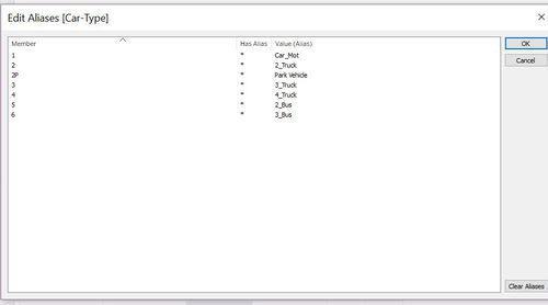
This variable was extracted from the raw file and contained the various car types
|
 This was created using the Alias function in Tableau This was created using the Alias function in Tableau
|
| Gate-Name
|
This was the name of the locations
|
This was extracted from raw file directly
|
| Gate-Name
|
This was the name of the locations
|
This was extracted from raw file directly
|
| Point Order
|
For every car ID this showed the path sequence. 1 being the first place it visited followed by consecutive numbers represented for consecutive locations
|
The data from Tableau was exported to excel. A sorting on the Car-ID column was done. Now all the car-IDs were congregated and the time followed an ascending order. An extra column was created that checked for the previous car ID. If the previous car id was the same as the current cell, it would be "TRUE" else "FALSE". The point order column contained a logic that said if the value for the column was "TRUE" then the point order should be 1+ previous value. If the column was "FALSE" then put point order value as 1.
|
Dashboard
Hi Mitch,
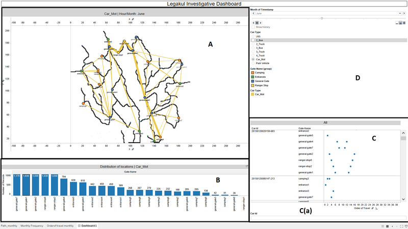
This is where you can interact more with the dashboard. The Dashboard can be accessed through this link Legakul Investigative Dashboard
Dashboard User Guide
Section A
Section A is the Legakul reserve map with the travel paths drawn. This map is interactive. Interesting paths could be selected to further investigate. Upon hovering you can see the point order information and you can also see the Car ID and location name.
Section B
This shows the distribution of the most popular areas visited in the selected time period.
Section C
This shows the individual car ids and the places they have visited. The x - axis is the point order or here stated as "Order of Travel". You can click on a particular car -iD and then zoom in. and see what has happened.
Section C(a)
This section helps you search for a particular car-id that you happened to see on the map and know the exact path
Section D
Here you can select your time periods. You can also select the type of motor that you want to zoom into. It also contains the legend of the location by gate-name group

