ISSS608 2016-17 T3 Assign MACK ZHI WEI VINCENT
Contents
Question Attempted
Mini-Challenge 2
Objectives
Insert text here
Question 1
Characterize the sensors’ performance and operation. Are they all working properly at all times? Can you detect any unexpected behaviors of the sensors through analyzing the readings they capture? Limit your response to no more than 9 images and 1000 words.
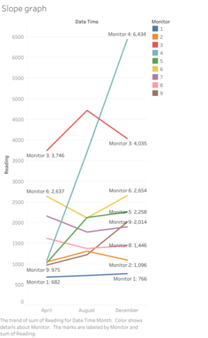
Overall trend analysis from Slope Graph
- The slope graph above shows us that the sensors can be categorised into three groups. The first group – sensors 2 and 3 – have readings that start low in April, peak in August, and drops back low in December.
- The second group – sensors 6, 7 and 8 – have readings that start high in April, dip in August, and go back high in December.
- The final group – sensors 1, 4, 5 and 9 – have readings that start at the lowest value in April, grow higher in August and is the highest in December. Readings for sensor 4 have the highest growth rate, followed by 5 and 9, with 1 at the slowest growth rate.
Studying the variation with a calendar plot and horizon chart
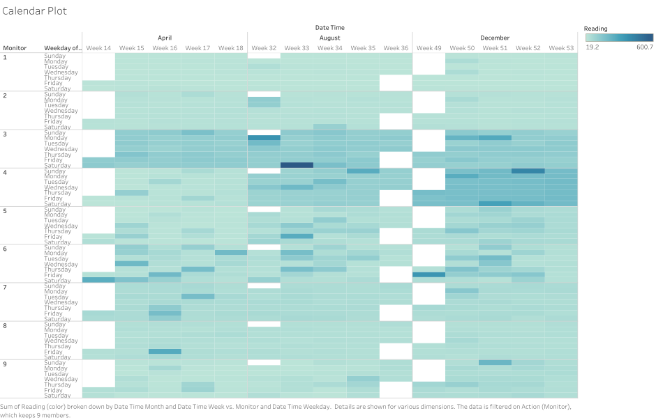
Calendar plot analysis
- The Calendar plot above provides an overview to the sensor dataset.
- It tells us that relative to the rest of the sensors, the readings detected by sensors 3 and 4 are generally much higher than the rest of the sensors.
- For sensor 4, this was especially so for the August and December readings.
- For sensors 5 and 6 – while readings are not as high as 3 and 4 – have much higher variability in the readings.
- This calendar plot allows us to detect outlier readings judging by the darker patches on the plots of sensors 5, 6, 7, 8 and 9.
- However, the calendar plot is limited. We will need to rely on other visualisation methods to get a better sense of the data.
Horizon Chart Analysis
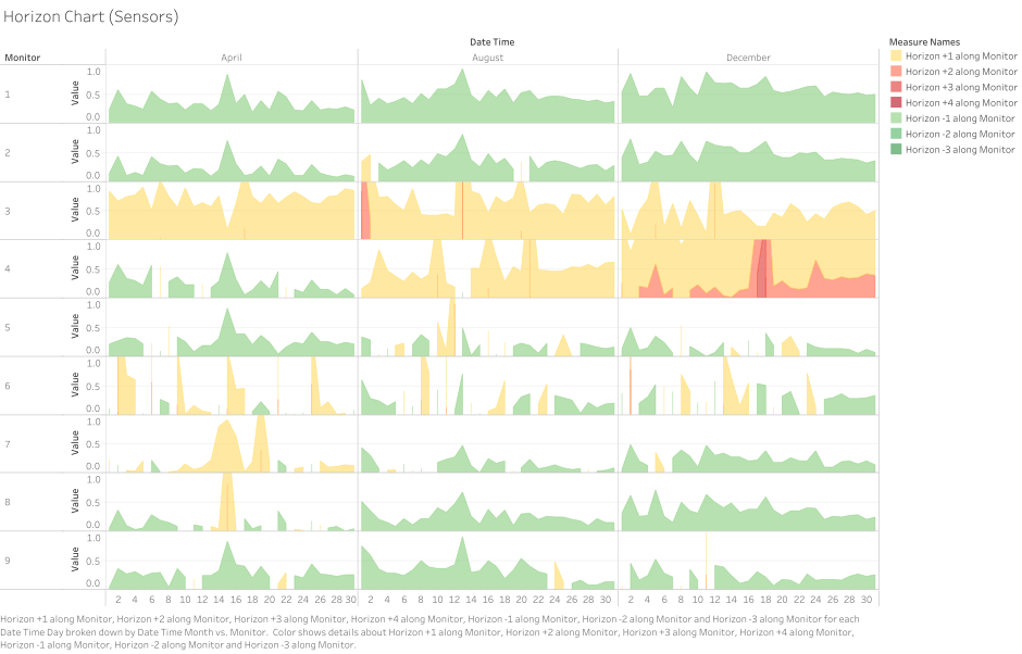
- The horizon chart of the sensors provides clearer indication on the performance of the sensors. With the global average reading as the baseline, the horizon chart measures the difference between the average reading per monitor compared to the global average. Readings that fall below the baseline, get coloured as green, while those above the baseline are coloured yellow. Higher readings (i.e. those more than 1 correspond with darker hues of red.
- Sensors 1, 2, 8 and 9 are mostly in the green zone, with a few fluctuations above the baseline.
- With the exception of April’s readings, sensor 7 displays similar behaviour as well.
- From both the horizon chart and the calendar plot, we see that the readings are especially high for sensors 3 and 4. These spikes could be further investigated later to see if they correspond with wind direction.
- For sensor 4, readings start low in April but get progressively higher each period, with the highest in December.
- Sensor 6 displays the most irregular performance, as fluctuations in the readings appear below and above the baseline. This may be the result of the location of Sensor 6 being set in the middle of the four factories, which bear further examination later on.
- In order to get a better sense of any cyclical patterns, we use a cycle plot showing the with the lowest and highest values in each cell labelled. Reference lines and bands were added showing the median, and upper and lower quartiles.
Cycle Plot: Studying seasonality
The behaviour of sensors 2, 3 shows similar seasonality patterns.
- The highest readings in April was on Friday where readings rose above their respective upper quartiles.
- The shape of the curves for the month of August resemble sine curves, where readings are generally low on Sunday, rising, to its first peak on Monday, then dipping on Thursday or Friday and rising to another high on Saturday.
- The shape of their curves was also similar in December, where readings rose from Sunday to Monday, dipped to a low on Tuesday, and slowly tapered off to the rest of the week.
- These findings suggest that the same factors may be responsible for the readings recorded by Sensor 2 and 3.
- The readings of sensor 1 are also roughly similar to sensors 2 and 3 but some minor differences apply – i.e. in April, readings peaked on Saturday instead of Friday, on Tuesday instead of Monday in August, and there was an extra rise in readings on Wednesday in December. These minor differences suggest that other factors may be responsible for these slight deviations in the readings.
- Other notable groups with similar reading patterns are the sensor-pairs 5-and-9 and 7-and-8 as can be seen from the cycle plot above. They showed noticeable increases and decreases on the same weekday each month suggesting that common factors are responsible for these patterns. This may also be due to the close proximity in which these sensors are to each other.
- Outlier sensor data detected are those of sensors 4 and 6, although sensor 6’s readings seems to be mirroring both sensor 5’s and 4’s readings – in the sense that the when readings in sensor 4 and 5 rise, sensor 6’s will drop to different extents. Given their respective locations, this may be due to the direction of the wind blowing from certain factories. This hypothesis is supported when observing the Coxcomb chart below – where the wind direction is plotted with the magnitude of the readings, i.e. the highest readings are indicated by largest segments in the respective Coxcomb chart. In the case of sensor 6, the readings tend to be the highest when they are blowing towards a southerly direction.
Strangely enough, the two sensors with the highest readings – i.e. 3 and 4 – do not show much similarities with each other in the cycle plot. However, the coxcomb chart below shows that the similarities in the readings may be the result of the similar wind directions.
Question 2.
Now turn your attention to the chemicals themselves. Which chemicals are being detected by the sensor group? What patterns of chemical releases do you see, as being reported in the data? Limit your response to no more than 6 images and 500 words.
Text
Text
Reference
Below are some works I personally admire and learning from it.


