ISSS608 2016-17 T3 Assign MACK ZHI WEI VINCENT
Contents
- 1 Introduction: Question Attempted
- 2 Embedded Tableau Visualisation
- 3 Objectives
- 4 Question 1
- 5 Question 2.
- 6 Question 3.
- 7 Data Preparation
- 8 General steps in setting up visualisations
- 9 Data Preparation to answer final question
- 10 Discussion
- 11 Reference
Introduction: Question Attempted
Mini-Challenge 2 Ornithology student Mitch Vogel was immediately suspicious of the noxious gases just pouring out of the smokestacks from the four manufacturing factories south of the nature preserve. He was almost certain that all of these companies are contributing to the downfall of the poor Rose-crested Blue Pipit bird. But when he talked to company representatives and workers, they all seem to be nice people and actually pretty respectful of the environment.
In fact, Mitch was surprised to learn that the factories had recently taken steps to make their processes more environmentally friendly, even though it raised their cost of production. Mitch discovered that the state government has been monitoring the gaseous effluents from the factories through a set of sensors, distributed around the factories, and set between the smokestacks, the city of Mistford and the nature preserve. The state has given Mitch access to their air sampler data, meteorological data, and locations map. Mitch is very good in Excel, but he knows that there are better tools for data discovery, and he knows that you are very clever at visual analytics and would be able to help perform an analysis.
Embedded Tableau Visualisation
Objectives
Mini-Challenge 2 provides a three month set of data for you to analyze, covering April, August, and December 2016.
The primary job for Mitch is to determine which (if any) of the factories may be contributing to the problems of the Rose-crested Blue Pipit. Often, air sampling analysis deals with a single chemical being emitted by a single factory. In this case, though, there are four factories, potentially each emitting four chemicals, being monitored by nine different sensors. Further, some chemicals being emitted are more hazardous than others. Your task, as supported by visual analytics that you apply, is to detangle the data to help Mitch determine where problems may be. Use visual analytics to analyze the available data and develop responses to the questions below. In addition, prepare a video that shows how you used visual analytics to solve this challenge. Novel visualizations and analysis approaches are especially interesting for this mini-challenge. Please do not use any other data in your work (including other Internet-based sources or other mini-challenge data).
Question 1
Characterize the sensors’ performance and operation. Are they all working properly at all times? Can you detect any unexpected behaviors of the sensors through analyzing the readings they capture? Limit your response to no more than 9 images and 1000 words.
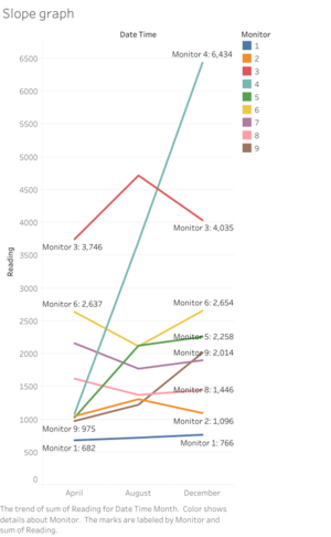
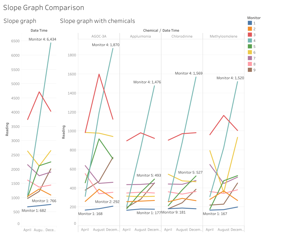
Overall trend analysis from Slope Graph
- The slope graph above shows us that the sensors can be categorised into three groups. The first group – sensors 2 and 3 – have readings that start low in April, peak in August, and drops back low in December.
- The second group – sensors 6, 7 and 8 – have readings that start high in April, dip in August, and go back high in December.
- The final group – sensors 1, 4, 5 and 9 – have readings that start at the lowest value in April, grow higher in August and is the highest in December. Readings for sensor 4 have the highest growth rate, followed by 5 and 9, with 1 at the slowest growth rate.
Are Sensors working all the time?
There are some occasions where the data is not available.
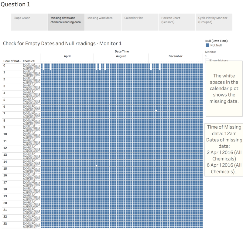
Regular disappearances. Maintenance?
In the dataset, it is observed that on the sensors have no data at 12am on the following dates:
- 2 April 2016
- 4 April 2016
- 2 August 2016
- 4 August 2016
- 7 August 2016
- 2 December 2016
- 7 December 2016
For these periods, chemical reading data for all chemical types were mostly missing, with the following exceptions:
- 2 August 2016 on Monitor 3, where only data for Appluimonia and Chlorodinine were absent;
- 7 December 2016 on Monitors 6 and 8 where all data except AGOC-3A were absent, and Monitor 7 where only Chloridinine and Methylosmolene were absent.
The regularity of the occurrences suggests that the sensors may have been systemically shut down for maintenance, although the two exceptions hint that there might be something else going on.
Irregular performance of sensors detecting Methylosmolene
Other than the above-mentioned missing data, data on Methylosmolene were absent on many different dates and hours as can be seen in the visualisation.
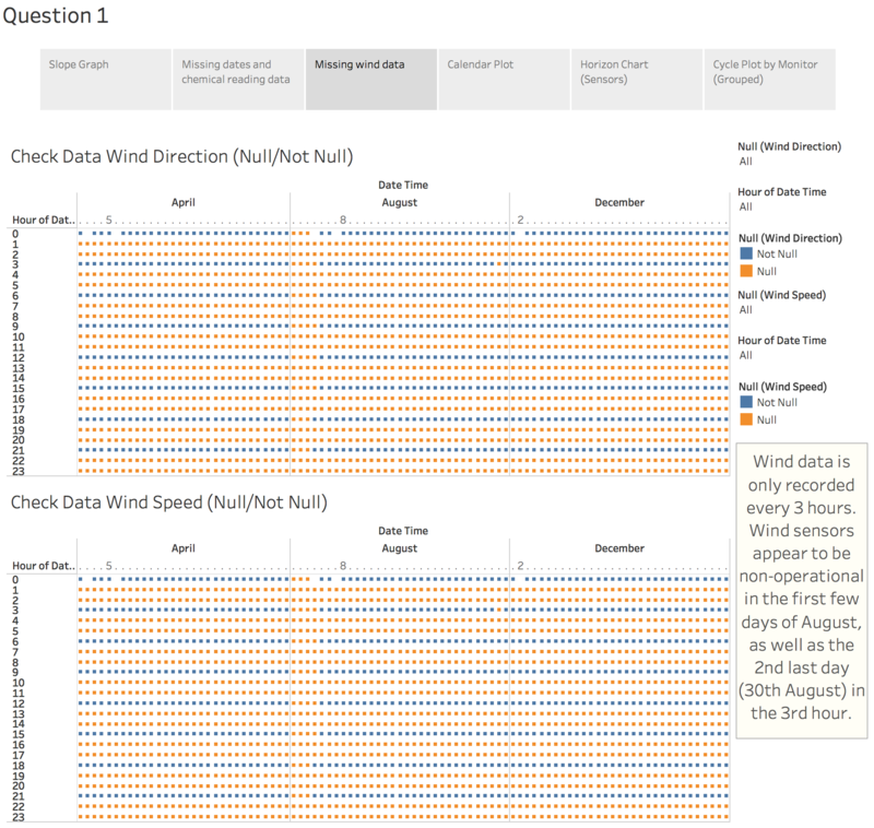
Missing wind data
- A similar examination of wind data shows that like chemical readings, the much of the wind data missing was on the same dates.
- Unlike the chemical readings, Wind Data are only recorded every 3 hours.
- Wind data collection appear to be non-operational in the first few days of August, as well as the 2nd last day (30th August) in the 3rd hour.
Studying the variation with a calendar plot and horizon chart
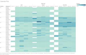
Calendar plot analysis
- As observed from the calendar plot, the readings detected by sensors 3 and 4 are generally much higher than the rest of the sensors, especially for August and December.
- Readings for sensors 5 and 6 – while lower than 3 and 4 – have much higher variability.
- The darker patches on the plots of sensors 5, 6, 7, 8 and 9 indicate outlier readings.
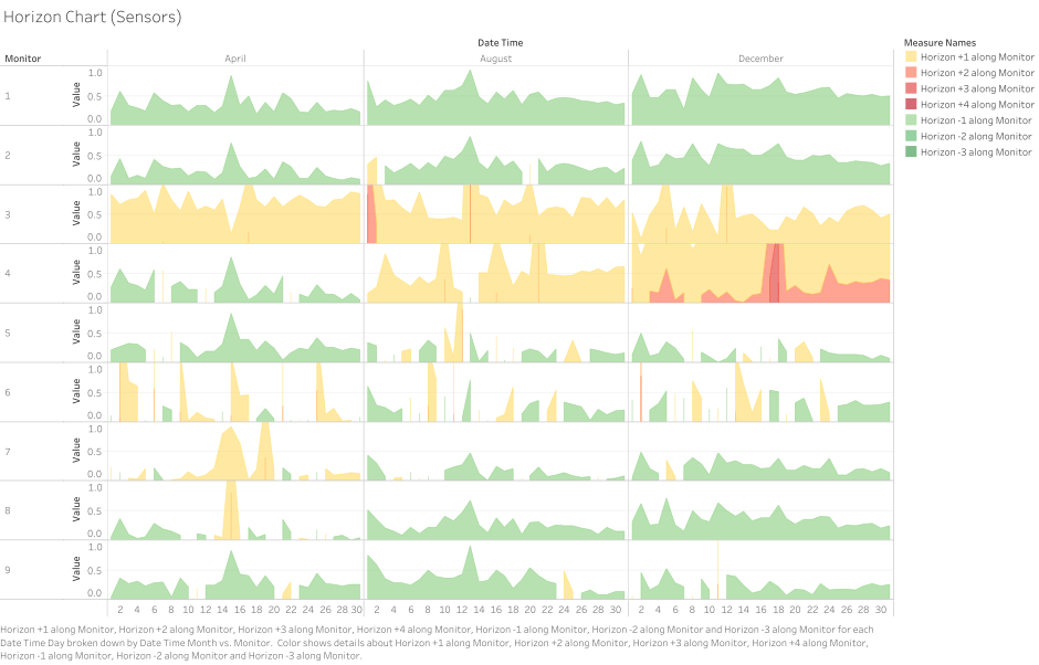
Horizon Chart Analysis
- Sensors 1, 2, 8 and 9 are mostly in the green zone, with a few fluctuations above the baseline.
- With the exception of April’s readings, sensor 7 displays similar behaviour as well.
- From both the horizon chart and the calendar plot, we see that the readings are especially high for sensors 3 and 4. These spikes could be further investigated later to see if they correspond with wind direction.
- For sensor 4, readings start low in April but get progressively higher each period, with the highest in December.
- Sensor 6 displays the most irregular performance, as fluctuations in the readings appear below and above the baseline. This may be the result of the location of Sensor 6 being set in the middle of the four factories, which bear further examination later on.
- In order to get a better sense of any cyclical patterns, we use a cycle plot showing the with the lowest and highest values in each cell labelled. Reference lines and bands were added showing the median, and upper and lower quartiles.
Cycle Plot: Studying seasonality
The behaviour of sensors 2, 3 shows similar seasonality patterns.
- The highest readings in April was on Friday where readings rose above their respective upper quartiles.
- The shape of the curves for the month of August resemble sine curves, where readings are generally low on Sunday, rising, to its first peak on Monday, then dipping on Thursday or Friday and rising to another high on Saturday.
- The shape of their curves was also similar in December, where readings rose from Sunday to Monday, dipped to a low on Tuesday, and slowly tapered off to the rest of the week.
- These findings suggest that the same factors may be responsible for the readings recorded by Sensor 2 and 3.
- The readings of sensor 1 are also roughly similar to sensors 2 and 3 but some minor differences apply – i.e. in April, readings peaked on Saturday instead of Friday, on Tuesday instead of Monday in August, and there was an extra rise in readings on Wednesday in December. These minor differences suggest that other factors may be responsible for these slight deviations in the readings.
- Other notable groups with similar reading patterns are the sensor-pairs 5-and-9 and 7-and-8 as can be seen from the cycle plot above. They showed noticeable increases and decreases on the same weekday each month suggesting that common factors are responsible for these patterns. This may also be due to the close proximity in which these sensors are to each other.
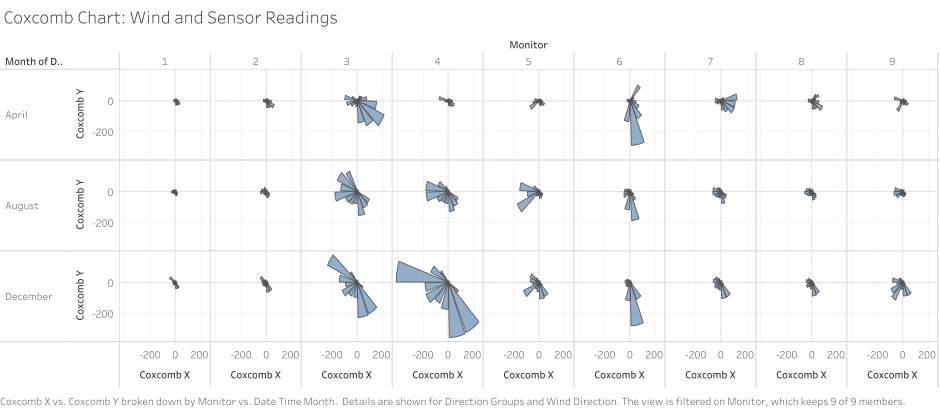
- Outlier sensor data detected are those of sensors 4 and 6, although sensor 6’s readings seems to be mirroring both sensor 5’s and 4’s readings – in the sense that the when readings in sensor 4 and 5 rise, sensor 6’s will drop to different extents. Given their respective locations, this may be due to the direction of the wind blowing from certain factories. This hypothesis is supported when observing the Coxcomb chart below – where the wind direction is plotted with the magnitude of the readings, i.e. the highest readings are indicated by largest segments in the respective Coxcomb chart. In the case of sensor 6, the readings tend to be the highest when they are blowing towards a southerly direction.
Strangely enough, the two sensors with the highest readings – i.e. 3 and 4 – do not show much similarities with each other in the cycle plot. However, the coxcomb chart below shows that the similarities in the readings may be the result of the similar wind directions.
Question 2.
Now turn your attention to the chemicals themselves. Which chemicals are being detected by the sensor group? What patterns of chemical releases do you see, as being reported in the data? Limit your response to no more than 6 images and 500 words.
Slope graph comparison
We turn to the slope graph to get a sense of how the composition of the chemicals contribute to the overall trend observed earlier. Overall trends observed:
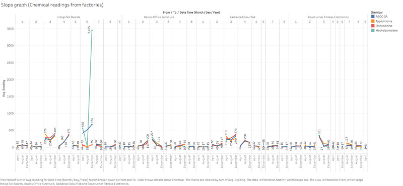
- Generally, AGOC-3A seems to be responsible for the largest fluctuations in the readings, with clear examples as observed by the spike in August for sensors 3 and 5.
- For sensor 6, the drop in Methylosmolene in August is responsible for the V shape observed in the slope graph.
- For sensors 3, 4, 7, 8, and 9, the shapes of the slopes while different in magnitude, are generally the same for all chemical types, with 8 being the exception for the tiny spike in Applumonia in August.
- These findings suggest that AGOC-3A and Methylosmolene are possible main factors responsible for variation in the readings.
Horizon and Coxcomb chart analysis of chemical types
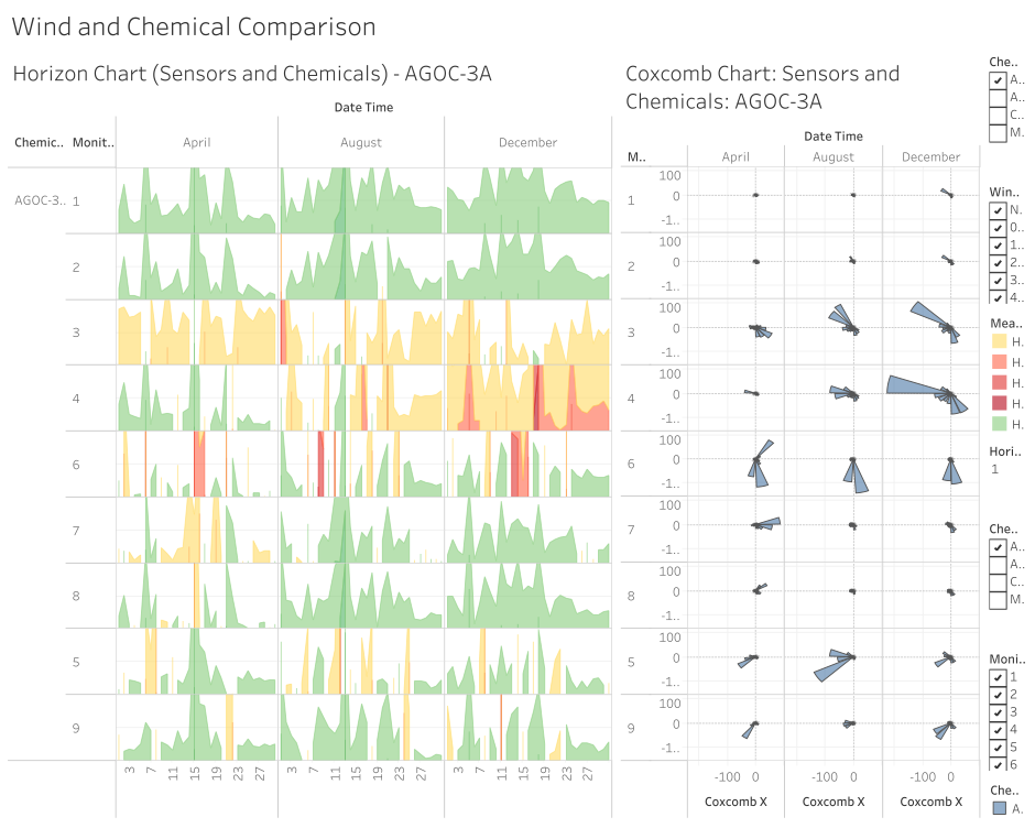
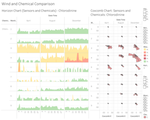
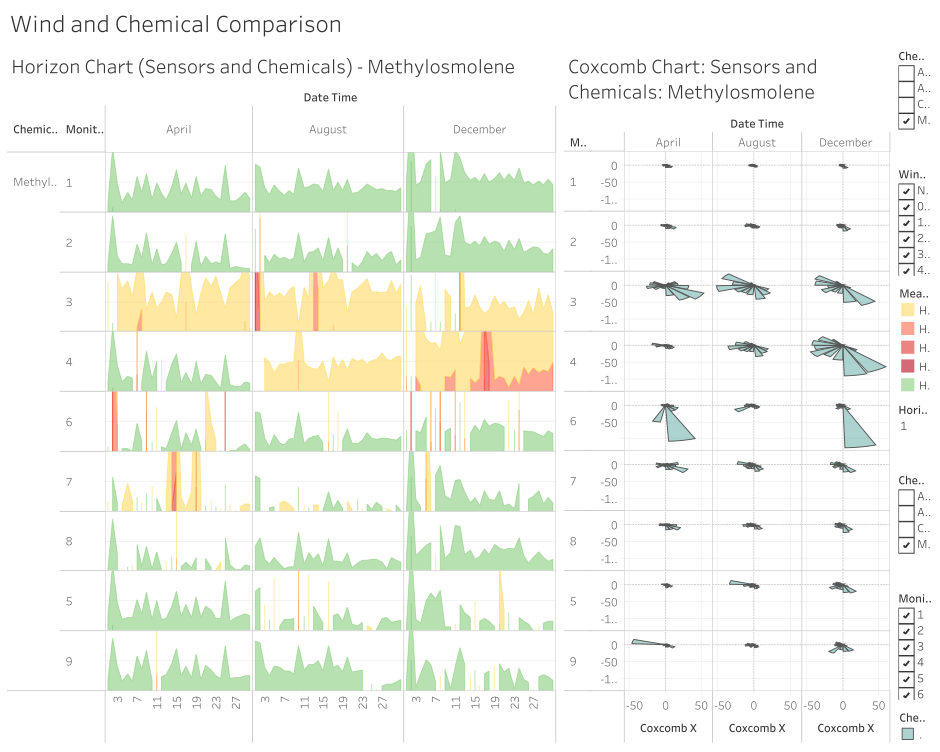
- A separate horizon chart – factoring chemical types – was constructed to explore this further along with a coxcomb chart that map the magnitude of readings to the size of the segments corresponding with the wind direction.
- For AGOC-3A, we can see that there is co-occurrence in the readings for sensors 1 and 2 (and parts April and August for sensor 4 as well) based on the shapes of the horizon chart. A quick check at the corresponding coxcomb chart shows that the wind directions remain constant for the most part.
- The same can be observed for sensors 7 and 8, although their wind directions corresponding with the largest readings are dissimilar.
- This suggests that the similarities in these two pairs of sensor may be a function of their close proximity to each other and the source of much of the readings they register may be ambient rather than blown from some other location.
- Despite having the highest average readings, sensor 3 and 4, have mostly very different shapes on the horizon chart, suggesting that their drivers may be different. From the Coxcomb chart, we also observed the wind direction responsible for those readings are different.
- As previously observed, readings and wind direction data for sensor 6 are pretty much standalone. Given its location, it may be the best candidate for answering Question 3.
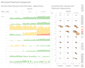
- For Appluimonia, most of the readings seem to be coming from the same the wind direction – i.e. from the northwest to southeast, or from the east to west.
- Similar observations can be made from the Chlorodinine chart.
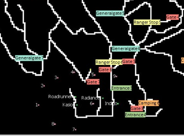
- Results from the horizon and coxcomb charts for Methylosmolene resonate with a lot that has been already mentioned. Of note are sensors 3, 4 and 6, where the largest spikes in readings come from a north or north-westerly source. Given that along that direction lies the park roads and gate 7, there’s a high chance that this chemical may be actually coming from vehicles travelling along the park trails rather than the factories. The same can be said for sensor 9 whose large spike in reading in April is corresponds with a wind blowing from the east, where only park trails are seen on the map.
Question 3.
Which factories are responsible for which chemical releases? Carefully describe how you determined this using all the data you have available. For the factories you identified, describe any observed patterns of operation revealed in the data. Limit your response to no more than 8 images and 1000 words.
Impact of wind factors on sensor readings
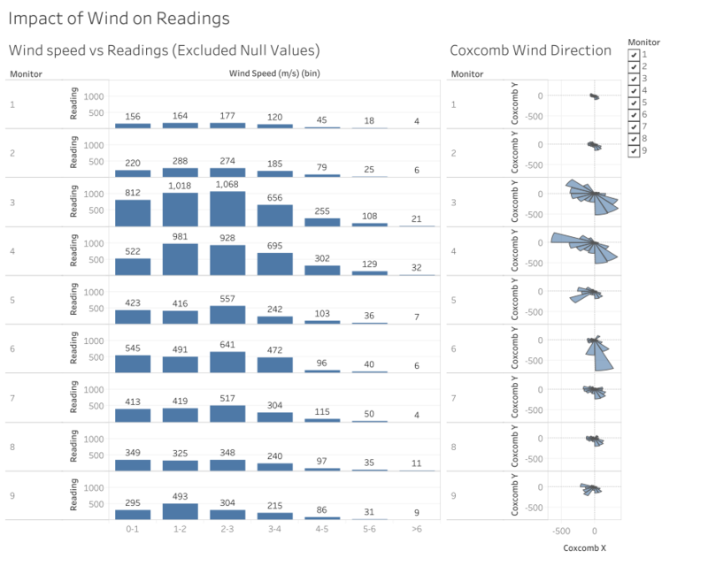
One of the biggest things I’ve noticed when going through the data is how most of the readings don’t seem to be coming from factories themselves. The observation arose from initially observing wind and speed data and their corresponding chemical readings.
Impact of wind speed on readings
- From the charts above, we can see that there is a correlation between slower wind speeds and higher readings. This makes logical sense as higher wind speeds probably blow away chemical particles that would otherwise be detected by the sensors.
Impact of wind direction on readings
- We can see that for sensors 1, 2, 3, 4, 7, and 8, (i.e. the sensors on the left half of the map surrounding the factories) the wind directions that correspond with the highest readings are similar, mostly coming from the northwest or southeast directions. The correlation between the higher readings and the northwest and westerly winds suggests that the factories on the east side of these sensors may be responsible for these readings.
- Sensors 5 and 9 have similar looking coxcomb charts, suggesting that the wind directions most responsible for their high readings blow to the southwest, west, and the southeast.
- Most of sensor 6’s readings come from northwards, blowing towards the south-south-east direction.
Unexpected wind directions
Comparing those readings with the positioning of the sensors relative to the factories and their surrounding environment we draw a few unexpected conclusions.
- It is strange that winds blowing towards the southeast have resulted in high readings for sensors 1,2,3,4,7,8 as there are no factories to their north-western side. Given the direction of sensor 6’s data, this mysterious northern source of chemicals also seems to be the one responsible for sensor 6 as well.
- The same is observed for sensors 5 and 9, that the highest readings come from the side opposite of the factories.
Isolating readings from factories
In order to better observe the relationship between the wind direction and wind data, I decided to aggregate chemical reading data and the wind data at the three-hourly level. More of how this was done can be found under the data preparation section. I derived the directions of the factories to sensors and matched them to the wind direction data, so as to isolate only the reading data that came from the factories.
After separating the dataset by matching the wind direction data to the direction from the factories, I made an interesting discovery:
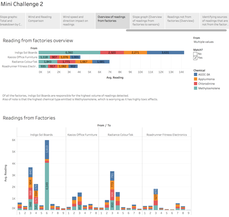
- From the factories, Indigo Sol Boards seems to be the biggest culprit in chemical emissions, judging by the readings from sensor 3 and 6.
- Next in line is Radiance ColourTek, followed by Roadrunner Fitness Electronics and Kasios Furniture.
In examining these readings, we have to be careful what we attribute to which factory, especially for the case of sensor 3, as both Radiance ColourTek and Indigo Sol Boards seem to lie roughly along the same direction. Hence, I paid more credence to the readings of sensors more closely located to the factories. This makes the readings of sensor 6 very interesting as it is located right at the centre of the factories. For Roadrunner and Kasio, I paid more attention to readings detected by sensors 2 and 3, given their close proximity and the predominantly north westerly wind featured earlier.
Of all the factories, Indigo Sol Boards are responsible for the highest volume of readings detected.
Also of note is that the highest chemical type emitted is Methylosmolene, as detected by sensor 6, which is worrying as it has highly toxic effects. Even if we deduct the amount of readings detected by sensor 3 to be from Radiance ColourTek (i.e assuming there’s double counting), the reading levels remain substantial.
Indigo Sol Boards’ largest Methylosmolene reading detected is observed to be found in December. Given that Indigo Sol Boards produced snowboards, and if this area is located in the Northern hemisphere, Winter months are in the December period, Methylosmolene may be a chemical that is emitted in the production of these snowboards and other equipment.
Identifying source of chemicals that do not come from factories
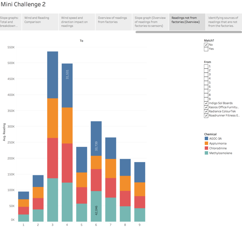
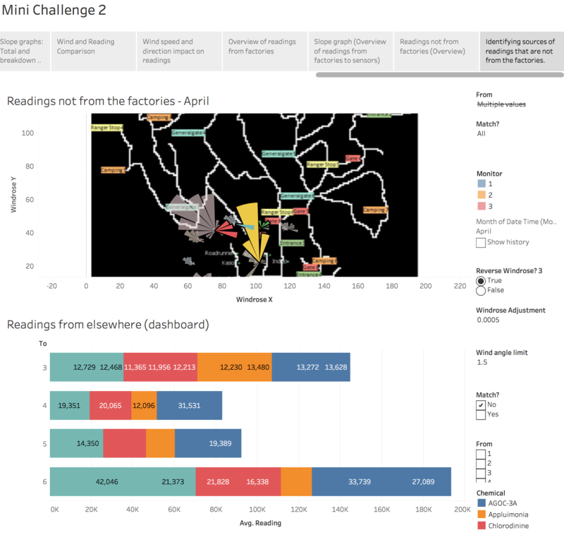
Also, I discovered that most of the readings that were picked up cannot be attributed to the factories, and instead seems to come from the environment - i.e. the park - in more or less equal proportions of chemical types.
I created another coxcomb chart/windrose plot and added a reverse wind rose parameter option so I can reverse the wind rose to see where the source of the chemicals is coming from. I also created a windrose sizing parameter called “Windrose Adjustment” to play with the size of the wind rose so that extremely large values won’t exceed the space of the map.
When I layered the coxcomb chart onto the map, the culprit became clear. The source of the chemical readings, excluding the factories might have come from the campsites and the roads, where vehicles travel on.
Data Preparation
Combining Sensor Data and Meterological Data
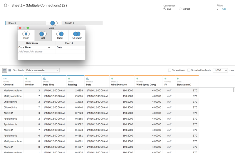
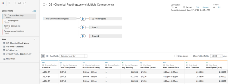
Sensor data and meterological data was combined in Tableau in the Data Source tab under the union function. Using the Left Join function – with Sensor data on the left – I combined the two datasets using the Date Time/Date field.
X-Y Coordinate data for sensors
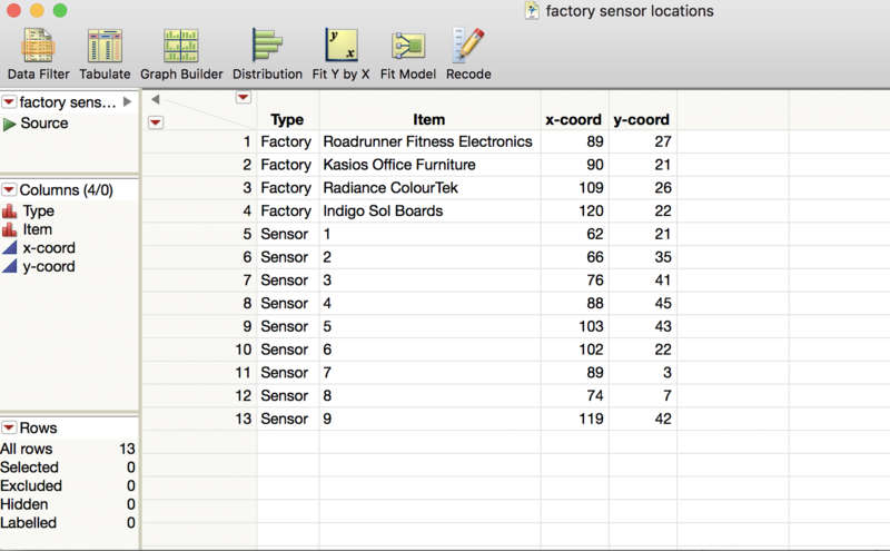
In order to incorporate the X-Y coordinate data for the sensors into the existing dataset, I created a “factory sensor locations” data file with the X-Y coordinate data provided in the MC2 Data Description.docx using JMP.
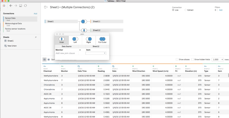
This was exported to csv and imported by through the add connection function in Tableau. Next, I did an inner join using the previous data and the X-Y coordinate data using the Monitor/Item fields. In order to join these two datasets, I had to change the variable type of “Monitor” from number to string.
Missing data discovery
As mentioned in the question 1, there are missing data in both chemical sensor readings and wind direction and speed datasets.
To aid the discovery of missing variables, I created three calculated fields with the following code:
- Null (Reading)
IF(ISNULL(SUM([Reading]))) THEN "Null" ELSE "Not Null" END Null (Wind Direction) IF(ISNULL(SUM([Wind Direction]))) THEN "Null" ELSE "Not Null" END Null (Wind Speed) IF(ISNULL(SUM([Wind Speed (m/s)]))) THEN "Null" ELSE "Not Null" END
Next, I created three separate calendar plot worksheets to visualise the missing data. For chemical readings, I dragged MONTH (Date Time) and DAY (Date Time) on Columns, and HOUR (Date Time) and Chemical on Rows; with exact Date Time on detail. I coloured the variables using Null (Date Time) and increased the size a little, and dragged Monitor to pages to make it easier to scroll through the dataset.
For Wind Data – i.e. both Wind Direction and Wind Speed – the setup was pretty similar, except that the fields chemical and monitor were not used. Also, Null (Wind Direction/Wind Speed) was used to colour the data instead, with HOUR (Date Time) and Null (Wind Data) set as filters.
General steps in setting up visualisations
This section delineates the general steps I had taken to set up the data visualisations in Tableau.
Area Map
To created a basic map with the coordinates of the sensors, I clicked on Map>Background Images>[Dataset name] and loaded the MapLargeLabels.jpg that came with the MC2 data files. I set the X and Y fields to X-Coord and Y-Coord respectively, with the following values: X-Coord Left: -1 X-Coord Right: 199 Y-Coord Bottom: -3 Y-Coord Top: 197 Finally, I dragged Monitor onto colour and changed Marks to Circle.
Slope Graph
I drag Month(Date Time) to columns, and Sum(Reading) to rows. Next, drag Monitor to colour. Drag monitor and Sum(Reading) to Label. Click on Label, select Show Mark Labels, and click line ends, and disallow labels to overlap. Under Label Appearance, click text, and change the words in the text box as follows: Monitor <Monitor>: <SUM(Reading)> Finally drag out the width of the Slope graph to an appropriate size.
Slope Graph with Chemicals
I dragged chemicals into the columns. Next, I create a new dashboard and drag the previous slope graph with the one with chemicals side by side.
Calendar Plot (Monitors)
The Calendar Plot (for Monitors) was created using the fields MONTH and WEEK for columns, with Monitor and WEEKDAY on rows. Reading was dragged to colour in order to give us a sense of which data point
Horizon Chart
- The horizon chart of the sensors provides clearer indication on the performance of the sensors. With the global average reading as the baseline, the horizon chart measures the difference between the average reading per monitor compared to the global average. Readings that fall below the baseline, get coloured as green, while those above the baseline are coloured yellow. Higher readings (i.e. those more than 1 correspond with darker hues of red.
- To create the horizon chart, I followed the instructions found on this site <https://www.tableau.com/learn/tutorials/on-demand/horizon-charts>
The following calculated fields and parameters were created:
- Total Average Readings
(TOTAL(AVG([Reading])))
- Difference from average
AVG([Reading]) - [Total Average Readings]
- Horizon Band Size
Data Type: Float; Current value: 1; Range: 1-10; Step: 1
- Horizon -1
IF [Difference from average]<0 AND [Difference from average]>=-[Horizon Band Size] THEN ABS([Difference from average])/[Horizon Band Size] ELSEIF [Difference from average]<-[Horizon Band Size] THEN 1 END
- Horizon -2
IF [Difference from average]<-[Horizon Band Size] AND [Difference from average]>=-2*[Horizon Band Size] THEN (ABS([Difference from average])-[Horizon Band Size])/[Horizon Band Size] ELSEIF [Difference from average]<-2*[Horizon Band Size] THEN 1 END
- Horizon -3
IF [Difference from average]<-2*[Horizon Band Size] AND [Difference from average]>=-3*[Horizon Band Size] THEN (ABS([Difference from average])-(2*[Horizon Band Size]))/[Horizon Band Size] ELSEIF [Difference from average]<-3*[Horizon Band Size] THEN 1 END
- Horizon +1
IF [Difference from average]>=0 AND [Difference from average]<=[Horizon Band Size] THEN [Difference from average]/[Horizon Band Size] ELSEIF [Difference from average]>[Horizon Band Size] THEN 1 END
- Horizon +2
IF [Difference from average]>=[Horizon Band Size] AND [Difference from average]<=2*[Horizon Band Size] THEN ([Difference from average]-[Horizon Band Size])/[Horizon Band Size] ELSEIF [Difference from average]>2*[Horizon Band Size] THEN 1 END
- Horizon +3
IF [Difference from average]>=2*[Horizon Band Size] AND [Difference from average]<=3*[Horizon Band Size] THEN ([Difference from average]-(2*[Horizon Band Size]))/[Horizon Band Size] ELSEIF [Difference from average]>3*[Horizon Band Size] THEN 1 END
- Horizon +4
IF [Difference from average]>=3*[Horizon Band Size] AND [Difference from average]<=4*[Horizon Band Size] THEN ([Difference from average]-(3*[Horizon Band Size]))/[Horizon Band Size] ELSEIF [Difference from average]>4*[Horizon Band Size] THEN 1 END
Once these fields were created, I dragged Date Time in Month, and Day onto Columns, and Monitor and Measure Values onto rows. The measure values sidebar will appear with all the measures of the dataset, to which all except the Horizon measures will be removed. I right click on the Horizon measures one by one to get them to compute using Monitor.
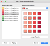
Once that is done, I drag Total Average Reading, Reading, and Difference from Average onto detail. I change Reading from SUM(Reading) to AVG(Reading), and checked if Total Average Reading and Difference from Average is correctly computed using Monitor. Next, I drag Measure Values onto Colour, and change the marks to Area. I edit colours and change the palette to Traffic Light, and change the colours as follows:
Finally, I right clicked on the parameter Horizon Band Size and clicked on Show Parameter control, and edit the Y-axis so that the range is fixed from 0 to 1.
With the global average reading as the baseline, the horizon chart measures the difference between the average reading per monitor compared to the global average. Readings that fall below the baseline, get coloured as green, while those above the baseline are coloured yellow. Higher readings (i.e. those more than 1 correspond with darker hues of red.
Cycle Plots
I dragged Month (Date Time) and Weekday (Date Time) onto Columns, and Monitor and Reading onto Rows. Next, I right click on the y-axis to add a reference line. When I get into the selection options, I click Distribution, and under Computation value, I select Quartiles from the dropdown list. I also edit axis to select independent axis ranges for each row or column. Finally, I clicked on label, and clicked on the checkbox marked show mark labels, selecting min/max under Mark to label.
Coxcomb Charts/Windplots
In order to plot the coxcomb chart in Tableau, we need to revisit some basic trigonometry. First, we need to get the new X and Y coordinates based on the Wind Direction and Wind Speed using the following formula:
- Y = r*sin(angle)
- X = r*cos(angle)
Where r = wind speed and angle = wind direction (in degrees) in a traditional wind plot. For my visualisations, instead of wind speed I used readings instead, as I’m trying to understand the relationship between magnitude of readings and wind direction.
Hence, I created the following calculated fields:
- Coxcomb X
IIF([Index]=1 OR [Index]=WINDOW_MAX([Index]),0, WINDOW_MAX([Radius (Coxcomb)]) * COS(RADIANS(avg([Wind Direction]))))
- Coxcomb Y
IIF([Index]=1 OR [Index]=WINDOW_MAX([Index]),0, WINDOW_MAX([Radius (Coxcomb)]) * SIN(RADIANS(avg([Wind Direction]))))
- Index
INDEX()
- Radius (Coxcomb)
WINDOW_SUM(SUM([Reading]))
I also had to created Direction Groups (converted to Dimension) to group the Coxcomb chart into segments.
- Direction Groups
If [Wind Direction] > 0 AND [Wind Direction] <= 22.5 THEN 11.25 ELSEIF [Wind Direction] > 22.5 AND [Wind Direction] <= 45 THEN 33.75 ELSEIF [Wind Direction] > 45 AND [Wind Direction] <= 67.5 THEN 56.25 ELSEIF [Wind Direction] > 67.5 AND [Wind Direction] <= 90 THEN 78.75 ELSEIF [Wind Direction] > 90 AND [Wind Direction] <= 112.5 THEN 101.25 ELSEIF [Wind Direction] > 112.5 AND [Wind Direction] <= 135 THEN 123.75 ELSEIF [Wind Direction] > 135 AND [Wind Direction] <= 157.5 THEN 146.25 ELSEIF [Wind Direction] > 157.5 AND [Wind Direction] <= 180 THEN 168.75 ELSEIF [Wind Direction] > 180 AND [Wind Direction] <= 202.5 THEN 191.25 ELSEIF [Wind Direction] > 202.5 AND [Wind Direction] <= 225 THEN 213.75 ELSEIF [Wind Direction] > 225 AND [Wind Direction] <= 247.5 THEN 236.25 ELSEIF [Wind Direction] > 247.5 AND [Wind Direction] <= 270 THEN 258.75 ELSEIF [Wind Direction] > 270 AND [Wind Direction] <= 292.5 THEN 281.25 ELSEIF [Wind Direction] > 292.5 AND [Wind Direction] <= 315 THEN 303.75 ELSEIF [Wind Direction] > 315 AND [Wind Direction] <= 337.5 THEN 326.25 ELSEIF [Wind Direction] > 337.5 AND [Wind Direction] <= 360 THEN 348.75
END
To create the Coxcomb Chart, I dragged Coxcomb X to Columns, and Coxcomb Y to Rows. (These we will have to right click and compute using Wind Direction. ) Next, I dragged (in this order), Direction Groups, Wind Direction (Changed to Dimension and Discrete) and Sum(Reading) into details. I also have to change Marks to Polygon.
This will create the basic Coxcomb chart. To make the chart easier to read, I gave it a dark coloured border, and set opacity to 60%.
Other details – such as monitor and Date Time fields – are added to the Rows and Columns later to customise the visualisations for analytic needs.
Data Preparation to answer final question
To answer the final question, I had to prepare the data differently from the previous arrangements. Due to the missing data, any form of time series analysis will be difficult. In order to reconcile the discrepancy, I decided to aggregate chemical reading data at the 3-hourly level, averaged by monitor/sensor number and chemical type.
Reconciling 1 hourly chemical readings vs 3 hourly wind data
I had to aggregate the reading data into 3 hourly intervals to align the once every 3-hourly wind data and the hourly reading data.
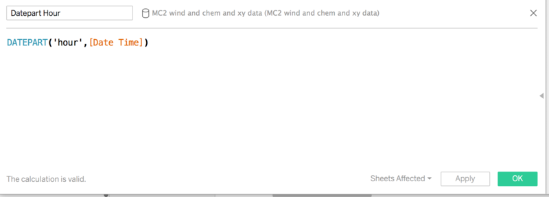
- First, I had to create a calculated field called “Datepart Hour” that extracted the hour of the day from the Date Time data provided. The DATEPART (‘hour’, [Date Time]) function was used.
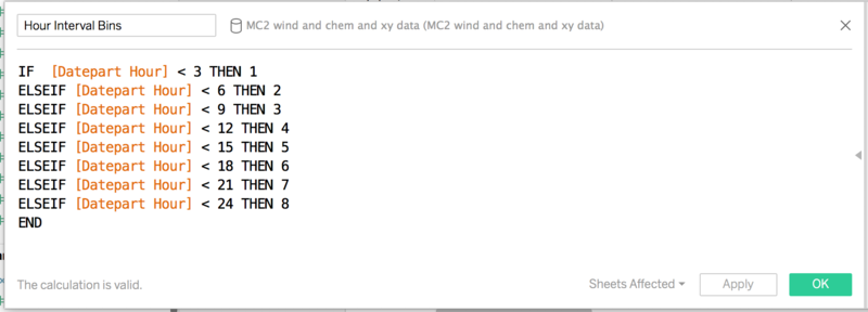
- Once that was done, I needed to group the hours in a three-hourly period. I created another calculated field called “Hour Interval Bins” where I numbered the 3 hour intervals from 1 to 8 as per the screen shot below:
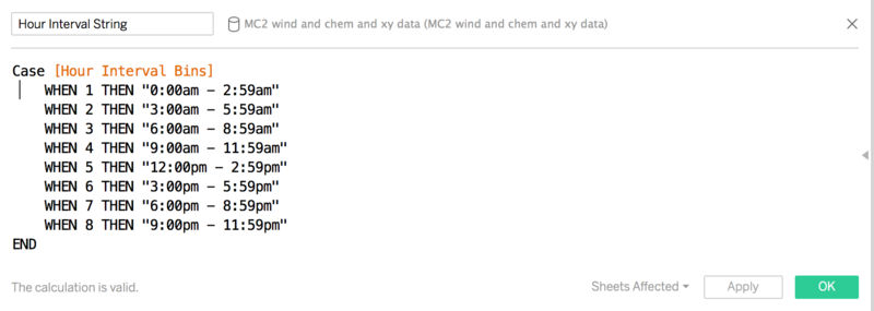
- Having acquired the three hourly intervals, I now could convert each number into its respective time period as a string:
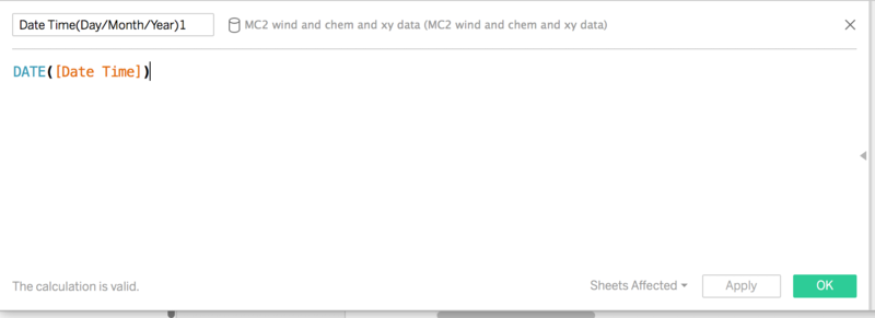
- Then I created another calculated field to extract the Date in Day/Month/Year format sans the time data from the original DateTime data field.
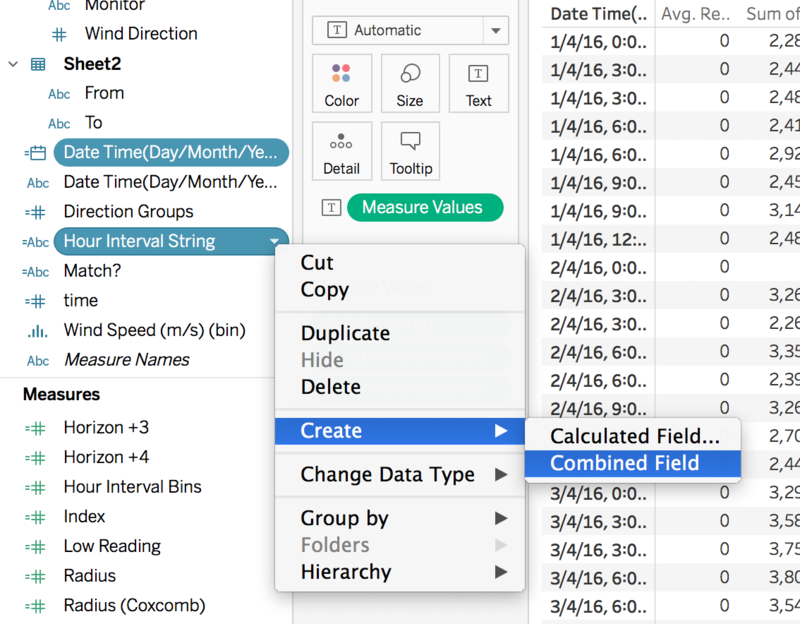
- Finally, I created a combined field called “Date Time(Day/Month/Year)” from the extracted date and the Hour Interval String variables that I can use to order the data into a 3 hourly time series.
- When that was done, I created a data frame using Tableau so that I can export it into a cleaner form for visualisation and analysis.
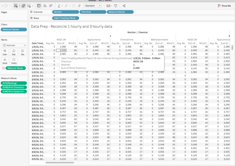
- To do that, I first had to create a new worksheet and dragged my new combined field Date Time (Day/Month/Year) & Hour Interval String to rows, and Monitor (converted to dimension), Chemical, Reading, Wind Direction, and Wind Speed to the columns.
- I aggregated Reading using the Average aggregated field, and left Wind Speed as the default summation field.
- I also changed Wind Direction to a continuous variable and used the SUM aggregation on it. Thereafter I clicked the “Show Me” Tab and click text tables, and clicked on the Swap Rows and Columns and dragged Measure names back to columns to achieve the view we see below:
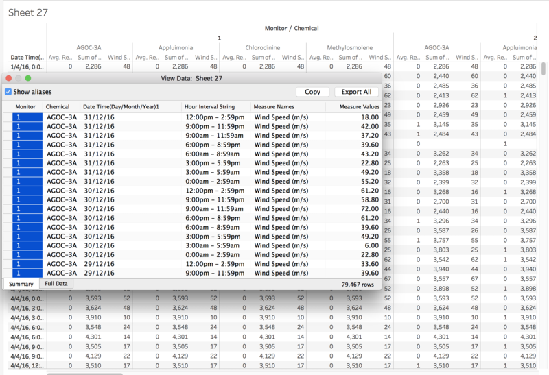
- In order to extract the data for analysis, I clicked analysis and view data and export all, which produced a csv file where the data is saved in long form. This was later processed with JMP where the Measure Names – Wind Speed(m/s), Wind Direction, and Chemical Readings – were extracted with their own measure values into separate csvs before combingin them into a different tableau file to answer the last question.
Calculation of Angle of Bearings between From Factories to Sensors
Since we already have the coordinates of the sensors and the factories, I decided that if I could derive the angle bearings from the factories to the monitor, then I could match them to the wind direction data (give or take a few degrees) which will lead me to find out chemical readings are blown directly from the factories’ locations to the respective sensors.
Using excel, I used the following formula to derive the angles:
=MOD(DEGREES(ATAN2(COS(RADIANS(Factory Y Coordinate))*SIN(RADIANS(Sensor Y Coordinate))-SIN(RADIANS(Factory Y Coordinate))*COS(RADIANS(Sensor Y Coordinate))*COS(RADIANS(Sensor X Coordinate-Factory X Coordinate)),SIN(RADIANS(Sensor X Coordinate-Factory X Coordinate))*COS(RADIANS(Sensor Y Coordinate)))),360)
After that, I went back to Tableau, and created a new workbook where I proceeded to add the 4 worksheets and joined them using the Monitor field.
Matching
I created this calculated field called Match? to get mark data points that come from the same direction as from the factories. The formula is as follows:
IIF(([Wind Direction]<=[Wind angle upper limit] AND [Wind Direction]>=[Wind Angle Lower limit]), "Yes", "No")
Wind angle upper limit and Wind Angle Lower limit are calculated fields I created to give some leeway of calculation for wind direction bearings.
- Wind Direction Upper Limit
IIF(([Angle of Bearing]+[Wind angle limit])>360, ([Angle of Bearing]+[Wind angle limit]-360), ([Angle of Bearing]+[Wind angle limit]))
- Wind Direction Lower Limit
IIF(([Angle of Bearing]-[Wind angle limit])<0, ([Angle of Bearing]-[Wind angle limit]+360), ([Angle of Bearing]-[Wind angle limit]))
Wind Angle Limit is a parameter created so that the user can adjust the wind angle limits for testing purposes. It is a float, with default parameter set at 1.5 with a range from 0 to 10, and a step size of 0.5.
I also added a Windrose Adjustment parameter, a float with default value set at 0.0005 ranging from 0 to 1 with a step size of 0.0001. This allowed me to scale the extremely large sizes that the wind rose plot could grow up to into something more manageable.
Finally, I added a Boolean parameter called “Reverse Windrose?” which toggles between true and false. The default is set as false, but when activated, it reverses the direction of the wind rose so that we see where the wind is blowing from.
The coxcomb segments that I used for this final plot are also tweaked to incorporate all these features:
- Windrose X
IIF([Index]=1 OR [Index]=WINDOW_MAX([Index]),0, WINDOW_MAX([Radius (Coxcomb)]) * COS(RADIANS(avg([Wind Direction]))))* [Windrose Adjustment] * (If([Reverse Windrose? 3] = TRUE) THEN -1 ELSE 1 END) + AVG([X-Coord])
- Windrose Y
IIF([Index]=1 OR [Index]=WINDOW_MAX([Index]),0, WINDOW_MAX([Radius (Coxcomb)]) * SIN(RADIANS(avg([Wind Direction]))))* [Windrose Adjustment] * (If([Reverse Windrose? 3] = TRUE) THEN -1 ELSE 1 END) + AVG([Y-Coord])
When it was done, I imported that workbook into my original workbook and did up the story board.
Discussion
Please feel free to leave comments here.
Hi Vincent,
Nice work and beautiful wind plot!
I have one concern:
When compare the chemical reading of each monitor, would it be more reasonable to use non-aggregated reading data? Using individual reading can also look at it in more specific details like to see the pattern by hour.
Great efforts overall!
Best regards,
Xiaoqing
Hi Vincent,
Well done. You've made good use of the new chart that we have learnt in class such as the slope plot and the horizon charts. The visualizations are clear and easy to understand. To improve clarity it would be possible to add a layout map to explain the relative position of the sensors and factories. I agree with Xiaoqing that when trying to pinpoint a particular emission event it might make more sense to compare the individual reading instead of looking at the combined data.
All the best,
David Ten Kao Yuan
Reference
How to convert coordinates to bearings How to make horizon charts Creating Coxcomb charts in tableau
