Assign NGO SIEW HUI Q3
|
|
|
|
|
|
|
|
Question 3
Which factories are responsible for which chemical releases? Carefully describe how you determined this using all the data you have available. For the factories you identified, describe any observed patterns of operation revealed in the data. Limit your response to no more than 8 images and 1000 words.
Response
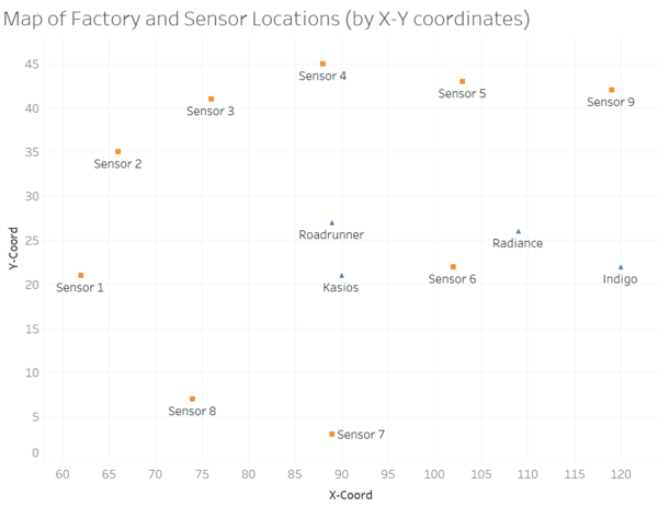
The X-Y coordinates of all 4 factories and 9 sensors have been plotted on a dashboard to facilitate the viewing of their relative positions to one another. This would be helpful in analysing which factories are responsible for the chemical releases, by investigating abnormally high readings and the corresponding wind records during that time period. This is because wind influences the flow of chemicals, and hence it may be possible to deduce the source of the chemicals by analysing the path of wind influence. For example, it can be deduced that certain factory may have released certain chemical by the relative positions of the sensor and the factory, and the corresponding wind direction and wind speed during that time period with abnormally high readings.
Sample View of Dashboard: Map of Factory and Sensor Locations
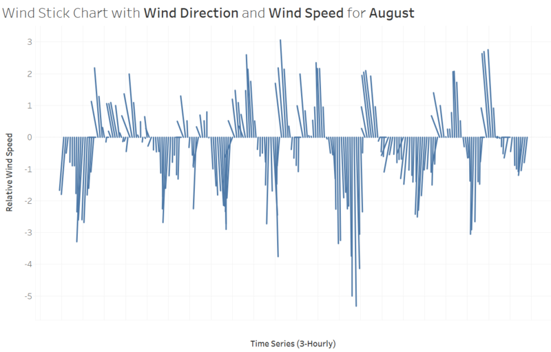
In analysing the meteorological data, a dashboard in the form of wind stick chart is created to represent both wind direction and wind speed. Every wind record (refreshed every 3 hours) is represented on the chart by a stick (i.e. straight line) which starts from the x-axis. The length of the stick represents the magnitude of the wind (i.e. wind speed) in relative scale, and the direction of the stick represents the wind direction in 360 degrees (corresponding to compass directions).
Note that wind direction in this dataset refers to where the wind is originating from. For example, a 180-degree wind direction refers to wind originating from the South (and hence it would be blowing in northward direction. With the use of informative tooltips, it would be easy to view the wind records by date and time. Interactive filter is also added to the dashboard to allow filtering of wind records by month.
Sample View of Dashboard: Wind Stick Chart by Month
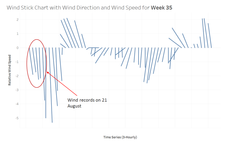
For a closer view of the wind records, another dashboard similar to the above is created, but the data filter is configured based on 'Week Number' instead of 'Month'. This would allow more detailed viewing of the wind records by the selected week.
Sample View of Dashboard: Wind Stick Chart by Week
Observation 1: With this dashboard, it would be possible to view the wind records by wind direction and wind speed during specific time periods of interest. For example, it is observed in Question 2 that there are unusually high readings of Chlorodinine on 21 August (between 8am to 5pm) as detected by Sensor 4. Based on this observation, the dashboard is used to focus on the wind records during that time period on 21 August. As the prevailing wind is actually originating from the southward direction (around 160 to 180 degrees) during that time period, it can be deduced that the higher readings for Chlorodinine may be due to one of the 2 factories, Roadrunner and Kasios, which are located in the southern regions relative to Sensor 4. Further investigations should be carried out on other abnormally high readings to see if it is possible to pin-point the responsible factory out of these 2 factories.
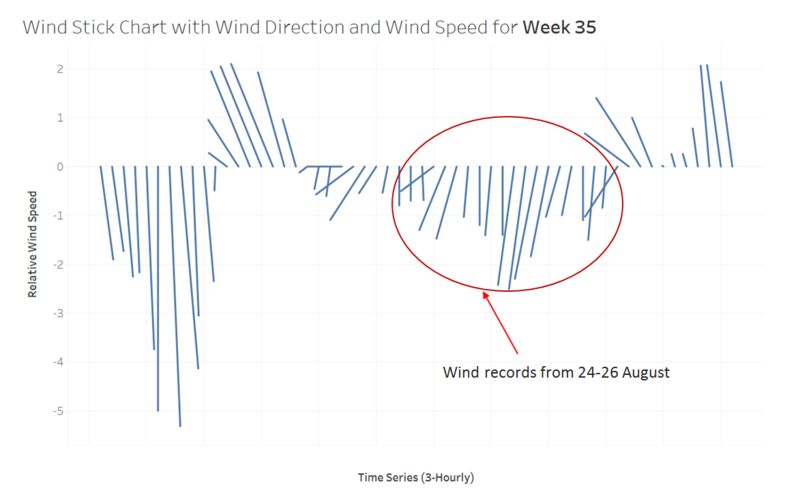
Sample View of Dashboard: Wind Stick Chart by Week
Observation 2: Using similar approach as above, the dashboard is used to investigate another period time of interest. As observed in Question 2, there are unusually high readings of Chlorodinine during the later part of August as detected by Sensor 9. The peak readings of Chlorodinine are captured on consecutive days from 24 to 26 August. Based on this observation, the dashboard is used to focus on the wind records during those days in August. As the prevailing wind is originating from the south and southwest directions (i.e. mostly between 180 to 270 degrees) during that time period, it can be deduced that the higher readings for Chlorodinine may be due to one of the 2 factories, Radiance and Indigo, which are located in the south and southwest regions relative to Sensor 9. Further investigations should be carried out on other abnormally high readings to see if it is possible to pin-point the responsible factory out of these 2 factories.
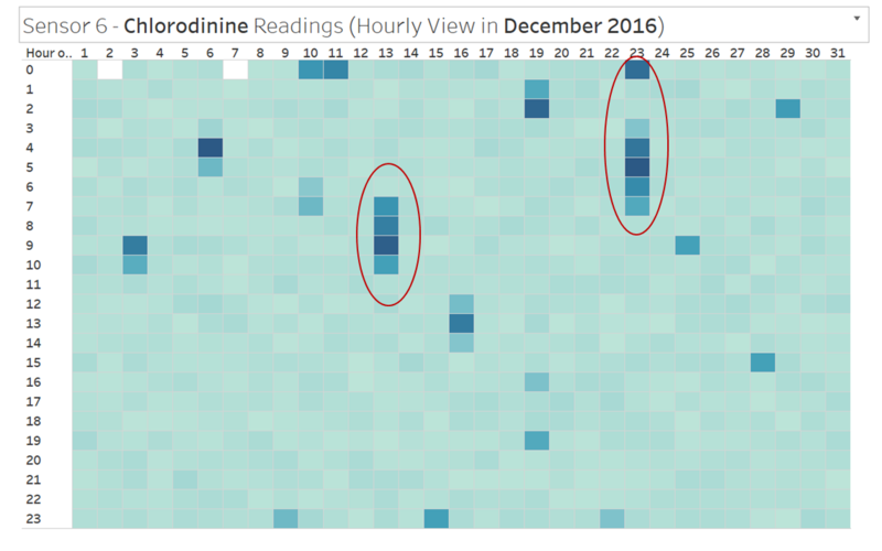
Next, the dashboards from Question 2 are used to identify other time periods of interest. For example, there are unusually high readings of Chlorodinine as detected by Sensor 6 on both 13 and 23 December.
Sample View of Dashboard (from Question 2): Hourly Chemical Readings by Sensor
From the image above, it is observed that specific time periods with abnormally high readings of Chlorodinine should be further investigated using the wind records, i.e. between 7am to 10am on 13 December, and between 0am to 7am on 23 December.
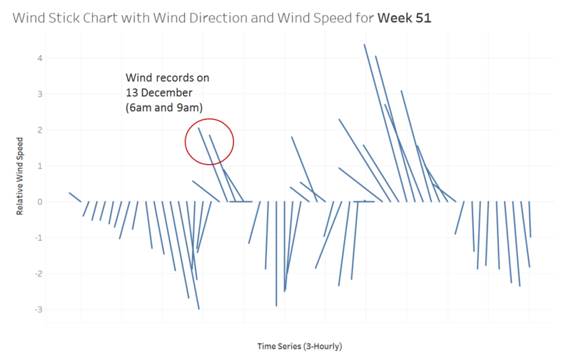
Sample View of Dashboard: Wind Stick Chart by Week (for 13 December)
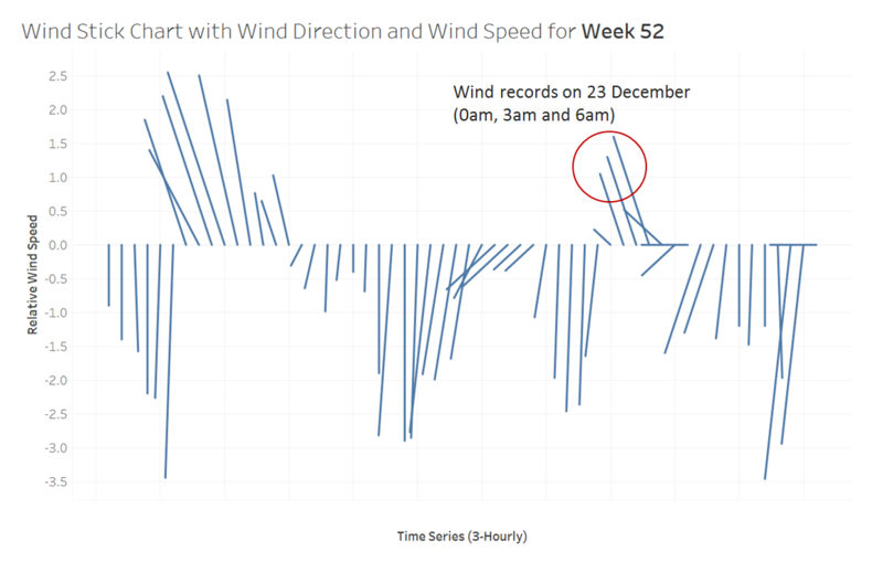
Sample View of Dashboard: Wind Stick Chart by Week (for 23 December)
Observation 3: On both days (13 and 23 December), for the specific time periods of interest, the prevailing wind is originating from the northwest direction (i.e. around 300 degrees). Hence, it can be deduced that the higher readings for Chlorodinine is likely due to the factory Roadrunner, which is located in the northwest region relative to Sensor 6. In other words, the factory 'Roadrunner' is most likely responsible for the release of Chlorodinine. Further investigations should be conducted at the factory to validate this finding.
Note: Similar approach can be applied to find out which factory may be responsible for the release of other chemicals. To summarise, the approach can be executed in 2-steps: Identify unusually high readings / spikes in the data; analyse specific time periods with the wind records as well as the map to deduce which factory is in the path of wind influence, and hence may be responsible for the chemical release.
To access the interactive version of the above dashboards, please go to the following URL on Tableau Public:
[Placeholder]

