 WeatherWISE
Application
The RainyApp can be accessed through:
insert link here.
Methodology
| Design Framework
|
Results
|

Row 1
|
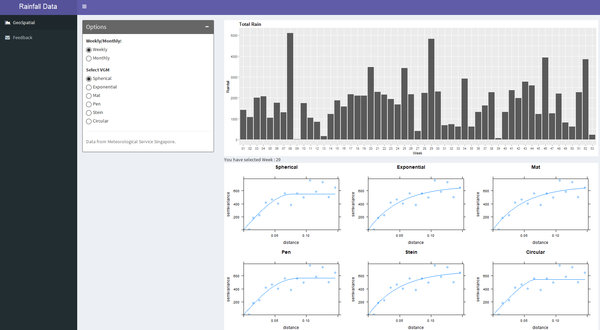
The application give the user the choice to select visualisation either monthly or weekly. Weekly option is to let the user to dig deep and monthly provides a overall picture. So these two options can cater the requirements of all users.
|
|
|
Row 2
|
Additional to the monthly and weekly option, user can also choose between six different VGMs(Variogram Models).
|
|

Roe 3
|
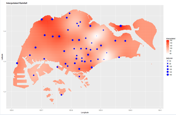
The interpolated graph reveals the rainfall pattern all over Singapore. The intensity of the red colour shows the amount of rainfall received and the blue dotes indicate the NEA points of rainfall recording. The size of the blue dots is also proportional to the amount of rainfall received.
|
Data Preparation
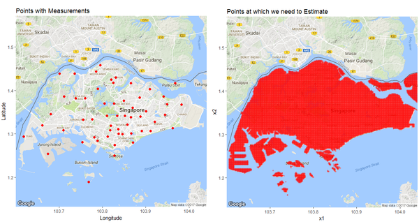
The data has been downloaded from NEA, which is provided for 58 active weather stations across spread across Singapore. The data is provided for each month and is updated on 10th of every month. This data has been used by us to
Shiny Application
| Description
|
R Script
|
Output
|
| row 1, cell 1
|
row 1, cell 2
|
row 1, cell 3
|
| row 2, cell 1
|
row 2, cell 2
|
row 2, cell 3
|
User Guide
| Design Framework
|
Results
|

Row 1
|
The application give the user the choice to select visualisation either monthly or weekly. Weekly option is to let the user to dig deep and monthly provides a overall picture. So these two options can cater the requirements of all users.
|
|
|
Row 2
|
Additional to the monthly and weekly option, user can also choose between six different VGMs(Variogram Models).
|
|

Roe 3
|
The interpolated graph reveals the rainfall pattern all over Singapore. The intensity of the red colour shows the amount of rainfall received and the blue dotes indicate the NEA points of rainfall recording. The size of the blue dots is also proportional to the amount of rainfall received.
|
