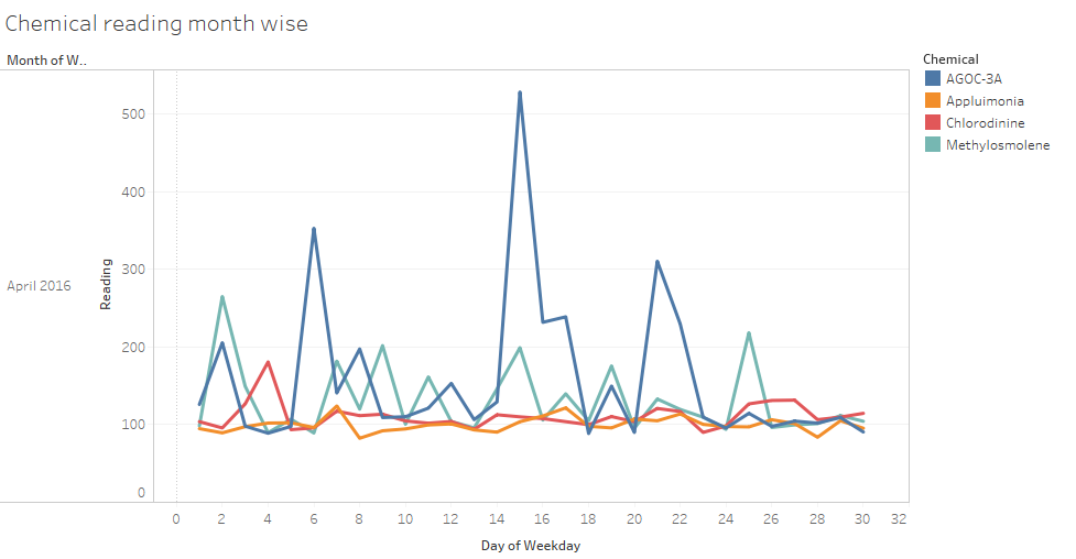
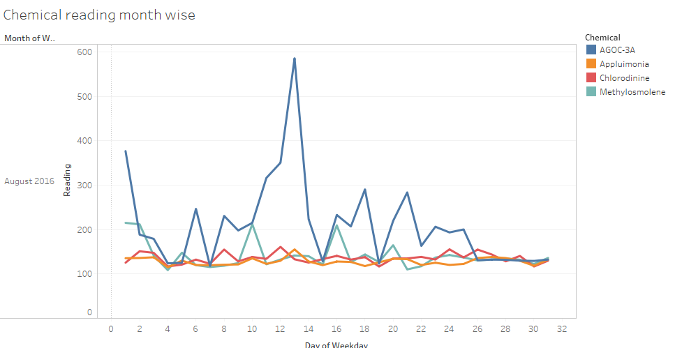
Visual findings
Revision as of 15:33, 7 July 2017 by Diptik.2016 (talk | contribs)
Visual Analytics Science & Technology Challenge 2017 MC2
|
|
|
|
|
|
Visualization Journey through the nature reserve
Sensors operations and performance
Calendar Heat map
This calendar map helps visualize the sensor data across the days of April, August and December. The sum of recordings per day has been used to plot this map. As can be seen clearly, the days in color grey represent low or no(zero) readings. These days are :
1. April: 2nd and 6th
2. August: 2nd, 4th and 7th
3. December: 2nd and 7th
Analysis of Chemical readings


