Difference between revisions of "ISSS608 2016 17T3 Group12 Report"
Jump to navigation
Jump to search
| Line 96: | Line 96: | ||
|<center><b>Results</b></center> | |<center><b>Results</b></center> | ||
|- | |- | ||
| − | |[[File: | + | |[[File:Select weekly-monthly.png|600px]]<br/> |
| − | <center>''' | + | <center>'''Row 1'''</center> |
| | | | ||
| − | + | Your content Here.... | |
| − | |||
| − | |||
| − | |||
| − | |||
| − | |||
| − | |||
| | | | ||
|- | |- | ||
| − | |[[File: | + | |[[File:Seelect the variogram.png|600px|centre]] |
| − | <center>''' | + | <center>'''Row 2''' </center> |
| | | | ||
| − | + | Your content here | |
| − | |||
| | | | ||
|- | |- | ||
| − | |[[File: | + | |[[File:Final output.png|600px]]<br/> |
| − | <center>''' | + | <center>'''Roe 3''' </center> |
| | | | ||
| − | + | Your content here | |
| − | |||
|- | |- | ||
| − | + | ||
| − | |||
| − | |||
| − | |||
| − | |||
|} | |} | ||
Revision as of 00:43, 7 August 2017
|
|
|
|
|
Contents
Application
The RainyApp can be accessed through:
insert link here.
Methodology
Data Preparation
The data has been downloaded from NEA, which is provided for 58 active weather stations across spread across Singapore. The data is provided for each month and is updated on 10th of every month. This data has been used by us to
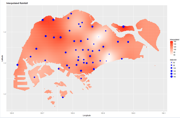
Geospatial Interpolation
| Description | R Script | Output | |
|---|---|---|---|
| Load the Shapefile and use it to create the map with a grid | |||
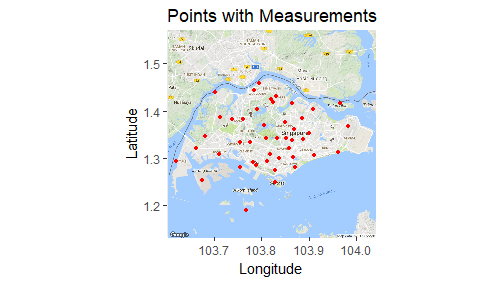
| Load the coordinates of each weather station and project it to the map | |||
| Filter the rainfall data based on the filter timeframe | |||
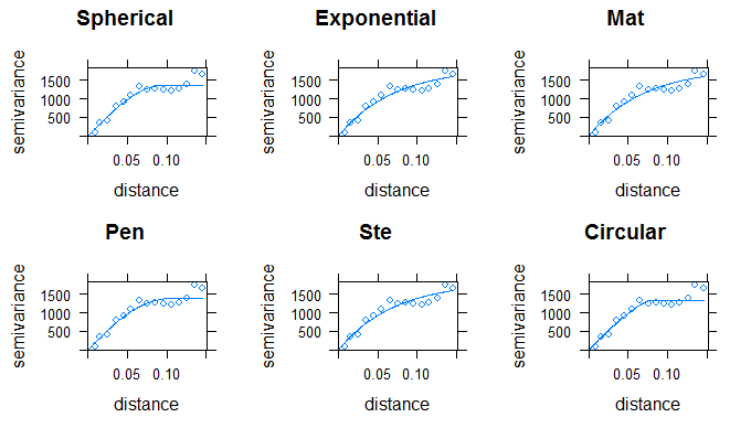
| Run the fit model for the variogram | |||
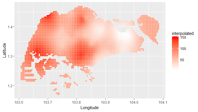
| Perform the Kriging based on the best fit variogram | |||
| Plot the interpolated values to the SG map |
Shiny Application
| Description | R Script | Output |
|---|---|---|
| row 1, cell 1 | row 1, cell 2 | row 1, cell 3 |
| row 2, cell 1 | row 2, cell 2 | row 2, cell 3 |
Design Framework
 |
Your content Here.... |
|
|
|
Your content here |
|
 |
Your content here |

