Difference between revisions of "ISSS608 2016 17T3 Group12 Report"
Jump to navigation
Jump to search
| Line 69: | Line 69: | ||
|- | |- | ||
|[[File:Select weekly-monthly.png|600px]]<br/> | |[[File:Select weekly-monthly.png|600px]]<br/> | ||
| − | <center>''' | + | <center>'''User Interface'''</center> |
| | | | ||
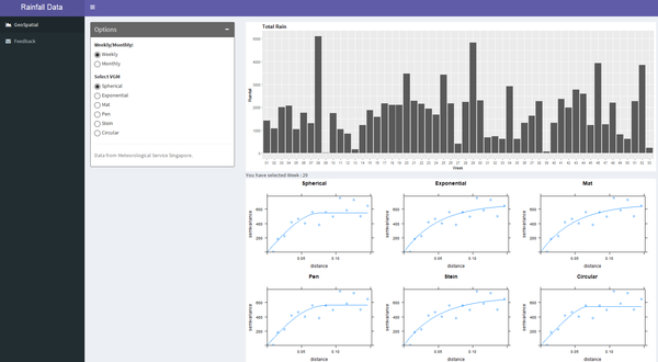
The application give the user the choice to select visualisation either monthly or weekly. Weekly option is to let the user to dig deep and monthly provides a overall picture. So these two options can cater the requirements of all users. | The application give the user the choice to select visualisation either monthly or weekly. Weekly option is to let the user to dig deep and monthly provides a overall picture. So these two options can cater the requirements of all users. | ||
| Line 75: | Line 75: | ||
|- | |- | ||
|[[File:Seelect the variogram.png|600px|centre]] | |[[File:Seelect the variogram.png|600px|centre]] | ||
| − | <center>''' | + | <center>'''User Interface''' </center> |
| | | | ||
Additional to the monthly and weekly option, user can also choose between six different VGMs(Variogram Models). | Additional to the monthly and weekly option, user can also choose between six different VGMs(Variogram Models). | ||
| Line 81: | Line 81: | ||
|- | |- | ||
|[[File:Final output.png|600px]]<br/> | |[[File:Final output.png|600px]]<br/> | ||
| − | <center>''' | + | <center>'''User Interface''' </center> |
| | | | ||
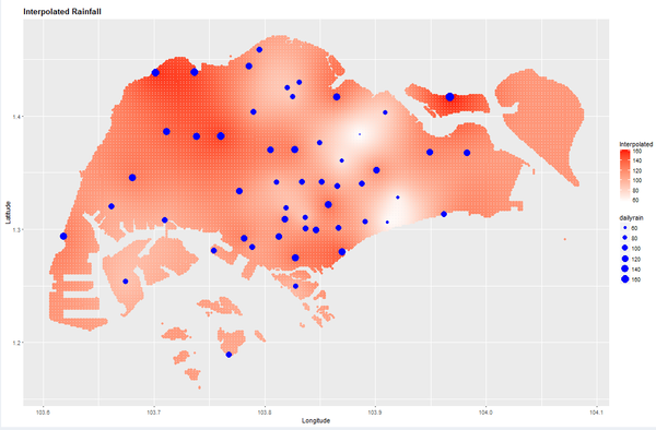
The interpolated graph reveals the rainfall pattern all over Singapore. The intensity of the red colour shows the amount of rainfall received and the blue dotes indicate the NEA points of rainfall recording. The size of the blue dots is also proportional to the amount of rainfall received. | The interpolated graph reveals the rainfall pattern all over Singapore. The intensity of the red colour shows the amount of rainfall received and the blue dotes indicate the NEA points of rainfall recording. The size of the blue dots is also proportional to the amount of rainfall received. | ||
Revision as of 01:33, 7 August 2017
|
|
|
|
|
Application
The RainyApp can be accessed through:
insert link here.


