Difference between revisions of "Report Group7"
| Line 63: | Line 63: | ||
<br/> | <br/> | ||
Jmp was used for cleaning this data. We needed date field to enable filters. So we extracted the date from the timestamp: | Jmp was used for cleaning this data. We needed date field to enable filters. So we extracted the date from the timestamp: | ||
| − | [[Image:Pic4_starburst.png | | + | [[Image:Pic4_starburst.png |500px|center|float]] |
<br/> | <br/> | ||
Next, we created a transpose of the gate name by car id and date. This gives us the following | Next, we created a transpose of the gate name by car id and date. This gives us the following | ||
| − | [[Image:Pic5_starburst.png | | + | [[Image:Pic5_starburst.png |500px|center|float]] |
<br> | <br> | ||
We combined the columns with “-‘” as the delimiter giving us the path taken. Now there is a column “path” created that can be used for sunburst. | We combined the columns with “-‘” as the delimiter giving us the path taken. Now there is a column “path” created that can be used for sunburst. | ||
| − | [[Image:Pic6_sunburst.png | | + | [[Image:Pic6_sunburst.png |500px|center|float]] |
<br> | <br> | ||
The columns “Row 1” – “Row 281” were deleted. This gives us a table needed for sunburst. | The columns “Row 1” – “Row 281” were deleted. This gives us a table needed for sunburst. | ||
| − | [[Image:Pic7_sunburst.png | | + | [[Image:Pic7_sunburst.png |500px|center|float]] |
<br/> | <br/> | ||
In R, Month was extracted from the date to enable filtering by month. And data was aggregated for months. | In R, Month was extracted from the date to enable filtering by month. And data was aggregated for months. | ||
| − | [[Image:Pic8_sunburst.png | | + | [[Image:Pic8_sunburst.png |500px|center|float]] |
<br/> | <br/> | ||
Final output sample: | Final output sample: | ||
| − | [[Image:Pic9_sunburst.png | | + | [[Image:Pic9_sunburst.png |500px|center|float]] |
<br/> | <br/> | ||
''' Network Plot ''' | ''' Network Plot ''' | ||
Revision as of 00:12, 7 August 2017
ISSS608: Visual Analytics and Applications
- Anuthama Murugesan
- Krutika Balveer Choudhary
- Sumalika Kodumuru
|
|
|
|
|
|
Geo-spatial analysis of vehicle movement data to uncover patterns and detect anomalies
Objective:
Data Pre-Processing:
Calendar Plot
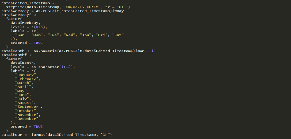
Calendar heat maps can be used to understand the peak and non-peak cycles across months, day of the weeks and hour of the day. It gives us an overview of the dataset. We need the time-stamp to be separated in months, day of the week and hour of the day. The following code was used to extract hour, day of the week and month from the timestamp to make the calendar plot
We then aggregated the data by month and day of the week.
This gave us the final table required for calendar.
Sunburst Plot
The route taken by the vehicles was explored using Sunburst diagrams. This has been used to view a summary of the paths taken and understand the more popular paths. Common destinations and starting points can be easily identified and compared.A sunburst plot is useful to visualize the sequence in navigation. We can also see the proportion of vehicles that took a certain path.
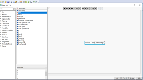
Jmp was used for cleaning this data. We needed date field to enable filters. So we extracted the date from the timestamp:
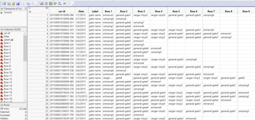
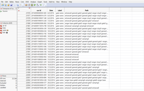
Next, we created a transpose of the gate name by car id and date. This gives us the following
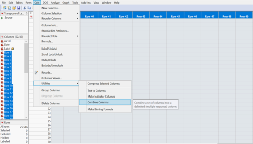
We combined the columns with “-‘” as the delimiter giving us the path taken. Now there is a column “path” created that can be used for sunburst.
The columns “Row 1” – “Row 281” were deleted. This gives us a table needed for sunburst.
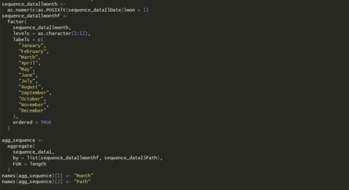
In R, Month was extracted from the date to enable filtering by month. And data was aggregated for months.
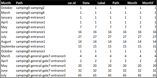
Final output sample:
Network Plot
Network plot is constructed to examine the structure of relationship between gates in terms of how frequently people/users have taken the path. From this it is easy to identify which road is more popular. In order to construct this network plot, source and target gates need to be identified and the data should be prepared to plot path from source to target gate. However since the popularity of the path is an important insight that can be drawn from the network plot, frequency of the source and target needs to be extracted from the data.
The prepared data consists of two tables:
1. Node Table: Consists of all the available gates in the preserve mapped to a unique identifier and with their respective location details. X and Y co-ordinates represent the location of the gate in the preserve. A snippet of the actual data table is shown as follows:
2. Edge Table: Consists of Source and Target variables denoting Gate names but mapped to the node table with a common ID. Frequency and the time at which it occurred is noted for analysis. Here X1,X2, Y1 and Y2 represent the X-coordinate and Y-coordinate of Source and Target variable respectively. A snippet of the actual data table is shown as follows:
Methodology:
