Difference between revisions of "Data Visualizations Q3 Sumalika"
| Line 11: | Line 11: | ||
| style="font-family:Century Gothic; font-size:100%; solid #000000; background:#001a66; text-align:center;" width="16.6%" | | | style="font-family:Century Gothic; font-size:100%; solid #000000; background:#001a66; text-align:center;" width="16.6%" | | ||
; | ; | ||
| − | [[ | + | [[ISSS608 2016-17 T3 Assign SUMALIKA KODUMURU | <font color="#FFFFFF">Assignment Overview</font>]] |
| style="font-family:Century Gothic; font-size:100%; solid #1B338F; background:#001a66; text-align:center;" width="16.6%" | | | style="font-family:Century Gothic; font-size:100%; solid #1B338F; background:#001a66; text-align:center;" width="16.6%" | | ||
Latest revision as of 12:53, 16 July 2017
ISSS608: Visual Analytics and Applications
VAST CHALLENGE 2017
- SUMALIKA KODUMURU
|
|
|
|
|
|
|
|
|
|
|
Data Visualization:
Dataset: Sensor Data, Meteorological Data
Tools & Techniques:
1. JMP
2. Tableau
3. Excel
Methodology:
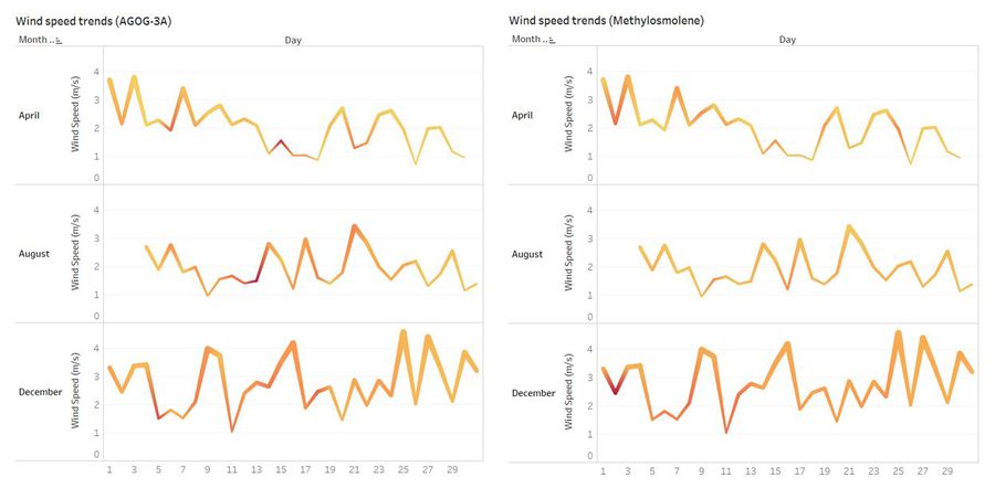
1. Wind Speed Trends
The wind speed trends graph is constructed by joining sensor data with meteorological data to map the chemicals with the wind speed.
This line plot is constructed by taking Day on columns (X-axis) and Month of year and Sum(Avg of Readings) on Y axis
Trendz grapg is color sorted on the sum of the readings of each chemical and sum of Average readings of these chemicals
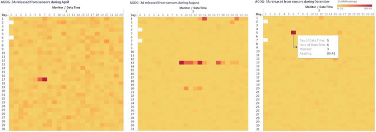
2. Calendar Plot
The calendar plot is created to identify the high chemical releases on each day at every hour.
This is created by taking Day on columns( X-axis) and Monitor,Month and Chemical on Row (Y-axis)
Color sorted on the Sum(readings) to generate a calendar heat map
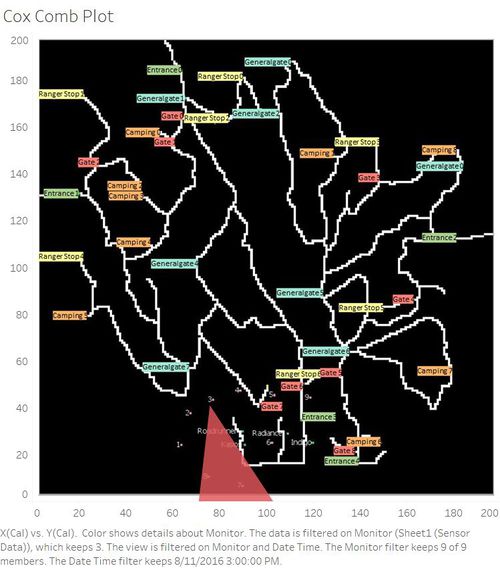
3. Cox Comb Plot
The cox comb plot is created to understand the wind behavior and identify the factories responsible for chemical releases
Refer to the " Data Pre-Processing" tab under Factories Responsible section for data transformation.
This is created by taking X(cal ) and Y (cal) on Row and Column respectively.
Filtered on Monitor and Date
Color sorted by Monitor
Location data for each factory and senor to plot them on the graph along with Background image ( given by VAST).


