Difference between revisions of "Data Visualizations Q2 Sumalika"
| Line 11: | Line 11: | ||
| style="font-family:Century Gothic; font-size:100%; solid #000000; background:#001a66; text-align:center;" width="16.6%" | | | style="font-family:Century Gothic; font-size:100%; solid #000000; background:#001a66; text-align:center;" width="16.6%" | | ||
; | ; | ||
| − | [[ | + | [[ISSS608 2016-17 T3 Assign SUMALIKA KODUMURU| <font color="#FFFFFF">Assignment Overview</font>]] |
| style="font-family:Century Gothic; font-size:100%; solid #1B338F; background:#001a66; text-align:center;" width="16.6%" | | | style="font-family:Century Gothic; font-size:100%; solid #1B338F; background:#001a66; text-align:center;" width="16.6%" | | ||
Latest revision as of 12:54, 16 July 2017
ISSS608: Visual Analytics and Applications
VAST CHALLENGE 2017
- SUMALIKA KODUMURU
|
|
|
|
|
|
|
|
|
|
|
Data Visualization:
Dataset: Sensor Data, Meteorological Data
Tools & Techniques:
1. JMP
2. Tableau
3. Excel
Methodology:
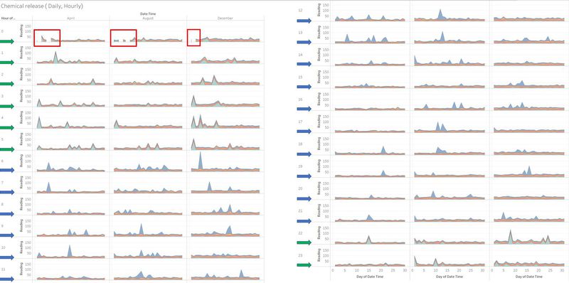
1. Chemical Release (Daily and Hourly)
The stacked Graph is constructed to observe the chemical releases at each hour of the day.
This calendar plot is constructed by taking Month and Day of the month on columns and Hour of day (x axis) and Sum of readings on Row (y axis)
The stacked graph is filtered on Chemical- " AGOG-3A, Methylosmolene, Appluimonia, Chlorodinine"
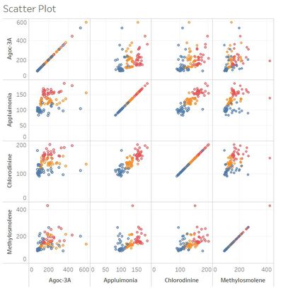
2. Scatter Plot
The satter plot is created to see correlation between the release of chemicals. All the four chemicals are taken on bith X axis and Y axis and scatter plot is constructed by detailing on the days of the month.
Refer to the data preparation tab under " Chemicals Released" section for more details on how the data was processes.
Filtered on Month:
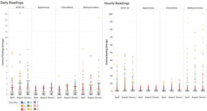
3. Box Plot of Daily and hourly Readings:
The box plot is plotted to understand the distribution of the chemicals over time and identify extreme outlier values.
This is created by taking Chemicals and month of the year on columns ( X axis) and Average of Chemical readings on Row ( Y- axis)
Filtered on Month and Avg(Reading)
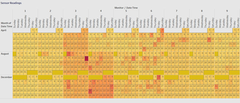
4. Calendar Plot:
Calendar plot is constructed to identify the monitors with high chemical readings
The plot is created by taking Monitor/Sensors on columns along with Weekday ( X- axis) and Month on rows ( Y-axis)
Color sorted on the sum(readings) to generate a heat calendar plot and labelled on Day.


