Difference between revisions of "Shuozhang insights"
| (9 intermediate revisions by 2 users not shown) | |||
| Line 114: | Line 114: | ||
'''Compare the Images of June:''' | '''Compare the Images of June:''' | ||
[[File:shuozhang06_NDVI_COMPARE.jpg|800px|center]] | [[File:shuozhang06_NDVI_COMPARE.jpg|800px|center]] | ||
| − | On X=50, Y=250 and X=50, Y=300 etc that are circled on the chart, there are new areas that are red show up in 2016. | + | On X=50, Y=250 and X=50, Y=300 etc that are circled on the chart, there are new areas that are red in NDVI show up in 2016. |
<!--spacing--> | <!--spacing--> | ||
| Line 129: | Line 129: | ||
'''Compare the Images of September:''' | '''Compare the Images of September:''' | ||
| + | [[File:shuozhang09_ndvi_compare.jpg|800px|center]] | ||
| + | On the contraty, the floods are dried in September in 2016. | ||
| + | |||
| + | However, the color of the lakes become more red, which means the NDVI is more negative. Which means the water becomes clearer. | ||
| + | |||
| + | <!--spacing--> | ||
| + | |||
| + | [[File:shuozhangQ3_cluster2.jpg|800px|center]] | ||
| − | + | <!--spacing--> | |
[[File:shuozhang09_band_compare.jpg|800px|center]] | [[File:shuozhang09_band_compare.jpg|800px|center]] | ||
| + | |||
| + | |||
| + | = Comments = | ||
| + | From LUO Mandi: <br/> | ||
| + | Wow! Your clustering results with the B2, B3, B4 are quite significant to identify the features in the preserve area. | ||
| + | In your final part, the legend of the cluster is overlapping with the map. It's a little difficult to read the dashboard. | ||
| + | |||
| + | From Chua Gim Hong: <br/> | ||
| + | Overall, very interesting analysis and easy to understand visuals. Your images and graphs are interesting. Please see if they can be larger, and the information on both axes be of light grey colour so as not to distract visual attention from the centre piece, which is your processed images. | ||
Latest revision as of 10:07, 15 July 2017
|
|
|
|
|
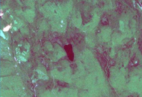
Boonsong Lake
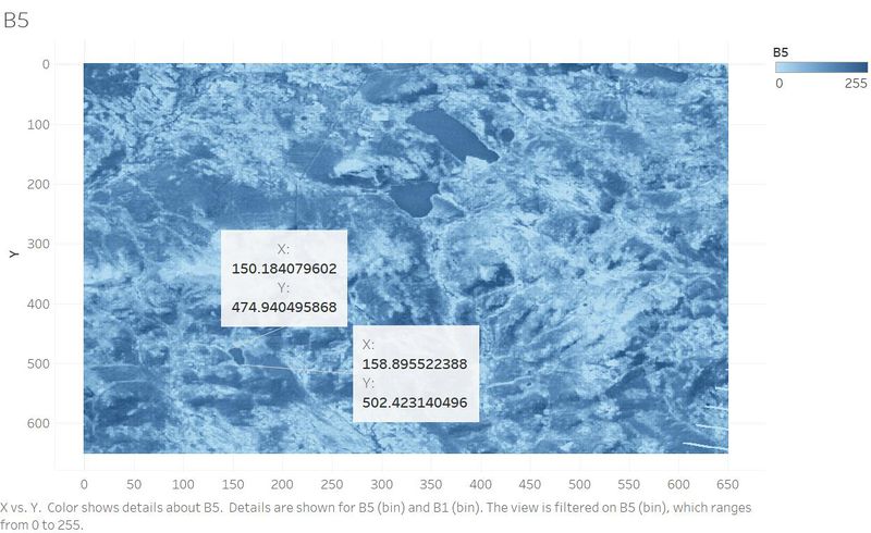
As X=0, Y=0 refers to the pixel in the upper-left corner of the image, the Y-coordinate should be reversed.
The B1 penetrates water and B5 absolutely absorbed by the water, the area that shows a large number of B1 and B5 is more likely to be the water body. The chart of B1 and B5 shows that the Boonsong Lake is roughly in the upper middle of the image. The length of the lake approximately covers from upper-left of the lake: X=150.1, Y=474.9 to bottom-right of the lake: X=158.9, Y=502.4. Then the length of the pixel is around 28.9 which means 28.9 is corresponding to 3000 feet in the real situation which means 1 pixel-length is 103.8 feet.
Therefore, one pixel covers 103.8*103.8=10774 square feet, nearly 10.8 thousand square feet.
Features in the Image
Multi-spectral bands and their utility:
| Band | Color | Wavelength (nm) | Useful for Mapping |
|---|---|---|---|
| B1 | Blue | 450-520 | Penetrates water, shows thin clouds and general visible brightness. |
| B2 | Green | 520-600 | Shows different types of plants and general visible brightness. |
| B3 | Red | 630-690 | Vegetation color and certain mineral deposits. |
| B4 | Near Infrared (NIR) | 770-900 | Partially absorbed by water, sensitive to vegetation structure and chlorophyll. |
| B5 | Short-wave Infrared (SWIR) 1 | 1550-1750 | Completely absorbed by liquid water. Sensitive to moisture content of soil and vegetation; penetrates thin clouds. |
| B6 | Short-wave Infrared (SWIR) 2 | 2090-2350 | Insensitive to vegetation color or vigor, shows differences in soil mineral content. |
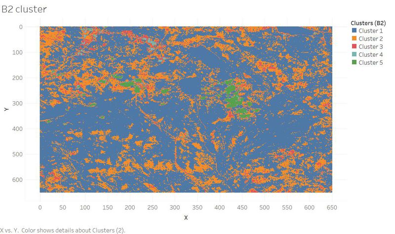
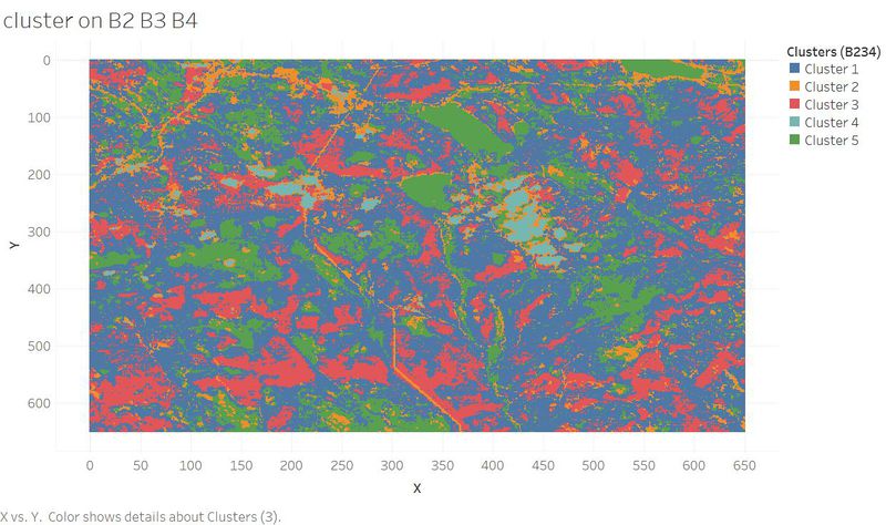
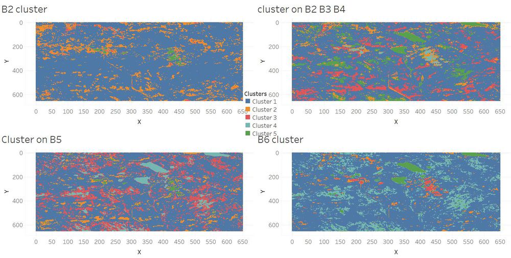
Since the B1 band only shows thin clouds and visible lights, there is no use to perform clustering on B1. B2 shows different types of plants and it is useful to see the plant health when combining B2, B3 and B4. Therefore clustering analysis is done on B2 and the combination of those three bands. The following images are the results. Here five clusters are considered.
Clearly, the cluster 1 collects the features that B2 cannot identify, as it is the largest group and the water body - lakes are also counted into it. Then the rest of the clusters are different types of plants.
For the clustering on B2, B3 and B4, the water body is differentiated from other features.
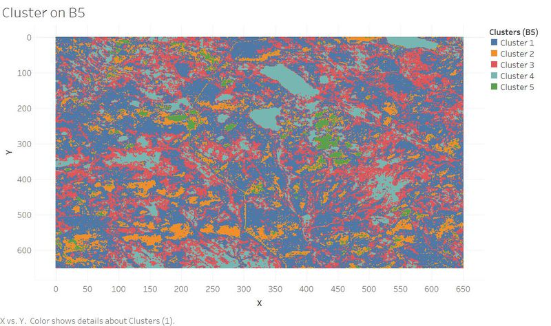
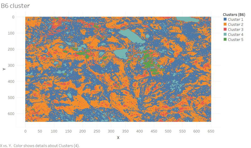
B5 and B6 capture much detailed information.
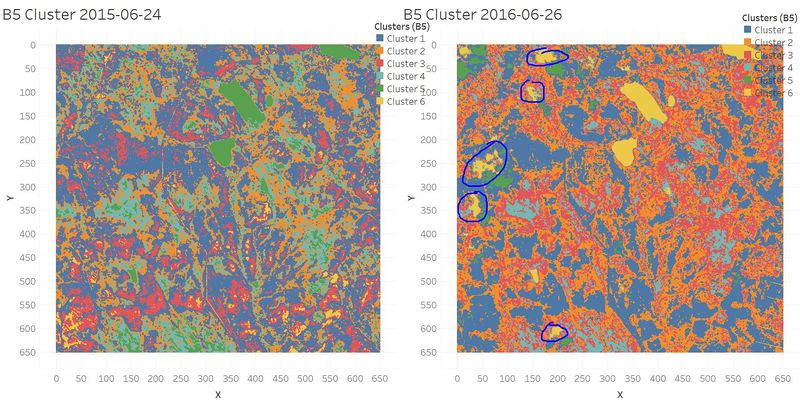
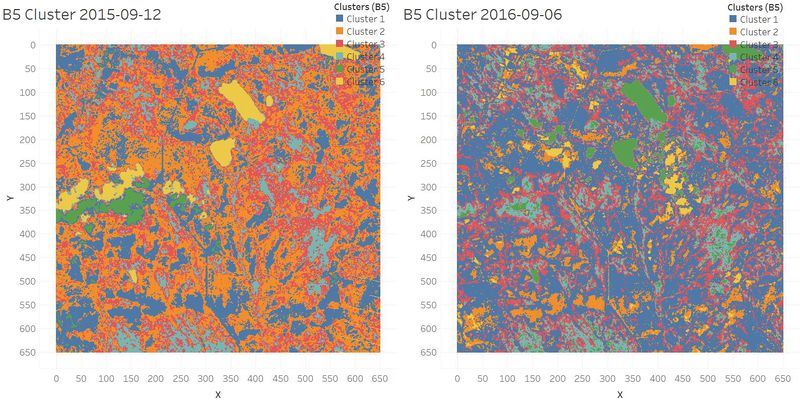
In the B5 clustering, cluster 1 is the normal vegetation; cluster 2 is the greener plants; cluster 3 would be the moisture soil; cluster 4 is the water body; cluster 5 is the clouds.
In B6 clustering, cluster 1 to cluster 3 is hard to interpret since B6 is insensitive to vegetation color or vigor, cluster 4 is water body; cluster 5 is the clouds.
Changes in the Features
As the differences in appearance of the image are subjected to the differences in the atmospheric conditions, the best way to identify the real change in the features is to compare the images that are of the same period of time in different years.
The NDVI helps to distinguish between healthy vegetation and bare ground cover.
Compare the Images of June:
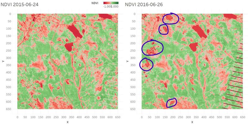
On X=50, Y=250 and X=50, Y=300 etc that are circled on the chart, there are new areas that are red in NDVI show up in 2016.
We can see that the new areas belong to the water body and they maybe floods since there is no this kind of area in the other images.
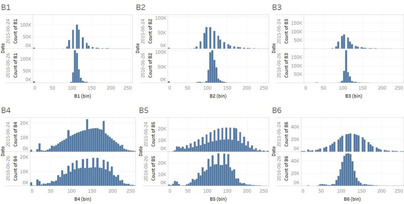
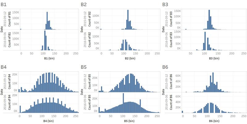
All the distributions of the bands tend to centralize. Gaps between groups are eliminated.
Compare the Images of September:
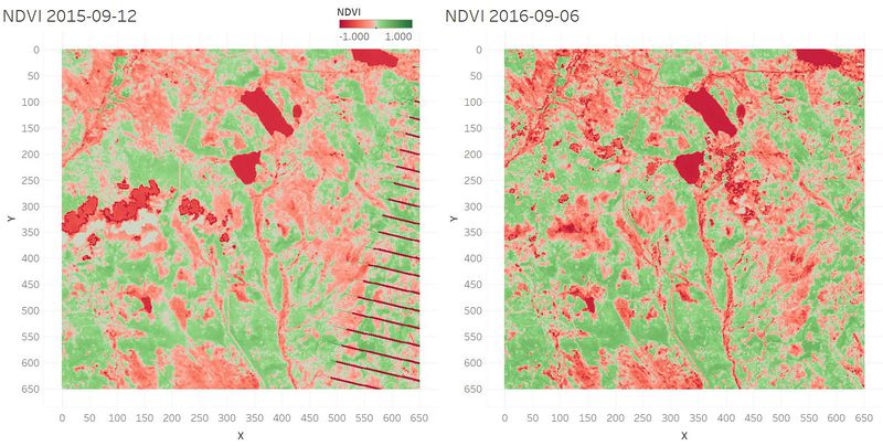
On the contraty, the floods are dried in September in 2016.
However, the color of the lakes become more red, which means the NDVI is more negative. Which means the water becomes clearer.
Comments
From LUO Mandi:
Wow! Your clustering results with the B2, B3, B4 are quite significant to identify the features in the preserve area.
In your final part, the legend of the cluster is overlapping with the map. It's a little difficult to read the dashboard.
From Chua Gim Hong:
Overall, very interesting analysis and easy to understand visuals. Your images and graphs are interesting. Please see if they can be larger, and the information on both axes be of light grey colour so as not to distract visual attention from the centre piece, which is your processed images.
