Difference between revisions of "ISSS608 2016 17T3 Group12 Report"
Jump to navigation
Jump to search
(Header Change) |
|||
| (35 intermediate revisions by 3 users not shown) | |||
| Line 1: | Line 1: | ||
<div style=background:#2B3856 border:#A3BFB1> | <div style=background:#2B3856 border:#A3BFB1> | ||
| − | [[Image: | + | [[Image:SG Grid.png|200px]] |
| − | <font size = 5; color="#FFFFFF"> | + | <font size = 5; color="#FFFFFF">WeatherWISE</font> |
</div> | </div> | ||
<!--MAIN HEADER --> | <!--MAIN HEADER --> | ||
| Line 25: | Line 25: | ||
|} | |} | ||
<br/> | <br/> | ||
| + | |||
| + | |||
| + | |||
| + | =Application= | ||
| + | |||
| + | The RainyApp can be accessed through: | ||
| + | |||
| + | https://weatherwise.shinyapps.io/RainApp/ | ||
| + | |||
| + | =Methodology= | ||
| + | |||
| + | {| class="wikitable" | ||
| + | |- | ||
| + | |<center><b>Design Framework</b></center> | ||
| + | |<center><b>Results</b></center> | ||
| + | |- | ||
| + | |[[File:Datasource.png|400px|center]]<br/> | ||
| + | <center>'''Data Source'''</center> | ||
| + | | | ||
| + | National Environment Agency collects data from total 58 weather stations all over Singapore, this data is made available for the public and can be found in their website. Data is provided monthly for each station, and from each station respective rainfall, temperature, wind speed etc are recorded. For this project we are using only rainfall data. Data.gov.sg provided the shape file for the visualisation. | ||
| + | | | ||
| + | |- | ||
| + | |[[File:Shp-grid.png|600px|centre]] | ||
| + | <center>'''Grid Points''' </center> | ||
| + | | | ||
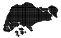
| + | From the shape file, we created grid points for interpolation. Interpolation is the important in this visualisation as rainfall from weather stations don't make much sense as its own. | ||
| + | | | ||
| + | |- | ||
| + | |[[File:Point to space.png|600px]]<br/> | ||
| + | <center>'''Interpolation''' </center> | ||
| + | | | ||
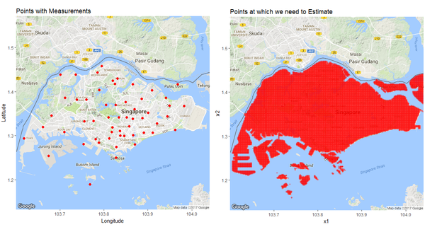
| + | The first graph shows the 58 weather stations and the second one is the interpolated visualisation of the same. It is evident that the first visualisation is not that useful while considering a certain region or the whole Singapore. | ||
| + | |- | ||
| + | |||
| + | |} | ||
| + | |||
| + | =User Guide= | ||
| + | |||
| + | {| class="wikitable" | ||
| + | |- | ||
| + | |<center><b>Design Framework</b></center> | ||
| + | |<center><b>Results</b></center> | ||
| + | |- | ||
| + | |[[File:Select weekly-monthly.png|600px]]<br/> | ||
| + | <center>'''User Interface'''</center> | ||
| + | | | ||
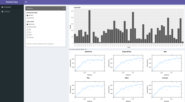
| + | The application give the user the choice to select visualisation either monthly or weekly. Weekly option is to let the user to dig deep and monthly provides a overall picture. So these two options can cater the requirements of all users. | ||
| + | | | ||
| + | |- | ||
| + | |[[File:Seelect the variogram.png|600px|centre]] | ||
| + | <center>'''User Interface''' </center> | ||
| + | | | ||
| + | Additional to the monthly and weekly option, user can also choose between six different VGMs(Variogram Models). | ||
| + | | | ||
| + | |- | ||
| + | |[[File:Final output.png|600px]]<br/> | ||
| + | <center>'''User Interface''' </center> | ||
| + | | | ||
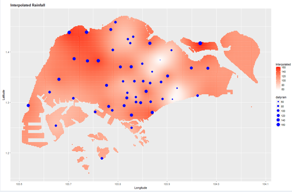
| + | The interpolated graph reveals the rainfall pattern all over Singapore. The intensity of the red colour shows the amount of rainfall received and the blue dotes indicate the NEA points of rainfall recording. The size of the blue dots is also proportional to the amount of rainfall received. | ||
| + | |- | ||
| + | |||
| + | |} | ||
| + | =Packages Used= | ||
| + | *dplyr | ||
| + | * shiny | ||
| + | * ggplot2 | ||
| + | * tidyverse | ||
| + | * ggmap | ||
| + | * sp | ||
| + | * plotly | ||
| + | * shinydashboard | ||
| + | * rgdal | ||
| + | * gstat | ||
| + | * gridExtra | ||
| + | * rvest | ||
| + | |||
| + | =Future Work= | ||
| + | * Currently the group has initially identified 6 variogram distribution, but considering there are 17 vgm implemented in the gstat library a great addition to future works could include comparing the dataset in all 17 vgms and getting the top 5 as options for the users. | ||
| + | * Currently the model is restricted to the Rainfall Data from NEA but future works improvement can include uploading of any dataset where the user just needs to indicate the location of the dataset and the variable to be interpolated and let the application capture the shapefile and map through DIVA-GIS and any open source map to create the interpolation. | ||
| + | |||
| + | =References= | ||
| + | |||
| + | https://wiki.smu.edu.sg/17t2is415g1/IS415_Team_Ninja_Project | ||
| + | |||
| + | https://cran.r-project.org/doc/contrib/intro-spatial-rl.pdf | ||
| + | |||
| + | http://rpubs.com/nabilabd/118172 | ||
| + | |||
| + | http://data-analytics.net/cep/Schedule_files/geospatial.html | ||
Latest revision as of 02:21, 7 August 2017
|
|
|
|
|
Application
The RainyApp can be accessed through:
https://weatherwise.shinyapps.io/RainApp/
Methodology
User Guide
Packages Used
- dplyr
- shiny
- ggplot2
- tidyverse
- ggmap
- sp
- plotly
- shinydashboard
- rgdal
- gstat
- gridExtra
- rvest
Future Work
- Currently the group has initially identified 6 variogram distribution, but considering there are 17 vgm implemented in the gstat library a great addition to future works could include comparing the dataset in all 17 vgms and getting the top 5 as options for the users.
- Currently the model is restricted to the Rainfall Data from NEA but future works improvement can include uploading of any dataset where the user just needs to indicate the location of the dataset and the variable to be interpolated and let the application capture the shapefile and map through DIVA-GIS and any open source map to create the interpolation.
References
https://wiki.smu.edu.sg/17t2is415g1/IS415_Team_Ninja_Project
https://cran.r-project.org/doc/contrib/intro-spatial-rl.pdf
http://rpubs.com/nabilabd/118172
http://data-analytics.net/cep/Schedule_files/geospatial.html
