Lw-preparation
Presented by: HUANG Liwei (liwei.huang.2016@mitb.smu.edu.sg)
Visualization tool: Tableau
Contents
Data Preparations
Modifications on Source Table
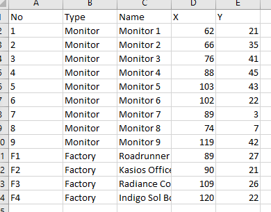
- Create an excel file for recording coordinates of monitors/factories.
Set an additional row for max values of x and y as 200.
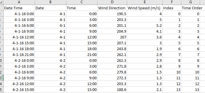
- Modify "Meteorological Data.xlsx", create two new columns for order index, 'index' is for overall order, 'time order' is for representing the order of each month.
- Create another sheet in "Meteorological Data.xlsx", calculate the x-y coordinates based on wind directions & speed.
The formular of x coordinates is:
WindSpeed*SIN(RADIANS(WindDirection))*(-1)+'TimeOrder
The formular of y coordinates is:
WindSpeed*COS(RADIANS(WindDirection))*(-1)
Append a set of same-length values representing the original points of x-y coordinates. x is as same as the 'time order', y is 0.
Add a new column as index for matching with the index in the former sheet.
Data Import
- Table join.
Open tableau. Import file Sensor Data, Coordinates and Meteorological Data.
Full outer join the tables based on monitor no. (Sensor Data & Coordinates) and date time (Sensor Data & Meteorological Data) respectively.

- New Datasource.
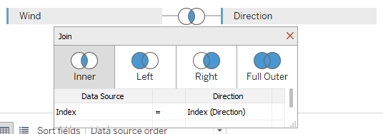
Add new datasource, join two sheets within Meteorological Data (wind & direction) together, inner join with index.
Trellis Graph (Lines)
- Create new calculated fields as row & column divider.
The formular of row divider:
int((index()-1)/(round(sqrt(size()))))
The formular of column divider:
(index()-1)%(round(sqrt(size())))
- Set filters.
Set month, chemical, monitor as filters with single value.

- Plot graph.
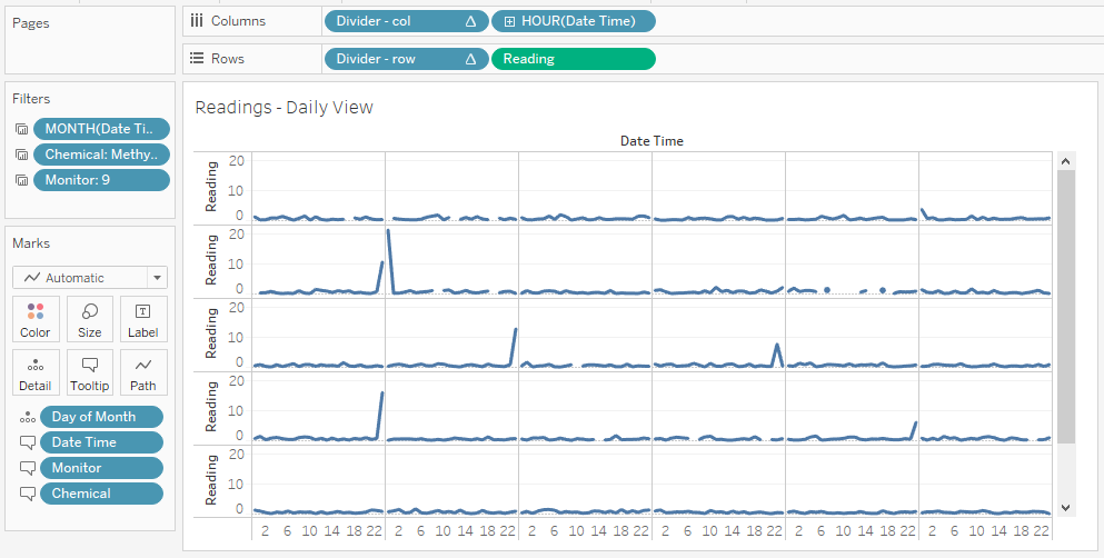
Set hour (discrete) as columns, readings as rows with unaggreagated measures.
Put column divider and row divider into columns and rows respectively, both computing using day of the month.
Put day of the month as detail. Set marks as line.
Supply the information tooltips with related attributes.
Trellis Graph (Counts)
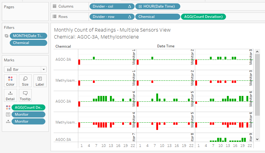
- Create new calucated field as count deviation.
The formula is:
sum([Number of Records])-max([Day of Month])
- Set month, chemical as filters.
Only keep chemical AGOC-3A and Methylosmolene since we only want to compare the record counts of this pair.
- Plot graph.
Set hour (discrete) as columns, set chemicals and count deviation as rows with aggreagated measures.
Put column divider and row divider into columns and rows respectively, both computing using monitor.
Put monitor as detail. Set marks as bar.
Add labels for showing the monitor names in each cell.
Supply the information tooltips with related attributes.
Calendar Graph (Days)
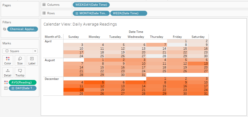
- Set filters.
Set chemical as filters with single value.
- Set columns and rows.
Put weekday into columns, put month, week into rows.
- Set Other attributes.
Set average reading as color, the darker the higher.
Set day of the month as labels so that each cell is labelled with day number accordingly.
Line Chart
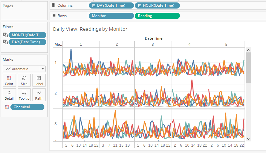
- Set filters.
Set month, day as filters. Month is single value and day can be multiple values.
- Plot graph.
Set day and hour as columns, monitor and reading as rows with unaggregated measures.
Set chemical as color.
Map
- Set max(x) and max(y) as columns and rows respectively.
So that the graph is 200*200 units.
- Set marks.
Set monitor/factory no. as details and labels. Set type as color.
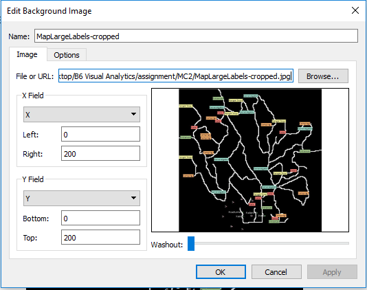
- Embed map picture.
Embed map picture as background, lock the field as 0-200 for both x and y.
 We will have the final graph:

Horizontal Graph
- Create paramter.
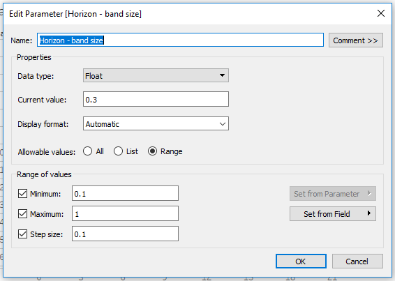
Create band size as paramter do that we can tune the band size to shifting granularity.
- Create measurement.
Create calculated field as different of speed, calculating the percentage different of wind speed based on median speed for each record.
The formular is:
(avg([Wind Speed (m/s)])/[Speed (window median)])-1
- Create horizontal bands.
Create calculated fields as differenct bands of speed differences.
The formular for band is like (take example of +1 band):
if (([Speed (% of diff)]>=0) and ([Speed (% of diff)]<=[Horizon - band size]))
then ([Speed (% of diff)]/[Horizon - band size])
elseif ([Speed (% of diff)]>[Horizon - band size])
then 1 else 0 end
The formular of the following band is like (+2 band):
if (([Speed (% of diff)]>=[Horizon - band size]) and ([Speed (% of diff)]<=2*[Horizon - band size]))
then (([Speed (% of diff)]-[Horizon - band size])/[Horizon - band size])
elseif ([Speed (% of diff)]>2*[Horizon - band size])
then 1 else 0 end
So on and so forth.
- Plot graph.
Set month as filter with single value.
Set hour of day as columns, day of month as rows. Put measure values into rows, only retain those horizontal bands.
Set differenct of speed as detail, set marks as area, set measure names as color with gradiant colors from the lowest band (negative) to the highest band (positive).

Wind Stick Graph
- Use the calculated sheet on 'Meteorological Data.xlsx'.
- Set filters.
Set month, day as filters.
- Plot graph.
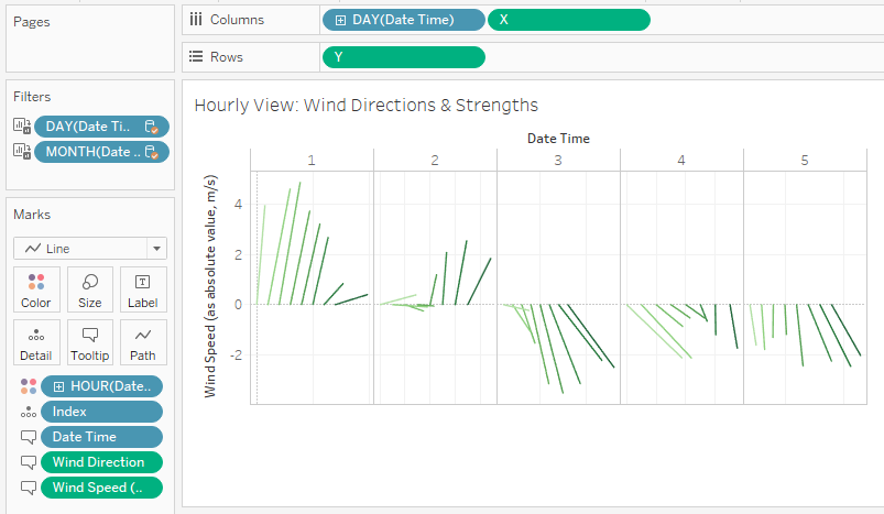
Set x, y as columns and rows respectively. Set day of the month as columns in front of x.
Set index as detail, set hour of the day as color, set mark as line.
Supply the information tooltips with related attributes.
Data preparations are all done.

