ISSS608 2016 17 T1 Project Team 7 Proposal
ISSS608 Visual Analytics and Applications
Group 15 Project
Visualisation with R:
Characterisation of Pandemic Spread
|
|
|
|
|
Project Title: Characterisation of Pandemic Spread Using R
Prepared by Group 15
Team Members:
- Chua Gim Hong
- Huang Liwei
- Ngo Siew Hui
Contents
Project Description
This project is based on VAST Challenge 2010 – Characterisation of Pandemic Spread, which involves the analysis of hospitalisation records relating to a major pandemic spread across the world in 2009. With the use of R, the project aims to develop a visualisation tool to analyse the illness across these countries, so as to help characterise the spread of the disease.
Background
There was a major disease outbreak that spanned several cities across the world in 2009. Such diseases tend to spread fast and are fairly difficult to combat. Hence, health officials are seeking for visualisation tools to analyse the hospitalisation records across these countries, so as to help characterise the spread of the disease.
Note: A disease outbreak happens when a disease occurs in greater numbers than expected in a community or region. An epidemic occurs when an infectious disease spreads rapidly to many people. A pandemic is a global disease outbreak, i.e. an epidemic of infectious disease that has spread through human populations across multiple continents or worldwide.
Data
The datasets used for this challenge are synthetic, with a blend of computer and human-generated data. No external data is needed to perform the analysis as all information necessary to form working hypotheses are provided in the datasets.
The datasets contained hospital admittance and death records for eleven countries/cities suspected to be involved in the pandemic, namely:
- Aleppo
- Colombia
- Iran
- Karachi
- Lebanon
- Nairobi
- Saudi Arabia
- Thailand
- Turkey
- Venezuela
- Yemen
Ojectives
The project aims to develop a visualisation tool using R programming to perform the following analysis:
- Characterise the spread of the disease, taking into consideration symptoms of the disease, mortality rates, temporal patterns of the onset, peak and recovery of the disease.
- Compare the outbreak across cities, including the timing of outbreaks, numbers of people infected and recovery ability of the individual cities.
- Identify anomalies from the hospitalisation records, if any.
Approach
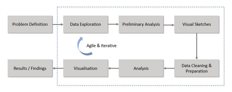
Below is a high-level flowchart of the steps that we have taken for the project approach. Much emphasis has been placed on the agile methodology involving iterative exploration and analysis. This is especially important in the area of visual analytics.
Motivations
Through this project, we hope that the visualisation tool developed can help health officials analyse hospitalisation records for the next disease outbreak. With the help of visual analytics, the tool aims to save them analysis time so that they can react quickly to the pandemic spread.
This would be particularly relevant in recent years as there have been widespread disease outbreaks leading to an alarming number of cases in the affected regions. For example, the Ebola outbreak has led to major loss of lives (~11K), and there is growing evidence that the Zika outbreak would lead to high risk of birth defects and other neurological disorders. For both outbreaks, there have been significant socioeconomic disruptions for the affected regions.
- Ebola Outbreak (2014 - 2016)
- Zika Outbreak (2015 - 2016)
Expected Outcomes
- Interactive visualisation tool deployed online using R-Shiny
- A series of visualisation charts illustrating (but not limited to) the following:
- List of countries/cities affected by the pandemic
- Temporal analysis of the pandemic spread across countries/cities (i.e. in which order)
- Strength of disease outbreak in each country/city
- Identification of symptoms which could be linked to the disease outbreak
- Profiling of population cohorts who might be more susceptible to the disease outbreak
- Insights derived from the visualisation charts
- Discussion on future work
Challenges
Due to time constraint and technical limitations, we have faced the following challenges in the course of developing the visualisation tool for this project:
Creating visualisations using R:
- Steep learning curve to pick up R programming skillsets for visualisation
Domain knowledge in hospitalisation records:
- Longer time required for data exploration and cleaning (e.g. identifying symptoms relevant to the disease and grouping them in a logical manner)
- Difficulty in interpreting analysis and detecting anomalies relevant to the scenario
Domain knowledge in disease outbreaks:
- Extensive research of the subject matter required in order to understand the problem statements
- Difficulty in determining appropriate visualisations to present the findings meaningfully and in the right context
References
- VAST Challenge 2010 – Characterisation of Pandemic Spread
- 2014-2016 Ebola Outbreak in West Africa
- CDC Info on Zika Virus
- R for Data Science
- Tidyverse R Packages
- R Shiny Tutorial

