ISSS608 2016-17 T3 Assign Qian Hongjun
Contents
Answer to the tasks
Task1. Detect sensor performanc
Sensor detection frequencies
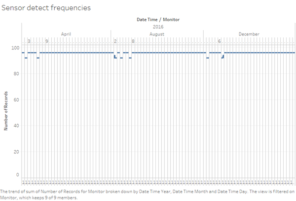
Normally, each monitor will have readings for each of four chemicals every one hour from 0:00 to 23:00. That means each monitor will detect 4*24=96 times each day. However, from the graph above, we can see in some days, the monitor only detects 92 times or 94 times each day. Namely, these days are April 2, April 6, August 2, August 4, August 7, December 2 and December7. These abnormal detection frequencies are questionable and require further investigation.
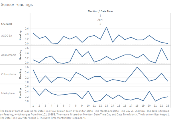
Take the monitor1 in April 2 as an example, we can find the it starts detection from 1:00 am but normally the monitor starts detection from 0:00. The rest of abnormal detections are the same situation which the sensors start detection from 1:00 instead of 0:00. The reason may be the sensors are not working properly in these years. However, this one hour gap may give the factory some opportunities to discharge the chemicals illegally. Furthermore, we can see a downward trend from 1:00 to 2:00, which means it’s highly possible the factory may discharge more chemicals from 0:00 to 1:00 but the sensor was not working properly at that time period.
Some questionable gaps
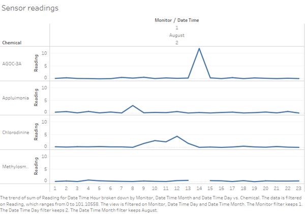
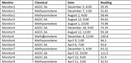
The graph above is an example of these gaps showing the readings of monitor1 in August 2. We can see from the graph, there’s a gap between 13:00 and 15:00. It means there’s no reading of the chemical Methylosm at that 14:00. Actually, these gaps very common in other monitors and in other dates. We may infer that these gaps are caused because the monitors are not working properly. However, each time when there’s no reading for Methlosm, the readings of AGOC-3A always increase dramatically.
Then when we trace back to that period, we can find that actually the recordings are wrong because there are no records of Methlosm at 14:00 August 2 but AGOC-3A was recorded twice. That’s the reason why we see so many gaps. The recording system must be upgraded or fixed to record the readings of corresponding chemicals properly.
Some extreme high readings
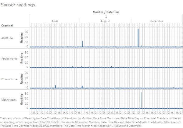
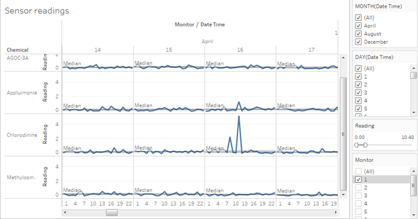
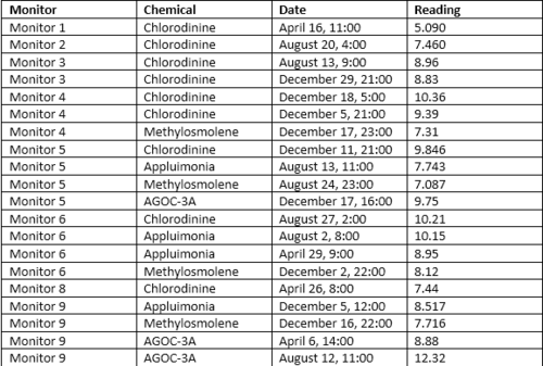
As can be seen in the graph above which is the readings of monitor1 in the 3 months, some readings are extreme high in the range of its corresponding monitors. The following table summarizes some extreme high readings for different monitors. These high readings are also questionable because they are quite outstanding from the normal range. The reason may be the sensors were not working properly or there were some external environmental factors such as wind. The reasons will be further investiged in the later parts.
Some other high readings
Except for some extreme high readings, there are also some other high readings in the fluctuation range. For example, the graph above shows the readings of monitor 1 in the middle of April. We can see that for each chemical there’s a reference line showing the median with quartiles and the median value of Chlorodinine is 0.199 but the value in April 16 11:00 is at 5.090. This is a high value compared to the median value and needs further investigation. Especially, we will put more focus on the reading of chemical Chlorodinine because Corrosives are materials that can attack and chemically destroy exposed body tissues. It is a dangerous chemical to our environment and human beings.
Some other high readings are shown in the following table.
Note:
- Monitor 3 has the largest fluctuations in the reading
- Most high value in the chemical AGOC-3A is due to the wrong recording.
Task2. Chemical exploration
Relationship between sensor and chemicals
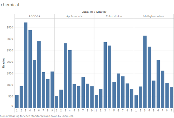
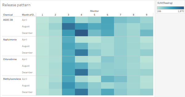
The graph above shows under each chemical group, which monitors detected the most reading. Monitor 3 and monitor 4 always have the highest reading among the four chemicals. For AGOC-3A, monitor 6 and monitor 5 also detected very high reading after monitor 3 and 4. For Appluimonia, monitor 7 and monitor 8 ranks 3rd and 4th of the reading. For Chlorodinine and Methylosmolene, monitor 6 and monitor 7 has the 3rd and 4th highest reading.
Release patterns
The graph above shows the chemical release pattern in different months. It is very clear that for monitor4, the release for all the four chemicals increase from April to December. Monitor 3 always detect high release in the three months but the release of AGOC-3A in August is higher than other months. Monitor5 and monitor6 detects higher release for AGOC-3A.
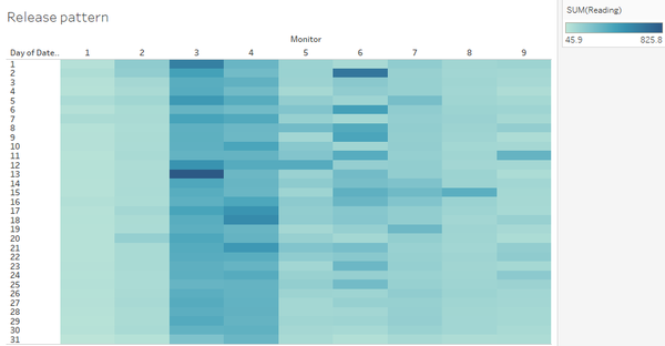
In terms of which day in a month has higher release, monitor 3 and monitor 4 detect higher release everyday compared to other monitors. Monitor 3 has extreme high release in the first day and 13th day in a month. Monitor 4 detect some high release during the middle of the month. Monitor 6 has high release at the 2nd day and the rest of release seem to have a high release intervally.
Then if we break down to hours, we find the chemicals release most at 6 o’clock and 4 o’clock in the morning. 13:00 and 9:00 also have relatively high release.
Interactive hourly release pattern
https://public.tableau.com/profile/hjqain#!/vizhome/trial_50/Sheet3?publish=yes
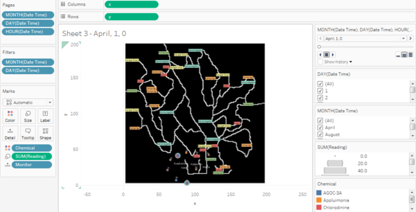
This tool helps to detect more detaily the realease of every hour in different days and different months. The position of the circle is the position of the 9 monitors. The size of the circle represents the release reading and the larger the circle is, the larger is the reading. The color represents differet chemicals. The color of the external circle means the chemical that releases the most at time.
Task3. Define which factories are responsible for which chemical release
Wind visualization tool
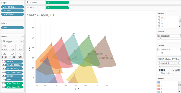
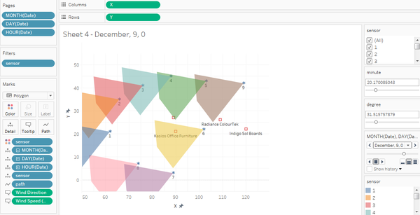
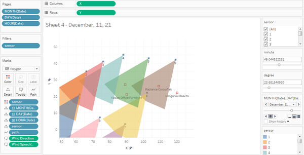
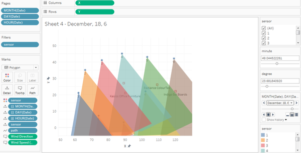
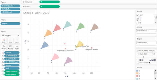
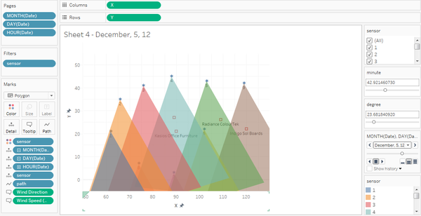
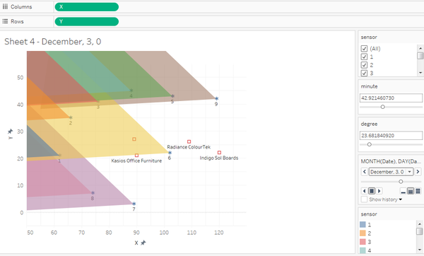
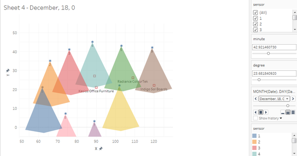
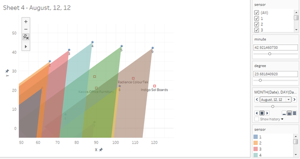
The application made to visualize the wind direction is shown as above. The blue point represents 9 different sensors and the red circle in the middle means different factories. The symmetry axis of the polygon represents the wind direction and the polygon area represents the cover area of the wind in a certain period. If the factory falls in the area, it means this factory should be responsible for the reading of that monitor. The color helps define the resource of the chemical release more clearly.
The first implication from this graph is that because monitor3 and monitor4 have the highest readings and they are quite near Roadrunner and Kasios, it can be inferred that these two factories probably produce more chemical release
Examine extreme high readings
This is the table defined in the first part of the extreme high readings. Here we are going to use the visualization application to see if there’s a relationship between the wind and the readings and which factories should be responsible. From a preliminary examination, all the high readings about AGOC-3A is due to the wrong records so we will focus on the chemical Methyosmolene.
In the table, we can see monitor 6 detects high release of Methyosmolene in December 8, 22 and when we trace back to the wind visualization, it shows Kasios Office Furniture is in the area of the monitor. The same findings are also shown in other time periods. It means the release of these high Methyosmolene is highly possible from Kasios Office Furniture and it’s not because the sensor is working improperly.
Factory detection
1.Chlorodinine
Chlorodinine has high reading on December 11, 21:00 on monitor 5 and we can see both Roadrunner and Kosias fall in the area.
This graph shows the area on December 18, 5:00 of monitor 4 and three factories are in the area. It can be inferred that the high reading of Chlorodinine may result from the release of multiple factories such as Roadrunner, Kosias and Radiance.
2. Appluimonia
Appluimonia has high reading on April 29, 9:00 on monitor 6 and this graph represents area in corresponding period. Radiance falls in the area so it may responsible for the release.
Appluimonia also has high reading on December 5, 12:00 on monitor 9. In this case, Indigo falls into the area.
3. Methylosmolene
Methylosmolene has high reading on December 2, 22:00 on monitor 6 and it can be seen Roadrunner can be the source.
Methylosmolene also has high reading on December 17, 23:00 on monitor4 and it proves that Roadrunner should be responsible for the release of Methylosmolene.
4. AGOC-3A
Apart from extreme high release of AGOC-3A from Kasios, Radiance may be another source for the release of this chemical. This graph shows the area on August 12, 11:00 of monitor 9.
To conclude, Roadrunner, Kosias and Radiance together may be responsible for the release of Chlorodinine. Radiance and Indigo are possible to be the source of Appluimonia. It is highly possible that Roadrunner produce high Methylosmolene release. Last but not least, Kasios and Radiance can be source of chemical AGOC-3C.
Feedback
Feedback from Xintian
Hi Hongjun,
I've read the solutions and here are my advises:
1) In terms of release pattern, it is much better to make an hourly reading heat-map. In this way, you can easily find the missing values.
2) In terms of wind visualization, I think it is no need to set different color into different sensors. And if you can put the center of fan-shapes on the factory, it will be much more visualized.
Regards,
Xintian
Feedback from Jiaqi
Hi Hongjun,
The 'interactive hourly release pattern' chart is interesting. It might look better if you put it on a lighter color background.
Thanks, Jiaqi
