ISSS608 2016-17 T3 Assign KISHAN BHARADWAJ SHRIDHAR The Data Elements
Contents
The Data Elements
Page overview
The data is vital,
it depends on the cars arrival,
can a visual revival,
lead to the Pipit's survival
Welcome to the page of the report, that explains how the dataset provided in the challenge was tweaked and new parameters were derived.
Data Overview
The snippet of the data that is provided is the CSV file, is as follows.
Timestamp,car-id,car-type,gate-name
2015-05-01 00:15:13,20151501121513-39,2,entrance4
2015-05-01 00:32:47,20151501121513-39,2,entrance2
2015-05-01 01:12:42,20151201011242-330,5,entrance0
2015-05-01 01:14:22,20151201011242-330,5,general-gate1
2015-05-01 01:59:27,20155501015525-264,1,ranger-stop2
2015-05-01 02:05:39,20155501015525-264,1,general-gate2
The timestamp field contains the recorded timestamp of a car entering the preserve identified by the unique Car ID at the designated place in the preserve, which is given by the gate-name. Based on the vehicle, the car type is also categorised as 2-axle car, 3-axle truck or ranger vehicles (appended with ‘2P’ tag). The below steps illustrate the procedure to derive more value of the data set provided and how it can be used to investigate patterns.
Tools that were used in data preparation and analysis include SAS-JMP , Tableau and the pivot table feature within Excel.
Steps of Data preparation
• The dataset was loaded onto SAS-JMP, by importing the csv file and using the “,” as the delimiter.
• Change the timestamp filed to be a numeric-continuous- date time column in the format d/m/y hh:mm
• Since the information given by the current data set might be limited, there are new variables needed, such as Path ID, the time spent by a car in a zone, the distance travelled, the speed of the car, etc.
• JMP allows performance of such analysis using the formula feature, where new variables can be tweaked.
• Before the above step is done, however, one of the important values to be derived is the coordinates of the various gates. This will allow to link the static map to the data provided, and helps to visualise the traffic patterns of various vehicles through the reserve.
• Performance of the step will also help to combine the aspect of temporal and spatial analysis onto a single frame.
• The tableau map pack provided by Bryant Bhowell which can be accessed from here will help to plot polygon images on a background image in Tableau.
• The image of the preserve provided,(.bmp file with 200x200 grid area) is imported and the labelled preserve gates provided inside Lekagul-roadways-labelled is used as reference points to draw out polygons.
• In all, there are 40 different gate names, and thus 40 polygons are plotted. Care must be taken to name the polygons according to the gate names.
• The HTML link will output the set of the coordinates, which is saved as another CSV file.
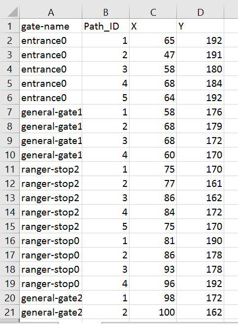
• The outputs gate-name are the names of the polygon, the path-ID is the order in which the polygon was plotted, and the X and Y respectively indicate the grid numbers on the 200 by 200 grid, which effectively translate as coordinates of the path.
The output from the tool which generates the polygons for each gate name
• The output from the top file is also imported to Tableau and later will be joined with the existing sensor data using the gate name field. Note that since only the coordinates of the gate name points are needed, the Path ID field will have to removed.
• Importing the dataset to Tableau and performing the simple analysis as given below, will help to produce the output desired.
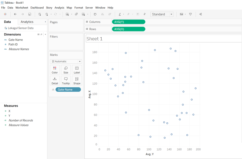
Eliminating the path ID field generated in the polygon and getting the exact coordinates of the gate names
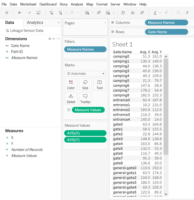
From the data, the above configuration inside Tableau computes the Average of X and Average of Y at each gate name. This will ensure the Path ID field is redundant and what is necessary has been obtained. Converting this plot into a table, will give the necessary coordinates of all the gates.
Eliminating the path ID field generated in the polygon and getting the exact coordinates of the gate names
• Plotting the coordinates of the gates:
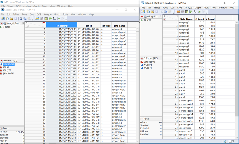
The table is exported as a CSV and updated to the main Lekagul sensor data table, again using the gate-name field to have the coordinates populated at each time stamp, as shown below.
Joining the coordinates of the gate names to the main dataset
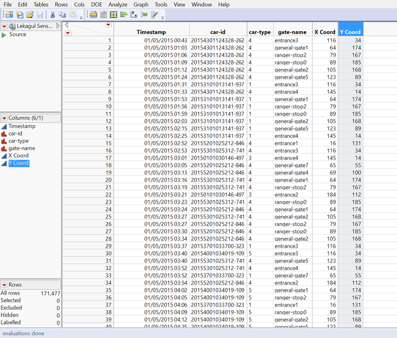
Using the update feature of JMP, the new sensor data is updated with coordinates and now looks like this below.
Updated dataset
• Creating the Path ID:
To devise the way to track the progress of a car through time, the Path ID field is necessary. This will indicate the total number of RFID readings that were recorded for a car. This is basically a sequence for each car as it traverses through the reserve and will be pivotal to find out how the cars moved through.
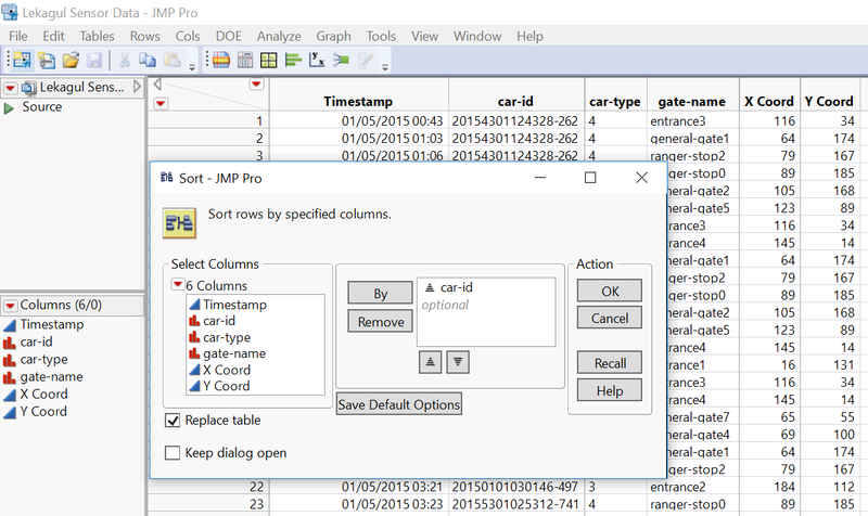
o The data table is arranged in the order of Car-ID (ascending order).
Sorting the dataset in order to prepare to find Path ID
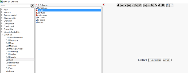
o The column rank function from JMP was used to find out the ranks for each row of the timestamp within each Car-id. This effectively gives the Path ID field. • New column called Path ID was created, and the formula is applied as shown below.
Using the Col Rank function to find the Path ID
• Finding the time spent by a car in a path:
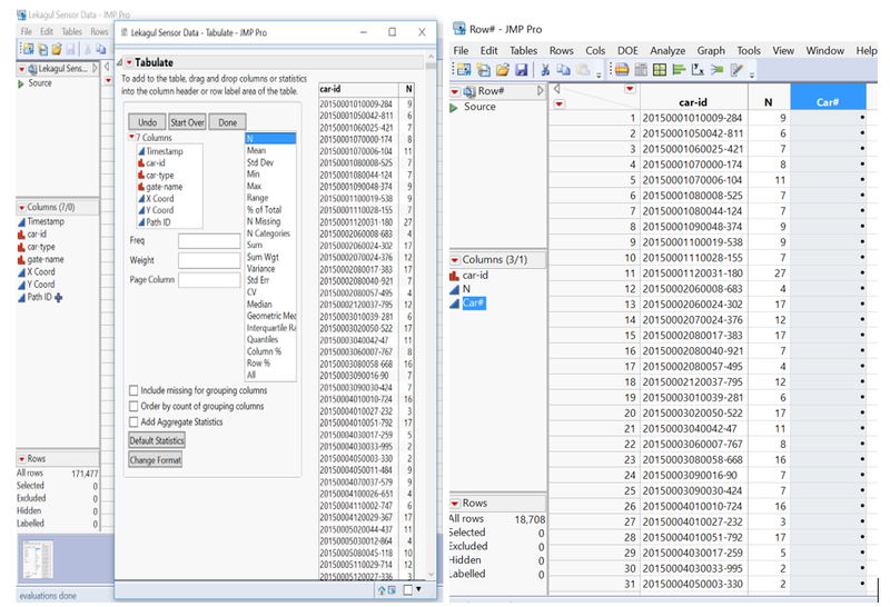
o In order to find the time spent by a car, inside each path, the time difference between the timestamp in the (n+1)st path is subtracted from the nth path ID row. This will be done for each car ID, and the below formula will help to achieve the same. o Before that, a Car# field will be created to facilitate the process better, and to provide easier reference to each car. o Car-ID field is tabulated and exported as a data table, so that the list of unique Car-IDs are found.
Creating the Car # field
o New formula for Car# is created using the Row() function, to find out the row # of each cars, which will effectively be the Car# field. The table is updated with the parent sensor data table, using the Car-ID field, to get the refined data table as below.
o A new column called Time spent is created with the properties of Numeric, Continuous and Date time format of d:hh:mm (days-hours-minutes). o The formula below will get the time spent by a Car at each path, and ensures that each unique car will be separated.
Calculating the time spent inside each path
o The time spent is thus populated as above.
• Finding the total distance covered by each car inside each path:
o Using similar logic as done for the time spent, the distance covered can be found out by the below formula. New column called Distance is created.
Calculating the raw pixel distance using Manhattan distances
• It must be noted that the 200 by 200 grid, indicates a 12 miles by 12 miles area. So value of X coordinate of 50 and Y coordinate of 100 would mean that the effective coordinate in miles is (3 miles, 6 miles). Applying the same logic, the speed of the car through the path is calculated as below (in miles per hour).
o In the below set of images, distance in miles, time spent in hours and speed in miles per hour (for those regions which have a change of path) are shown.
Converting the raw pixel distance to fit the grid scale of 12 miles
Finding the time spent in hours at each path for a car.
Calculating the speed in MPH
The speed (in MPH) column is created as above, and the formula applied is as given. The If clause is added to take care of the vehicles which enter and exit from the same path, later. For e.g.: The car in the camping sites at different points, would have spent some time here, since distance is 0, and speed through the route is not applicable.
• The last step in the data preparation is to find out the Corridor Name.
Deducing the corridor names between two consecutive timestamps
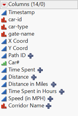
This will connect the gate names between the timestamps for each vehicle. It is achieved by creating a new Corridor Name character column, and applying the above formula. Since the path name is applicable only beyond the 1st entry path, the formula will help to see which corridor the car is at a given time. The final 14 columns of the refined data set are as shown below.
An overview of the generated fields which will be used in subsequent analysis
Special transformations needed inside tableau for the visualisations:
- Gate categories:
Create groups on the gate names, with camping 0 to camping 8 labelled as Camps, and other gates accordingly.
- Traffic:
The distinct count of Car # will be the traffic at any region. This will allow analyses, without the interference of the same car being found at various places of the preserve. So there are a total of 18708 unique cars in the preserve, and it is desired to find the traffic patterns amongst them on a daily as well as a seasonal basis.
- Aliases for car-type:
The car types are numbered, and may not guide the user properly. So aliases are created based on the number of car types. So ‘2’ is changed to “2 axle truck” and so on.
- LongShort:
It is desired to find the long stayers and short stayers. Long stayers are filtered by the time spent in hours field. Long stayers are cars that have a time spent in hours >24, i.e. 1 day.
This is used in finding who stays the most inside the camping regions, and where the long stayers have a preference in terms of camping inside the preserve.
- Month-Year:
This allows the visualisation of the 13 months pattern of the timestamp. The month and year of the timestamp can be concatenated and an alias can be created. In most cases, to reflect chronology, a sorting might be needed.
- Naming of the Speed Columns—mean(SPEEDS) and max(SPEEDS)
Inside JMP, the tabulate feature is used to compute the average speed of the car by taking all the speeds inside the paths it takes and the maximum speeds that are travelled by each car. This means that for each car type, there is exactly 1 value of average speed, (averages of speeds across all paths) and 1 value of maximum speed. So, in total, for 18708 cars, we get the same amount of values. The fields are thus named mean(SPEEDS) and max(SPEEDS) and the units are in miles per hour. Conversion according to the pixel to miles ratio (200 pixels on the background unlabelled image is 12 miles) has been done. The distance measure used to calculate speed is the manhattan distance.
Special transformations needed inside tableau for the visualisations:
- Gate categories:
Create groups on the gate names, with camping 0 to camping 8 labelled as Camps, and other gates accordingly.
- Traffic:
The distinct count of Car # will be the traffic at any region. This will allow analyses, without the interference of the same car being found at various places of the preserve. So there are a total of 18708 unique cars in the preserve, and it is desired to find the traffic patterns amongst them on a daily as well as a seasonal basis.
- Aliases for car-type:
The car types are numbered, and may not guide the user properly. So aliases are created based on the number of car types. So ‘2’ is changed to “2 axle truck” and so on.
- LongShort:
It is desired to find the long stayers and short stayers. Long stayers are filtered by the time spent in hours field. Long stayers are cars that have a time spent in hours >24, i.e. 1 day.
This is used in finding who stays the most inside the camping regions, and where the long stayers have a preference in terms of camping inside the preserve.
- Month-Year:
This allows the visualisation of the 13 months pattern of the timestamp. The month and year of the timestamp can be concatenated and an alias can be created. In most cases, to reflect chronology, a sorting might be needed.
- Naming of the Speed Columns—mean(SPEEDS) and max(SPEEDS)
Inside JMP, the tabulate feature is used to compute the average speed of the car by taking all the speeds inside the paths it takes and the maximum speeds that are travelled by each car. This means that for each car type, there is exactly 1 value of average speed, (averages of speeds across all paths) and 1 value of maximum speed. So, in total, for 18708 cars, we get the same amount of values. The fields are thus named mean(SPEEDS) and max(SPEEDS) and the units are in miles per hour. Conversion according to the pixel to miles ratio (200 pixels on the background unlabelled image is 12 miles) has been done. The distance measure used to calculate speed is <a href="https://heuristicswiki.wikispaces.com/Manhattan+Distance">manhattan distance. </a>
Preparation of visualisations:
For Q1:
- Times when cars are found:
- Add gate categories and traffic to columns.
- Modify timestamp in rows to display hours of day.
- Add filter for car type
- Colour by gate categories.
- Time of day:
- Repeat visualisation of “Times when cars are found” sheet.
- Add combined field of gate categories and hour of timestamp and sort by descending traffic. Hide the headers.
- Which gates do vehicle take:
- Add Traffic to columns.
- Add car type, gate groups to rows. Use the combined field of car type and gate groups, sort by descending and hide the headers.
- Colour by car type.
- Add filter for gate categories.
- Speeds:
- Add Average of mean speeds to rows.
- Add car type to columns, sort by average speed.
- Add filter for gate categories.
- Rangers Entry:
- Add hour of the timestamp to columns.
- Add gate categories and traffic to rows.
- Filter by Car type.
- Add a filter for Path ID and select only Path ID=1. This shows the first timestamp record for each vehicle, meaning entry time.
- Popular zones:
- Add modified X coord and Y coord variables respectively to columns and rows. These range from 0 to 982 each since the pixels of the labelled map correspond to the same.
- Insert the labelled map image as background image, adjusting for width and height to be 982 each.
- Add car type, gate categories and long short as filters.
- Adjust colour gradient after adding traffic to colours. Use 4 stepped red to blue gradient, reversed.
- Add gate name to detail.
- Add annotations to the camps alone.
- Popular Zones_Time Spent:
- Add modified X coord and Y coord variables respectively to columns and rows. These range from 0 to 982 each since the pixels of the labelled map correspond to the same.
- Insert the labelled map image as background image, adjusting for width and height to be 982 each.
- Add car type, gate categories as filters.
- Use Sum of Time Spent in Hours as colour field, use a 4 stepped reversed red to blue divergence to illustrate hotspots.
- Add gate name to detail, annotate the camping sites.
- Locations Traffic/Speed/Time Spent Treemap:
- Add “Sum(Time Spent in Hours)” to colour field, use traffic as the sizing, and add gate categories and gate name as labels.
- Sort gate name by descending traffic, so that inside each gate category the respective gates are known for traffic/speed/time spent trends.
- Replace size variable to “Sum of time spent in hours” to get time spent trends and “Average of Speed in MPH” to get speed trends.
- Use stepped colour gradient to illustrate variation, and add car type as filter.
- The filtering maybe useful to compare across different car types.
- Annotate the gate with the highest traffic, most time spent and the greatest average speed.
For Q2:
- Traffic at Gates:
- Add the traffic variable as size.
- Use the gate categories as colour.
- Add month-year fields as label, and manually sort so that the timeline is coherently flowing from May 2015 to May 2016. Else, the default Tableau takes the alphabetical order of the fields.
- Add gate categories as filter, annotate the Gates to illustrate that they have constant traffic.
- Preferred Corridors:
- Use a suitable map as background image, and adjust the coordinates accordingly. Two maps of sizes 200*200 and 982*982 are available.
- To create this flow map, add the traffic as the size variable, and set the Marks to ”Line”.
- Colour traffic, use a stepped gradient to illustrate the path in a divergent fashion, i..e path with most traffic is shown prominently.
- Add the car type as filter.
- In addition, corridor name is added as filter, and corridors such as camping 8-camping 8 that repeat itself, are not selected. This will remove the interference of camping vehicles, and give the plot of vehicle traffic.
- The variables can be altered to speed or time spent according to the needs.
- Calendar Views:
- To prepare calendar view, add the weekday of timestamp to columns.
- Add the year, month, week of timestamp as rows so that basic calendar schema is formed.
- Use Traffic/Speed/Time spent as the colour fill, and use divergent red to blue reversed gradient to display the trends over the 13 months of observation.
- Add car type as filter (optional).
- Time spent trends:
- Add car type to columns.
- Add “Sum of time spent in hours” to rows.
- Sort columns by the value in rows. In this case, descending time spent.
- Add table calculation for rows, show as percentage of total, to get which car type is accounting for most time spent in the preserve. Speed trends:
- Weekday vs Weekend trends:
- Create a set on the weekday of the timestamp. Choose In for the 5 weekdays and Out for the weekends, or vice versa.
- Use the weekday of timestamp as columns, and traffic as rows.
- Colour using the set created above, to illustrate the differences.
- Reference lines can be added to show the differences.
- Cycle Map:
- Use the Month-Year and weekday of timestamp as coumns, with Month-Year sorted chronologically.
- Add traffic to the rows column.
- Add gate categories to the colour field. Change the marks to “Area”.
- This will create a cycle map that varies according to the traffic patterns on each day of the week across the 13 months.
- It may be repeated for other suitable variables.
For Q3:
- To find the speeding car:
- Use Max(Max(Speeds)) field as the columns.
- Use Car-ID as rows.
- This will give the Car-ID that has travelled with the maximum speed across the preserve.
- To find the loitering car:
- From the Max of Path-ID, 281 is the most number of paths traversed by a car. Viewing the data for the row, will give the Car-ID and other details needed.
- It is seen that this car-id matches with the car that spends the 2nd highest time in the preserve, which can be attained by a minor tweak of the visualisation of the speeding car, and changing the variable to “Time spent in hours”.
- To find the camp hoppers:
- Add Month-Year sorted to columns and traffic to rows.
- Colour by car type. Add Car-ID to detail.
- Filter by corridor name and choose only those camping corridors which are consecutive and different. i.e for camping 0, exclude camping 0-camping 0 and choose camping 0-camping 1, camping 0-camping 2, etc. Repeat for the 8 camps and the compact visualisation can be created to see which car and car type is a repeat visitor of camps, and moves between camps.
- The 4-axle truck:
- Add traffic to columns, gate categories to rows.
- Add car type to colour, sort by descending traffic.
- Filter out car type to retain only the 4-axle truck.
- Add mark labels, and it is seen that the 4 axle truck is present in gates.
- Preparing the tailgating calendar:
- Add weekday of timestamp and car type to columns.
- Add year, month and week of timestamp to rows to get the schema.
- Fill the colour with traffic.
- Add car type filter and retain only the 2 axle ranger truck and 4 axle truck, since the hypotheses needs to be tested for them.
- Add the gate categories filter, and retain only gates, since hypotheses needs to be tested for them.
- It illustrates that Tuesdays and Thursdays are days of week across the observation period, where the 4 axle truck is found alongside 2 axle ranger trucks in the preserve.
- Add a colour gradient for traffic, to see variations in flux, but this might be optional.
- Ranger Vehicle loitering:
- Add gate categories and traffic to columns.
- Add the hour of timestamp to rows.
- Create a “Ranger loitering set” with the times 6am to 5 pm of the hour of timestamp as In and others as out, or vice versa. This inference on the ranger vehicle working hours is available due to a previous visualisation.
- For the set, 10pm to 4am was taken, as these are deduced to be very abnormal hours for a ranger vehicle to be patrolling.
- Add the ranger loitering set as colour, to show that ranger vehicles are indeed seen outside of their regular working hours.
