CAO BO Comments
|
|
|
|
|
Comments
1) All questions have been well solved and explained and there are many interactive techniques and graphs to make user understand the patterns better. Although this is a good visualization output and full of exploratory space. I would like to offer three humble suggestions:
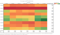
1. In many places, divergent color can be replaced with mono-color range to show the value more direct.
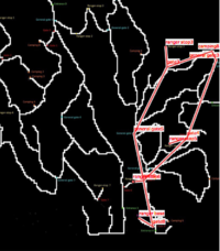
2. When showing paths in the map, size of the line can be used to show the traffic volume.
3. Since car type is categorical variable, cyclical graph is not a good choice to visualize the pattern.
Overall it's a very good job! Keep on it.
2)
Hi Caobo,
Nice work! Great efforts to this assignment! The solutions well answer the questions.
Here are my concerns:
- When plot the route of each vehicle, probably can take consideration of the time duration or traffic volume, using the size to represent.
- When checking the abnormal pattern, you also can try to compare the speed of each vehicle since you have the distance and time.
Best regards,
Xiaoqing
3) Hi Cao Bo,
Quite deep and detailed analysis. Analysis is consistent with your visualization. And it is very interesting to see you do a network analysis among all gates!
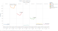
Just two suggestions: a. When doing the heatmap, since your min and max value are both positive, it's advisable to use one color range, which would be easier for human eye to detect the outstanding value. b. When using line graphs, would it be better for some of them if they have some reference lines?
Yuhui ZHOU
4) Hi Cao Bo,
Good job! We can see you have put in a lot of efforts to prepare the data and to explore new softwares for this assignment. From your analysis I could say that the efforts were well paid off!
Some suggestions on the Tableau workbook you've created:
- When visualizing the traffic sequences, include a colour legend so that at one glance we can know what are the stops in the sequence. I'm referring to the dashboard "General Visualization Interface" and currently I need to refer to the colour of the texts in the data table to see which gate does each colour represent.
- You may wish to adjust the dashboard size setting to fit the dashboards into one screen size to have all the information presented in one view, without any scrolling.
Yifei
Acknowledgement
Guided by:
- Prof.Kam Tin Seong
Discussed with:
- Zheng BIJun (Miss Zheng taught me how to visualize the car sequences and shared with me the idea of "episode")
- KISHAN BHARADWAJ SHRIDHAR (Mr Kishan taught me how to get the sequences from raw data)
- Wei YunNa (Miss Wei taught me how to display the car sequences in Gephi according to the coordinates)


